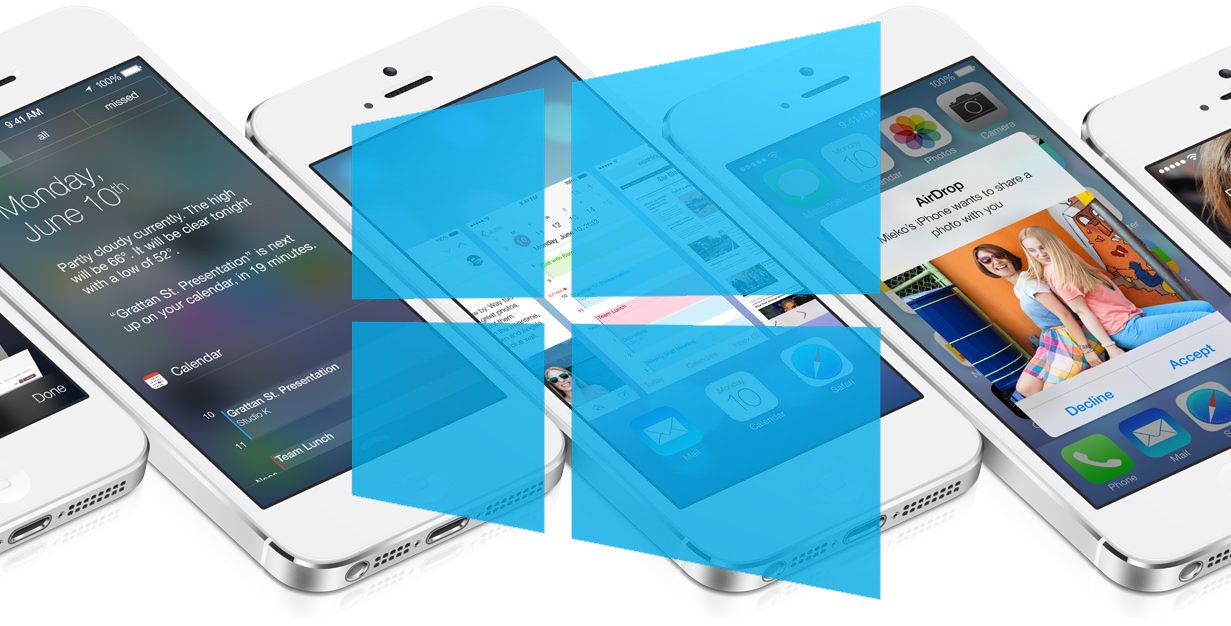
Meet the latest Windows Phone incarnation, iOS 7
Today has been an exciting day for both video gamers at E3 and Apple fans at WWDC. Despite what you may think, I actually followed Apple’s event just as closely as Microsoft’s press releases on the Xbox One.
As I sat on our sister site, iMore.com, and watched the WWDC Live blog I realized that I absolutely loved the updates to iOS7. Apple decided to go for a “flat” design and get rid of faux textures for a completely modern approach. As I watched on and became more excited I realized something; flat design, no faux textures, and Bing integration – this was Windows Phone.
I personally don’t like to claim that one company stole an idea from another company; I have this stance, because I encourage companies to become better by implementing their variations of what is already available on the market. A personal motto of “let the best implementation prevail”!
That being said, it is hard for a Windows Phone user to look at iOS7 and not see some striking resemblances to Microsoft’s current mobile operating system. Of course it wouldn’t be Apple if they didn’t say it was theirs: “The mobile OS from a whole new perspective.”

Jonathan Ive, Apple’s lead designer, had been previously cited for wanting to drop the use of “heavy textures” in iOS, stating that “software design filled with physical metaphors do not stand the test of time”.
Apple hasn’t dropped the rounded edges on its icons or buttons, but there is no longer any evidence of drop shadow or 3D imagery. The new operating system is bright white with simplicity all over.
If my last statement is to be true, and Apple is implementing their own variation of what is already available on the market – then what changes have been made that Windows Phone hasn’t taken advantage of with its modern UI? The answer is transparency; Apple has added transparency to certain buttons and menus, such as the new Control Center. While Windows Phone does embrace flat design, it does not take use of transparency; the addition of which, I believe adds a hint of sophistication to its design.
Get the Windows Central Newsletter
All the latest news, reviews, and guides for Windows and Xbox diehards.
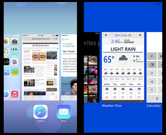
The new changes to iOS7 are the largest design changes ever seen on Apple’s mobile platform and hints that Microsoft’s latest design initiative has been heading in the right direction. As always though, we have to wonder if Apple will get all the credit for “flat design”.
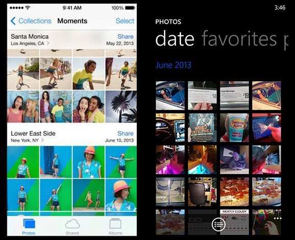
The operating system’s design isn’t the only change to Apple’s latest creation, a collection of new features include Control Center, Airdrop, and more. The feature we are interested in, is the company’s decision to now bundle Bing instead of Google into its virtual assistant, Siri.

It is no secret that Apple has been trying to pull away from the claws of Google, if you weren’t aware of the Apple Maps fiasco – you were living under a rock. The company has decided to take it one step further and drop Google search from Siri’s collection of data. Apple's virtual assistant now pulls in data from Bing, Wikipedia, and Twitter.
We shall end on a closing note from Steve Jobs himself:
What do you think of Apple’s latest change to iOS7 – did they take a design cue from the boys in Redmond, Washington?

