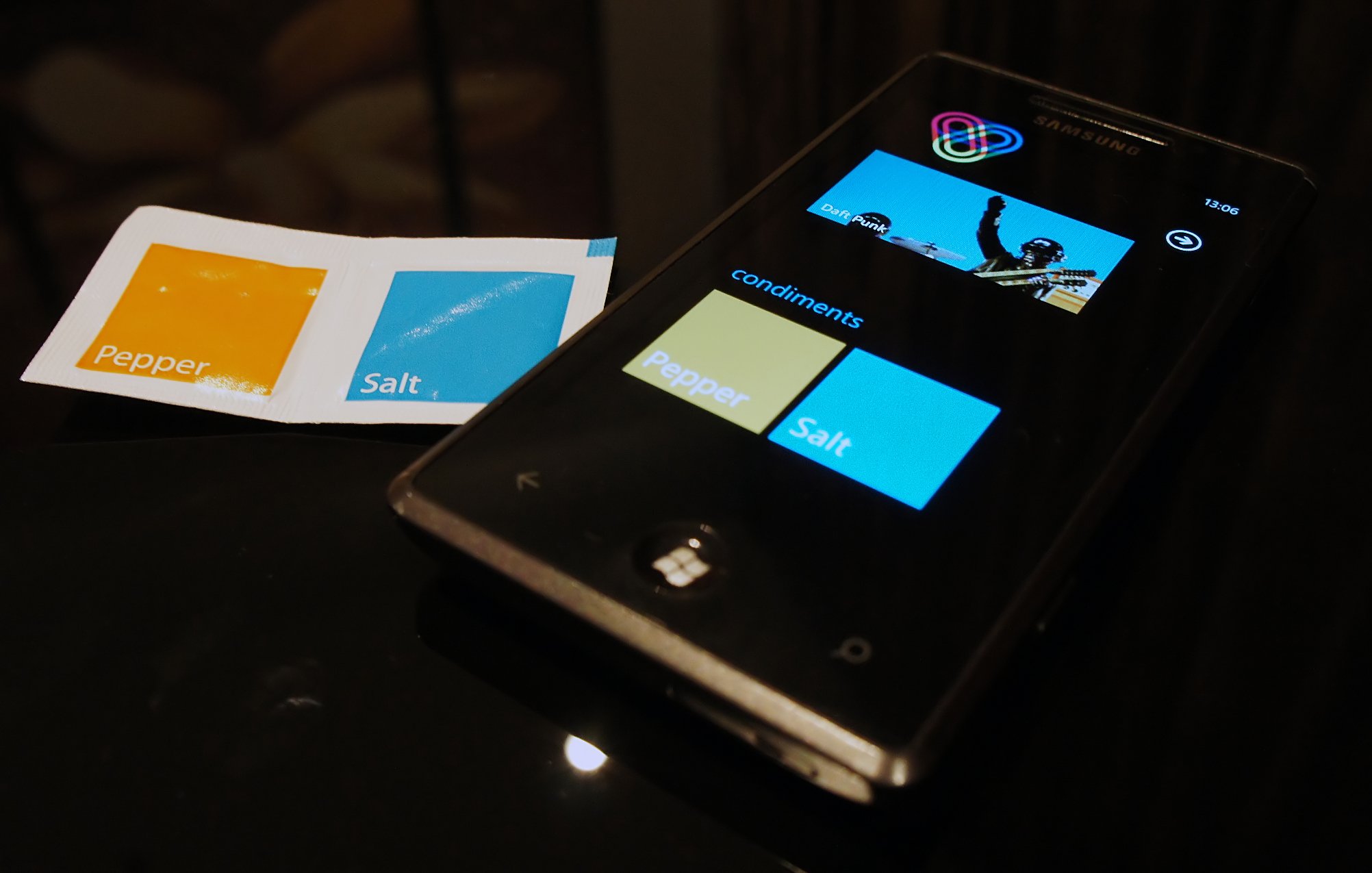
KLM Airlines lifts a page from the Metro UI design book

There's no doubt that Microsoft is doing the right thing by recognizing how brilliant the Metro UI is and incorporating into the next Xbox update and Windows 8 desktop OS. So perhaps it is of little surprise to see others starting to snag some deisgn cues from Microsoft's groundbreaking UI by incorporating Metro-esque themes into their products.
Reader Florian (Disinto) recently flew on KLM (Royal Dutch Airlines) and couldn't help but noticing something as simple as salt & pepper packets had an all too familiar look to them. There's no confusion here either--those are exactly like the Metro tiles from Windows Phone. Odd seeing them on such banal items as disposable spice packets and yet...it still looks great, no?
Hey, we can't speak for Microsoft, but we're cool with Metro UI/Tiles taking over design aesthetic. So long as Android and Apple stay away, they've already copied enough.
Thanks to Florian for the sweet pic and observation, not to mention good taste in music.
Get the Windows Central Newsletter
All the latest news, reviews, and guides for Windows and Xbox diehards.

Daniel Rubino is the Editor-in-chief of Windows Central. He is also the head reviewer, podcast co-host, and analyst. He has been covering Microsoft since 2007 when this site was called WMExperts (and later Windows Phone Central). His interests include Windows, laptops, next-gen computing, and wearable tech. He has reviewed laptops for over 10 years and is particularly fond of 2-in-1 convertibles, Arm64 processors, new form factors, and thin-and-light PCs. Before all this tech stuff, he worked on a Ph.D. in linguistics, performed polysomnographs in NYC, and was a motion-picture operator for 17 years.