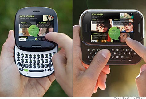
KIN: 'Full Bleed, No Chrome'

So a lot has come out in the last 72 hours about Microsoft's KIN project. Some of us get it, a lot of us don't, most of us still have many questions.
One interesting article, written by Microsoft itself, addresses the design process behind KIN. Although we can see inspiration coming from the same roots as Windows Phone 7, that is Zune (which in turn was inspired by Windows Media Device Center), a lot of KIN comes from a different source: magazines.
Read more after the break ...
As it turns out, Microsoft had another program entitled "Muse" that predated "Pink." Muse was a research project where essentially the big, out of touch corporation tries to figure out what the "kids" want these day in a phone. It basically involved them interacting with, interviewing and investigating the habits and wants of some 2,000 volunteers. What they found out was obvious: social networking plays a big part behind usage habits these days, what with "Twit My Face" being the top three services, hence the concentration in KIN.

The term "full bleed" is used to describe the layout. In printing, this style refers to printing from one edge to the other without traditional boarders and that the print runs right to the edge, without stopping short of it. Microsoft's designers decided that magazines offered the best metaphor for what the wanted to replicate--basically that all of your close contacts have a "story." The magazine with a 'full bleed' layout stuck out the most as it concentrated on the content, therefore it was chosen. As Pioneer Studios creative director Jon Friedman notes:
“We started to think about what magazines do really well. They help you prioritize what to read first. There’s a teaser on the cover, and then there’s a headline, and then there’s the article itself. So there’s really a first read, second read, and third read to that kind of content, and that’s how the structure lives in KIN.”
"No chrome" was an expression we first heard with Windows Phone 7. It means no menus, scrollbars, etc., essentially everything that made up previous Microsoft UI layout. It too became a purposeful design decision. Combined with the magazine metaphor, social networking and full bleed and voila, you have KIN.

While the success of KIN remains to be seen and there are many hurdles for Microsoft to overcome yet, one thing is becoming clear between the designs of KIN and Windows Phone 7: style. This may sound silly, but up till this point, Microsoft has steered relatively clear of any sense of UI philosophy, leaving that to their competitors like Palm, Apple and even HTC.
Get the Windows Central Newsletter
All the latest news, reviews, and guides for Windows and Xbox diehards.
At least in that area, Microsoft now seems to get it and that's a good thing.
Phil is the father of two beautiful girls and is the Dad behind Modern Dad. Before that he spent seven years at the helm of Android Central. Before that he spent a decade in a newsroom of a two-time Pulitzer Prize-finalist newspaper. Before that — well, we don't talk much about those days. Subscribe to the Modern Dad newsletter!

