It's time to embrace the change with Windows 10, not dismiss it before it arrives

In the week that was Microsoft was the talk of the town. From Windows 10 through the enormous Surface Hub and the HoloLens, the Redmond event left the tech world – and arguably even further beyond – talking about Microsoft. Satya Nadella himself said that Microsoft wants people to love Windows. And a lot of work is going into making that a reality.
Just as Windows 8 was a big departure from Windows 7, Windows 10 is bringing about change, also. The thing about change is that it's a necessary evil. To continue to grow and develop, change is inevitable. But change frightens and frustrates, we become creatures of habit set in our ways. But it's going to happen, so we should embrace it. Not write it off before it's officially even here.
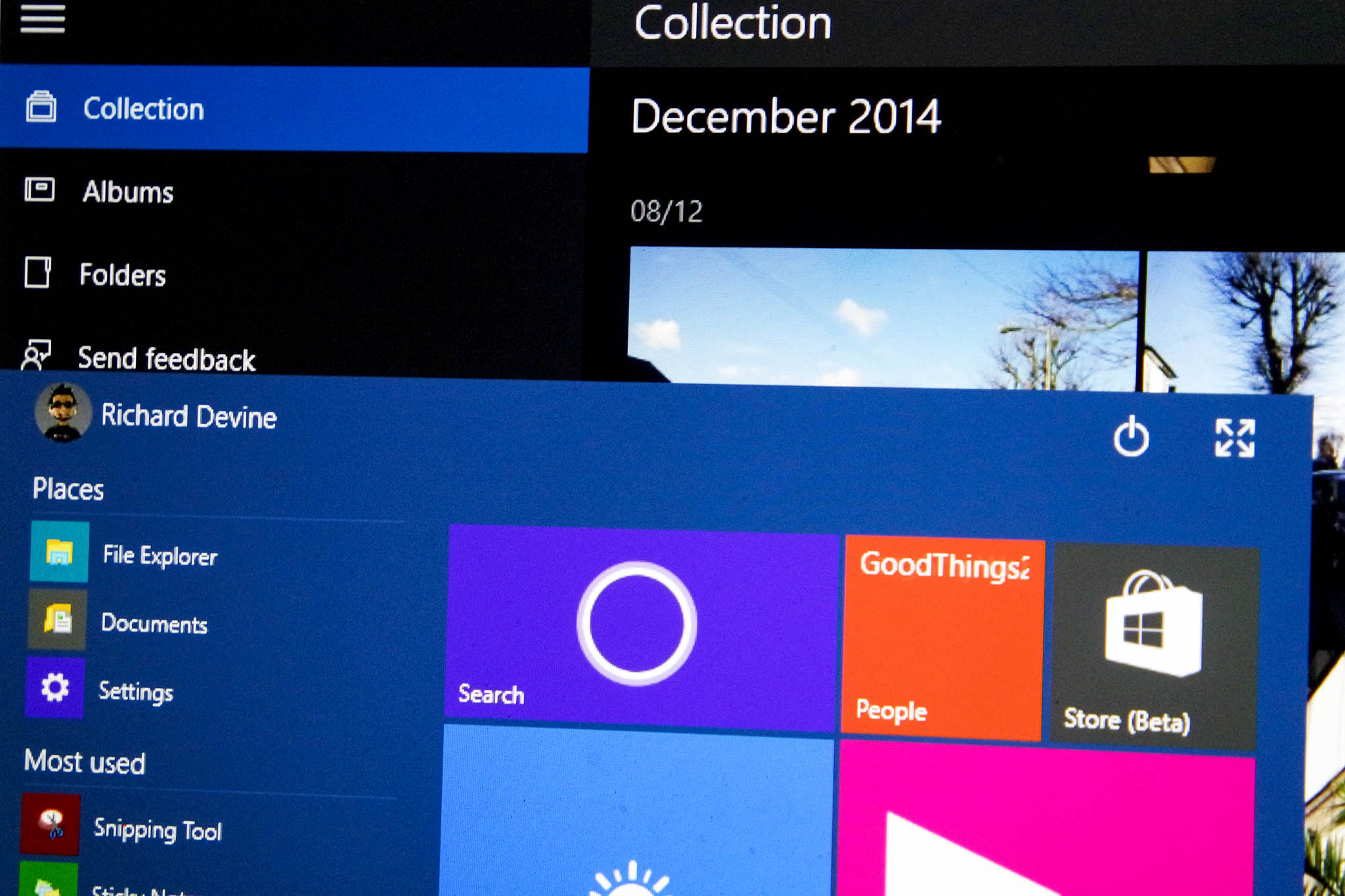
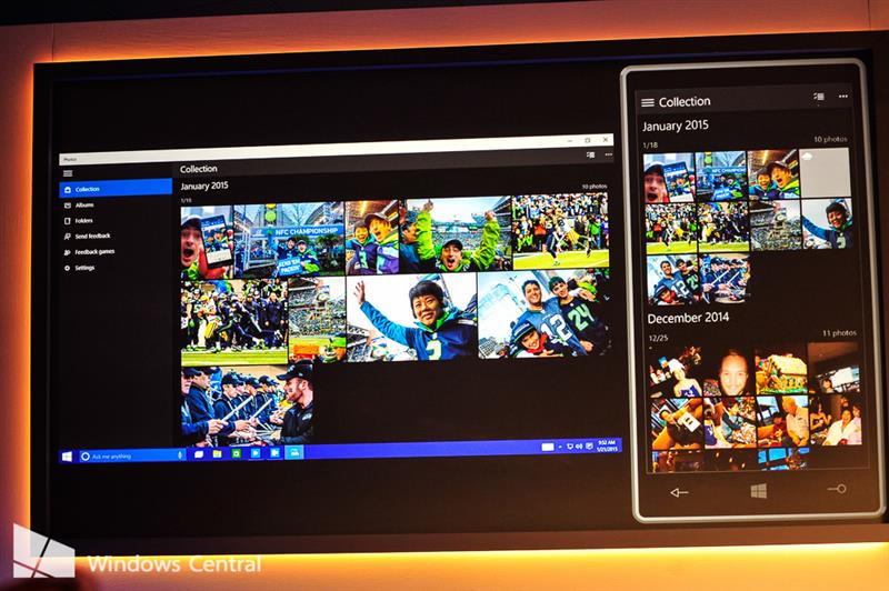
One of the hotter points of contention seems to be the visual changes. Hamburger menus are in, sideways scrolling and the "Metro style" appears to be out. And it's OK to be unhappy. Lots of Windows 7 users despised what Windows 8 became, and now lots of happy Windows 8 users are looking at a fairly big change for Windows 10.
The thing is this. This is the way Microsoft is going with Windows 10. Be it on a phone, a tablet, an Ultrabook, a desktop PC or even the Xbox, Windows 10 is the future and this is what it (currently) looks like. If everyone was instantly pleased, Microsoft wouldn't have done enough. Because Windows 10 shouldn't be built to please the crowds of fans. Windows 10 should be built to be the best damned operating system it can be.

Hamburger menus aren't an "Android thing" or an "Apple thing," they're a standard used in many applications across the board. Windows Central has one, right there on the homepage. Why? Because it does what it does very well. It hides important options that need to be quickly accessed but not always visible. On mobile they're usually opened with a gesture, a swipe from the left or the right. Simple, natural to use. They're familiar to many. They don't belong in Windows Phone 8, I'll admit, but the key point is right there. Windows 10 is not Windows 8 or Windows Phone 8.
So yes, you really, truly may not like the visual style of Windows 10, and that's OK. There will be just as many, maybe more that love it, you can't please everyone. But don't get bogged down. Embrace what Windows 10 is going to do for us. A unifying platform across mobile, desktop and games console. It hasn't been done before. Microsoft is taking a bold step to unifying our entire device collection. And it could be glorious.
That's what we should try to take away from what we've got so far. Being in the Windows Insider program isn't just kick ass and a way to see the new things early, it carries responsibility. Through your feedback, Microsoft will shape the future of the platform. If you don't like something, say so. Through the right channels and back it up with some facts. Don't just hate, help create.
Get the Windows Central Newsletter
All the latest news, reviews, and guides for Windows and Xbox diehards.

Richard Devine is a Managing Editor at Windows Central with over a decade of experience. A former Project Manager and long-term tech addict, he joined Mobile Nations in 2011 and has been found on Android Central and iMore as well as Windows Central. Currently, you'll find him steering the site's coverage of all manner of PC hardware and reviews. Find him on Mastodon at mstdn.social/@richdevine
