HTC Touch vs iPhone, Part 1

All the latest news, reviews, and guides for Windows and Xbox diehards.
You are now subscribed
Your newsletter sign-up was successful
Join the club
Get full access to premium articles, exclusive features and a growing list of member rewards.
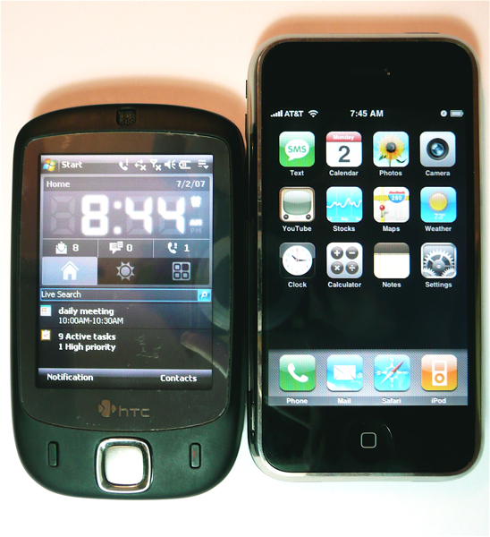
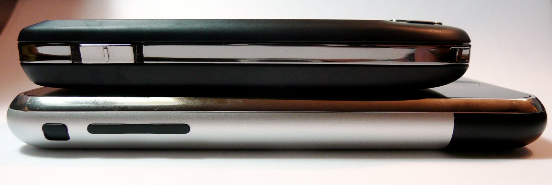
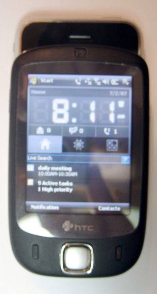
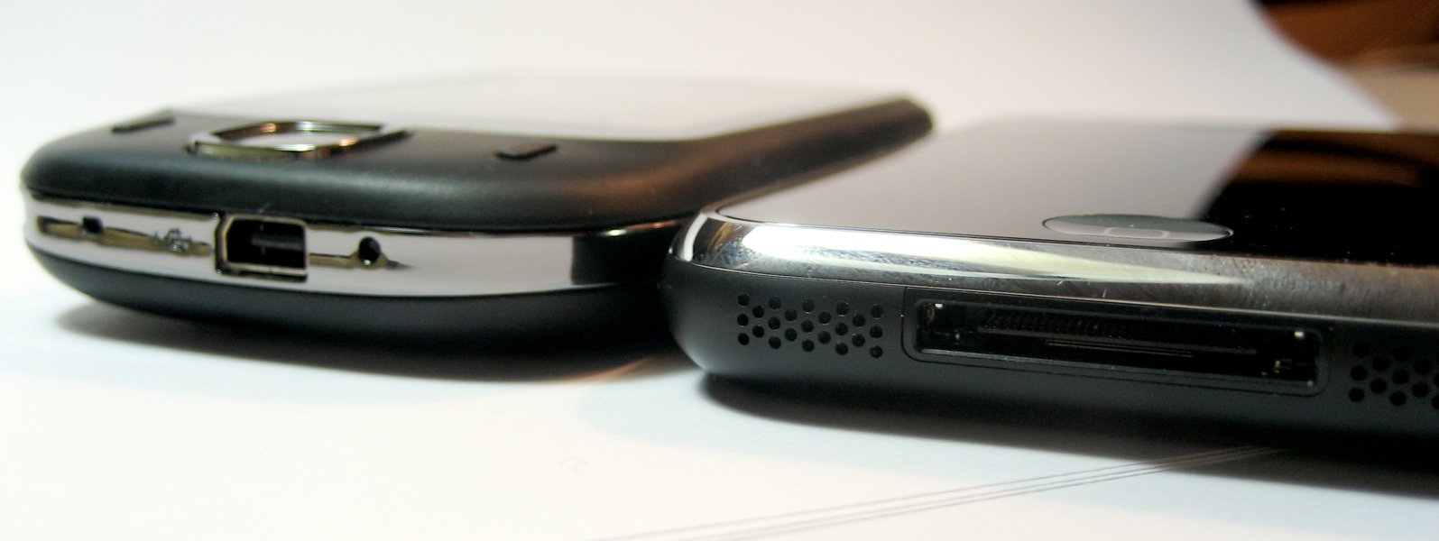
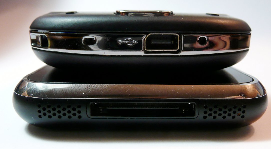
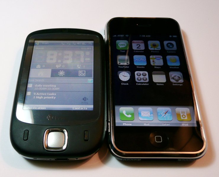
Here they are on my desk, sitting quietly next to each other. On the inside, though, both are smoldering cauldrons of hate and jealousy. Seriously, there's almost steam rising out of the speaker grills on each phone. We'll get to software in part two (here's a preview, though, it's apples and oranges / featurephone v smartphone), but for today let's just compare the hardware. I'm sure that nobody out there would actually base their purchasing decision between these two on which is thinner (iPhone), but it's still fun to look.
Read on for some pics and thoughts.
Buttons
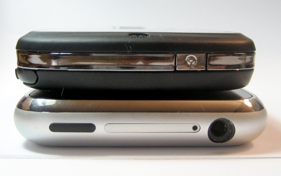
The HTC Touch has the fewest buttons of any WM device I've used. It's positively button-aenemic, there's power on the top, a camera button, the 5-way, send, end, and a volume slider. Given my standard usage habits, I found this to be pretty aggravating.
Article continues belowOf course, compared to the iPhone the Touch is just awash in buttons. The iPhone has power, home, a volume rocker and a ringer switch. On both devices the tactile feedback on the buttons is satisfying - both have good clicky-ness, though the iPhone's button have more travel.
I know, I know, I'm writing about buttons on devices whose main selling point is that they don't primarily use buttons. Fine, let's move on. Before I do, though, slightly related to buttons are indicator lights. The Touch has 'em (elegantly hidden within the speaker grille and blinking in various colors and rates to tell you your signal for Cell, WiFi, and Bluetooth), the iPhone does not.
Advantage: Touch. Yes, I get what Apple's aiming for here, but the Touch is example #1 that you can have some buttons without killing the elegance of the device.
Touchscreens
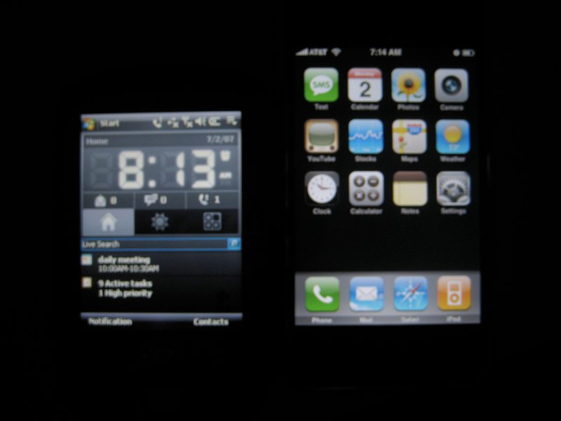
Sorry, HTC. The touch loses, but it's not your fault. You thought the touch was playing in the big leagues, but it turns out it was just AAA ball. The touchscreen on the Touch is really very good - it's actually among the top 2 or 3 touchscreens I've ever used in my life, actually. It's not a gigantic screen, but compared to some of the stuff I'd been using lately (Treos and Blackjacks), it's more than enough. Brightness, response, contrast, etc etc.. All fine, good even.
All the latest news, reviews, and guides for Windows and Xbox diehards.
But the screen on the iPhone is just abso-@$@#$@-lutely stupendous. It's gigantic, 3.5 inches, and high-res, and it sports 160 pixels per inch. It's bright. It has the oft-mentioned "multitouch" feature which is fun (but won't change your life, sorry).
The iPhone also has an ambient light sensor tucked away in there so it doesn't blast your eyes out when you're using it in the dark or fail to even appear on in direct sunlight. It's really nice. Also nice is the proximity sensor that prevents it from working when held up to your face. Finally, the iPhone's glass surface really does feel much nicer than the Touch's plastic.
Advantage: iPhone. "Advantage" isn't the right word here. It's a blowout, it's almost not even fair.
Dimensions
The short of it is that the iPhone is thinner and taller, but they are about the same width. Their weight also isn't all the noticeable to me, either.
The long of it is that physically-speaking they're both very satisfying devices to hold in your hand. I prefer the soft-touch-paint approach of the Touch a little more than the brushed-metal feel of the iPhone, I think it helps grip-ability more. But the brushed-metal of the iPhone isn't exactly a slippery doomsday scenario, it seems fine.
The iPhone is more rounded than the Touch on the sides, which is nice but not essential.
Advantage: iPhone by a slim margin. It's a surprising result, perhaps, but I stand by it. Yes, the iPhone is more elegant and polished overall than the Touch. But the Touch's short stature makes it feel very nice held up to the ear and in your hand. By comparison, I'm almost tempted to call the iPhone a slab.
iPhone vs Touch Hardware edition: iPhone wins.
The Touch held up remarkably well for me, much better than expected when I was imagining it next to the juggernaut that is Apple hardware design. It put up a valiant effort, but I suppose from a hardware perspective it was doomed from the start.
Coming up later is the main event: Specs and Software. Stay tuned!

Home to the most invested and passionate Microsoft fans, Windows Central is the next generation destination for news, reviews, advice and buying recommendations on the Windows, PC and Xbox ecosystems, following all products, apps, software, AI advancements, and accessories. We've been around for more than decade, and we take our jobs seriously. Windows Central writers and editors value accuracy and editorial independence in everything we do, never receiving compensation for coverage and never pulling punches.
 Join The Club


