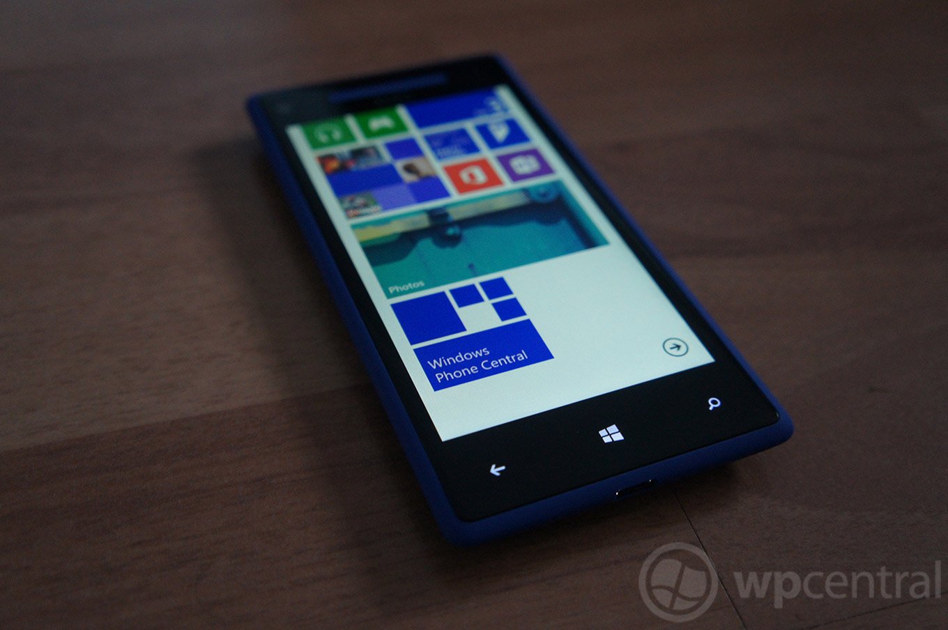
The history of the start screen in Windows Phone 8

Live Tiles have been a much loved feature in Windows Phone since the platform launched back in 2010. Microsoft has since improved the functionality by extending the column support from two to four, enabling more tiles to be present on-screen at any one time. But how did Live Tiles in Windows Phone 8 come about at Microsoft?
A detailed post on the Windows blog runs readers through the development and design work of Live Tiles and how the feature was improved. Josh Phillips, author of said post and who served as program manager for the start screen redesign in Windows Phone 8, goes into detail about how difficult and daunting it was to approach a feature that was already loved by consumers. His thoughts on first seeing Live Tiles in Windows Phone 7:
"I was hooked: My phone, it seemed, cared about the same people I did."
Making the start screen more personal was a challenge, and to get it just right was essential for Windows Phone to increase its marketshare by offering consumers an intuitive and unique user experience. We'll be the first to agree that the team successfully achieved their goal - the new start screen is a welcomed improvement. Should it have gone wrong, we could have been looking at more problems on Microsoft's mobile list.
For those who are unaware just what Live Tiles do on Windows Phone, they replace static app icons one is accustomed to seeing on competitor platforms (iOS, Android, etc.). Displaying useful information from within an app, Live Tiles ensure users spend less time navigating around the device but receive relevant information they need from the app itself.
Phillips goes into explain what the engineering team looked at in the previous Live Tiles to see how and where they could implement improvements. First off the team decided to tackle adding more tiles to the start screen, enabling consumers to pin more personal content. Second, they looked to make it possible to reflect the personal content they wish to pin to the start screen. And third, how the team could make the start screen more distinctive than it already is.
Oh, and adding more accents was on the todo list. Many more accents. If that wasn't enough, the arrow proved rather tricky:
"That arrow, by the way, was a tricky little guy—and provides some insight into how the software design process typically works. Initially we figured we could safely remove it. But when we began bringing real people into our usability labs to play with the redesigned Start screen—something we always do as part of the design process to double check our hunches—we saw that quite a few of them weren’t finding the App list, which requires a quick left swipe to see."
It's an interesting read that goes into detail how much work has gone into improving the user experience in Windows Phone 8. Be sure to head on over to the Windows Blog to find out more about the process.
Get the Windows Central Newsletter
All the latest news, reviews, and guides for Windows and Xbox diehards.
Source: Windows Blog

Rich Edmonds was formerly a Senior Editor of PC hardware at Windows Central, covering everything related to PC components and NAS. He's been involved in technology for more than a decade and knows a thing or two about the magic inside a PC chassis. You can follow him on Twitter at @RichEdmonds.
