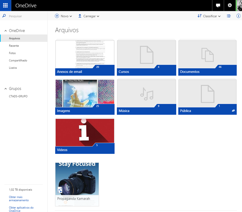
Here's a quick look at OneDrive's visual refresh on the web


Microsoft announced a visual refresh coming to OneDrive on the web earlier today, but oddly left out a screenshot of the new interface itself. Now, thanks to a Twitter user, we've got a quick look at what the refresh has in store.
Here's the screenshot that was posted by Twitter user @O_Guinomo earlier today:
Of note are some slight color changes and design tweaks for the various folders in your account, as well as some shuffling of different colors and elements of the page. Overall, things look a bit tidier, but it isn't a massive overhaul by any means. What do you guys think?
Source: @O_Guinomo (Twitter) Thanks for the tip, Veeo!
Get the Windows Central Newsletter
All the latest news, reviews, and guides for Windows and Xbox diehards.
Dan Thorp-Lancaster is the former Editor-in-Chief of Windows Central. He began working with Windows Central, Android Central, and iMore as a news writer in 2014 and is obsessed with tech of all sorts. You can follow Dan on Twitter @DthorpL and Instagram @heyitsdtl.
