Here's a quick look at the new Steam library page design
Steam has begun rolling out a new library section for its game pages. If you haven't seen it yet, here's a quick glance at how it looks and works.

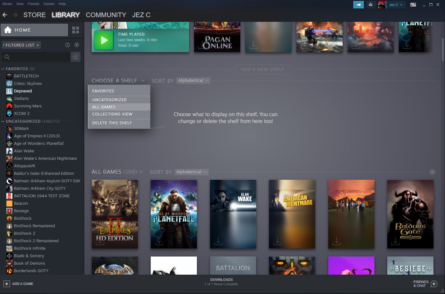
The world's premier PC game storefront — Steam — has begun rolling out new designs for its library pages, modernizing the list view and game description pages, currently with a beta tag. There's not much in terms of new functionality, but they look refreshed, cleaner, and clearer, complete with a view that showcases your collection with some added visual flair.
If you haven't had the chance to check out the new Steam pages yet, here's a quick overview.
The main home section of the new Steam library is segmented into customizable "shelves," alongside some defaults. The top shelf is reserved for news from games in your Steam library, and below that lists your most recently installed games. The next shelf is customizable, allowing you to list out specific collections, or all of your collections in a single place. There doesn't seem to be an upper limit on the number of shelves you can add here.


By selecting the tiles icon next to the home button, you get a new collections view, allowing you to create your own filters, or use Steam's suggested dynamic filters by a number of criteria. Some of the optional filters include genre, number of players, controller support, and so on, and will automatically include new games as your library grows.
Inside each collection, games can be sorted in different orders, including alphabetical, hours played, whether your friends are currently playing, and so on. The collections view is well-presented, showcasing game art prominently. It certainly seems like Steam is taking some welcome inspiration from GOG Galaxy here.
The library still has a list on the left, familiar for long-time users, with the added benefit of drag-and-drop functionality. Moving games in and out of collections are incredibly intuitive this way and the process does not require additional clicks or menus.
To complement the new collections, Steam has also overhauled game info pages, with prominent artwork across the top, complete with some modern transparent acrylic, Fluent Design-like panels. It's easy to quickly find everything you need, including forum access, game news, achievements, workshop mods, and beyond. Each game page also has an expandable section, showcasing additional information including game publisher, genre, release date, and social channels.
Get the Windows Central Newsletter
All the latest news, reviews, and guides for Windows and Xbox diehards.
There are a few minor visual anomalies here and there. The roll-over animation for games in your collection produces a strange border that doesn't seem intentional, and the design creates a pretty jarring disconnection against other, non-updated segments of Steam. But hey, it's a beta after all.
Steam is facing some aggressive competition as more and more third-party publishers begin putting together their own dedicated storefronts, including Epic Games' notorious push into paid exclusivity for its own platform. The updates should help keep Valve's store ahead of the competition, which frankly, even without the modernization is still decades ahead of everyone else.
What do you think of the modernized Steam? Hit the comments, let us know.

Jez Corden is the Executive Editor at Windows Central, focusing primarily on all things Xbox and gaming. Jez is known for breaking exclusive news and analysis as relates to the Microsoft ecosystem while being powered by tea. Follow on Twitter (X) and Threads, and listen to his XB2 Podcast, all about, you guessed it, Xbox!
