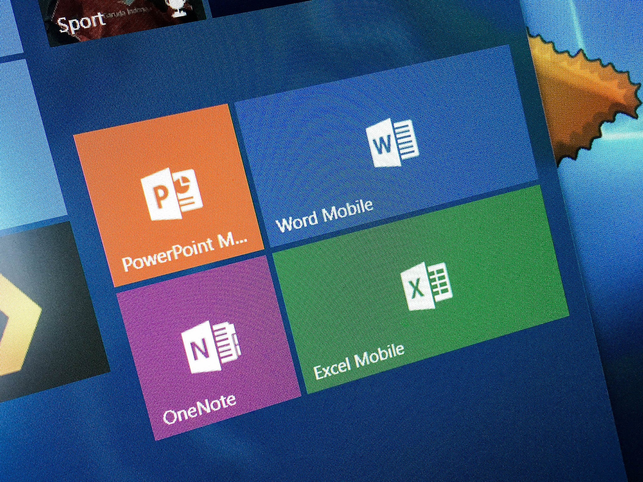
Take a look at how the Office Mobile apps for Windows Phone were designed

All the latest news, reviews, and guides for Windows and Xbox diehards.
You are now subscribed
Your newsletter sign-up was successful
Join the club
Get full access to premium articles, exclusive features and a growing list of member rewards.
William van Hecke, who lead the design team at Microsoft for the Word, PowerPoint and Excel Office apps on Windows Phone, has revealed a ton of details on that process in a new paper.
The paper was written as part of the online design school UX Launchpad's 'Design Explosion' series. In this case, van Hecke, who has since left Microsoft to work at Twitter, wrote about the three different design concepts the Office Mobile team came up with. One, which had a Windows Phone-based look, was code-named "Norma", while the second, which mostly used the regular Office UI, was called " Tabitha", Finally, there was "Solana", which had its own look that did not use elements from either "Norma" or "Tabitha"

van Hecke wrote:
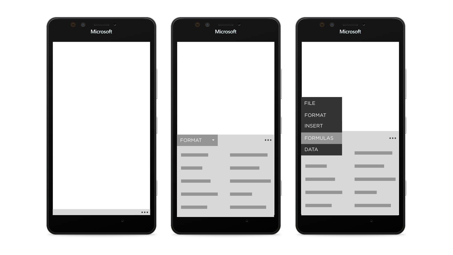
Article continues below"After much discussion, and to the surprise of no one, we decided we liked components of all three designs. We liked how Norma felt at home on the system. We liked how Tabitha scaled. And we liked how Solana deferred to the content, leaving behind just a tiny little touch target for getting into the multiple palettes to edit content."
The article also touches on the hamburger menu, which has been the subject of much discussion on the Windows Phone front. In his paper, van Hecke takes the position that even aliens from outer space might need to use such a design if they wanted to fit app options in a small display size:
"Maybe it's not drawn with three horizontal lines, but I guarantee a design pattern that says "touch this button to see more options" is in use across the galaxy. And I don't even know if aliens exist. But if they do, and they have something resembling software, they have realized that responsive design is the only way to translate a design from a small canvas to a large one. I believe this is as significant a discovery as fire or shopping malls."
The lengthy online paper is definitely worth a read if you are interested in the choices Microsoft made in the UI design for Office Mobile.
Source: William van Hecke (Medium)
All the latest news, reviews, and guides for Windows and Xbox diehards.

John Callaham was a former contributor for Windows Central, covering Windows Phone, Surface, gaming, and more.
 Join The Club


