My Galaxy Fold died, so I revisited the Surface Duo 2
My Galaxy Z Fold 3 folded, so I decided to revisit an old friend.
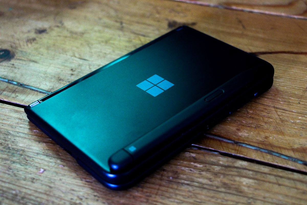
Last year, I grabbed a Surface Duo 2 from the Microsoft Store as my professional, and personal curiosity reached a fever pitch. The original Surface Duo was a decent first attempt, but the buggy software, horrible camera, and odd price point really blurred the value proposition for me. Fast forward to the Surface Duo 2; did the Surface team learn anything? At least at launch, apparently not.
The Surface Duo 2, much like its predecessor, launched with software I wouldn't mind calling half-baked. The touch response hadn't been improved enough from the first phone, and performance on side-by-side apps was simply not as good as my Samsung Galaxy Z Fold 3, which I had also just purchased. In a battle between the two flagship foldies, I ended up opting for the Samsung Galaxy Z Fold 3 and returned my Surface Duo 2. That was then, though. This is now.
My Galaxy Z Fold 3 flexible screen just randomly died on me a few weeks ago. Now I know these new-fangled flexy-screens are fragile, but I had expected my phone to break due to a fall or some other unfortunate accident. Hilariously, the screen died while passively using Twitter, which was not at all expected. To Samsung's credit, they replaced the screen for free within two weeks, and that's the reliability I've come to expect from the company. However, in the interim, I still needed a phone.
Having heard my pleas and complaints on Twitter about the Galaxy Z Fold 3, Microsoft offered me the chance to go hands-on with their latest updates and improvements for the Surface Duo 2. Indeed, we've been documenting just how hard Microsoft has been working to update its flagship mobile device over the past year. So, I was naturally curious to see the extent to which Microsoft had improved the experience.
It's still far from perfect. And, honestly, quite spectacularly impossible to recommend at the current retail price. But I am in the unique position to choose between both the Galazy Z Fold 3 and the Surface Duo 2. I was stunned at how close it came between the two.
Two screens IS better than one
Do foldable phones need to exist at all? The markets don't yet seem entirely sure, but Samsung at least has plowed ahead into its fourth iteration of its foldable, and we expect Microsoft to follow up with a Surface Duo 3 maybe next year. When my Galaxy Z Fold 3 broke, I asked myself if I shouldn't just get a regular Samsung Galazy S22 or something. I've always babied my Galaxy Fold. The plastic-feeling screen has always been anxiety-inducingly fragile. When I went to the seaside this summer, the terrifying crunch of getting air-borne sand trapped in the hinge mechanism gave me pause.
The compromises on the Galaxy Fold line are pretty clear. A fragile display meets an "average" battery and arguably a sub-par camera array in exchange for a phone that can double as a mini tablet. I loved this thing for gaming, with its large and clear display ideal for arranging touch controls and also consuming media. But the downsides are numerous, notwithstanding the fact that the screen died simply from being looked at.
Get the Windows Central Newsletter
All the latest news, reviews, and guides for Windows and Xbox diehards.
This is where the Surface Duo 2 presents a clear advantage. This thing is made of good ol' regular glass. I don't need to worry about dust getting trapped in the hinge mechanism, nor do I need to baby the screen with protectors. I don't need to worry about a grain of silt cracking the display if I fold it at the wrong time. It feels safer to use, and it actually folds flat when closed, unlike the Galaxy Fold 3.
The downside here, of course, is that the bezels are chunky, reducing the body-to-screen ratio fairly unpleasantly. And the big split down the middle means you can't use all of that combined screen real estate for media consumption. However, the multi-tasking experience on the Duo 2 is definitely a cut above what Samsung is able to offer with its flexible option, with Android itself being partially to blame here potentially.
Samsung uses virtual containers for its multitasking experience. You can drag and drop apps for a side-by-side experience, which is useful and intuitive. However, if you interact with a text box, the on-screen keyboard shifts everything around if it's docked, and typically you'll want it to be docked. The Surface Duo 2 screens work largely independently of each other, however, and I'd argue that the wider aspect ratio generally makes for a better side-by-side portrait experience, anyway.
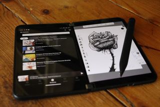
One thing I've found myself doing regularly is putting a Udemy art course on one screen while using Autodesk Sketchbook on the other. The split between the displays means I don't need to consider how interacting on one side would impact the other since they're completely isolated unless I'm directly actuating the display.
I've also found myself pleasantly surprised by the hardware experience after months' worth of updates. Inking on the Duo 2 feels great, and the Surface Slim Pen feels a cut above the small and squashy nib found on the Galaxy Fold's S-Pen. The Duo 2 has even impressed me with its camera array, which is at least comparable to the Galaxy Fold 3, if not superior, in certain situations.
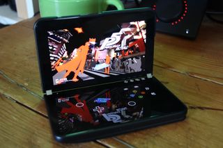
I also love the Xbox Game Pass implementation on the Surface Duo 2. Using the second display as a virtual gamepad is a stroke of genius. It's simply superior to other touch solutions since the gamepad isn't laying on top of the gameplay elements. The positioning of the USB-C port also means I can add a gamepad like the Razer Kishi V2 or the GameSir X2 Pro without creating a top-heavy, unbalanced device, which is impossible with the Galaxy Fold 3 due to its off-set USB-C port in tablet mode.
Being able to fold the display backward also has some fun advantages. Setting the phone into a "tent" configuration for watching content on a train or plane while also angling the phone with a timer for taking photographs or selfies.
It's also just generally more elegant than the Galaxy Z Fold 3. It's sexier, with a stark unique design and unrelenting physical polish from its robust hinge work to that gorgeous and slim glass body.
Yet still, the experience is far from perfect. In a lot of ways, Surface is still playing catch up with its implementation of Android.
Polish is everything in 2022
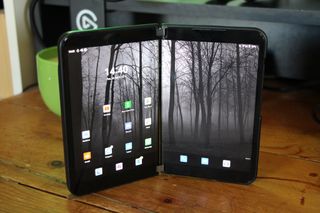
While I've ended up preferring the dual-screen implementation in the Surface Duo 2, the same cannot be said for the OS experience in general. Without a doubt, Samsung's version of Android is still the more polished and feature-complete version of the two designs, although the gap is quite rapidly closing.
Microsoft unleashed a fairly large update for the Surface Duo range based on Android 12L. The update is supposed to bring new design standards for app developers making experiences for dual-screen phones, but it will also bring a range of new quality improvements to the Duo on the side. We'll finally have some (frustratingly limited) accent color customization for the OS layer, for example. We also got some refreshed design language to bring it in line with Windows 11, with a new settings app, among other tweaks. Still, the overall experience is vastly improved from the first time I went hands-on with the Duo 2. But no phones live in isolation. It's tough not to draw direct comparisons to Samsung's Galaxy phones or Apple's iPhones, given that they bear similar costs and features and exist in the same space. In a world where all devices are equal, it does come down to things like polish alongside unique exclusive features.
I was saddened to discover the Xbox Game Pass implementation on the Surface Duo 2 was broken and had been broken for several weeks. While a fix is rolling out now, I can't help but wonder if anyone at Microsoft had even noticed it. Had it not been for Windows Central amplifying complaints, would it have ever been fixed? There's very little dialogue between Surface and its community, unfortunately, so we have absolutely no idea.
I'm also not a fan of how multi-tasking works while the phone is in landscape mode, with the keyboard taking up the entire display, shoving the top app out of the picture entirely. It defeats the positives I mentioned earlier about having more control over what happens on each display and makes me wonder if Surface engineers are actively using the device for media consumption.
I was also disappointed to discover that the Surface Slim Pen 2 haptics do not work on the Surface Duo 2, which is a big bummer considering how expensive the Surface Slim Pen 2 (and the associated magnetic Duo cover) is. And finally, the radios on the Surface Duo 2, again, do not seem as powerful as the Galaxy Z Fold 3. When in my pocket, the Surface Duo 2 cannot connect adequately to my Bluetooth earbuds, which has led to me piling on another expense to get a 3.5mm USB-C connector for music. However, the recent Android 12 L update may have improved the situation there.
Either way, therein lies the central criticism of the Surface Duo 2, ultimately. While I have come to feel like it's giving me a better overall "phone" experience than the Galaxy Z Fold 3, it's still tough to recommend due to associated costs. Based on pure form factor, I think the Duo 2 is the correct road to travel for Microsoft. But, if it's the form factor keeping prices this high, I can't help but wonder if there isn't a regular ol' one-screen phone in Microsoft's future. A Surface Solo, if you will.
I am a Surface Duo convert, almost
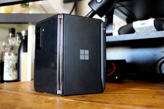
I sort of "got" the Surface Duo 2 when I stopped trying to use it like a tablet and instead started using it more like a laptop with dual-screen monitors. You don't always need two displays, and I was somehow trying to force myself to use both displays simply because I had them. Once I started trying to use it like a regular phone, opting for dual screens only as needed, I ended up preferring it to the Samsung Galaxy Z Fold 3. That's part of the problem, potentially. I had to actively try to figure out how to best enjoy this device since it's such a departure from what we're typically used to as consumers. At least the Galaxy Fold 3 is a little more familiar in its tablet configuration. But this is what Surface is all about — punching holes in convention. The iPad itself has started co-opting the Surface Pro's kickstand design, proving that, in reality, Microsoft was right all along.
As PCs have gotten more powerful and more capable, adding second displays to your setup has become increasingly commonplace. Maybe the same is becoming true for phones as well. There are rumors Microsoft may be exploring building its own Android store, too, akin to Samsung's Galaxy Store, and I would argue any serious competition in an Apple-Google-dominated mobile world is a good thing at this point.
The Duo 2 has a lot of drawbacks and downsides, especially baked into that price point. But increasingly, I think Microsoft has gotten it right in essence. Where my choice between the Duo 2 and the Galaxy Fold 3 boiled down to a litany of problems, this time, it's simply because I can't stand the Surface Duo 2's limited accent color options. The gap has closed so much that it's essentially only trivialities keeping me off the Duo line at this point.
It's with that in mind that I think the Duo line could be poised to go broader. Perhaps all it needs is that true "Surface Pro 3" moment — where the compromises are eliminated, and the software experience reaches full maturity, complete with a more affordable option. Either way, I'm coming along for the ride. Long live the Duo.

Jez Corden is the Executive Editor at Windows Central, focusing primarily on all things Xbox and gaming. Jez is known for breaking exclusive news and analysis as relates to the Microsoft ecosystem while being powered by tea. Follow on Twitter (X) and Threads, and listen to his XB2 Podcast, all about, you guessed it, Xbox!