Windows Central Verdict
The Y70 Touch feels less like a brand-new case than an evolution of HYTE's iconic Y60 predecessor. It's still a giant fish tank designed to show off your high-end PC components, geared around a single full-sized PCIe expansion in a dedicated, vertically mounted graphics card but with a twist on the 4K touchscreen. HYTE Nexus software should handle the widgets without issue, but RAM bloat and issues with saving customization make it a rough experience. Still, a 4K touchscreen will always be useful if you find the right apps.
Pros
- +
Broad range of color options
- +
Simple disassembly from all sides
- +
Vibrant multi-touchscreen
- +
Decent storage options with removable bays
Cons
- -
Designed exclusively for gigantic desks
- -
Fragile glass panel detaches without tools
- -
HYTE Nexus app uses too much RAM and suffers from slowdown
Why you can trust Windows Central
Building a custom desktop PC is, for the most part, a straightforward affair of matching compatible components. However, one of the most challenging problems is whether your chosen parts will comfortably fit together.
Some of the best PC cases will excel in one area but fall short in others, lacking enough space for modern behemoth graphics cards or making it a hassle to manage components and cables properly.
HYTE looks to solve most issues suffered by custom builders by modifying the previously reviewed Y60 PC case with a quirky 4K touchscreen while retaining the gigantic space inside since the fish tank-esque frame remains the same.
Disclaimer: This hands-on article was made possible by a sample unit provided by HYTE. The company did not see the contents before publishing.
HYTE Y70 Touch: Price and availability
- How much? $359.99
- When? October 24, 2023
- Where? HYTE store and third-party retailers
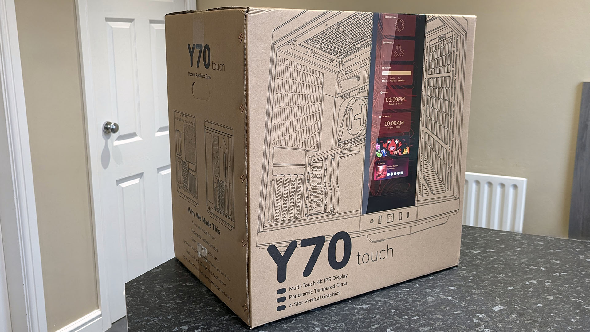
HYTE sells the Y70 Touch PC case with an MSRP of $359.99 through its official store. Third-party retailers in the US and Canada, including Amazon, Best Buy, Newegg, B&H Photo, Newegg, Walmart, and more, are expected to launch their listings soon. It launched on October 24, 2023, and the Y70 Touch still comes in various colorways, including 'Snow White,' white and black, red and black, and all black.
The Y70 Touch includes a small box of accessories, including velcro cable ties and a combination 3.5mm audio splitter for separated headphones and microphones, alongside a short DisplayPort cable for connecting the 4K touchscreen to a compatible graphics card.
Specifications
| Category | Spec |
|---|---|
| Type | Dual chamber mid-tower ATX |
| Case materials | ABS, steel, tempered glass |
| Motherboard support | E-ATX, ATX, mATX, ITX |
| Power supply | ATX up to 235mm in length |
| Graphics card support | 422mm (length)105mm (height)<90mm height recommended for best cooling |
| Top radiator and fans | 3x 120mm or 2x 140mm fansUp to 360mm or 280mm radiator (68mm thick) |
| Side radiator and fans | 3x 120mm or 2x 140mm fansUp to 360mm or 280mm radiator (125mm thick) |
| Rear radiator and fans | 1x 120mm or 1x 140mm fanUp to 120mm or 140mm radiator |
| Bottom fans | 3x 120mm or 2x 140mm fans (32mm thick) |
| CPU cooler height | Up to 180mm |
| Internal 2.5" drives | 4 |
| Internal 3.5" drives | 2 |
| Expansion slots | 4x vertical7x half-height |
| Interfaces | 14.1-inch (283 PPI)1100 x 3840 (4K)60Hz capacitive touchscreen10 point multi-touch |
| PCI riser | 4.0 PCIe x16 included |
| Dust filters | Top, side, and bottom |
Although the HYTE Y70 Touch lists seven half-height PCIe expansion slots, only six are realistically usable. The seventh is reserved for a DisplayPort bay, and its included miniature cable is designed to connect to a spare slot on your dedicated GPU and power the built-in touchscreen. It's the entire appeal of the case, so consider it if you plan to use several smaller modules, like PCIe Wi-Fi expansion cards.
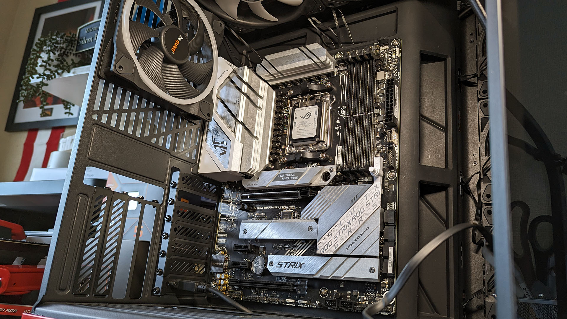
A standout feature is support for a 360mm AIO radiator, or three 120mm case fans, on the top and side panels of the Y70 Touch. It's relieving if you're picking up a high-end motherboard with oversized heatsinks around the CPU socket, which previously forced me to rethink my CPU cooler placement in more compact PC cases. There's even more space in the bottom section for a triplet of fans and a sizeable grill on the rear for a single exhaust fan.
The dual-chamber design has plenty of space for routing cables, but I can't recommend using E-ATX motherboards.
It's worth noting that HYTE claims the Y70 Touch supports E-ATX motherboards, but after fitting an ASUS ROG STRIX B650-A Gaming Wi-Fi and ASUS ROG Strix X670E-E Gaming Wi-Fi in test builds, both ATX boards were already filling the interior to the border of what would be considered reasonable. The dual-chamber design has plenty of space for routing cables out of sight, but I can't recommend any E-ATX motherboards for this PC case.
HYTE Y70 Touch: Design and function
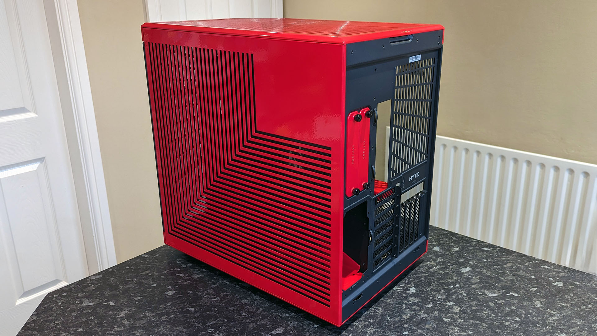
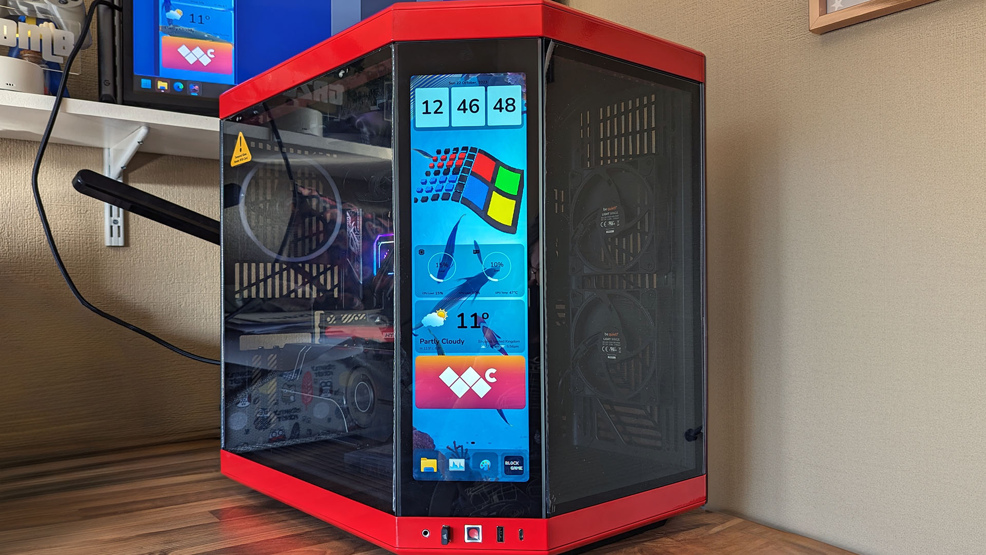
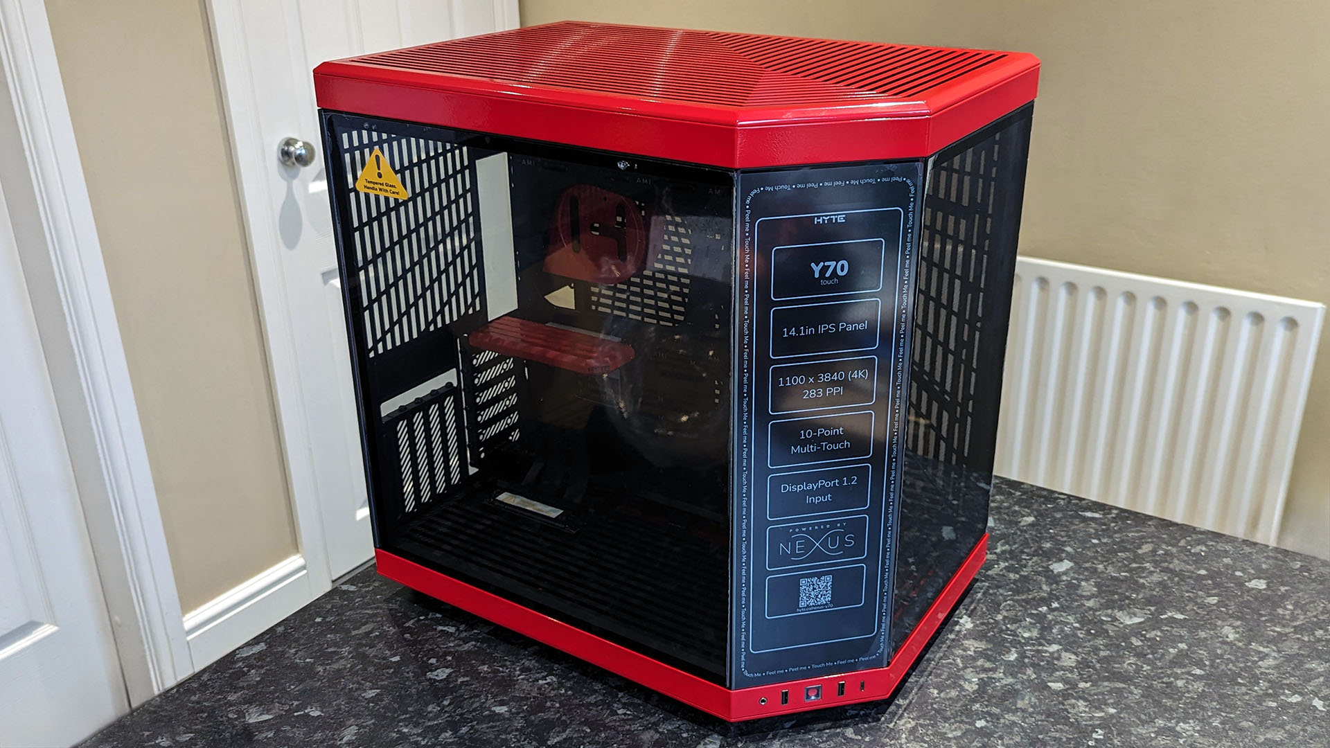
If you've ever looked at the most famous cases from HYTE, this sharp-angled design probably won't strike you as particularly revolutionary, but it's stunning in person. When offered a choice of colors, I couldn't resist picking my favorite red and black, and it pops beautifully, even if the red sheen is somewhat excessively lacquered. However, none of the exposed parts are particularly sharp, so I don't mind the thick coating.
It's plain to see why HYTE has such confidence in its Y-series cases regarding airflow since there are tactically placed vents across the entire chassis. There's no lack of options for mounting fans and radiators. Still, an implied preference for a 360mm AIO like the previously reviewed Corsair H150i Elite Capellix becomes apparent when you inspect the corner. Air coolers would work fine, too, with a massive rear-fan exhaust space well-suited to a traditional setup, but this case is anything but conventional.
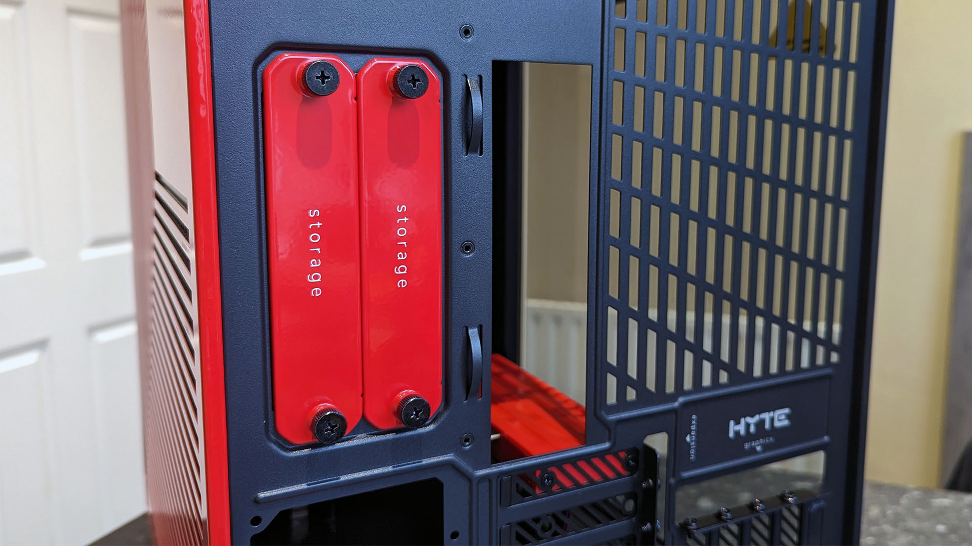
Around the rear side, two clever storage bays slide out quickly once you remove the thumb screws. Both are fully coated in the accent color for your chosen Y70 Touch model and can fit a single 3.5" mechanical hard drive each. Alternatively, you could fit individual 2.5" solid-state drives in both bays or double up with two SSDs in a single bay by using an alternative mounting pattern. I stick to M.2 sockets where possible (without turning off critical PCIe lanes,) but this is a superb option for anyone with up to four extra drives.
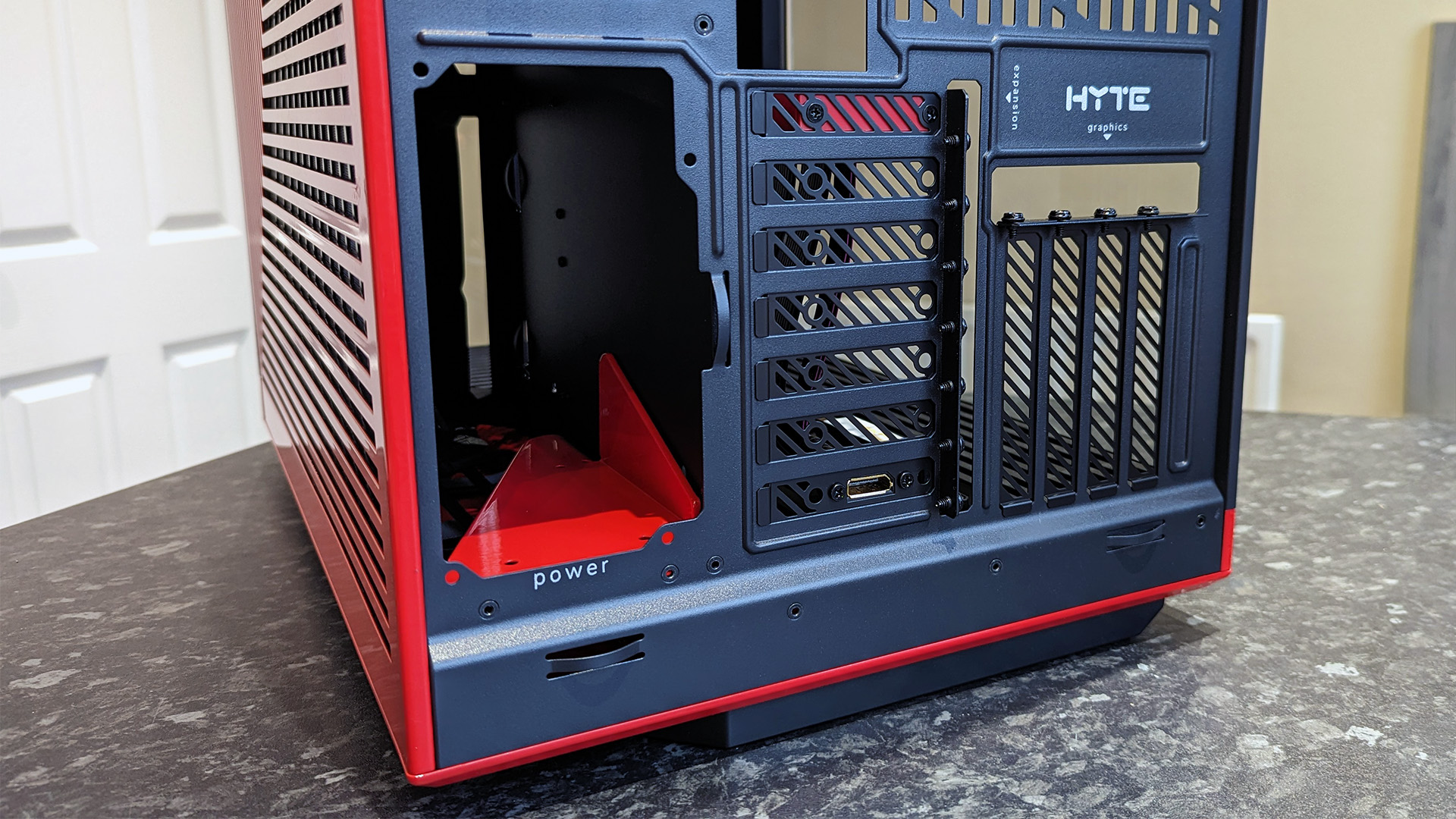
Your chosen power supply rests on a quaint, partially sliced shelf highlighted again by the accent color.
Underneath, a reasonably straightforward slot for your best power supply, up to 230mm in length, isn't exceptional from this view, but there is a hidden appeal inside. Rather than sliding along a metallic floor, your chosen PSU rests on a quaint, partially sliced shelf. It's another piece highlighted by the accent color, if a little pointlessly, since you will hardly see it once your rig is complete, but it's charming and favors cable management.
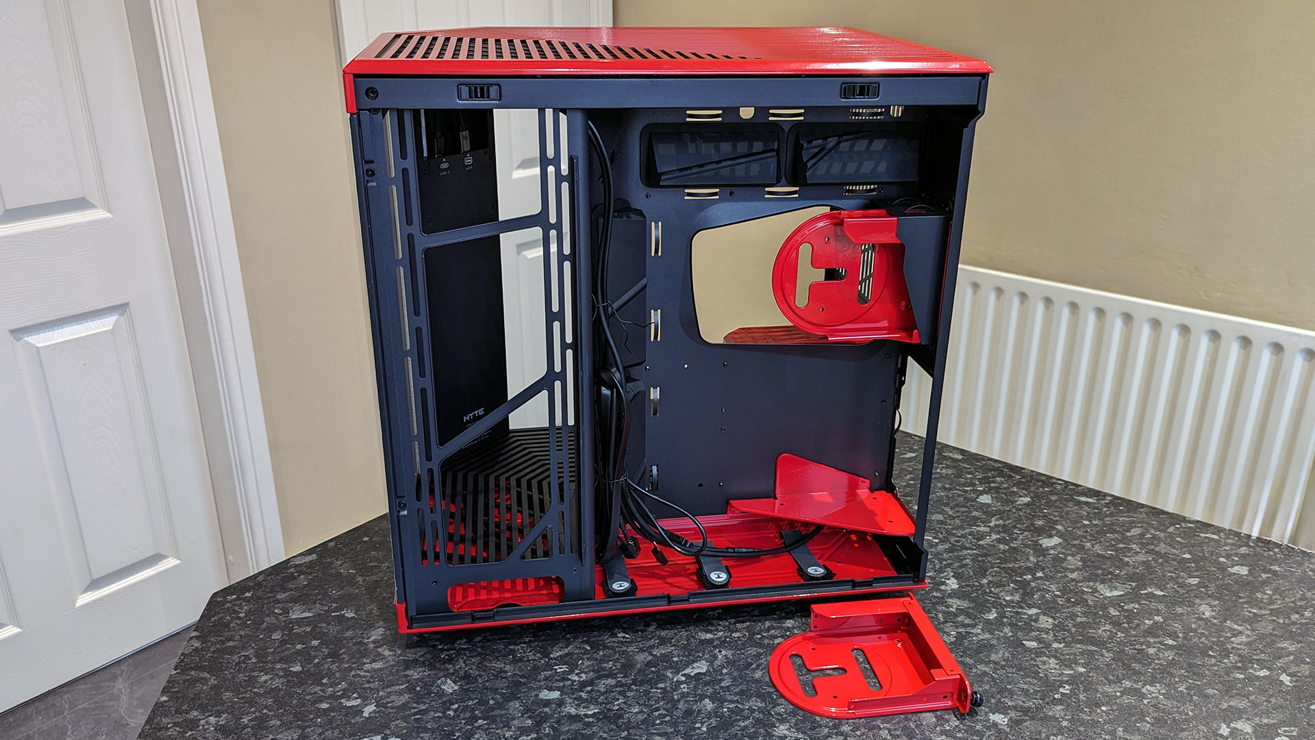
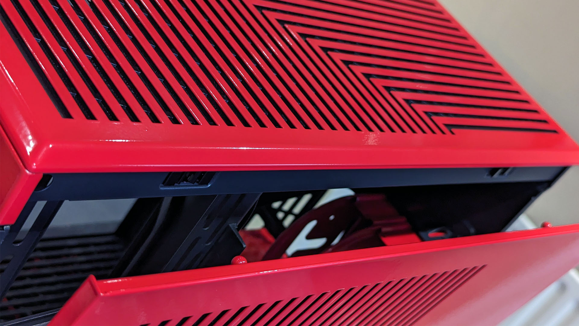
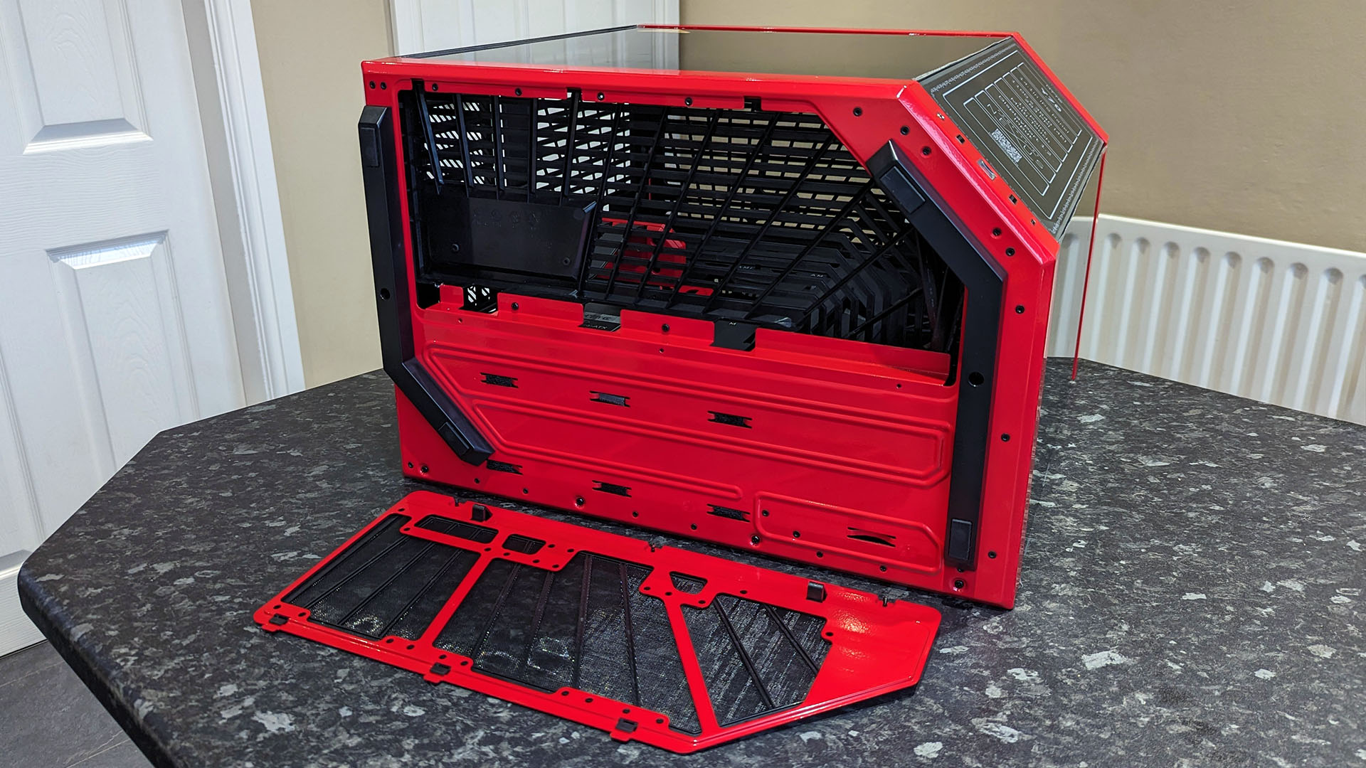
Naturally, the focus of the Y70 Touch is undoubtedly the 4K multi-touch 60Hz screen rigged to the front panel. However, I immediately recognized that HYTE understands the woes of custom-built gaming PCs because so much of this gigantic beauty is focused on convenience. Each panel, top, bottom, and side, comes off with a firm pull without the need to remove screws. I don't necessarily agree that this method best suits the fragile glass panel, but I understand the appeal.
Besides the extra space in the back panel that I expect in a dual-chamber case, a raised floor is accessible from a clip-on dust shield underneath to make routing cables to your PSU as simple as possible. Even the flagship touchscreen pops out of the way if you ensure that you unplug its pair of removable cables first, giving unparalleled freedom to fit even the chunkiest options among the best graphics cards. Just don't lean anything on this unsupported corner while it's exposed to avoid bending it.
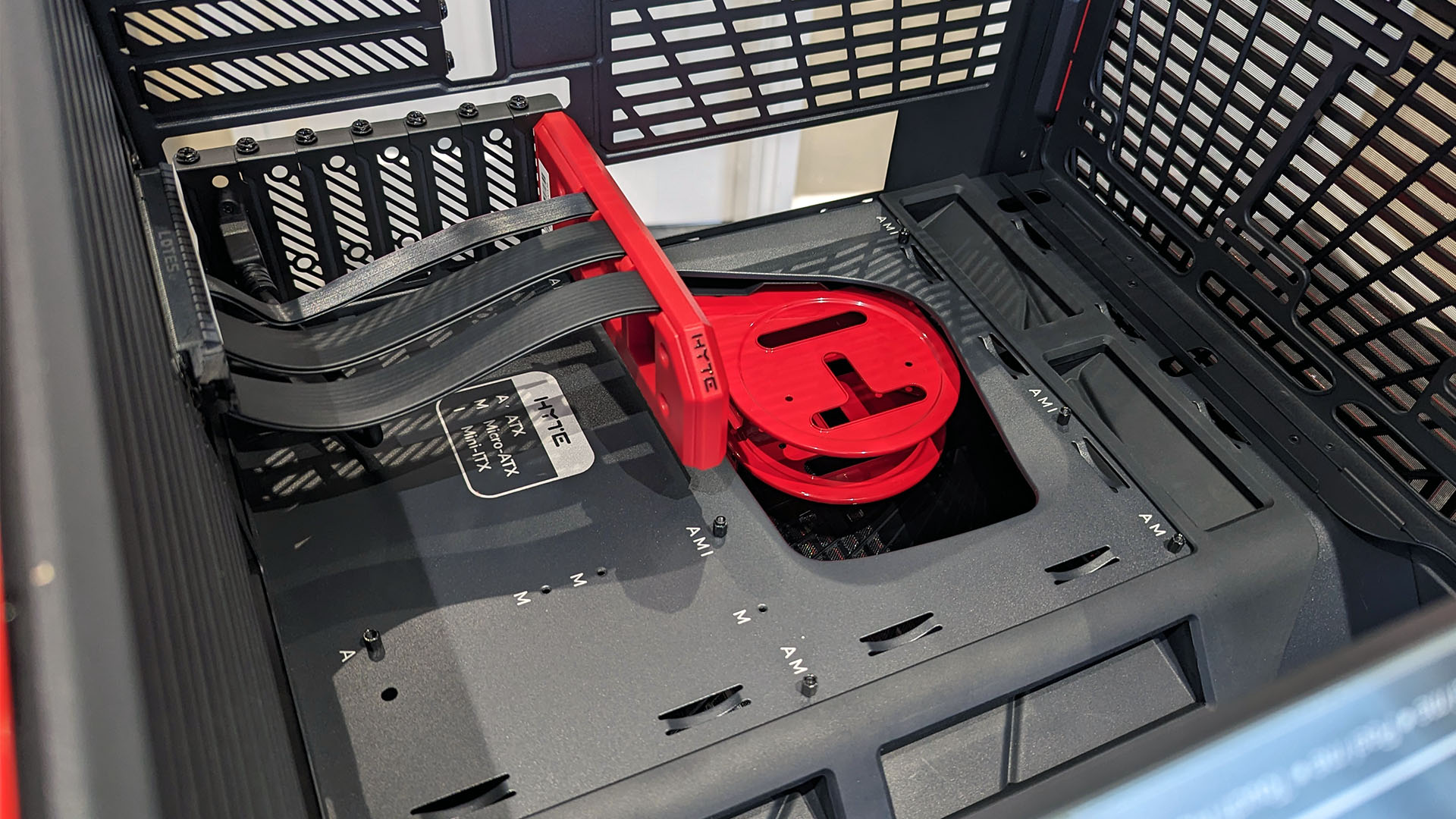
A cute PCIe 4.0 vertical GPU riser is another accessory that matches the color theme and boasts the HYTE logo. Four vertical expansion slots at the rear are purely here for a dedicated graphics card, ready for the market's thickest, most outrageously oversized options. However, you won't be able to fit a second full-size PCIe expansion module in the Y70 Touch, so this is all about highlighting a fancy GPU. Screw standoffs for motherboards are equipped and ready to go in an ATX pattern, with a collection of Velcro and plastic cable ties included with a slim cardboard box of goodies.
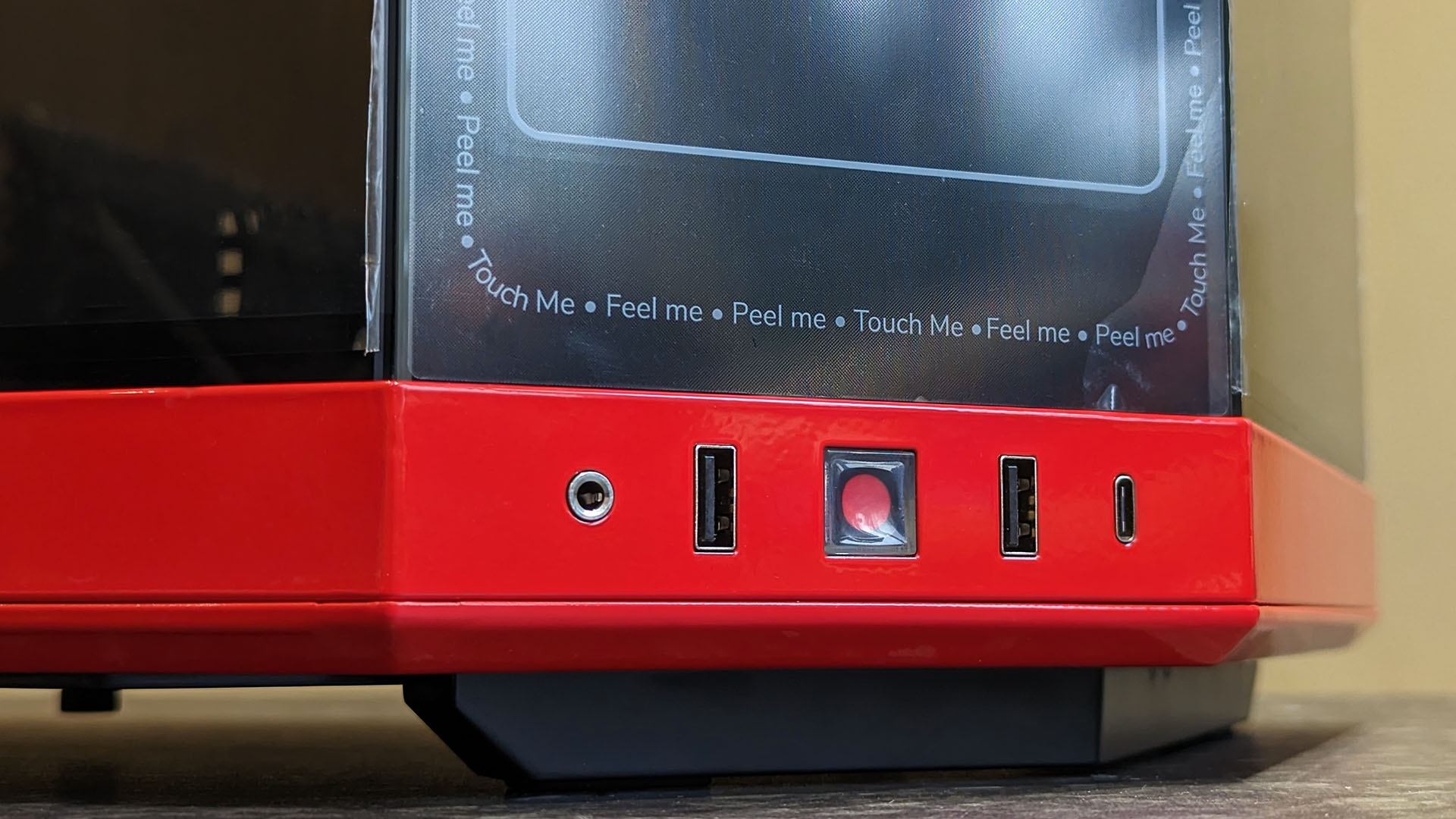
A bottom-ended power button confirms that the Y70 Touch is designed to be placed on a desk, not the floor.
Finally, the front panel includes a welcoming pair of USB-A 3.2 Gen 1 ports, a single USB-C 3.2 Gen 2, and a 3.5 mm combo audio jack. I've owned many cases that stick to a single port, but I maintain that a double offering is perfect for wireless dongles if you have wireless mice and keyboards.
Plus, the bottom-ended power button confirms that the Y70 Touch is undoubtedly designed to be placed on a desk, not on the floor. Ignoring the gorgeous 4K touchscreen seems absurd anyway.
HYTE Y70 Touch: 4K screen
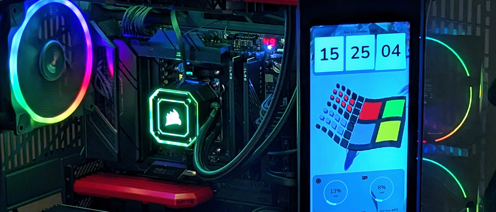
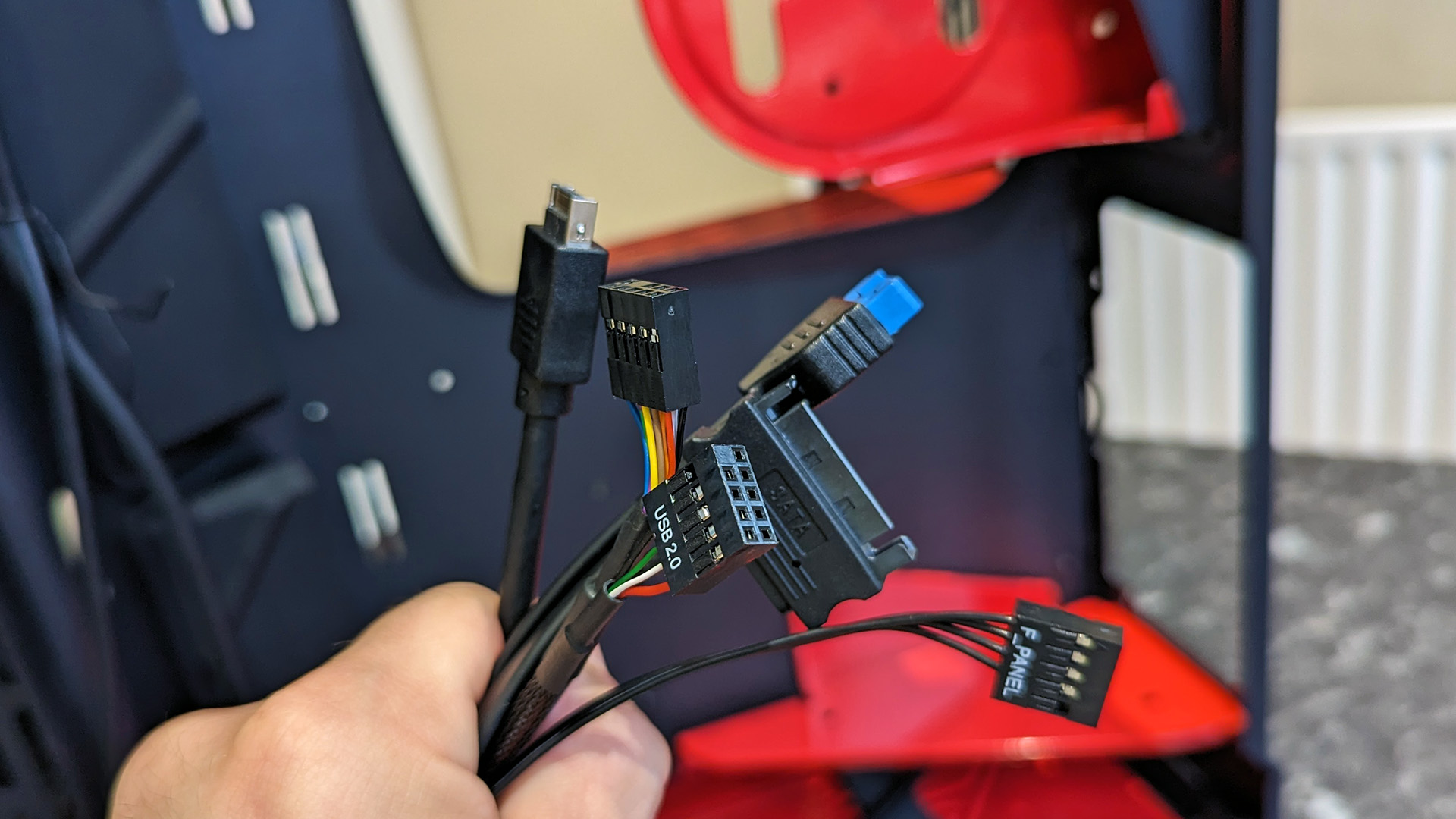
The minimum necessary connections to make the 4K touchscreen work involve SATA power, a USB 2.0 header, and a DisplayPort connection to a GPU, all available inside the case with a miniature DP cable in the box. Windows 11 detects the multi-touch 4K panel as a standard monitor, which unfortunately defaults to an incorrect rotation. Not to worry, as the HYTE Nexus app remedies all these issues upon installation, including deactivating Windows-specific touch gestures to prevent accidentally triggering irrelevant functions.
If your motherboard is lacking USB 2.0 headers or you're loading four solid-state drives into the Y70 Touch, there's a chance you might struggle for SATA power and spare ports. Then again, this case is hardly designed as a budget option for low-end hardware, so it seems highly unlikely that anyone would pair it with a bargain-grade motherboard. For the minimum requirements, choose a motherboard with enough USB headers for the front-facing Type-C port and your remaining hardware.
A beta version of the HYTE Nexus companion app I used for an initial hands-on experience with the 4K touchscreen was far from flawless and hasn't changed much in the following months. It still lacks some essential functions like a scroll bar if you connect any external monitor with a default resolution lower than 1920x1080, which might seem niche, but it's problematic when I rely on a small 720p panel just for the build stage. Hitting the tab key to reach buttons lurking further down each screen is far from convenient but shouldn't prevent enthusiasts from completing the setup.
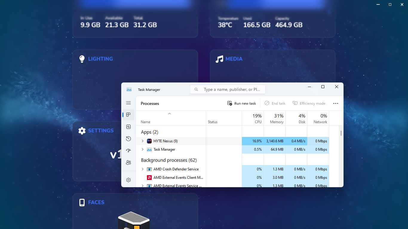
Adding animated widgets pushed the Nexus app higher in Windows Task Manager, consuming around 3.1GB of memory.
From here, a sprawling menu of adjustable widgets appears, promising plenty of customization. Unfortunately, those promises are still somewhat delayed as some widgets are greyed out and labeled 'coming soon.' Moreover, an overall issue with RAM usage still plagues the Nexus app.
The more widgets I added to the touchscreen, particularly anything animated, pushed it higher in Windows Task Manager with around 3.1GB of memory consumed. Simple .GIF files begin to slow down, and animated backgrounds offered in Nexus become painful slideshows.
Calibrating the touchscreen can temporarily remedy the slowdown, though I suspect it might simply be flushing its bloated cache from RAM as the issue slowly returns. The Nexus app becomes less appealing when you realize it's still treated as a second monitor at inopportune times. It occasionally had my mouse scrolling over to the skinny screen in games using a borderless windowed mode setup, and every screenshot includes the gigantic 4K vertical panel unless you specify which monitor to capture.
In essence, this is how multiple monitors are supposed to work. However, the Y70 Touch implies to be a separate entity from your desktop, offering quick access to shortcuts and helpful widgets visible at head height on your desk, but it's just a slimline app running on a second screen. For further frustration, Nexus forgets my preferred configurations for some widgets after a reboot, defaulting the CPU and GPU usage screens to voltage rather than percent of usage. The app is already suffering from a sluggish performance in its current state, so requiring me to venture back into its settings to restore my widgets is less than ideal.
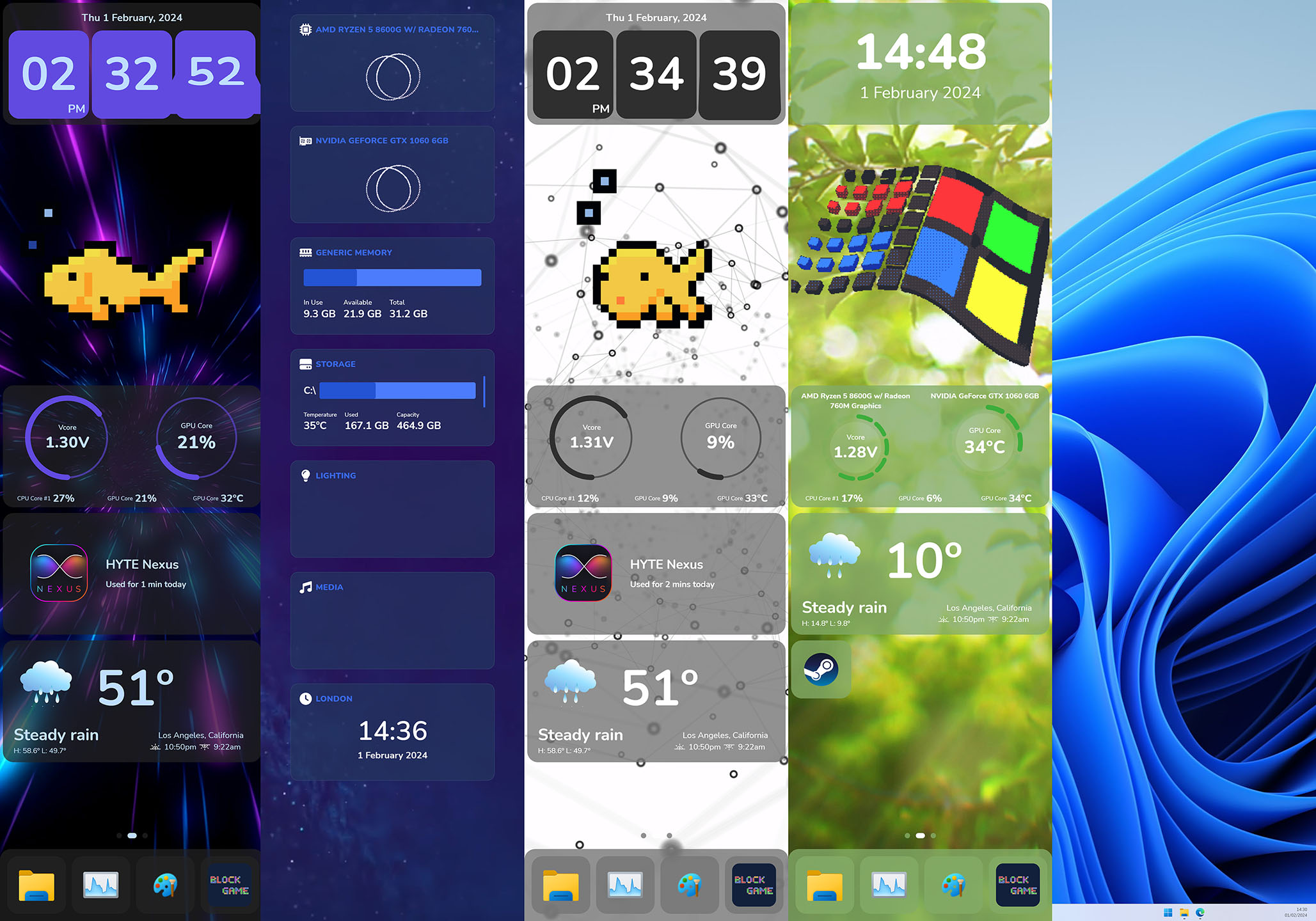
Overall, the touchscreen is a neat feature. It's a gimmick, no doubt, but the technology behind it is excellent and has the potential to shine. The downside lies in the HYTE Nexus companion app, which struggles to display simple animated widgets and touchscreen shortcut icons without bloating my RAM worse than a set of Google Chrome tabs. Simply using the vertical screen as a second Windows monitor can yield more interesting results when paired with suitable apps (yes, you can play DOOM on it.)
It's the centerpiece of an already bougie PC case intended to show off your high-end hardware in something that resembles a cyberpunk fish tank. I can't recommend loading anything other than ultra-basic widgets or a simple Twitch chat window while livestreaming because the memory management issues are too intense. It doesn't detract from the iconic Y-Series case because it replaces an otherwise plain glass panel, but the software needs work before it can be truly iconic.
HYTE Y70 Touch: Should you buy it?
You should buy this if ...
✅ You have a huge, strong desk
The Y70 Touch demands to be seen, so you'll need a spacious desk with support for a weighty PC case. It's designed to be seen (and touched,) so you'll need a suitable place on your right side to benefit.
✅ You have high-end PC parts
The included PCIe 4.0 riser cable and wrap-around glass panels lend this case to those who take pride in their custom gaming PC builds. Show off your luxury GPU and plethora of fans with this flexible option that's a joy to build in.
You should avoid this if ...
❌ You crave a complex set of widgets
The current state of HYTE's Nexus companion app struggles with memory management and bloating RAM when multiple animated widgets are introduced. Coupled with forgotten configurations after rebooting Windows, the software experience is seriously lacking.
It's been a while since I was genuinely excited to build an entire desktop PC from scratch. Not that I don't enjoy the process, but it often comes with inevitable headaches involving tight cable management or finicky clearance between VRM heatsinks and AIO radiators. My usual test machine is already crammed into one of the best PC cases, but the Y70 Touch promises a refreshing build experience with plenty of room to maneuver.
The 4K touchscreen is undoubtedly a gimmick, presumably limited to live streamers who show off their rig in clear view of their webcams or perhaps those deep into the aesthetics side of custom builds. Still, the multi-touch panel could offer more genuinely helpful information at a glance than color-coded case fans linked to CPU and GPU temperatures can if only the Nexus companion app weren't such a RAM hog. It has potential, and if ever discounted to the same price as the reviewed HYTE Y60, it's a no-brainer to grab the Y70 Touch.
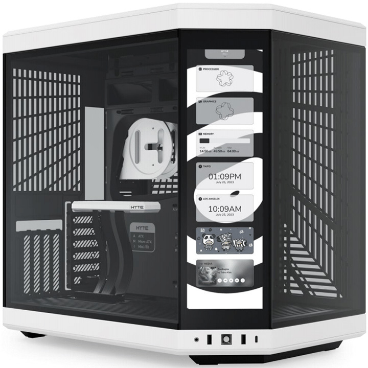
A tall and vibrant 14.1-inch 4K 60Hz multi-touchscreen sits up front on this gorgeous tweak to the already beautiful HYTE cases that came before it. Display PC stats or quickly access apps from the capacitive screen and enjoy straightforward custom builds in this gigantic dual-chamber option.

Ben is a Senior Editor at Windows Central, covering everything related to technology hardware and software. He regularly goes hands-on with the latest Windows laptops, components inside custom gaming desktops, and any accessory compatible with PC and Xbox. His lifelong obsession with dismantling gadgets to see how they work led him to pursue a career in tech-centric journalism after a decade of experience in electronics retail and tech support.
-
GraniteStateColin Wow, what an intriguing case. I know it's intended for creative work, but how bright and color accurate is the display? Because it's intended to sit on the desk instead of under it, I'm curious how the display looks where it will naturally be sitting right next to other HDR high-end monitors. Does it look pale or washed out in comparison, or does it hold its own?Reply -
Ben Wilson I'm wondering the same. Thankfully, it can be used as a regular screen since Windows detects it as a simple second monitor, so I'll try and test the panel for accuracy with my colorimeter!Reply
