Hands-On: Samsung Valencia and its Mysterious Onboard Storage
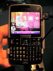
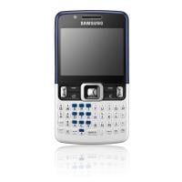
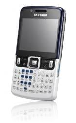
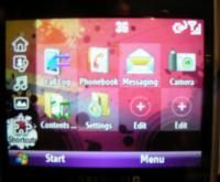
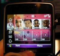
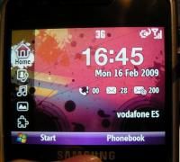
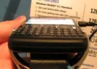
The Samsung Valencia joins its brother, the Samsung BlackJack II, in being a simple, straightforward front-facing QWERTY messaging machine. Well, simple except for mysterious internal storage specs. The look is updated a bit, the processor may be a bit snappier, and the keyboard looks to be a might bit easier to type on. The hardware itself is nothing to write home about, it does the job but isn't an snazzy as the BlackJack II or as svelte as the Q9h. It's straightfoward stuff that we wouldn't be ashamed to put in our pocket. We're also moderately impressed with the custom home screen, but not so impressed that we'd choose it over the default sliding panels.
The fact that it's Tri-Band Edge, however, makes us suspect it's probably meant for pockets outside the US.
- Windows Mobile 6.1 Standard
- 3G, Tri-Band Edge
- 393 MHz ST Micro 8810 Processor
- 128MB Rom, 128MB RAM, 20GB Storage, or maybe 2GB, or maybe none.
- 7 hours talk time
- 320x230 QVGA screen
More photos after the break, plus did you notice the reference to a mystery? Did you notice that reference to internal storage in the spec list? Yeah, odd. (update: Odd enough that we're already updating the post)
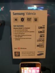
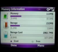
Ok, so first thing's last: the card at the MS booth lists the Valencia as having 20GB of internal storage memory and sure enough, a peek at the Memory Information screen shows it's got a "Storage card" in there clocking in at 1902.7mb - which is about two GB. They had the memory card door taped shut so I could see if there was a 2GB microSD card in there. Suddenly the Valencia doesn't seem to humdrum now, does it? Assuming this thing's microSD card slot is for real and it supports microSDHC, you could potentially be looking at some massive storage on this guy. Or perhaps just 2GB. Or none at all. Either way: spec card FAIL. (paragraph updated)
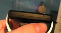
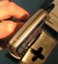
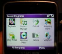
You can trust that we'll be hitting up Samsung to find out the exact details on the Valencia. In the meantime, enjoy what you can of the photos below, quality and color compliments of Microsoft's frustrating 'mood lighting' at their booth.


Get the Windows Central Newsletter
All the latest news, reviews, and guides for Windows and Xbox diehards.
