Hands-On Impressions, Video of the HTC Snap
If you've followed the site fairly closely you may know that my form-factor of choice is the front-facing QWERTY keyboard and that I slightly prefer Windows Mobile standard to WM Pro. My most-used phone of 2008 was, believe it or not, the Q9h – and it was the phone I always went to when I needed to "give'r." Lately, though, it's gotten tired.
I give you all this history because, well, the HTC Snap is something I've been hoping HTC would make ever since I first laid eyes on the T-Mobile Dash. I've handled the Snap on three separate occassions and will go have another look today. Since this is 'my' form factor, I care a lot about whether HTC got the details right on the Snap.
For the most part, they did. Read on for a hands-on gallery, a brief video (hall noise removed), and my thoughts so far on the device.
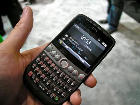
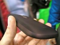
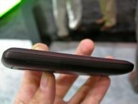
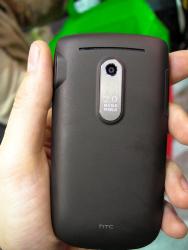
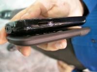
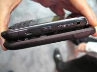
In the hand, the Snap feels almost illicitly good. In an age where everybody else (including, er, HTC) is going with glossy and shiny, the Snap is unabashedly covered in the best "soft touch finish" I've ever laid hands on. The thing is grippable and the best way I can explain the feel is that it's a very good mix of organic curves and hard lines. I also adore the color, which has just enough brown notes to be interesting without falling into Zune territory.
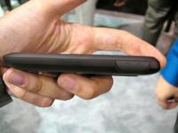
It's thin, too, or at least thin enough for me. The main button board (no more power button/quick button, a improvement to this Treo-user) is a little oddly laid-out, but the buttons are big and have more travel than you may be used to on modern smartphones. It's almost disconcerting how far down you can press them, but it works on a functional and design level quite nicely.
The main buttons flank a trackball that replaced the d-pad you usually see here and hallelujah for that. As I've mentioned on the podcast many a time -- I like trackballs on devices, but the device needs to be very fast to support them. If a trackball doesn't feel directly tied to what's happening on the screen, it quickly becomes frustrating. So far with the Snap, no problem -- the processor is fast, the trackball works nearly as well as it does on a BlackBerry.
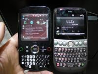
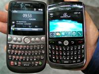
Speaking of BlackBerry, is the Snap a BlackBerry Killer? Well you can see it compared to the BlackBerry 8900 below. The answer, of course, is no. If you're a BB user, there's nothing here compelling enough to make you switch. If, however, you're not interested in the BB OS but like the form factor, the Snap is your phone. Seriously – it's going to be the best thing out there in this shape. BlackJack II, Q9(insert letter here), Dash: you all had great runs, but later this year you're getting replaced.
Get the Windows Central Newsletter
All the latest news, reviews, and guides for Windows and Xbox diehards.
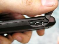
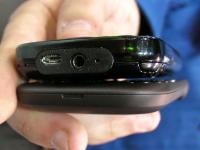
Before we leave the BB comparison space, I do need to address my disappointments with the device. HTC, folks, I hope you're reading this. Nobody likes ExtUSB except for you. Seriously. Nobody. Give us a 3.5mm headset jack. I don't care that this is a messaging device instead of a multimedia device. 3.5mm headset jack. Stop with the ExtUSB. We don't like it.
Secondly, I'm not really sure where to direct the blame for this, but we need Windows Mobile Standard to break out of the land of 240x320 screen resolution (and I don't rate the Samsung Propel Pro's 320x320 screen as a huge improvement). The BlackBerry Curve 8900 fits a 480x360 screen in the same space. Now, the Snap's screen is quite big and readable, but I want me more pixels. Somebody please tell me where to direct my scorn about this WM Standard Screen Resolution issue, so that I may heap it upon the technical, engineering, or imaginative failure responsible.
Lastly: 2 megapixel camera, no flash ... on a phone being released in 2009. For shame.
Regarding all three complaints: I understand that every design decision is about tradeoffs and that these decisions keep the cost of the phone low. I find it hard to believe, however, that in 2009 fixing any of those problems would radically increase cost.
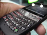
With that out of the way, let's end on a high note. The Snap's #1 feature isn't their "inner circle" combined inbox (sorry, HTC), but the keyboard. Short version: it's great. Long version – accept that you're going to feel a little apprehensive about it. The keys are offset as they are on an actual keyboard and that can be a little odd. The are also the biggest freaking keys I've ever seen on this kind of form factor. They're simply gigantic.
But it works, the keyboard works very well. As with the main buttons, there is a lot of travel to them. The first time I typed on it I was tempted to say that they were a bit mushy, but subsequent uses have convinced me that my first impression was just my smartphone brain trying to process the massive size of the keys. They feel fine, although not especially 'clicky.' New smartphone users will pick up typing on it in no time. Longtime smartphone users will need a little time to get used to it – mainly because of the offset.
I strongly suspect that 1 year from now I'll be reviewing some other smartphone in this form factor and rejecting it completely because it doesn't come close to the Snap's keyboard.
So those are my impressions. The Snap hits nearly every feature point I would want for a messaging phone in a package that isn't necessarily sexy but definitely isn't boring. I wish I didn't have to keep calling it a messaging phone, but the screen and lack of a 3.5mm jack definitely put it in that camp.
Yet it is a good messaging phone. It will be my messaging phone as soon as it sees US release as the S522 this summer.



Phil is the father of two beautiful girls and is the Dad behind Modern Dad. Before that he spent seven years at the helm of Android Central. Before that he spent a decade in a newsroom of a two-time Pulitzer Prize-finalist newspaper. Before that — well, we don't talk much about those days. Subscribe to the Modern Dad newsletter!
