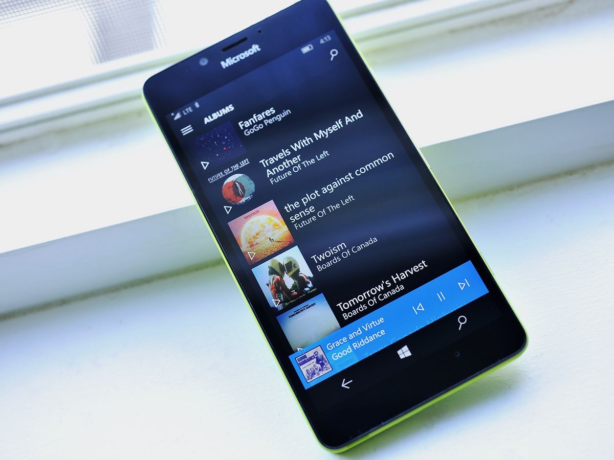
Groove Music update brings lots of small interface tweaks

A relatively minor, but pretty interesting update is rolling out to the Groove Music app on Windows 10 PC and Mobile. While there are no big, flashy new features to speak of, the update introduces a number of small UI tweaks that make the app particularly more enjoyable on Mobile.


None of the changes are what you'd call major, but they should be pretty noticeable if you're a regular Groove user. Here's a quick rundown of what we've picked up on so far:
- Removed Get Music in Store shortcut
- Changed playlist icons to fit mobile better
- Swapped Repeat and Shuffle buttons
- General improvements to resume and other functions
As you can see in the comparison shots above, the Playlist section change is probably the most jarring. That said, it allows more playlists to occupy your screen space at one time, which is likely a positive thing for most people — particularly on mobile.
In any case, you should be able to pull the update down now from the Windows Store to start checking out everything that's new. If version numbers are of concern, the update bumps the app from version number 10.16102.1034.0 to 10.16122.1027.0. Let us know what you think in the comments, and shout out if you happen to notice anything else that's new or changed after updating.
Download Groove Music from the Windows Store
Get the Windows Central Newsletter
All the latest news, reviews, and guides for Windows and Xbox diehards.
Dan Thorp-Lancaster is the former Editor-in-Chief of Windows Central. He began working with Windows Central, Android Central, and iMore as a news writer in 2014 and is obsessed with tech of all sorts. You can follow Dan on Twitter @DthorpL and Instagram @heyitsdtl.