Google Photos PWA review: Not quite progressive, not quite an app, but that's OK
Google Photos is now a Progressive Web App, which is great, but it highlights an issue that could become a trend.
All the latest news, reviews, and guides for Windows and Xbox diehards.
You are now subscribed
Your newsletter sign-up was successful
Join the club
Get full access to premium articles, exclusive features and a growing list of member rewards.
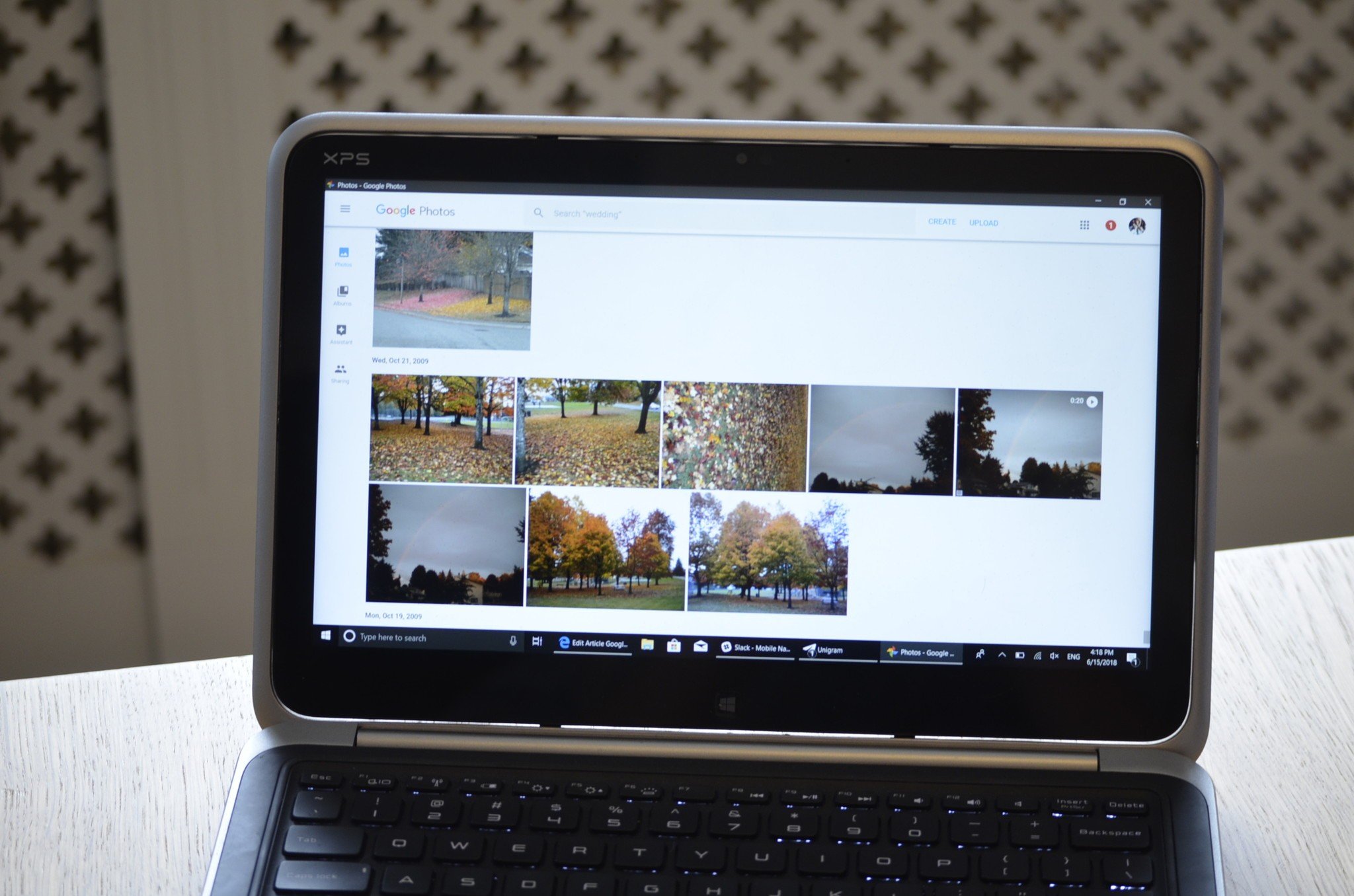
Made correctly, Progressive Web Apps can look great across different platforms and provide excellent functionality. Google is the driving company behind PWAs, and it's a positive sign that more of their services are becoming PWAs. But using Google Photos just feels a bit off, almost as if a Google app has invaded my PC.
Using it raises some questions to me about PWAs and what their rise means to our old friend the native UWP app.
To open Google Photos, go to its webpage. What you can do with it from there depends on the browser you're using which we explain further in the review.
Article continues belowA wrapped webpage
While PWAs are at their core websites, a good one could fool the average user into thinking it was a natively built application for a platform. Twitter recently replaced their Windows 10 app with a PWA version of Twitter, and while there are some features still missing, the overall feel of Twitter isn't that different now that it's a PWA.
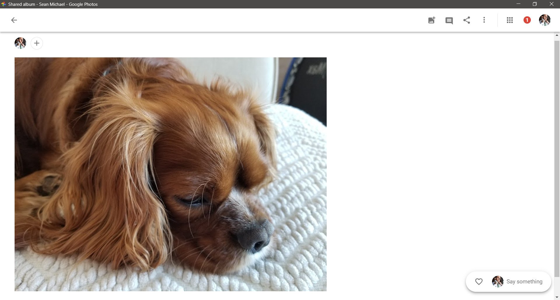
In contrast, Google Photos feels like it's just a webpage that if "installed" just removes the browser UI. It doesn't look awful, it scales when resized on your desktop and elements move around to fit your screen better, but it also feels a bit off. For example, the PWA has a 3x3 grid icon that opens up a flyout to other Google services. While it's expected that Google would make it easy to jump to other services, only one of the services in the flyout menu is a PWA (Google Maps), and they all just launch a browser page. It seems a bit odd to leave this here.
The biggest thing that sticks out to me is that Google Photos just didn't feel like it belongs on my Windows 10 PC. The design is very Google. It has icons and menus that will be extremely familiar to anyone on the Google ecosystem, but it sticks out like a sore thumb on Windows 10. This could be an inherent flaw in PWAs because they will share a look no matter where you open them, but it doesn't feel the same way when you use Twitter which fits right in on Windows. That could just be because Twitter doesn't have as distinct of a design as Google services but it's still very noticeable when using Google Photos.
Google Photos also lacks some features of the Google Photos app that you can download on Android such as automatically uploading photos that you take. This limitation means less on a PC but is also a restriction that affects Google Photos overall. While the design will likely remain mostly the same, I think it's likely that as many features that can work on a PWA will arrive on Google's PWAs in the future. It's in the company's best interest for their PWAs to not look limited when it comes to features.
All the latest news, reviews, and guides for Windows and Xbox diehards.
Odd installation
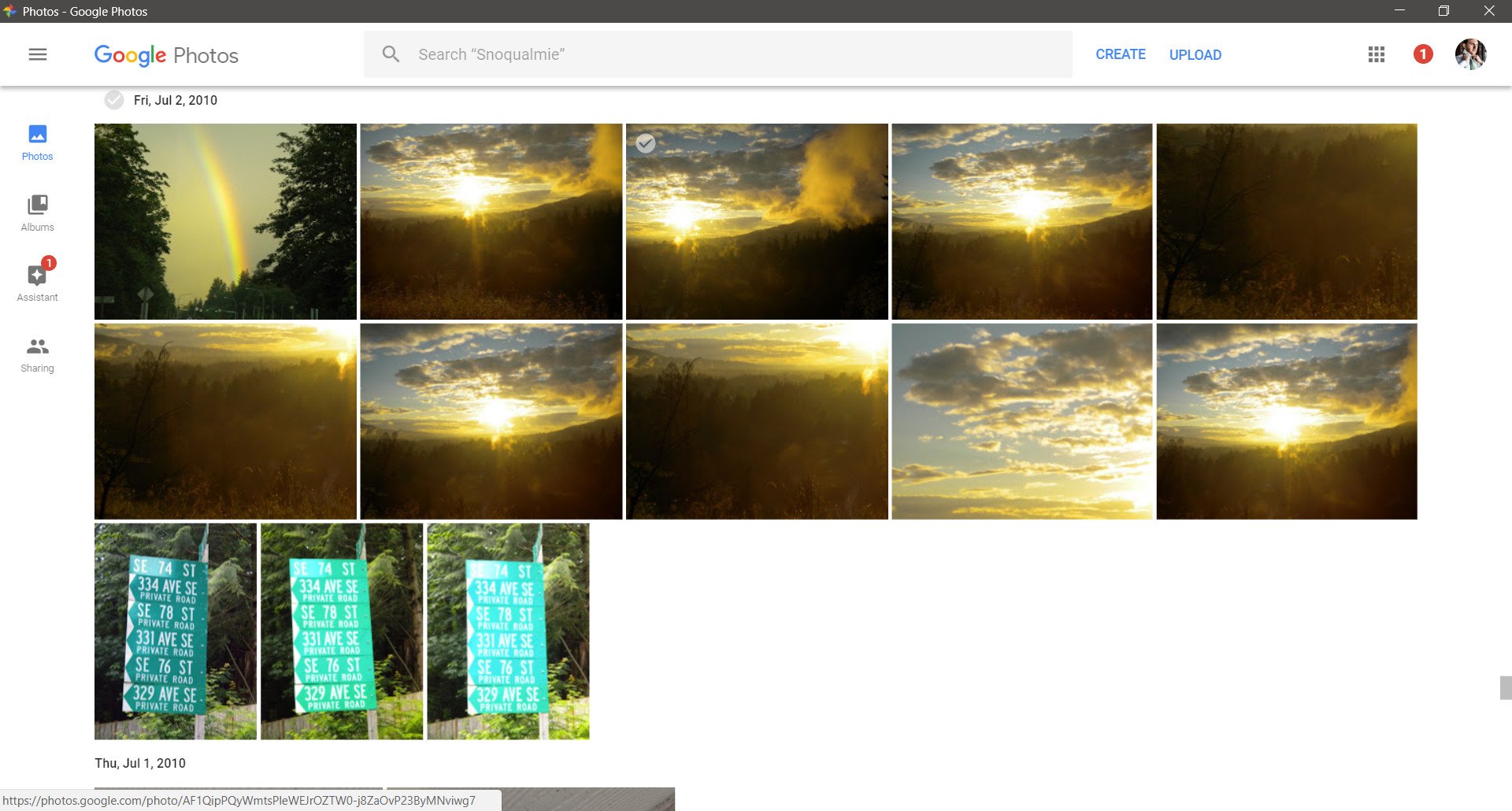
Due to a mixture of factors, "installing" Google Photos is a bit odd right now. It's important to remember that you can just go to Google Photos' website and use it in your browser, but if you want to open it as if it was its own application, you'll have to go through some steps.
First, you'll have to have Google Chrome. While you can pin websites from Microsoft Edge, it doesn't remove the browser UI and is really just an attractive shortcut from your Start Menu. Inside of Google Chrome, you can go to chrome://flags and enable service workers. This gives you the option to create a shortcut on your desktop to a browserless version of Google Photos.
Google Photos isn't in the Microsoft Store and requires a browser made by Google to get the best version of it. Hopefully, in the future, this won't be the case, and Google PWAs can feel more like they belong in Windows 10.
Overall thoughts
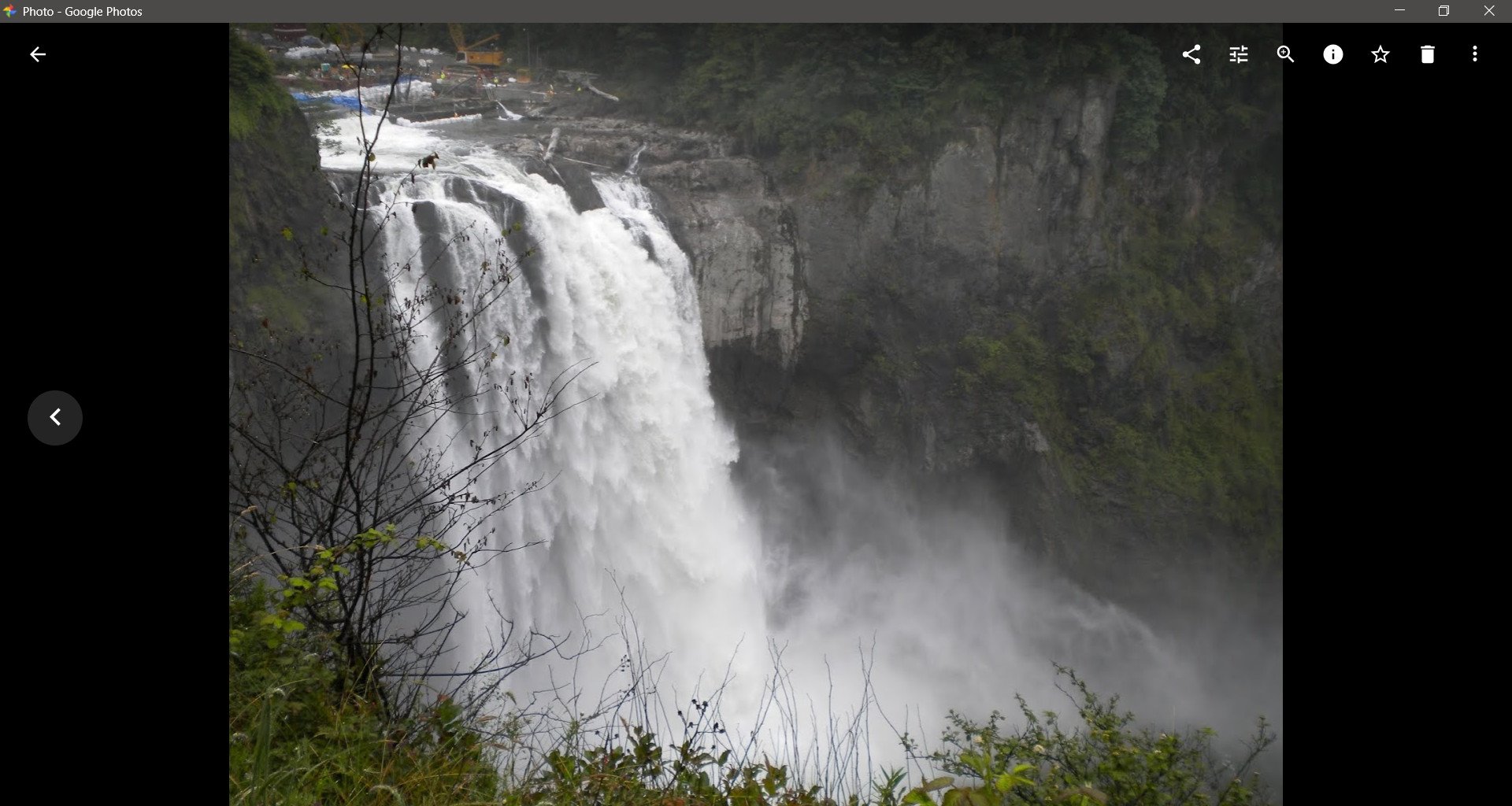
Don't get me wrong, I'd rather have every Google service look like I'm using a Chromebook on my PC than not be able to use them, but I can't help but miss my native UWP applications that feel like an extension of Windows 10.
Google Photos does a good job of presenting your photos, previewing videos, and looking back on your memories. Uploading is there and installing it does make it feel more like an app than a webpage.
It's difficult to review Google Photos through the lens of a Windows 10 user. It works well, and I think it's a good thing that it has been made into a PWA, but it does feel off if analyzed specifically as part of a Windows 10 experience.
Pros
- Makes it easy to look back at photos
- Supports uploading images and videos
- Can be "installed" to deliver a browserless experience
Cons
- Not available through the Microsoft Store
- Requires Google Chrome for the best experience
- Design sticks out on Windows 10
- Lacks auto-upload feature of mobile apps

Sean Endicott is a news writer and apps editor for Windows Central with 11+ years of experience. A Nottingham Trent journalism graduate, Sean has covered the industry’s arc from the Lumia era to the launch of Windows 11 and generative AI. Having started at Thrifter, he uses his expertise in price tracking to help readers find genuine hardware value.
Beyond tech news, Sean is a UK sports media pioneer. In 2017, he became one of the first to stream via smartphone and is an expert in AP Capture systems. A tech-forward coach, he was named 2024 BAFA Youth Coach of the Year. He is focused on using technology—from AI to Clipchamp—to gain a practical edge.
 Join The Club


