Getting in touch with creators: how Microsoft is courting Apple's creators
Tech giants Microsoft and Apple have two distinct visions for the touch experience and interacting with digital content.
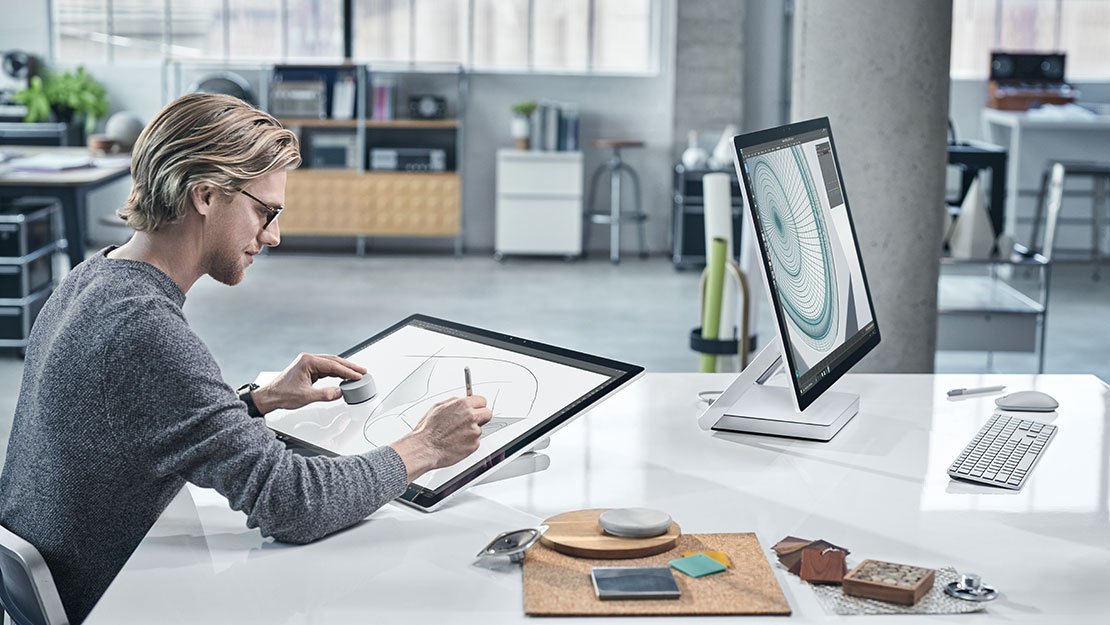
Microsoft recently introduced the Surface Studio, a 28-inch convertible, touch-screen PC that turns a desktop into a Studio and the Surface Dial, an innovative new peripheral.
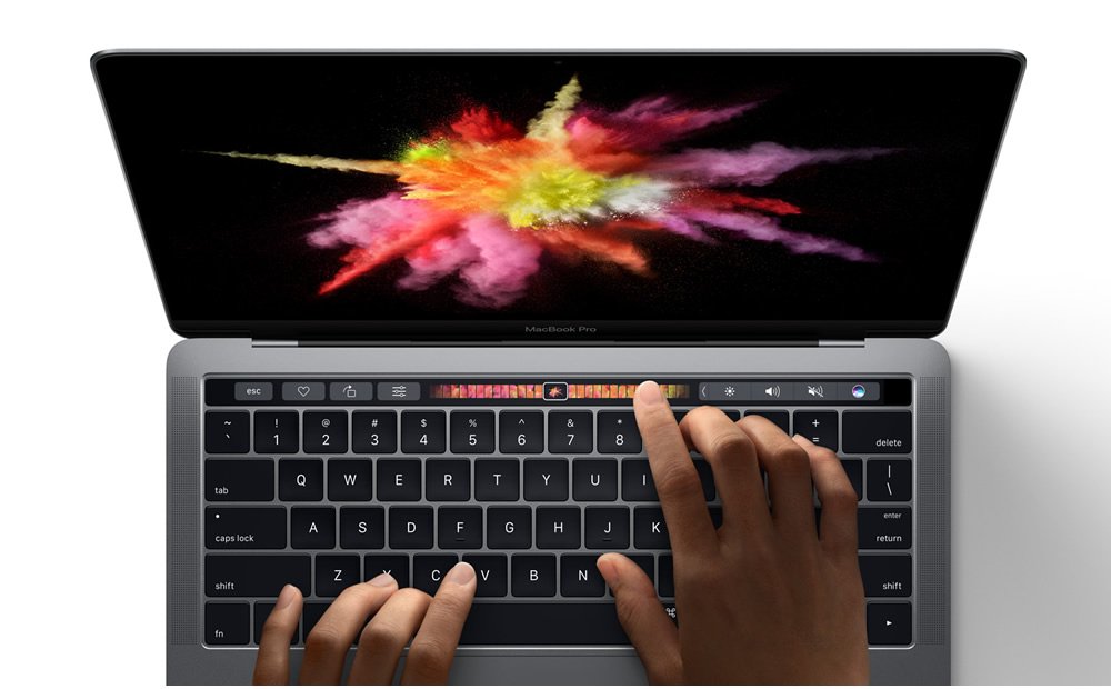
In the wake of Redmond's category-defining presentation, Apple introduced a refreshed line of MacBooks. The souped-up hardware continued its legacy of high-end design and, as expected, an exclusion of a touch-screen experience.
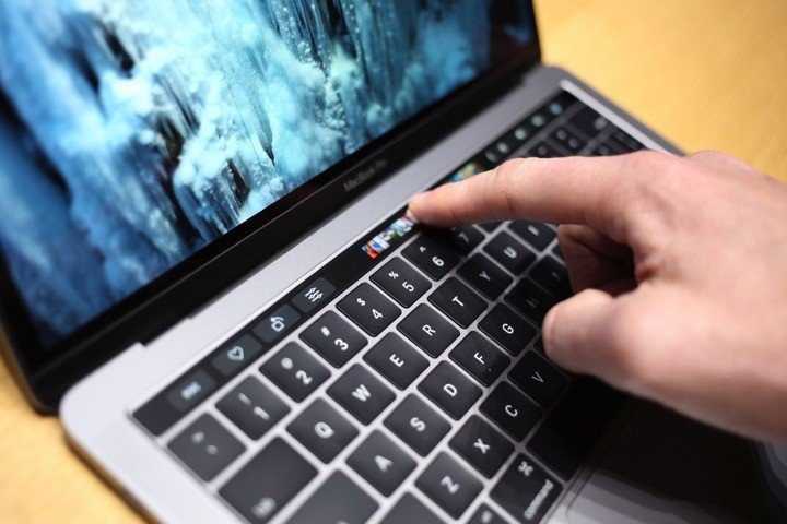
As a metaphoric dip of a toe into a world that has gone all-in with all-touch, Apple sprawled a thin "strip of touch" across the top of the MacBook's keyboard. The TouchBar is Apple's way of participating in a world where digital content is manipulated through screens almost as naturally as one handles physical objects.
While Microsoft's full touch approach immerses users in their digital content; Apple continues to keep users, and their content at a virtual arm's length as the keyboard remains their only bridge to "touching" their content.
Apple's ideological shift toward productivity?
Apple has a history and a reputation as being the company that provides creators with the tools that they need to be creative. This reputation persists, though it is diminishing among the artistic elite. Still, despite evidence of lack of software support and complaints of Cupertino not updating the tools that have earned the company this coveted reputation Apple's iMac has retained the "creators PC" title. It is, however, losing some of that shine.
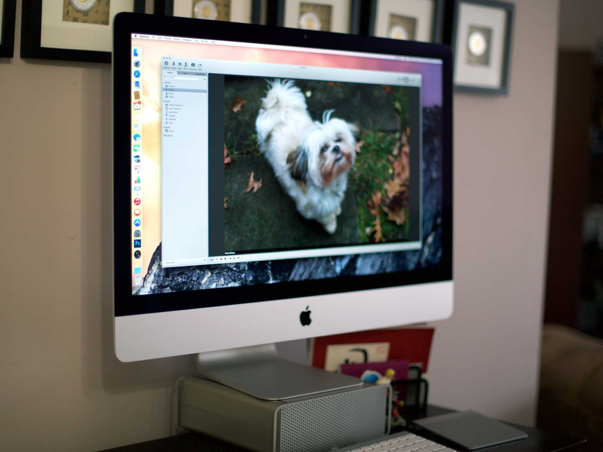
Having earned a position as a luxury device among creatives, one may wonder why Apple might risk losing this niche stronghold. One reason may have to do with the company's arguably over-dependence on the iPhone. With 60% of its revenue coming from its flagship device it makes strategic sense for them to invest in other income streams.
Apple may be losing it's creator's focus.
Thus, nurturing a perception of its line of computers as productivity tools for the mainstream has likely taken precedence over efforts to keep the iMac in the perception-box of a niche tool for creatives. This strategy probably paid off: while the PC saw declines over the past years the Mac has performed better than Windows PCs in many quarters. They even gained market share at the cost of PCs.
Get the Windows Central Newsletter
All the latest news, reviews, and guides for Windows and Xbox diehards.
Apple's focus toward a more productive Mac experience may be why Cupertino introduced a "practical" TouchBar rather than an immersive "touch environment." When one considers Apple's competition: industry-inspiring aspirational productivity devices like the Surface and Surface Book and OEM devices they inspire, one can understand an ideological direction within Apple that may see a precedence in making a Mac more efficient as a productivity device.
Moving in a direction that does not (yet) see a touch-screen as necessary for that productivity vision has positioned Apple and Microsoft's approaches and missions at polar extremes.
All up in it
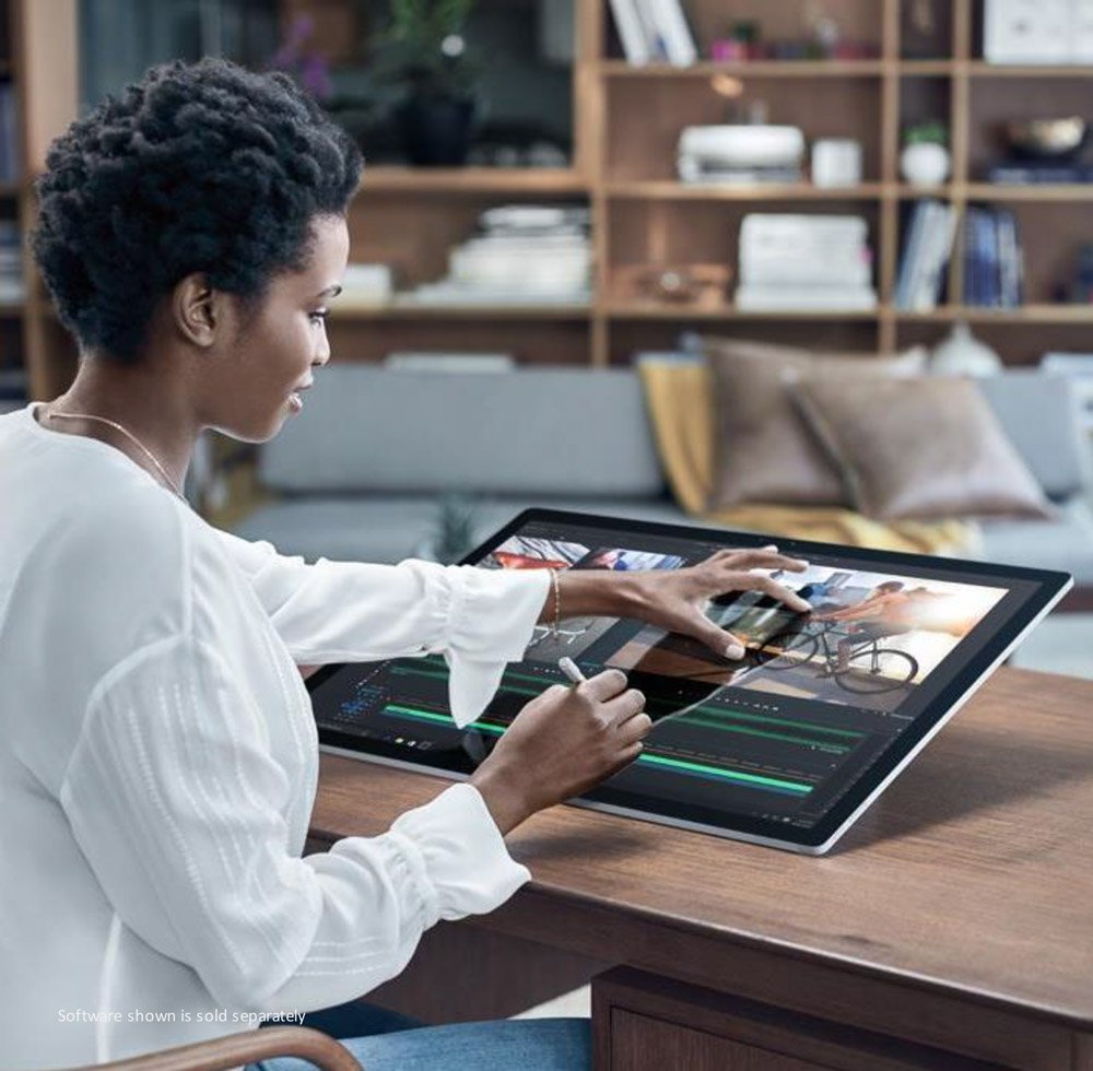
Microsoft's Creator's Update, new features like 3D Paint, and the Surface Studio compose the company's every-user-is-a-creator-vision — now paired a long productivity history with a strong pitch to be the platform for creatives of every level.
The tools that Microsoft has introduced to facilitate this vision are impressive in their ability to engulf a user in the creative process. According to Microsoft Surface Division head Panos Panay, the goal of the 28-inch Surface Studio is to provide a truly immersive environment.
Surface Studio provides an immersive creative environment.
The Surface Studio's ability to convert to a 20-degree angle that mimics classic drawing boards puts users in the same natural "all-up-in-the-content" creative position experienced when working with non-digital content. Panos bragged that the quality of the 4K display wouldn't allow users to see pixels even while in that immersed-position.
This is how 3D drawing on the Microsoft Surface Studio works pic.twitter.com/RQfM1fiTIyThis is how 3D drawing on the Microsoft Surface Studio works pic.twitter.com/RQfM1fiTIy— Destroying Stuff (@DestroyingCIips) November 3, 2016November 3, 2016
Combined with the Surface Dial, a new peripheral that lets users manipulate on-screen content, Microsoft's comprehensive touch vision further excites. When the Dial is placed on the Studio's screen the physical and digital worlds seemingly merge as a color palette or radial controls explode around the perimeter of where the base of the Dial and the screen meet.
The Surface Dial and Pen work in concert as naturally as a painters palette and brush as users effortlessly manipulate digital content with each tool. Microsoft's vision for touch to easily access and effortlessly manipulate digital information is reminiscent of the futuristic vision we saw in Minority Report.
Out of touch (or Can't touch this!)
Apple's reluctance to bring touch to macOS, and restricting even creative functions such as DJ and Video scrubbing controls to the keyboard via the TouchBar, is ironic.
Consider when Steve Job introduced the iPhone in 2007: direct interaction with the content via our fingers was the high point.
To see the rest of the world adopt touch in everything from PCs to ATMs, to vending machines and more to give users direct contact with digital content, while Apple keeps users and their content at arm's length through a TouchBar is indeed ironic.
The digitizing of keyboard controls, though uninspiring when compared to Microsoft's immersive touch approach, may have some practical benefits. Furthermore, the context sensitive nature of the TouchBar and its ability to be customized for a range of apps is a strength.
Developers can tap into both the TouchBar and Surface Dial
The Surface Dial, however, shares this strength, arguably with a much more engaging adaptation. For instance, like the TouchBar the Dial can be used to control audio volume. Moreover, rotating the Dial to adjust volume may feel more natural to users than poking at a thin strip on a keyboard.
Wrap Up
Apple and Microsoft are approaching touch from very different angles. Microsoft's approach is about putting users as close to their content as possible. By providing users an immersive digital experience that is an approximation of the physical world, Microsoft empowers users of varying skill levels to be creative and productive naturally.
Microsoft: Surface Studio & Dial! Apple: TouchBar It's settled, Microsoft is leading in innovation! @donasarkar pic.twitter.com/oNjXk0Gel2Microsoft: Surface Studio & Dial! Apple: TouchBar It's settled, Microsoft is leading in innovation! @donasarkar pic.twitter.com/oNjXk0Gel2— Jason L Ward (@JLTechWord) October 28, 2016October 28, 2016
Apple's TouchBar approach, digitizing keyboard functions on the keyboard, seems targeted more toward making the manipulation of PC and app controls more accessible and efficient. That said, Microsoft's customizable Surface Dial may prove capable of the same feat while remaining an engaging tool as part of an immersive digital experience.
Related Reading:
Microsoft's reimagining of the PC heralds a new generation of computer
Jason L Ward is a columnist at Windows Central. He provides unique big picture analysis of the complex world of Microsoft. Jason takes the small clues and gives you an insightful big picture perspective through storytelling that you won't find *anywhere* else. Seriously, this dude thinks outside the box. Follow him on Twitter at @JLTechWord. He's doing the "write" thing!

