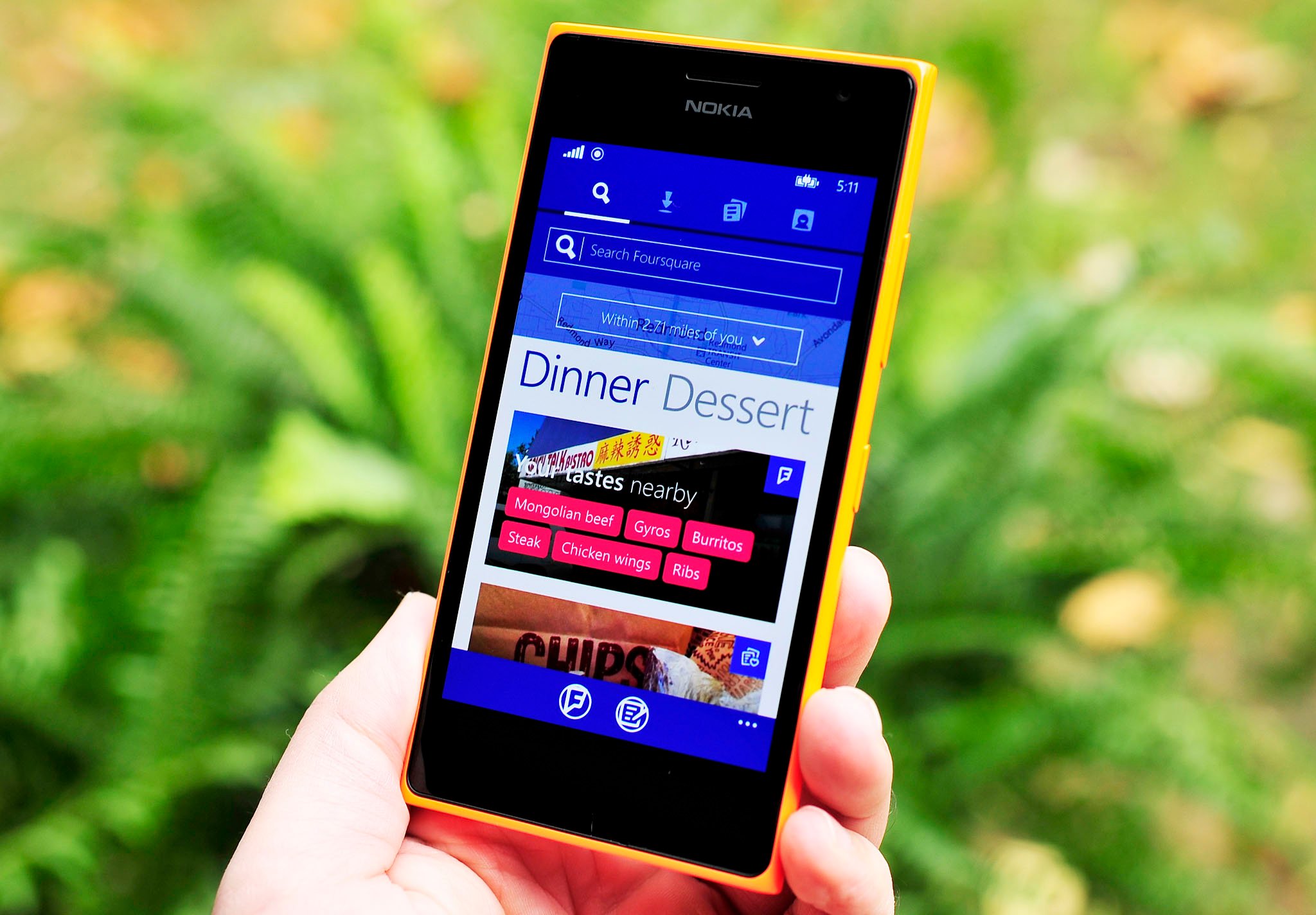
Foursquare designer talks challenges of redesign process

If you're an aspiring Windows Phone developer, a new blog post by a designer of the Foursquare app may be of some interest to you. A little over a week after debuting a fresh new look on Windows Phone, Foursquare designer Basak Haznedaroglu took to a blog post to describe some of the design challenges behind the visual revamp.
Haznedaroglu says that the team's mission was to take a hard look at Windows Phone and what makes it unique:
Our goal as a team was simple —to craft an experience that is tied to the new Foursquare vision and embraces the Windows design language. While simultaneously not deviating too far from the Foursquare designs and branding present on iOS and Android.
Speaking on the importance of Windows design itself, Haznedaroglu says:
Windows design emphasizes heavily on compelling experiences with meaningful transitions and animations that makes your app feel fluid and alive. Considering the sequence of the operations your user will be taking is a key part of laying out the motion design. After seeing successful examples in the market, we knew that not taking advantage of motion design to convey our app's narrative would be a missed opportunity.
To address the above challenges, Haznedaroglu says that the design team worked hard on a number of fronts to bring the app to life. One of the most important aspects of the redesign was to improve the onboarding experience for new users. To this end, the team worked to implement a fast and fluid interface by adding engaging animations and transitions during onboarding in order to emphasize personalization while keeping the experience fun. Additionally, Windows Phone's use of pivot control (menu navigation via left and right swipes) made the team think harder about the the app's prioritization of valuable information in each menu.
This is a fascinating look at the thought process that goes into bringing an app to life, and Haznedaroglu goes into much more detail concerning the exact steps that the Foursquare design team took in the full post. Be sure to click on over via the source link below if you're interested in learning more, and let us know in the comments how you're enjoying the redesigned Foursquare.
Source: Basak Haznedaroglu

Get the Windows Central Newsletter
All the latest news, reviews, and guides for Windows and Xbox diehards.
Dan Thorp-Lancaster is the former Editor-in-Chief of Windows Central. He began working with Windows Central, Android Central, and iMore as a news writer in 2014 and is obsessed with tech of all sorts. You can follow Dan on Twitter @DthorpL and Instagram @heyitsdtl.
