Following negative response to redesign, Skype team says it is listening

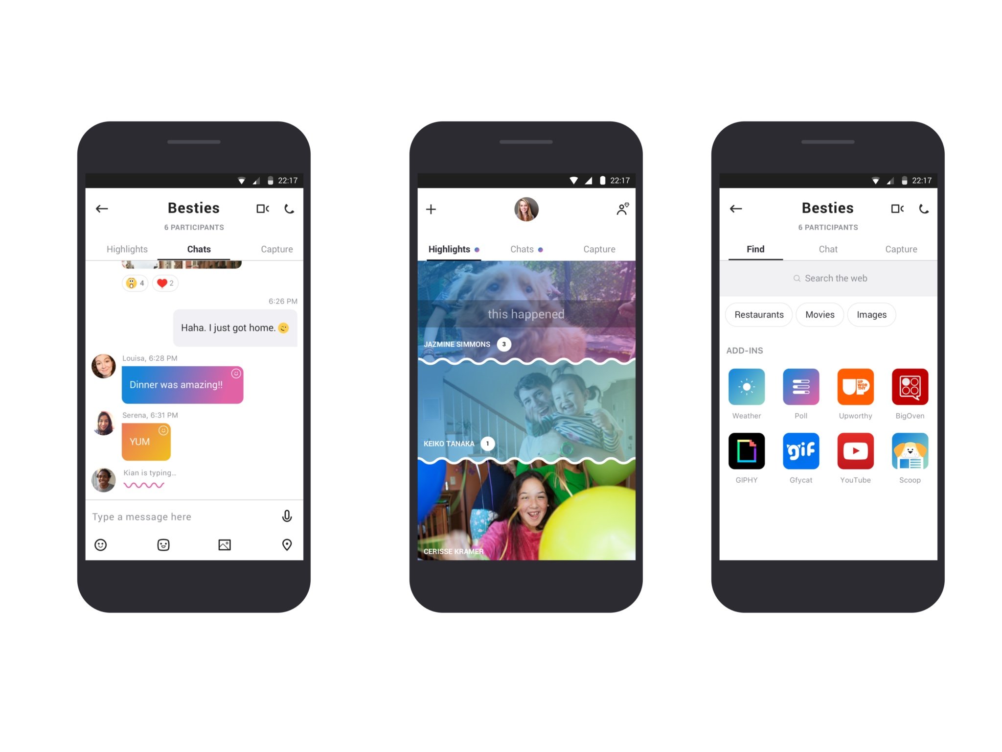
Microsoft recently rolled out a complete redesign of the Skype app (for Android and iOS, at least), and the reaction has been less than stellar so far. If you check out recent reviews on the Google Play store, for example, opinions have skewed, overwhelmingly negative. Our own poll on the subject was less negative, but still mixed, to say the least. Thankfully for those less than pleased with the changes, Microsoft says it is listening.
In a recent post on the Skype blog, the Skype team assures users that it has "been listening, updating, and responding to your feedback." As part of that process, the team has worked to reintroduce requested features like status display on the home screen and native sharing capabilities. In response to feedback, the team has worked on more color options and themes, as well as tweaks to the interface to "improve legibility and to make it easier to navigate and access your conversations."
For better or worse, it sounds like the radical redesign that the update introduced is here to stay. That certainly won't be reassuring for some, but it's still a positive sign that the Skype team is taking feedback in stride and making an effort to course-correct with requested features.
As for Windows users, the refreshed design still hasn't arrived. The Windows 10 app did recently receive an update that brought some design tweaks and added message reactions, but the overall design is roughly the same as before. As per original reveal post, both Windows and Mac users should expect to see the design overhaul arrive within the "next few months."
Get the Windows Central Newsletter
All the latest news, reviews, and guides for Windows and Xbox diehards.
Dan Thorp-Lancaster is the former Editor-in-Chief of Windows Central. He began working with Windows Central, Android Central, and iMore as a news writer in 2014 and is obsessed with tech of all sorts. You can follow Dan on Twitter @DthorpL and Instagram @heyitsdtl.

