Fluent Design System is the Windows UI structure Microsoft desperately needs

One of the most exciting things Microsoft announced at Build 2017 was the Fluent Design System (formerly codenamed Project Neon). Not because of the name, which is a bit clumsy, but rather the theory underlying Fluent Design.
While the current look of Windows 10 carries many of the original "Metro" design principals, there has been a lack of structure for app developers. Gone was the strict mantra behind the Metro design language – the "content before chrome" that provided clear principals and goals. Instead, the design seemed ad hoc and inconsistent.
What the Fluent Design System is all about
In listening to a few developer sessions at Build, I came away with the impression that Microsoft finally did some hard thinking on design. The Fluent Design System has real goals, a reason to exist and important guidelines that make the underlying principles of the system clear.

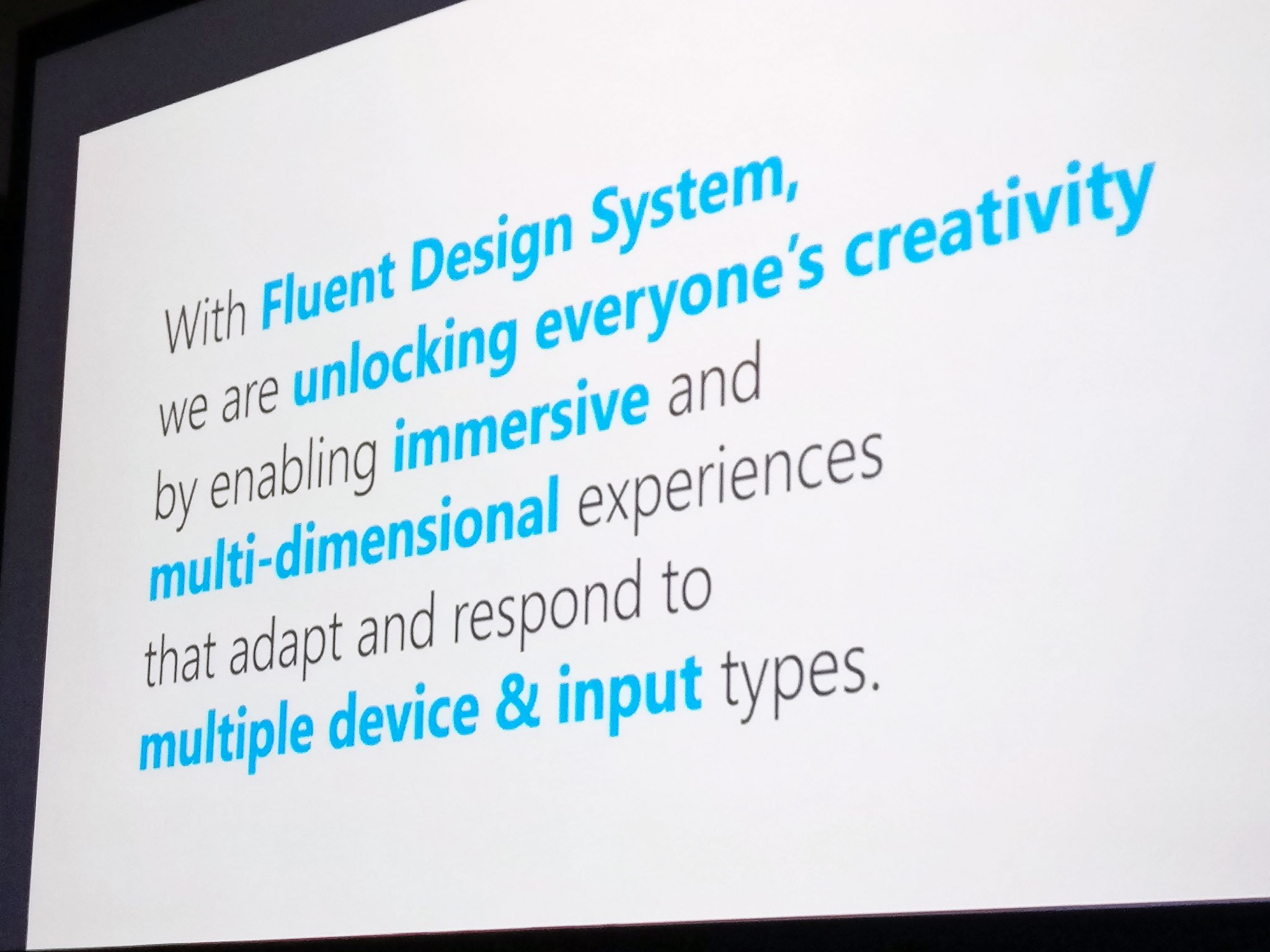
A slide shown during the "Introducing Fluent Design" session, lead by Microsoft's Principal Lead Program Manager Paul Gusmorino and Principal Director of Design Bojana Ostojic, suggests you can easily discern the point of the system. From that slide:
With Fluent Design System, we are unlocking everyone's creativity by enabling immersive and multi-dimensional experiences that adapt and respond to multiple device and input types.
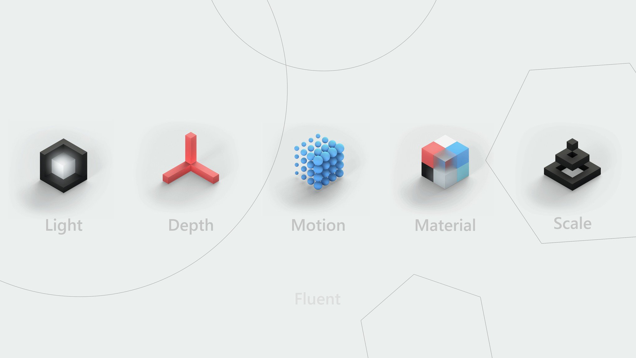
There are also five main principals behind Fluent Design, including light, depth, motion, material, and scale. This shift is a significant change from the "flat" design found in Metro, to a more modern one that lets Microsoft create apps for a new world of varying computing experiences.
What changed between 2010 and today is the rapid expansion of personal devices. Smartphones became pervasive, but we also saw the growth of devices without traditional displays, such as IoT gadgets, wearables, and mixed reality devices. Adding to the complexity are laptops, 2-in-1s, tablets, and large wall-mounted computers (the Surface Hub, for example).

Modalities for input also changed. No longer is touch or a keyboard and mouse the only game in town. Now Surface Dials, pen, gestures, gaze, and even presence are part of the system. A new way to build apps that can meet all those requirements had to be created.
Get the Windows Central Newsletter
All the latest news, reviews, and guides for Windows and Xbox diehards.
This is "the era of ubiquitous computing," but also a renaissance in digital creativity. To put the burden on the developer to create unique apps for each of those device types would hinder their adoption and expansion. With the Universal Windows Platform (UWP), and now Fluent Design, developers can create apps with a beautiful design for all device types.


I find that to be super motivating. This is not just a design language that looks lovely (though it does) but rather a system that is taking users on a path to a future where 2D displays won't be the primary interaction modality. That's some forward thinking, just like Metro was years ago.
Fluent Design System and the future of Windows
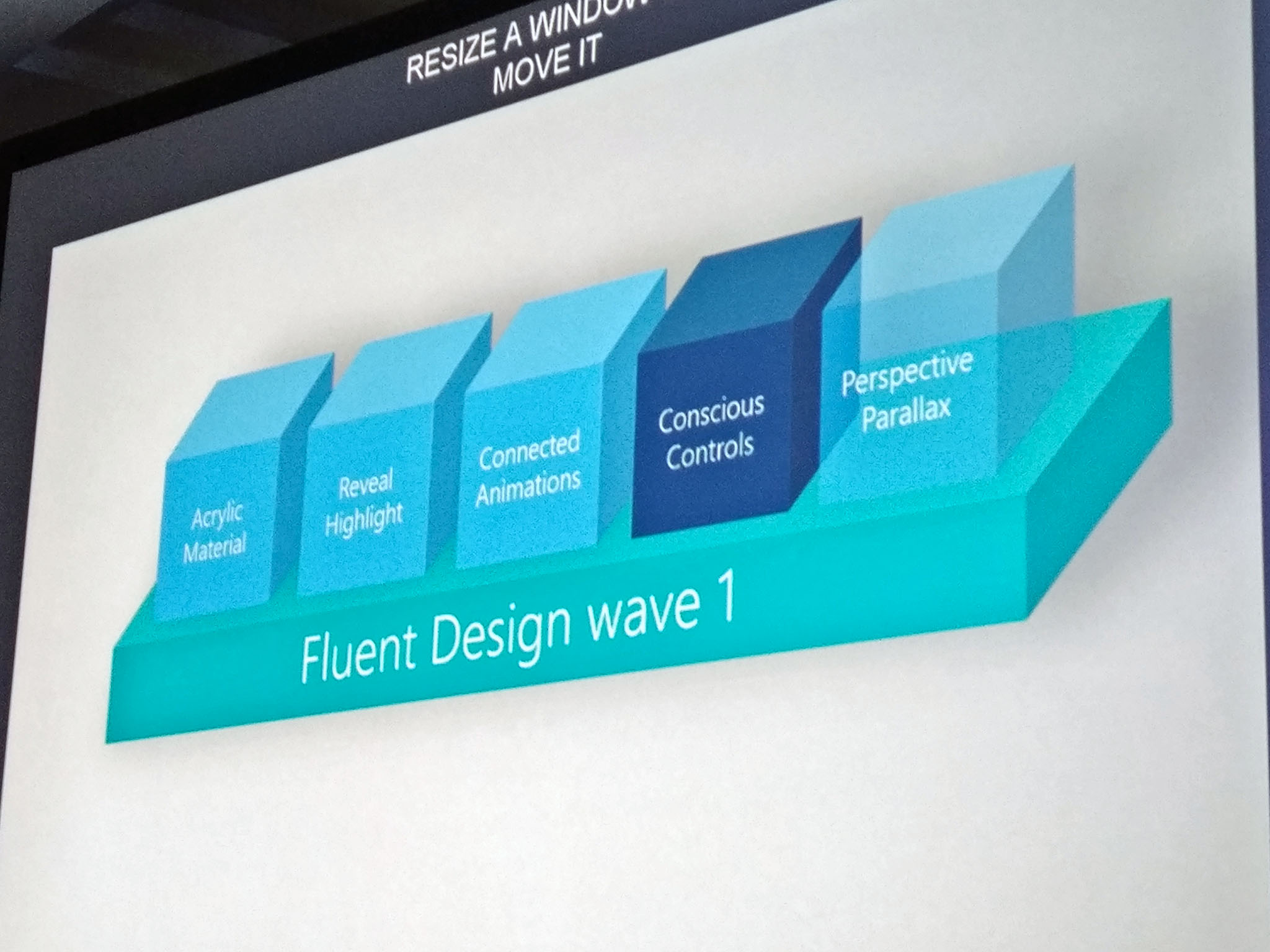
From "reveal highlight" to "conscious controls" and "perspective parallax," Fluent Design feels like a UI built for the year 2025. And that's exciting. There's a cohesive message that developers and consumers can understand.
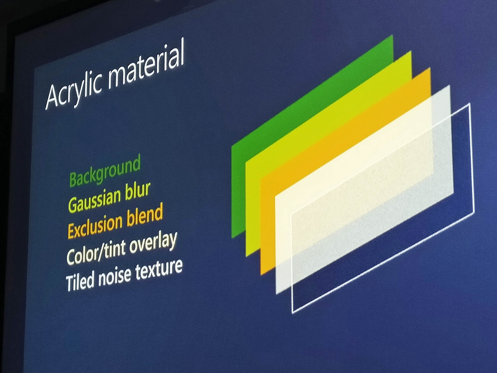
Even the material principal, understood as "acrylic" (or inaccurately, "blur"), may be only the first material replicated. Other materials may show up later.
We're told that "wave one" of Fluent Design is now rolling out, but Microsoft is already thinking about "wave two". That second iteration may include things like 360-degree video playback for all apps, "conscious headers" (see Groove app's dynamic headers), speech, z-depth layering, and even spatial sound. It's all heady stuff that's been missing for the last few years, and it's fun to ponder.
I'm glad Microsoft seems to have found its design mojo again. Just like how enthusiasts rallied around Metro, Fluent Design System is a forward-thinking and inspiring way to think about UI and computation.
I can't wait to see it all in action — and where it goes from here.

Daniel Rubino is the Editor-in-chief of Windows Central. He is also the head reviewer, podcast co-host, and analyst. He has been covering Microsoft since 2007 when this site was called WMExperts (and later Windows Phone Central). His interests include Windows, laptops, next-gen computing, and wearable tech. He has reviewed laptops for over 10 years and is particularly fond of 2-in-1 convertibles, Arm64 processors, new form factors, and thin-and-light PCs. Before all this tech stuff, he worked on a Ph.D. in linguistics, performed polysomnographs in NYC, and was a motion-picture operator for 17 years.
