Is Microsoft copying Google with its Fluent Design System?
During Build 2017, Microsoft introduced its new design language, the Fluent Design System. Microsoft's new venture immediately reminded me of Google's three-year-old Material Design initiative.

King Solomon, who is renowned for his profound wisdom, wrote: "There is no new thing under the sun. That which has been is that which will be."
This ancient King certainly didn't have the design systems of competing tech companies in mind when he penned that, but the principle of what he shared applies. Microsoft's Fluent Design System isn't an entirely new idea, though it looks as if it provides developers with an excellent framework to guide the development for consistent and great user experiences across devices. Just like Google's Material Design does.
I know some Microsoft fans would prefer it if all of Microsoft's ventures found inspiration only within the confines of Redmond's halls. Tech companies (most companies, for that matter) exist within a cyclic existence of perpetual mutual "inspiration," however. Microsoft has had its share of inspiring "firsts," such as a smartphone platform and Windows on a tablet.
Live Photos, 3D Touch, Universal Apps: Apple hijacks Microsoft's lingo
In the case of Fluent Design, however, Microsoft may be doing the following with its twist on an established concept, of course.
The 'why' of Material Design and Fluent Design
Three years ago, Google's Vice President of Design Matias Durate shared why the company embarked on the course that ultimately led to Material Design. As seen in the video interview below he highlighted that the design decisions and legacies that Google was dealing with were the "design decisions and legacies from laptops that had evolved completely differently from those for phones." Over time, the design language and system for designing apps for the two platforms had completely diverged:
Google was bringing Android to additional screens, such as watches, TVs and automobiles. This growth required a reset in the design system that would provide standard tools for developers across all screens and a consistent experience for users across the same.
Get the Windows Central Newsletter
All the latest news, reviews, and guides for Windows and Xbox diehards.
This year, Corporate Vice President of OSes at Microsoft Joe Belfiore shared that Fluent Design was birthed from a need for Microsoft to expand its current design system to accommodate a broader scope of experiences for a growing range of devices. Belfiore stressed that Microsoft is building experiences for inking, mouse, gesture and gaze across devices such as PCs, tablets, phones, TVs and mixed reality headsets.
Both of these companies are moving in similar directions and have been for some time. Sometimes Microsoft is ahead, such as with its productivity suite and global dominance in the education space. In the case of a comprehensive design system meant to provide common development tools and experiences across devices, Google had the jump.
With Windows 10 S and Surface Laptop Microsoft takes aim at Google and Apple
The 'what' of Material Design
The foundation of Google's approach toward a new design system was defining for themselves the "material" of the digital interface (what it is made of) and what the rules are that govern it. Durate said, "If every pixel on the screen somehow lived in a virtual world, what would the rules of that virtual world be?"
Consequently, Google set out to replicate various aspects of the physical world within the digital via a design system with strict rules for light, shadow, motion, surfaces and layers.
To arrive at a system informed by reality, the Google team conducted studies where it carved all of its product icons out of paper and explored in depth the different effects of lighting on the sculptures. Google ultimately dubbed the "material" of Material Design "quantum paper" because of the physics that govern it:
A material metaphor is the unifying theory of a rationalized space and a system of motion. The material is grounded in tactile reality, inspired by the study of paper and ink, yet technologically advanced and open to imagination and magic.Surfaces and edges of the material provide visual cues that are grounded in reality. The use of familiar tactile attributes helps users quickly understand affordances. Yet the flexibility of the material creates new affordances that supersede those in the physical world, without breaking the rules of physics.The fundamentals of light, surface, and movement are key to conveying how objects move, interact, and exist in space and in relation to each other. Realistic lighting shows seams, divides space, and indicates moving parts.
In Material Design, light illuminates a scene highlighting seams, moving parts and divides in space which, along with movement, helps to focus a user's attention where desired within a 3D space governed by defined rules. Surface, which is the "quantum paper" of the design, has physical qualities such as being "solid" and "occupying a unique point in space" that mimics our experiences with objects such as books. This digital replication of the relationship between humans and the physical medium of a book was important for the team.
The 'what' of Fluent Design
Microsoft's Fluent Design, like Material Design, brings a number of physical elements to the digital plane. It is, however, less grounded on a foundation of one "material", like Google's quantum paper, and the physics of that single material within a defined digital environment.
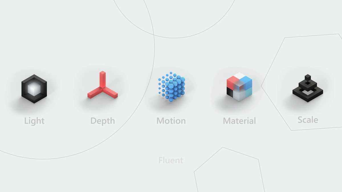
As a matter of fact, Fluent Design will allow for a variety of materials, beginning with acrylic, to be affected by the four other building blocks of the system: light, depth, motion and scale.
- Light draws our attention and illuminates information.
- Motion allows developers to create transitions that keep users focused where they want them focused.
- Materials bend, stretch, bounce, shatter, and glide. Acrylic is the first material quality Microsoft has translated to the Fluent Design digital environment.
- Depth is the breaking apart of the frame that contains a developer's information and reconstructed in the layered way it would be represented in a physical environment.
- Scale is Microsoft expanding its toolkit (beyond the traditional 2D environment) from 0D to 3D.
Microsoft is applying this common design system to a range of screens including mixed reality. When we consider this particular point, it becomes easier to understand why Microsoft may have chosen not to ground its design system in the "physics" of a single material.
Multiple materials may be an advantage of Microsoft's Fluent Design System.
Mixed reality, from augmented to virtual, is poised to become the next personal computing paradigm. If it is to accurately mimic the physics of the physical world, and how we interact with digital artifacts, a variety of materials and the physics that govern them allow for a more diverse and realistic experience than a single material provides.
Wrapping up

Google has had a head start with Material Design. The comprehensive breadth of its approach to "building a digital world," to define strict rules for the physics of that world and its digital material quantum paper is impressive. It also leads to a high level of consistency if adhered to. Since its debut, millions of users have seen its elements on smartphones and the web.
With the Fall Creators Update coming to Windows 10 this year, 500 million users will begin to see more elements of the multi-staged Fluent Design System in Windows. (Apps like Groove and calculator already have been affected.) Microsoft has communicated that Fluent Design will evolve over time and will be released in waves.
The more ambitious nature of Microsoft's venture (with multiple materials) also potentially presents an additional challenge for the company, however. The introduction of other "materials" may necessitate a change of the "physics" of some of the elements of the digital world of Fluent Design. Will that present greater challenges to the consistency that Google's quantum paper and Material Design system will never face?
Will the different "materials" in Fluent Design present a challenge to consistency?
When Microsoft introduced the flat Modern (formerly Metro) UI, rivals responded with less skeuomorphic elements in their UIs. The tech industry is in a perpetual cycle of companies being "inspired" by one another. It seems that in regard to a design system, it's Microsoft's turn to follow.
You have to wonder, will Apple be influenced by the moves of these two giants? And in what other areas might Microsoft follow its rivals?
Jason L Ward is a columnist at Windows Central. He provides unique big picture analysis of the complex world of Microsoft. Jason takes the small clues and gives you an insightful big picture perspective through storytelling that you won't find *anywhere* else. Seriously, this dude thinks outside the box. Follow him on Twitter at @JLTechWord. He's doing the "write" thing!
