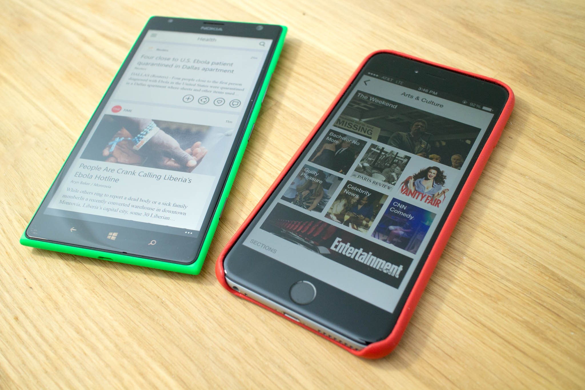

Flipboard is a very popular app that grabs content from several sources and presents them in a magazine format. There's a social networking aspect to as well since it lets people curate and share content as their own magazines that others can follow or subscribe to. The app has been available on iOS and Android since 2012, and you might have heard that the Windows Phone equivalent has just been released. We happen to have an iPhone 6 Plus lying around, so let's compare Flipboard running on iOS with the recently released Windows Phone app. The results may disappoint you.
Flipboard. Flip. Board. It's supposed to flip, right? On iOS, the pages flip like a page in a magazine. On the Windows Phone version, there's no flipping. This may not be a big deal to many people, but Flipboard without flipping feels like eating "peanut butter and jelly" without the jelly.
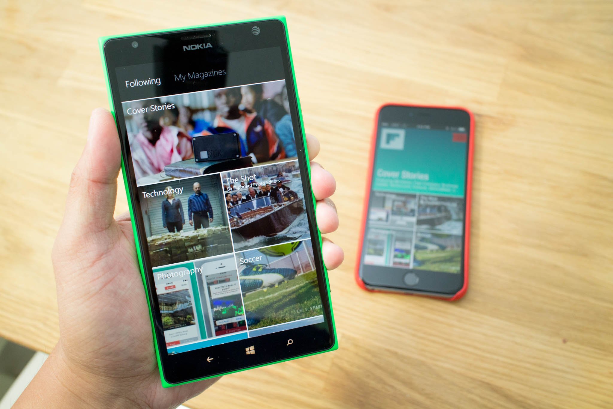
When you open both apps, the iOS version displays the topics you 've selected during setup. For example, my account shows Cover Stories, Technology, The Shot, Photography, Soccer, and Top Stories in Travel. Each topic has a thumbnail. The Windows Phone app takes a different approach. When you open the app, it shows one story from Cover Stories. Scrolling down displays more stories.
After selecting a topic, this is the part where the Windows Phone version of Flipboard visibly lacks a few things compared to the iOS version. On top of the iOS app, you can tap a topic to view sections. For example, you can specifically look at Apps, Gaming, Mobile, or Science under the Technology topic. That option is not available on the Windows Phone app.
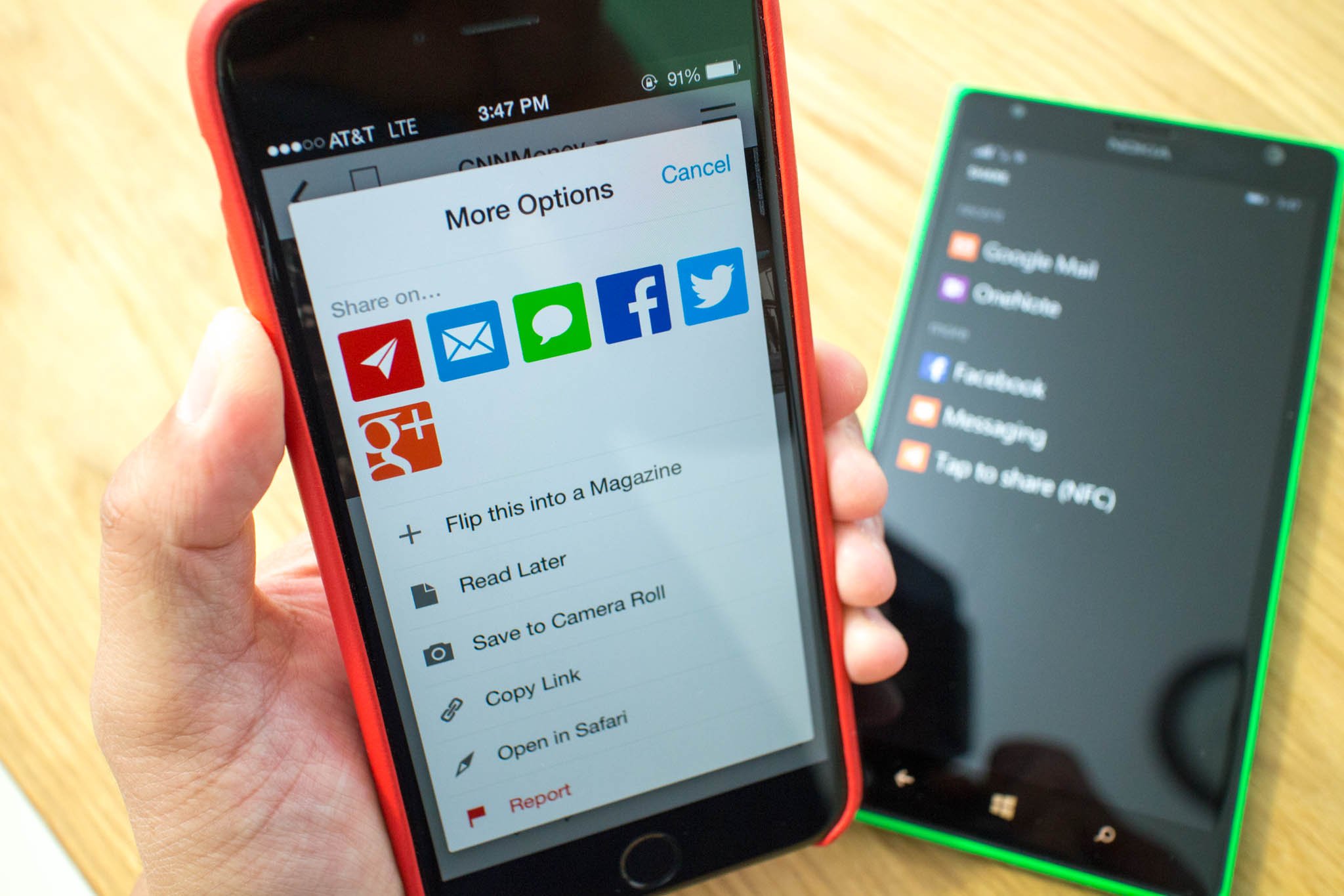
With the Windows Phone app, there are 4 icons below every story. They're for flipping stories into your curated magazine or sharing with others via email, Facebook, or Twitter. You can also like and comment on a story. The iOS app takes a different approach. There's a plus sign under every story for flipping stories. Tapping and holding a story, brings up a menu to share stories, save to camera roll, or copy link.

If there are other topics you would like to see, you can tap the hamburger button on the top right corner of the iOS app. The search icon on the top right corner of the Windows Phone app has the same function. You can search for topics or select from the list provided. The iOS app has an upper hand because they provide subsections for topics. If you see a topic you like, just tap the badge icon next to it. On Windows Phone, you need to tap the topic first, tap the three dots on the lower right corner, and then the follow button.
Another difference between the iOS and Windows Phone versions of Flipboard is video support. It's surprisingly not available on the Windows Phone app. Either stories have a big white space where the video is supposed to be, or you a see video player, but with the error that it "cannot load video."
Get the Windows Central Newsletter
All the latest news, reviews, and guides for Windows and Xbox diehards.
We're glad that Flipboard is finally available on Windows Phone, but it still has a lot of work to do. They're definitely not on the same level. Being able to select sections from topics should be high on the priority. The flipping animation and video support would be nice, too. Have you played with Flipboard on your Windows Phone device? How do you like it?


