First look at Outlook Mobile on iOS with modern redesign, new features
Soon iOS users will have a brighter, cheerier Outlook to use on their phones and tablets.

Outlook Mobile is one of Microsoft's top apps with over 100 million downloads on Android and being ranked in the top five for productivity on iOS, so it makes sense it gets lots of love. Today, at Microsoft Ignite 2018 the team behind Outlook showed off what's coming next, and while those on Android are getting new features, it's the iOS app that gets the major overhaul.
Here's what's new and coming soon.
Modern look on iOS, similar to Android

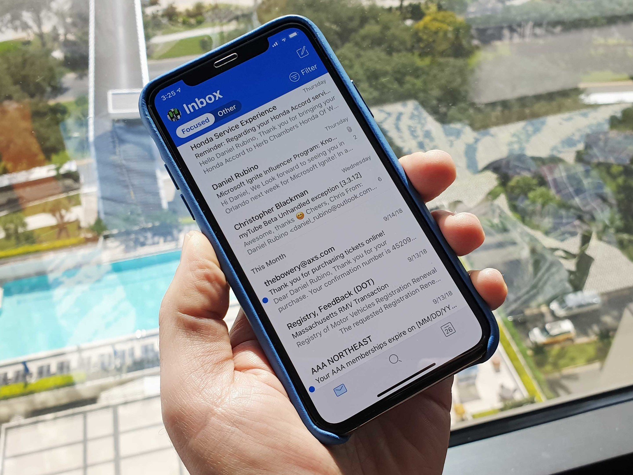
For users who switch between Android and iOS, the Outlook experience is similar for features (although not exact parity), but it's the color schemes that are vastly different. Outlook on Android has the Outlook "blue" banner and is just more colorful, and now that look is coming to iOS.
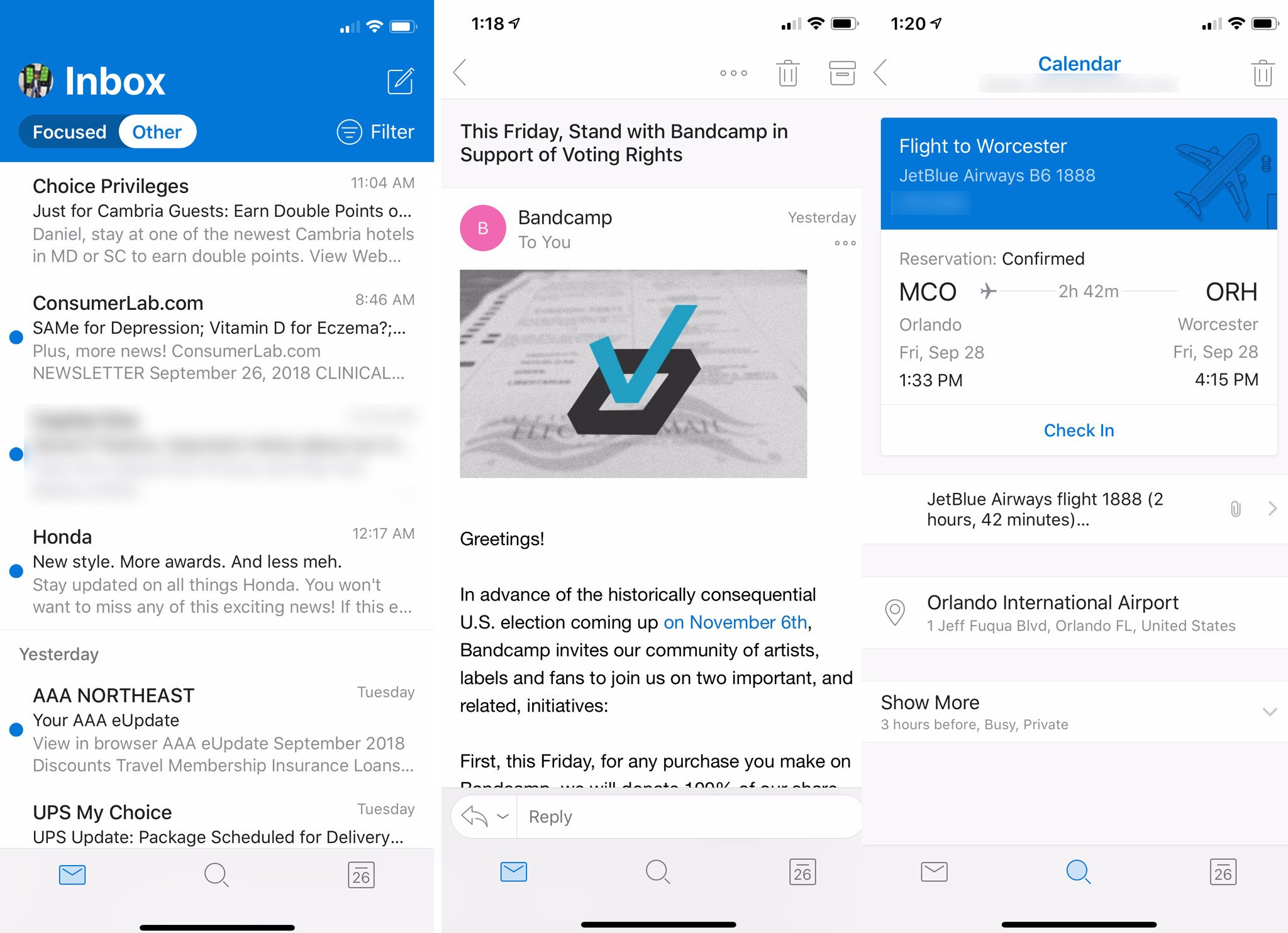
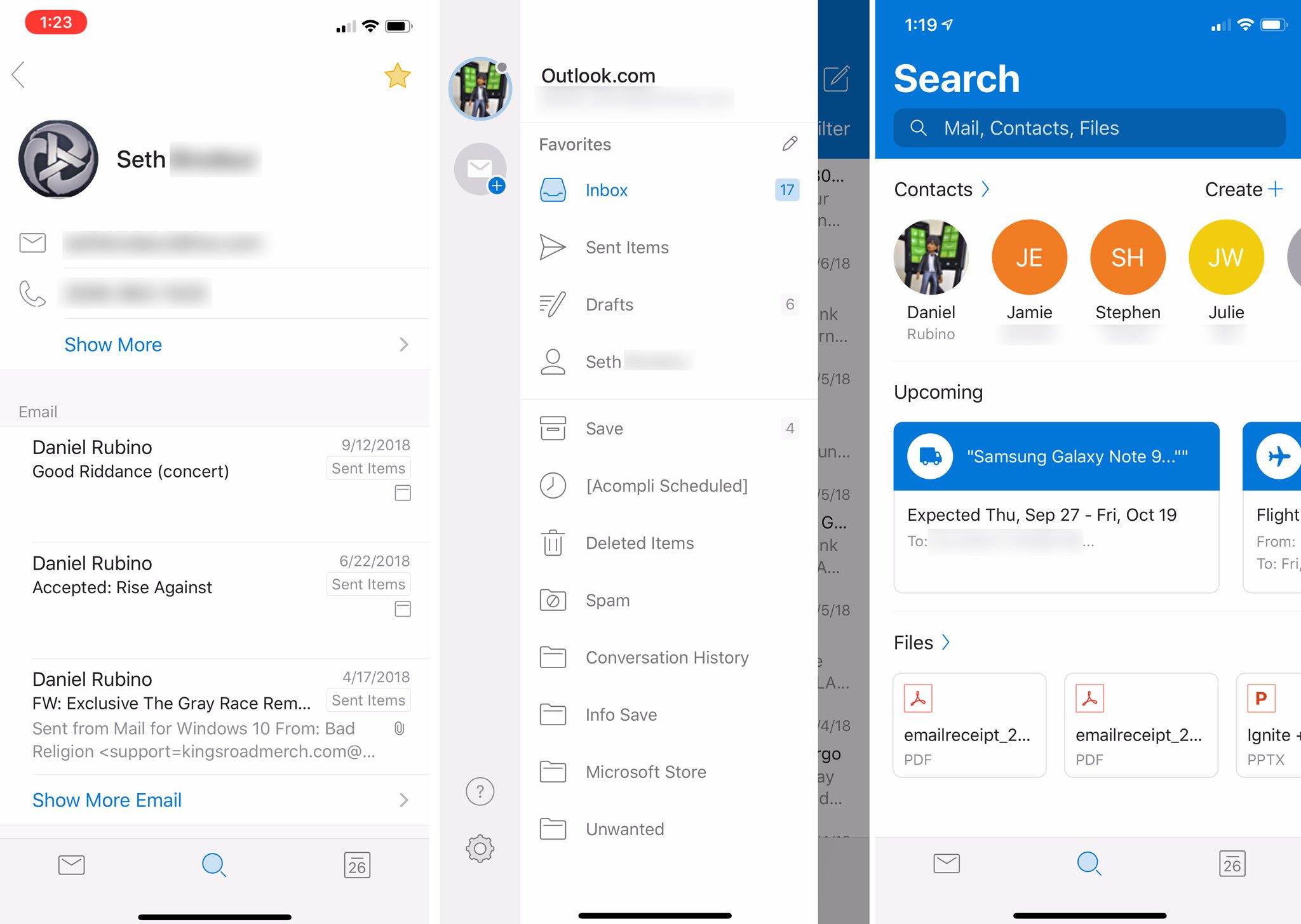
In these exclusive screenshots, it is clear Microsoft is bringing Outlook for iOS on par with Android. There are dozens of changes including:
- New blue banner.
- Banner shrinks when scrolling similar to UWP apps on Windows 10.
- Switch from REST sync layer to Hx, bringing parity to Windows 10 UWP Mail app.
- New swipe experience with better colors and haptic feedback.
- Send availability based on your calendar and current schedule.
- Favorite contacts now to quickly see info, email, attachments, and calendar.
- New gesture and swipe support for accounts and folders.
- New brighter icons that match the email service account, e.g., "G" logo for Gmail.
- New smarter and easier to read filtering system.
- New pillbox design to switch between Focused and Other inboxes.
- Actionable events e.g. check in to your flight directly.
- Much more.
The switch to Hx sync layer away from REST allows optimization of reading and writing tasks from the cloud with a bias towards increasing the read performance of documents, attachments, etc. Interestingly, this is already how it works on Mail for Windows 10 through the UWP, but now all of Microsoft's Outlook apps will be on the same sync layer, which gives them much more flexibility.

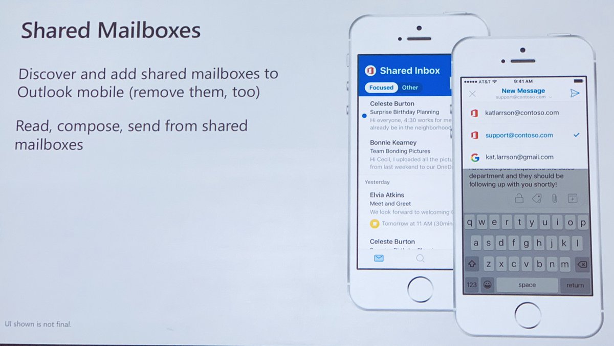
It's not just a redesign either as the Outlook team told the audience that some of the most highly requested features are now in the early stages of engineering, including:
- Shared Mailboxes.
- S/MIME support.
- New File & Share picking.
- Classify, label & protect.
These features will be for iOS and Android.
Get the Windows Central Newsletter
All the latest news, reviews, and guides for Windows and Xbox diehards.
As to timing for the iOS redesign, it should be out by the end of the year (it's already on internal testing). In our short time with it, the new look finally makes Outlook on iOS just more fun and pleasant to look at and use.
Fun fact: the average Outlook user is only in the app for 22 seconds. Microsoft is keen on making sure brevity and letting people get back to work is the signature of this app going forward.
What about dark mode!?!?
We asked Michael Palermiti, Product Lead for Outlook on iOS about dark mode and as you guessed it, it is one of the top-requested features from users.
The good news is dark mode is on the way. The first stage will be the redesign revealed in this article, and that will be the template for adding dark mode soon after. The team is building the design with a dark mode in mind, so the UI elements should all work with the easier-on-your-eyes theme.
No ETA on dark mode but look for movement on it soon after the redesign for iOS lands sometime in 2018.
Outlook for Android is not left out
For Android users, Outlook is getting multiple improvements around the calendar, agenda view, new month view (coming next week), and refinements to the calendar widget to better match the current app design.
Another neat feature coming is the inclusion of Office Lens support directly in the app. Users will be able to snap a photo of a business card, and with optical character recognition (OCR) from Office Lens, it will turn the photo to text and auto-add to contacts directly.
More to come

There was a lot packed into the Outlook Mobile session here at Microsoft Ignite more than we can cover here. More will be revealed and announced in the coming weeks and months as the team begins to push these updates to production and end-users.
The takeaway is Outlook Mobile is thriving at Microsoft. Combined with integration with Microsoft To Do (flagged articles get created in a To Do list) and Microsoft's entire ecosystem for productivity is coming together nicely.

Daniel Rubino is the Editor-in-chief of Windows Central. He is also the head reviewer, podcast co-host, and analyst. He has been covering Microsoft since 2007 when this site was called WMExperts (and later Windows Phone Central). His interests include Windows, laptops, next-gen computing, and wearable tech. He has reviewed laptops for over 10 years and is particularly fond of 2-in-1 convertibles, Arm64 processors, new form factors, and thin-and-light PCs. Before all this tech stuff, he worked on a Ph.D. in linguistics, performed polysomnographs in NYC, and was a motion-picture operator for 17 years.
