Editor's desk: First impressions of the AT&T Samsung Focus 2
Samsung is back in...white...with the Focus 2 on AT&T. What do I think of it after a few hours? Let's find out.
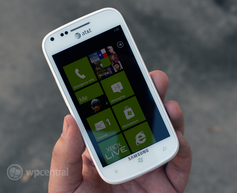
For many of us, the original Samsung Focus (review) was our first foray into the Windows Phone world. And truth be told, it was an excellent experience. With it's 4" Super AMOLED screen, slick design, light body and decent (for the time) camera, the Samsung Focus set the precedent. Recent numbers also reflect that status with upwards of 90% of AT&Ts first generation Windows Phone being the Focus.
Today, AT&T and Samsung have released the Focus 2, a moderate update to the original design (check out today's unboxing video). Eschewing glossy black for the new hip white, dropping in a faster 1.4GHz CPU and adding 4G LTE are the most notable changes. Adding a more rounded design with some updated sensors and cameras are the more under-the-hood type differences.
So how does it stack up in the first few hours I've been toying with it? For $50 on contract or $399 off, the Focus 2 is a nimble little guy that has certainly caught my attention.
The feel of the device is really good in the hands albeit a touch slippery. The roundness of the device, while slick, makes it a joy to hold and at 4" for the screen size, it's a more natural fit. The chrome accent adds a touch of class and while the device is very plastic, it doesn't feel cheap. The buttons have an interesting layout with the volume keys to the left, power and camera to the right. While odd, it does make it less confusing than the Lumia 900's where they are all lumped together on the same side. Travel of the keys is good and they're tactile with no rattle.
The Super AMOLED screen is really brilliant but obviously not as good as the Lumia 900's. Still, it holds its own and it's great to look at while not getting to grimy.
Audio quality is moderate with very little distortion when maxed out. It's a touch tinny but not by much.
The camera is surprisingly good even at 5MP, in fact forgetting the loss of resolution, it's as good if not better than the Nokia Lumia 900's. While it doesn't really contain any advanced settings e.g. no anti-shake or panorama, photos are well detailed and pleasing to the eye. We do however recommend turning up sharpness and contrast a smidge more to make the most of it.
Get the Windows Central Newsletter
All the latest news, reviews, and guides for Windows and Xbox diehards.
Any extras worth reporting on? No, not really. There are the advanced GPS settings (GLONASS) and Samsung's "extra settings" present but other than that it has the same wallpapers as other Samsung Windows Phones and their regular cheesy ringtones.
Overall though, we're impressed and like the Focus 2 a ton. It feels great in the hand, is fun to use and makes a solid addition to AT&T's lineup. I'm going to have little problem adding it to my repertoire of Windows Phones.
Check after the break for a few more pics of the device and a couple camera samples (compared to the Lumia 900)...
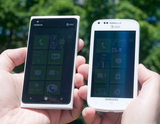
Out in the sun, both phones perform admirably well with the 900 slightly edging out the Focus 2
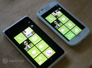
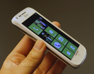
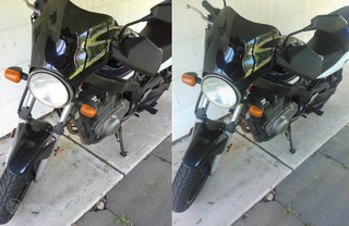
Camera sample - Focus 2 (Left) and Nokia Lumia 900 (Right)
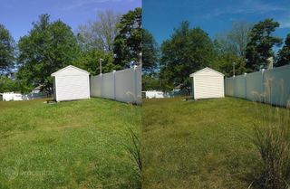
Camera sample - Focus 2 (Left) and Nokia Lumia 900 (Right)

Macro camera sample - Focus 2 (Left) and Nokia Lumia 900 (Right)

Daniel Rubino is the Editor-in-chief of Windows Central. He is also the head reviewer, podcast co-host, and analyst. He has been covering Microsoft since 2007 when this site was called WMExperts (and later Windows Phone Central). His interests include Windows, laptops, next-gen computing, and wearable tech. He has reviewed laptops for over 10 years and is particularly fond of 2-in-1 convertibles, Arm64 processors, new form factors, and thin-and-light PCs. Before all this tech stuff, he worked on a Ph.D. in linguistics, performed polysomnographs in NYC, and was a motion-picture operator for 17 years.