Files&Folders is a gorgeous file explorer after its recent Fluent Design update
The old File Explorer is due for an update, but in the meantime, Files&Folders is here to be easy on the eyes.
All the latest news, reviews, and guides for Windows and Xbox diehards.
You are now subscribed
Your newsletter sign-up was successful
Join the club
Get full access to premium articles, exclusive features and a growing list of member rewards.
The File Explorer is one of the least attractive aspects of Windows 10, lacking modern design features and not scaling well to encourage touch. Files&Folders aims to deliver a touch-friendly and attractive file explorer.
Files&Folders already made its way onto my list of best file explorer apps on Windows 10, and with its recent update has further secured its spot as one of the best alternatives to the default File Explorer. The update brouhgt in Fluent Design throughout the app and introduced a number of features that make it easier to use Files&Folders as your main file explorer. The full changelog can be found on Finebits' website.
I'll be going over some of the basic features of the app, but this review is based primarily on what the update brings and how it affects the quality of Files&Folders.
Article continues belowThe app is available for Windows 10, Xbox One, Windows 10 Mobile, and HoloLens. There are two versions of Files&Folders. The lite version is free, and the pro version is on sale at the time of this article's publication for $1.99. Its non-sale price is $9.99. The pro version removes ads, adds the ability to extract files from archives, and more.
Filling in features
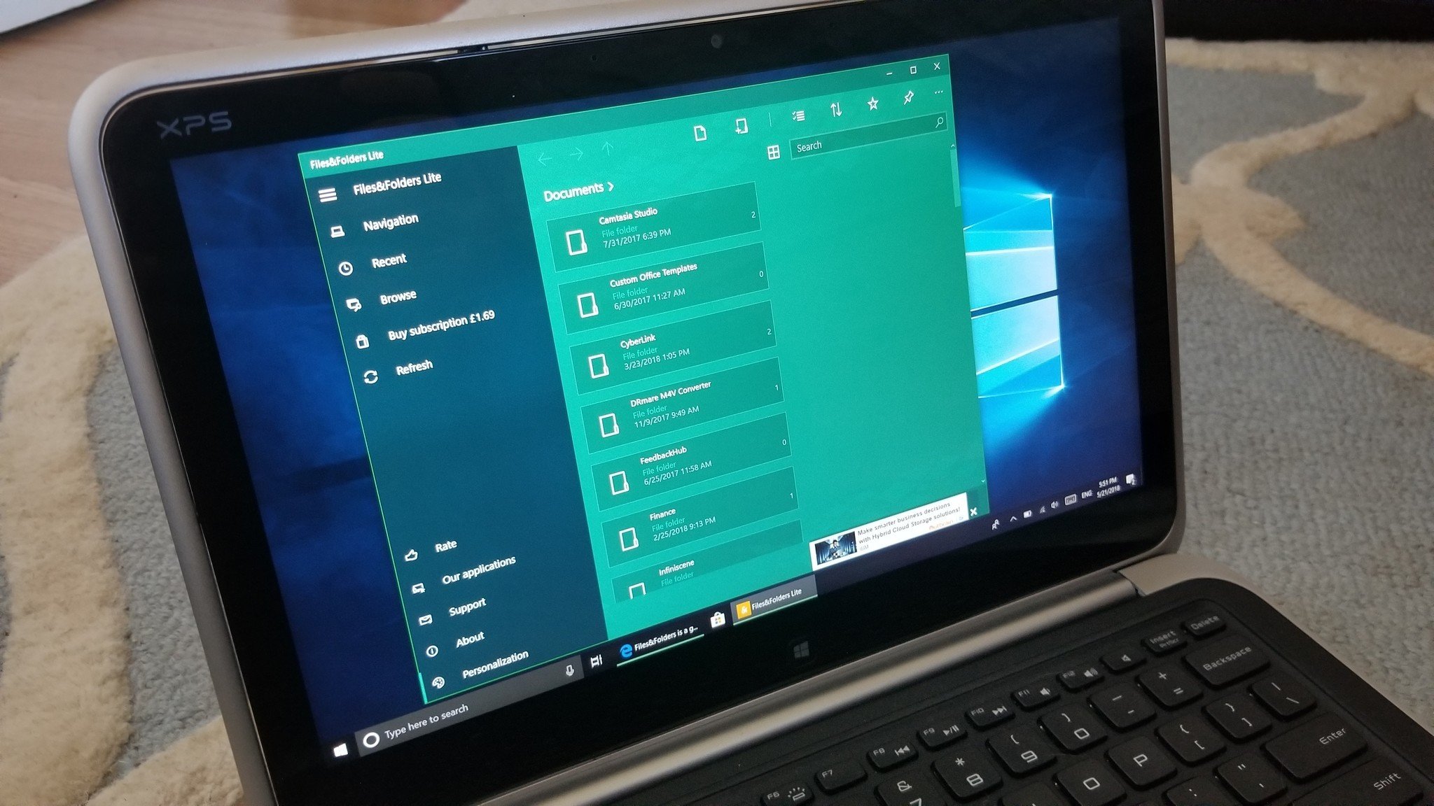
Files&Folders was a good app before the update, but since it isn't the built-in Windows 10 File Explorer, it had limited functionality. While it's still behind the native File Explorer, it's gained some notable features thanks to the April 2018 Update of Windows 10. It allows you to easily view your files, move items around, and go to different storage locations on your system or various cloud services.
The April 2018 Update made it possible for apps like Files&Folders to run multiple instances simultaneously. This is a huge boost to the app's functionality as you can now drag and drop content between folders and areas of your PC much more easily.
All the latest news, reviews, and guides for Windows and Xbox diehards.
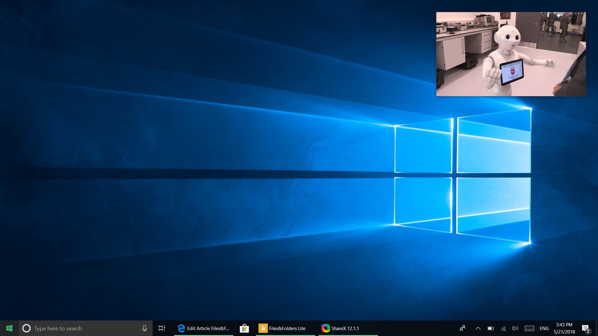
One of my favorite features of any app is a good compact overlay mode, and Files&Folders's allows you to play videos directly within the app using its built-in picture-in-picture mode. This new mode can be used in conjunction with the ability to have multiple instances of the app open at once so you can view a movie and move files around at the same time.
Files&Folders has also gained support for Google Drive and a couple of other cloud storage services. Previously you could only use OneDrive or Dropbox. You can now also extract files directly inside of the app.
Bringing Fluent Design
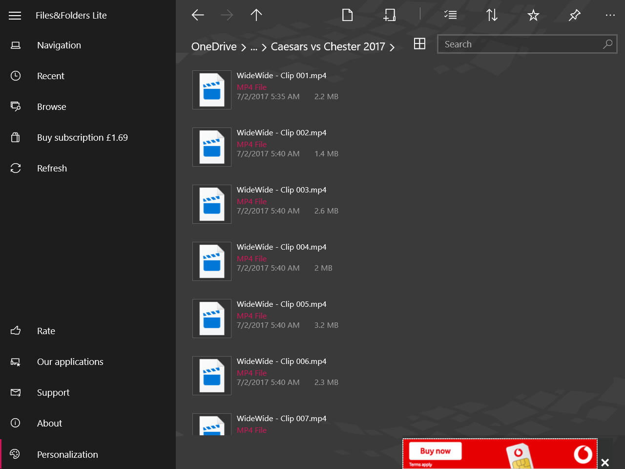
While the features added in the most recent update increase functionality, the change that's most obvious is the update to using Fluent Design. Files&Folders has a smooth acrylic effect that makes the app fit right in on the latest public build of Windows 10. The app has always been aimed at delivering a more attractive version of the built-in File Explorer on Windows 10 and with the addition of acrylic effects and the depth that they bring, there's now an even wider gap regarding appearances.
Over the next few weeks, I'll be focusing on apps that use Fluent Design and Files&Folders is an excellent example..
A step forward
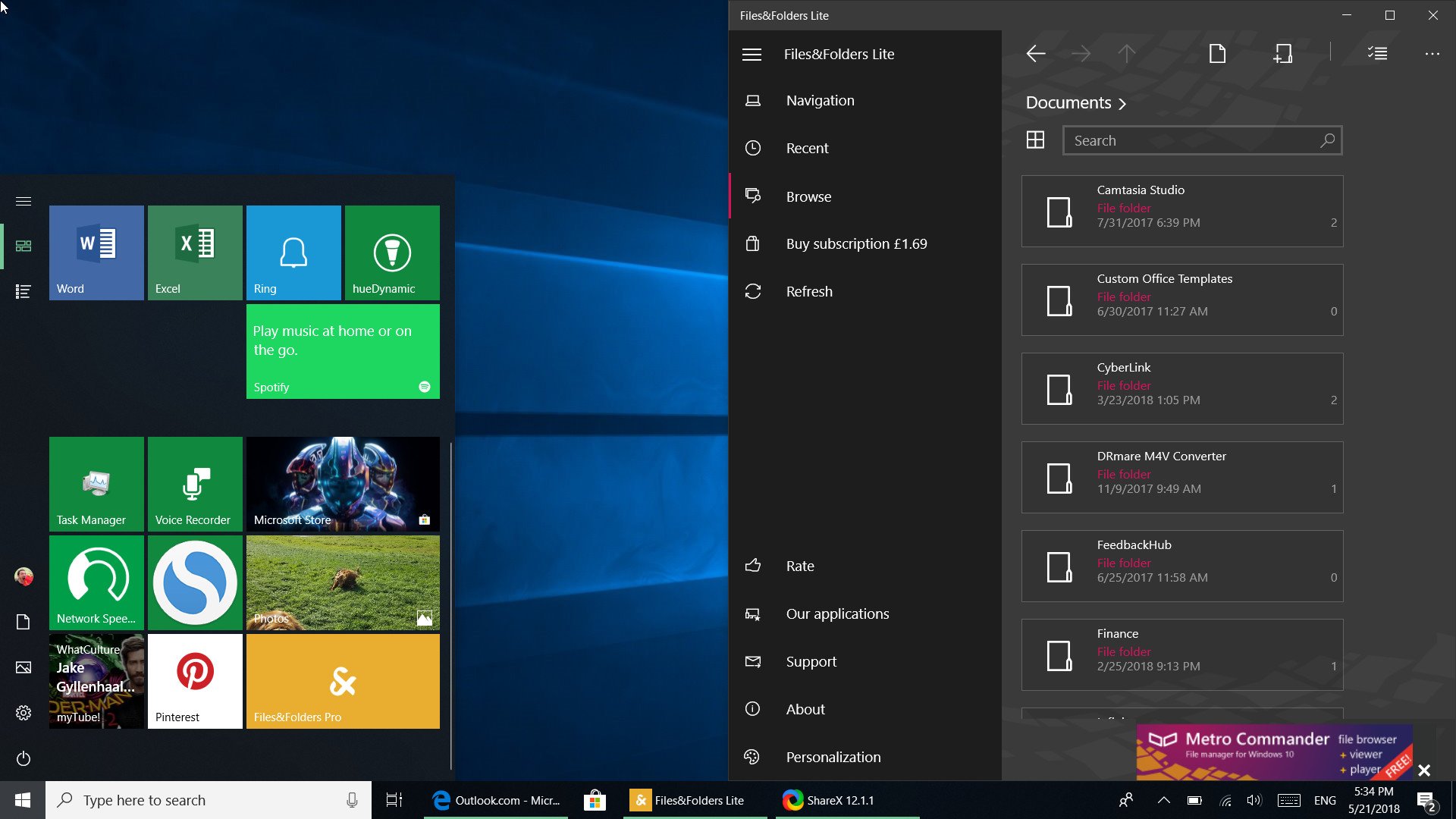
Files&Folders was more attractive than the default File Explorer before any updates, at least in my opinion. Bringing it in line with the Fluent Design language makes it a gorgeous app that will fit into the Windows 10 ecosystem even more as other apps and more parts of the operating system incorporate acrylic features.
One issue I ran into was that the pro version had a hard time starting and running on my PC. The free version worked perfectly so it's hard to know what the issue with the pro version was on my PC.
Where the app fell short before was in terms of functionality. It looked nice, but you needed to jump in and out of it to the default File Explorer to be productive. That persists to some extent but being able to open multiple instances of the app and other additions have lessened that fault and show that the app is trending in the right direction. Depending on how you use a file explorer, you could primarily use Files&Folders and enjoy its design without having to go back to the system default that often.
Pros
- Gorgeous design
- Can run multiple instances at once.
- Has built-in media player.
- Works with many cloud storage providers.
Cons
- Can't fully replace default File Explorer.
- Can be difficult to navigate.
- Pro version can have issues booting up.

Sean Endicott is a news writer and apps editor for Windows Central with 11+ years of experience. A Nottingham Trent journalism graduate, Sean has covered the industry’s arc from the Lumia era to the launch of Windows 11 and generative AI. Having started at Thrifter, he uses his expertise in price tracking to help readers find genuine hardware value.
Beyond tech news, Sean is a UK sports media pioneer. In 2017, he became one of the first to stream via smartphone and is an expert in AP Capture systems. A tech-forward coach, he was named 2024 BAFA Youth Coach of the Year. He is focused on using technology—from AI to Clipchamp—to gain a practical edge.
 Join The Club


