Starting today, Microsoft is beginning to roll out a brand new update for Windows 10, packing a whole new set of features and enhancements for users. Microsoft is calling this update the "Fall Creators Update," as a continuation of its efforts that started with the Creators Update earlier this year. Although its name implies this update is aimed at creatives; this update is actually for everyone, as it features new changes and enhancements that everyone will appreciate.
The Fall Creators Update is the fourth major update to Windows 10 since its original launch in July 2015 and is the final update scheduled for release in 2017. Microsoft likes to release two major updates to Windows per year, and that trend will continue into 2018 and beyond. For now, however, the Fall Creators Update is Microsoft's latest version of Windows 10, and this is our full review.
- Video Walkthrough
- Fluent Design System
- Start and Action Center
- My People
- Windows Mixed Reality
- OneDrive Files On-Demand
- Microsoft Edge
- Pen and input
- Cortana
- Story Remix
- Phone linking
- Other improvements
- Conclusion
Windows 10 Fall Creators Update Walkthrough
Reading not your thing? Not to worry, we've thrown together a 22-minute video walkthrough showcasing all the best and noteworthy new changes in the Fall Creators Update. Give it a watch!
Windows 10 Fluent Design System
Starting with the Fall Creators Update, Microsoft is introducing a brand new design language called "Fluent Design System." This is the design language that Microsoft will be bringing to all its products and services over the next few years, and it starts with the Fall Creators Update. Admittedly, the Fluent Design elements in this update are minor, meaning you likely won't notice them unless they're pointed out to you.
In this update, the two major new design elements to keep an eye out for are "Acrylic" elements and "Reveal" effects. These new design elements are sprinkled throughout the Fall Creators Update in such a way that the OS may feel a little more inconsistent when it comes to design. This will be rectified over time, of course, as more areas of the system get the Fluent Design treatment.
The Acrylic element is an updated blur/translucency effect found in apps and throughout the system. It's similar to the original Windows Vista and Windows 7 Aero effect, but more updated to 2017 standards and far more subtle. Reveal is a new highlight effect that you'll notice when moving your cursor over certain app menus and elements. We'll point out where these new effects are in use throughout our review.
There are other Fluent Design elements at play within the Fall Creators Update too, such as parallax effects and fluid animations. Parallax effects can be found in a few built-in apps, but fluid animations are a little rarer at this time.
Overall, the new Fluent Design System is an exciting and beautiful prospect that starts with the Fall Creators Update. Right now, however, the changes that Fluent Design brings are small and subtle, and slightly inconsistent when mixed with the older design languages. Microsoft says the implementation of Fluent Design in Windows is a journey and will be implemented in more areas over the next few updates.
Windows 10 Start menu and Action Center
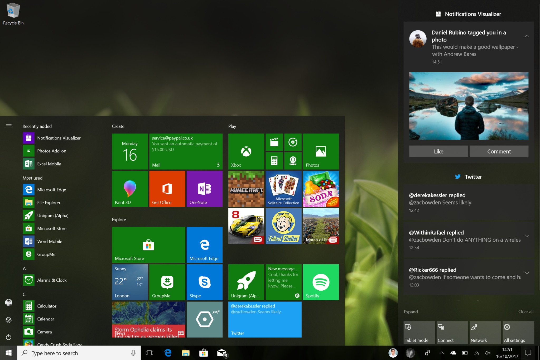
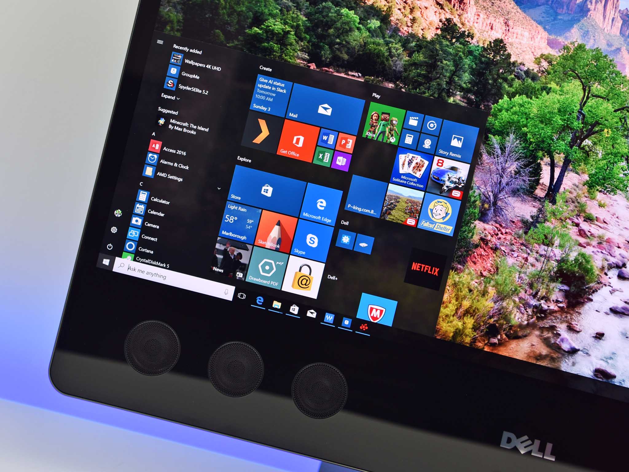
Continuing an apparent trend with new Windows 10 updates, Microsoft has done some more fiddling around with the Start menu and Action Center. With the Fall Creators Update, Microsoft has focused on smaller tweaks and changes over any major new features with the Start menu. This is appreciated, as I feel the Start menu as-is is already pretty feature filled, and a focus on smaller improvements is necessary at this point.
For example, the Start menu can now be resized diagonally, and the resize function itself has been improved with fewer frame drops. Resizing the Start menu horizontally will see the menu begin moving instantly instead of snapping to predefined widths. This makes for a far more smoother experience when resizing Start vertically, horizontally and now diagonally too.

Also new to the Start menu is the addition of the "Acrylic" blur effect. This is a change you likely won't notice unless compared side-by-side with the older Start menu, but the Start menu in the Fall Creators Update now has a slightly improved blur effect when transparency is enabled. Context menus in Start now have more icons too, a nice addition for those who notice that kind of thing.
The Action Center has seen more noteworthy changes with the Fall Creators Update, mainly being with its design and layout. Microsoft has changed how the Action Center displays notifications, putting new notifications into boxes that are grouped under app headers. This is supposed to provide a clearer view of all your notifications, but in reality, it means you see fewer notifications on screen at one time.
This is because the separation between headers and the notification boxes themselves are now larger. This, in theory, should allow for more text in a single notification, but it instead spreads out all the notifications and takes up more space within the Action Center. If you're someone who receives lots of notifications, you'll notice that less of them will be displayed on screen in the Action Center at one time. This likely won't be much of an issue for most, however.
Fluent Design elements can also be found in the Action Center too. Acrylic is present, as is the Reveal effect. Unfortunately, the Reveal effect is only present around the Quick Action buttons and doesn't appear to affect notification boxes themselves. This is just one example of the inconsistent design choices that are spread throughout the Fall Creators Update.
Notification popups have also received some design treatments. Acrylic is now present within notifications, and the notifications themselves are no longer attached to the bottom right of the display. Instead, they float just above the taskbar in the same location. I much prefer this design choice. Also, the X to dismiss notifications is now an arrow that points to the Action Center, which tells the user that you're putting the notification away instead of deleting it.
I like the improvements Microsoft has made to the Start menu. It's still missing some much-needed functions such as being able to select multiple tiles at once, but the improvements made to the Start menu in the Fall Creators Update are welcome. In regards to the Action Center, I don't mind the new design. Those with small screens may find it feels a little more cramped, but as someone who uses Windows on a big display, I like the spaced-out feel.
Windows 10 My People
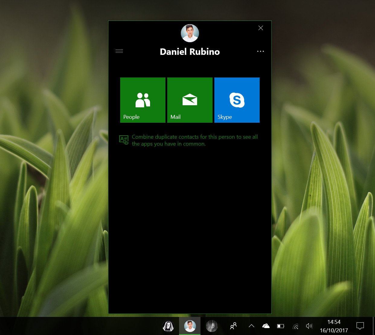
Starting with the Fall Creators Update, You can now pin up to three of your favorite or most frequently contacted contacts directly to your taskbar. There's also a new People Hub that gives you quick access to your contacts list and apps that take advantage of the new My People feature.
This feature is accessible directly from the People Hub button found just to the left of the system tray. You can drop files directly onto a contacts pinned icon to send it to them, which makes for sharing content much quicker than manually going through a file picker to send something. You can also send and receive "My People notifications," which as of right now only work with Skype.
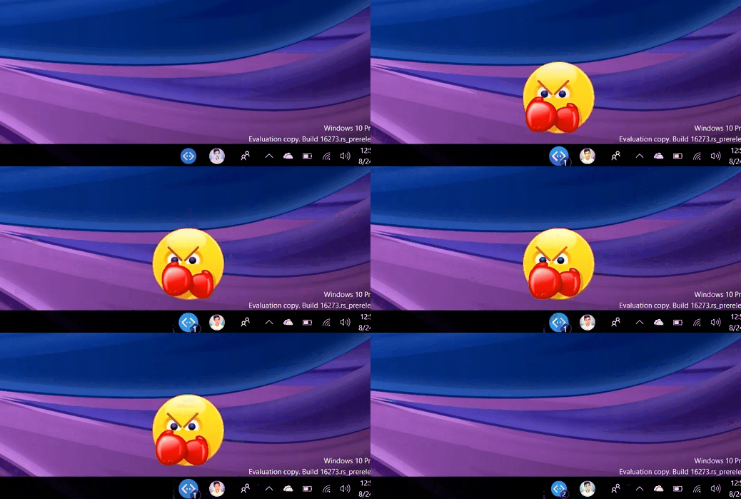
When using the Skype function in My People, you can send and receive animated emoji directly on your desktop. These emoji play a quick animation just above the taskbar and then disappear. Don't worry; you can turn this feature off. In fact, you can turn the entirety of the My People function off if it's something you're not going to use.
The appearance of the People Hub is pretty bad. It looks unfinished at best, even with some of the new Fluent Design elements in play. The People Hub features the Reveal effect in most of its menus, including the contacts list and apps list. It looks nice, and when you select a contact or app, gives you a quick circular-pulse animation.
The People Hub relies heavily on third-party app support if it's going to be useful, and as of right now there just aren't many apps that support it. Out of box, we have People, Mail, and Skype, and the only third-party app I've found with support is an app called Unigram.
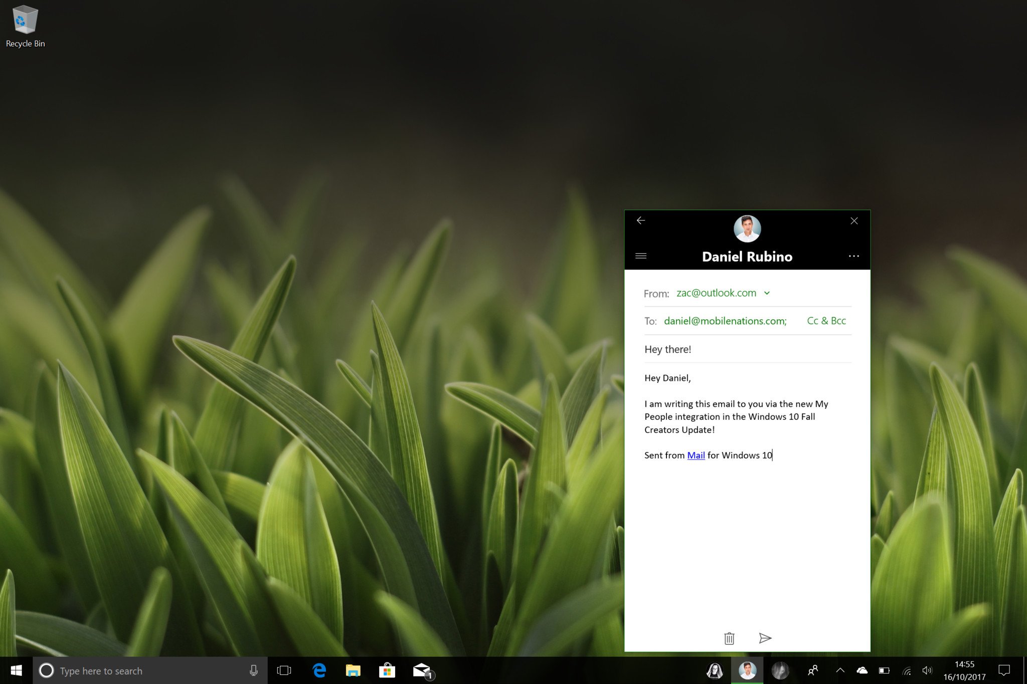
If you're someone who uses Skype or the Mail app a lot, then this feature will be somewhat useful to you. But if you don't, then you will likely find no real use for it, at least not yet. If app developers, and that's a big if, decide to start supporting My People, then I can see infinitely more use in this feature. For now, though, you'll likely forget about it.
One area where the people integration in Windows does make sense is the Share UI. You can now see your most contacted contacts in the Share UI, right above the selection of apps to share too. This gives you quick access to sending a contact a web page, image, document or something else directly from the Share function built into Windows 10 without needing to select the app, and then the contact.
Windows Mixed Reality
Microsoft is continuing its journey into the world of AR and VR in the Fall Creators Update with a new platform called "Windows Mixed Reality." This is Microsoft's version of SteamVR or Apple's ARKit. The difference between what Microsoft is doing and what the others are doing, however, revolves around what Windows Mixed Reality covers. Instead of being AR or VR, it's both. It's HoloLens, the company's new dedicated head-mounted displays, and it's through the cameras on your Windows 10 PC or tablet.
With the Fall Creators Update specifically, Microsoft is focusing more on the VR side of things. Starting with this release, you can now go out and buy dedicated VR headsets built for Windows Mixed Reality, connect it to a compatible PC and then run Windows 10 apps in VR. Some apps will be standard 2D apps, and others will be fully immersive 3D experiences. Microsoft and Steam are even working together to bring SteamVR titles to the Windows Mixed Reality platform, which is great news for gamers.
Mixed Reality is easily this updates biggest new feature.
Windows Mixed Reality is an entirely new experience and way of using your PC. It gives you a fully immersive 3D environment where you can use your PC to watch movies and TV, play games, browse the web, and even be productive with dedicated Mixed Reality controllers or a keyboard and mouse. Of course, being able to type on a physical keyboard in VR will depend on how good you are at typing without looking at the keyboard.
If you don't have the money to get yourself a new Windows Mixed Reality headset, fear not; you too can experience the Windows Mixed Reality platform in a less immersive way. Microsoft is bundling an app called Mixed Reality Viewer, which uses your device's webcam and maps the environment, allowing you to place 3D objects in the real world through your camera.
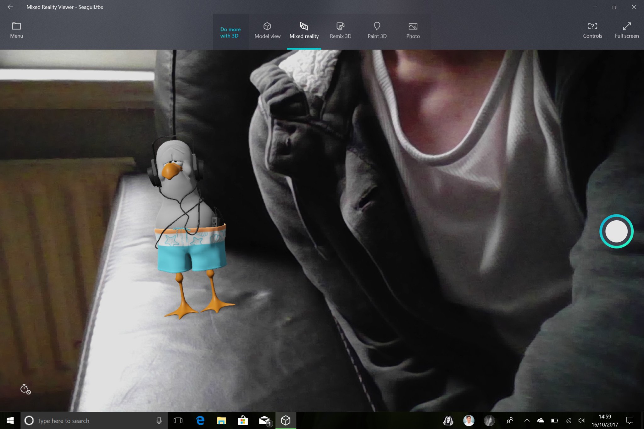
This is pretty much identical to Apple's ARKit platform on the iPhone, except built with Windows Mixed Reality in mind. You can create your own 3D models via the Paint 3D app, and place them into the real world. It's a neat feature, but as of right now it doesn't have much of a point. Once developers start utilizing the Mixed Reality platform, it will become a lot more useful.
You can even implement 3D models into other apps such as PowerPoint and Word, giving you the ability to spice up your documents or presentations with ease.
Microsoft thinks the future of computing is VR and AR, and that's incredibly exciting. The Windows Mixed Reality platform is a bold step into that future, and we're hoping Microsoft will continue venturing down this path in years to come. Microsoft says it envisions a future where head-mounted displays can do both VR and AR, which is the perfect blend of immersive experiences.
Windows 10 OneDrive Files On-Demand
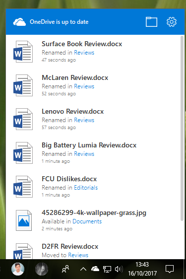
One of Windows 10's biggest criticisms was the removal of OneDrive's file placeholder features, which gave the user the ability to see their entire OneDrive library without actually having that library downloaded on their PC. However, with the Fall Creators Update, Microsoft has brought this functionality back under a new name: "On-Demand Sync."
Microsoft says it has reworked the entire syncing system with the Fall Creators Update, making On-Demand Sync easier and more straightforward to use. Now in the Fall Creators Update, if you set up OneDrive, the app won't immediately start downloading your entire OneDrive collection for offline use. Instead, it'll show all your files, whether they're local or in the cloud, without you needing to download anything.
If you need to open a file, you just double-click it like normal. That file will then quickly download and launch like you'd expect. Then, once you're done with the file, it'll resync to your OneDrive and remove itself from your local disk, freeing up the space it took up when you double clicked it. You can see which files are in the cloud and which are available offline with new OneDrive icons that show up next to files in File Explorer.
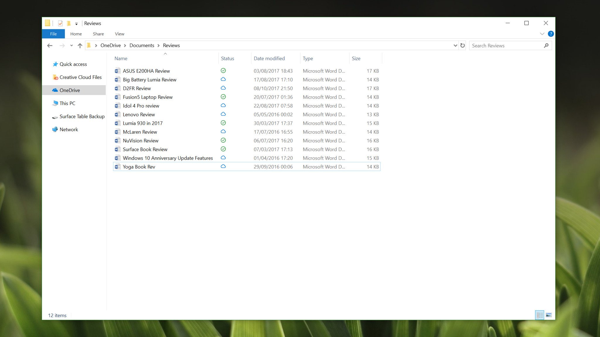
The cloud icon means that file is not on your hard drive, which means you cannot access that file when offline. You can double-click that file to download it and open it when connected to the internet, or right click and select "Always keep on this device" to permanently store it locally. You should do this with files you know you'll need to access when away from an internet connection.
On-Demand Sync is a feature that will be most useful on devices with a low storage capacity, or those who have multiple Windows 10 devices and want files to sync between them instantly. I'm very excited to see the return of OneDrive cloud-files in Windows 10, and I encourage everyone to try it out when you upgrade to the Fall Creators Update. OneDrive will prompt you to switch it on automatically.
Windows 10 Microsoft Edge
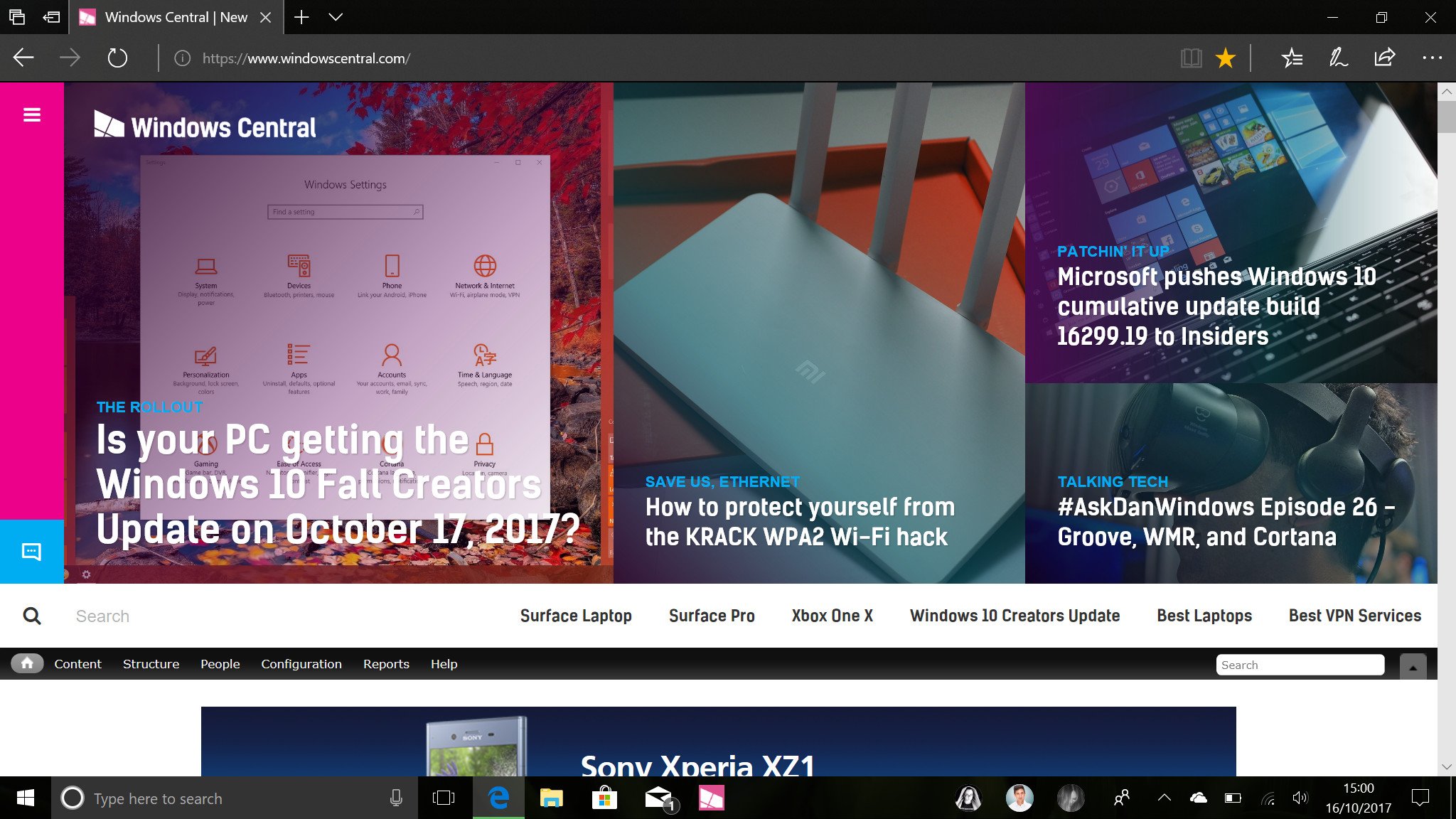
As with every new Windows 10 release, Microsoft Edge is now a bit better than it was before. I've been a Microsoft Edge user since Edge was first introduced in beta back in early 2015, and I can say first-hand that Edge has improved so much since it was first introduced back in 2015. Lots of people prefer Chrome, and I understand that, but I think Edge is now good enough for users to make the switch.
The favorites system has been overhauled, allowing you to see all of your favorites in a directory UI when adding a new one. You can organize bookmarks into folders, rename and update links all from the new bookmark UI, making for a far more seamless bookmarking experience. You can now also pin websites directly to the taskbar like you could with Internet Explorer 11 and Google Chrome. Clicking on a pinned website in the taskbar will open that website up in a standard Edge window.

Microsoft Edge with the Fall Creators Update is also now a much better PDF and eBook reader. Improving on its efforts that started with the Creators Update, you can now annotate and virtually ink directly onto PDFs and eBooks in the Fall Creators Update. This means you can now sign PDFs, highlight books that you're reading, add comments, virtual sticky notes and more. There's also a new virtual narrator feature called read-aloud that works in PDFs, eBooks, and even web pages.
A lot of the improvements made to Edge in the Fall Creators Update are under the hood, meaning most users likely won't notice those changes. For example, Edge now supports many new protocols and standards, including things such as WebVR. There's also a pretty healthy library of extensions too, with big ones such as Grammarly and 1Password now available.
Windows 10 Pen, touch and other input methods
With the Fall Creators Update, Microsoft has put a lot of effort into improving the many input methods people use when using a PC. Some of us prefer using a traditional keyboard and mouse; others prefer the more modern approach of touch and pen. No matter what input method you use, there are improvements for everyone in the Fall Creators Update.
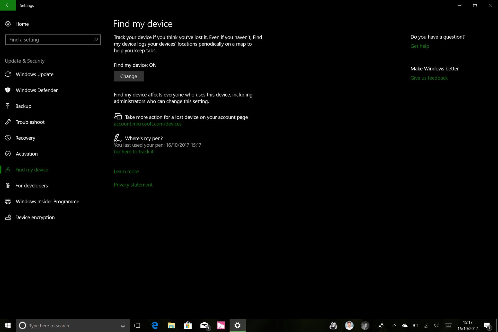
Let's start with pen and touch, which has seen some much-needed improvements with this release. There's a new "Find my pen" option in Settings that logs the last location you used your digital pen on your device. Using Bing maps and your Microsoft account, you can check online where your pen was last used, hopefully giving you a rough idea where your pen is if you've lost it.
If you're someone who is often presenting PowerPoints, you can now use your pen as a remote clicker to switch back and forth between slides when presenting on a stage or in a conference room as well, which is excellent for those who may not already have a dedicated clicker on hand.
Pen users can now also scroll web pages and lists within Windows without needing to grab the scrollbar first. In previous versions of Windows 10, scrolling with a pen was only possible with scrollbars as Windows itself treated a pen touching the screen as a click and hold. This has changed with the Fall Creators Update, as Windows now treats the pen making contact with the screen as a touch and drag instead, just like if you were using your finger on a touchscreen to scroll.
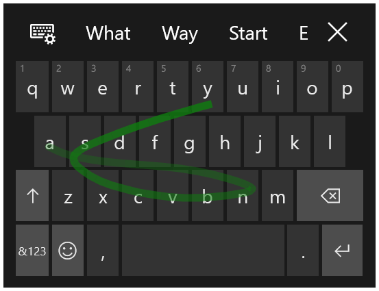
For those who use Windows with touch, there are improvements worthy of note here too. The biggest improvement for touch users is the introduction of Microsoft's "Shape Writing" keyboard on Windows 10 PCs and tablets. Users can now swipe between letters on the virtual keyboard and have that keyboard create words without you lifting a finger. It works just like SwiftKey on Android and iOS but updated for Windows 10.
If you're a keyboard and mouse user who also happens to love emoji, Microsoft has finally added a new emoji panel to Windows 10 that gives you quick and easy access to the entire emoji library on Windows 10. When in a text field, hitting the Windows key and period button (.) will pop up a dedicated panel where you can select emojis. There's even a search function for when you're looking for a specific emoji to insert into a sentence.
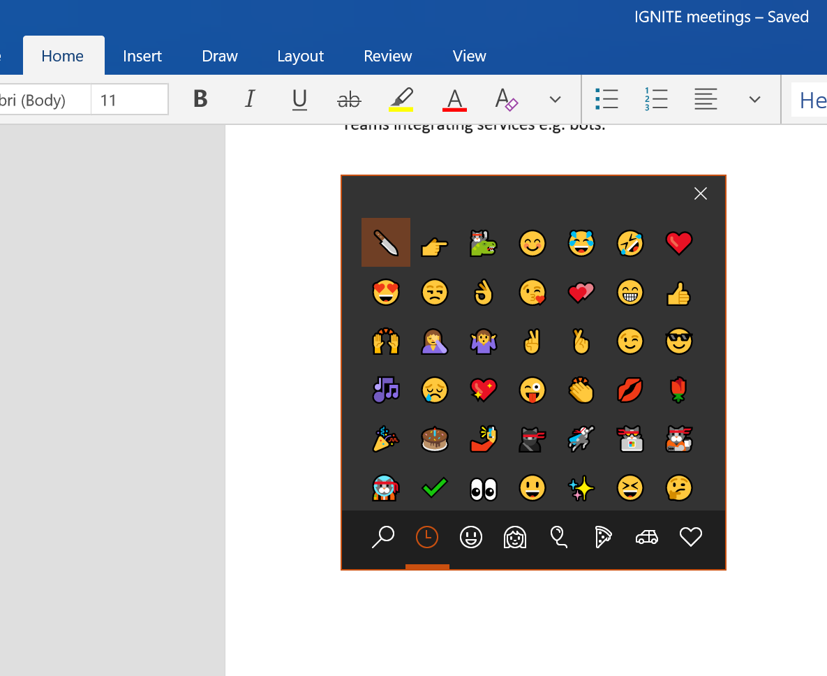
This is a small change, but one I'm certain will be appreciated once people learn to use it. macOS has had a feature similar to this for a while, and in a world where emoji use is on the rise; more and more people are going to find the inclusion of a dedicated emoji panel important. If you're not someone who cares for emojis, then don't worry, this panel won't ever show up unless you specifically insert the Windows key and period shortcut on your keyboard.
While Microsoft has been working hard to improve existing input methods in Windows, the Redmond-giant has also been working on adding native support for some new input methods too. Most notably, the Fall Creators Update features something called "Eye Control," which as of right now is an input method mainly for those who may be less capable of moving their hands or arms.
Eye Control in Windows 10 is truly fascinating. The feature requires dedicated hardware from Tobii, but once it's all setup you can control your PC with just your eyes. You can look around, select things on screen, and even type with a dedicated "eye keyboard" that also supports Shape Writing too. It's an incredible bit of tech that I'm sure ease-of-access users are going to appreciate.
Windows 10 Cortana
As with all Windows 10 updates, Cortana is now smarter and more capable in the Fall Creators Update. For example, Cortana can now intelligently suggest reminders for you when taking a photo of something. We've all taken a photo of a poster or document to remember specific dates, locations and times, and now Cortana will be able to add reminders to its notebook based on the photos you take.
If you're on a device without a camera, yet still want to save details from an image or web page, you can use your pen to circle the information you want, and Cortana will also be able to add that to its notebook too. These features are only going to be useful to you if you use Cortana reminders, and it's only available for users in the United States at this time.
The more interesting changes to Cortana are happening under the hood in the Fall Creators Update. Cortana Skills, a platform that allows developers to make apps and services that hook into Cortana is finally here, allowing you to control things such as Spotify or your internet connected lights via the Cortana app on your phone or PC.
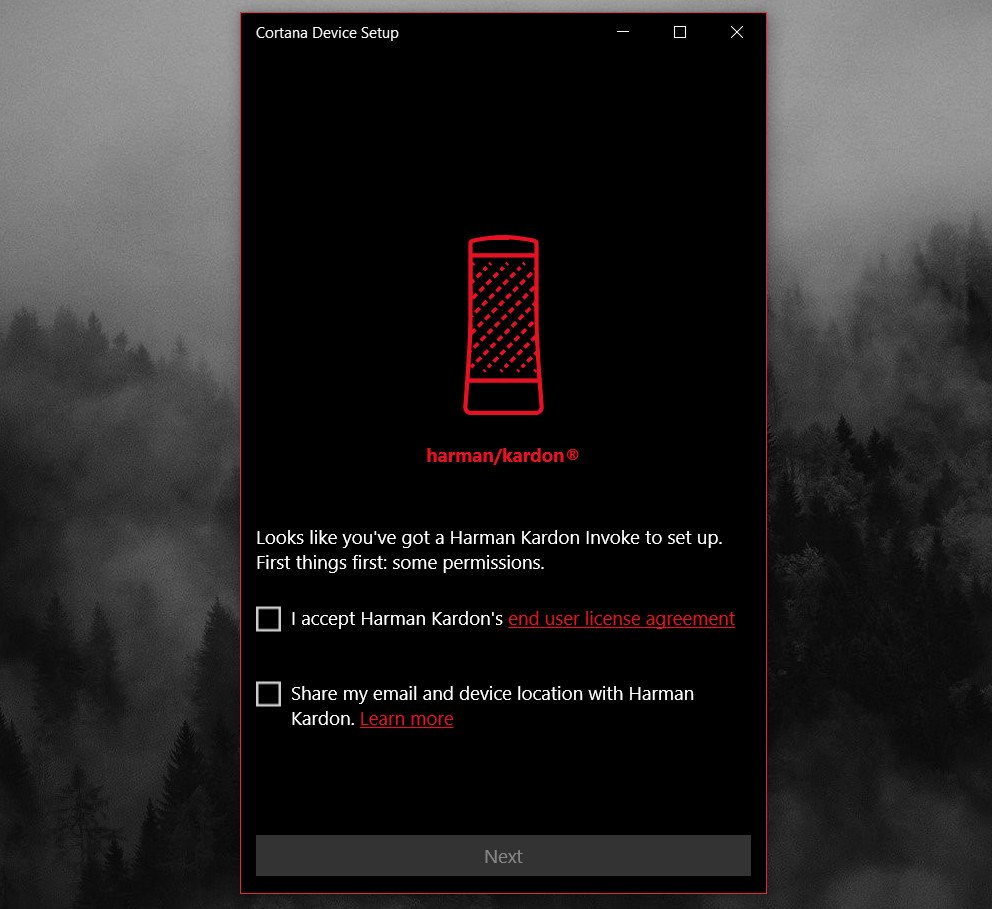
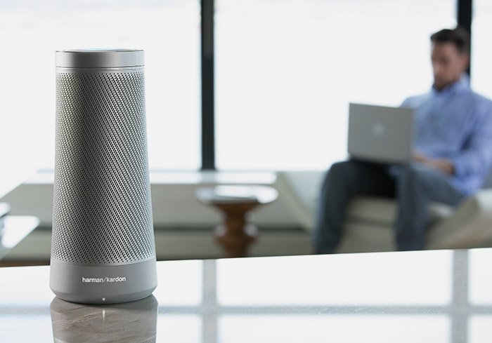
Cortana Skills tie in heavily with dedicated Cortana speakers, which will start becoming available in the coming weeks. In the United States, the Fall Creators Update supports dedicated Cortana speakers that you can setup from your PC and use around the house. Just like the Amazon Alexa or Google Home, Cortana now has a platform for always-on speakers too.
This is arguably the most exciting new addition to Cortana in the Fall Creators Update and one that I can't wait to get behind. Since this is going to be U.S.-only at first, I haven't had a chance to try this out just yet. Hopefully, it will begin rolling out in other countries over the next few months.
Windows 10 Story Remix
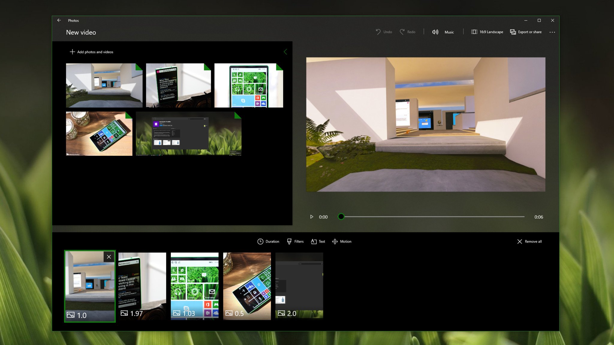
Story Remix is one of the reasons why this update is a continuation of the "Creators" moniker introduced earlier this year. Microsoft has built a brand new video editor directly into the Photos app; something Windows 10 has arguably needed for some time. This video editor is only really good for short videos and isn't something you're going to be replacing professional video editing software with.
And that's okay because that's not what Story Remix is supposed to be. Instead, Story Remix is for sharing family videos and collages with friends and relatives. It's called Story Remix because it allows you to remix a story, whether that be video clips or photos that you've taken, with music and effects that come bundled with the Fall Creators Update.
There are a few different options to choose from, including a fully automated mode that will throw your clips and photos together for you, time it with some music and render it all out in just a few clicks. Then there's the manual mode, which gives you full control over the video project you're creating. You can add text, music, video transitions and effects. It's a neat little video editor that I'm sure will get some use, but I have no real need for it.
Windows 10 phone linking
The Fall Creators Update is the first version of Windows 10 that embraces iOS and Android devices. There's now a dedicated "Phone" area in the Settings app that allows you to link your phone with your PC, making it easy to share web pages between your phone and Windows device without missing a beat. No longer do you have to email yourself a link or image when you want to switch devices, just link your phone to your PC and use the dedicated "Continue on PC" function.
On iOS, this is done with a dedicated "Continue on PC," Microsoft Edge (coming soon) and Cortana apps on your phone. With Android, you can use Microsoft's new dedicated Launcher, along with Cortana and Microsoft Edge too. If you're an iOS or Android user who uses Windows 10, then I highly recommend you link your phone to your PC.
Android users will get additional benefits too, including the ability to sync notifications from your phone directly to the Action Center on your PC, and new with the Fall Creators Update; decline calls directly from your desktop.
Phone linking will only improve with newer Windows 10 updates over time. With the Fall Creators Update, Microsoft is just getting started with what it can do for the user when linking their phone to their Windows device.
Windows 10 other improvements
As with all updates, the Fall Creators Update comes with a bunch of smaller and uncategorizable improvements under the hood and on the surface. There are plenty of new security improvements for consumers and enterprises, with Windows Device Application Guard, Exploit Protection and more. Windows 10 is now safer from threats such as WannaCry, which is excellent. You can now also recover your Microsoft account directly from the lock screen, too.
Microsoft has also made several improvements to how Windows Update behaves. For example, no longer will Windows Update use all of your bandwidth when downloading updates by default. Instead, it'll dynamically adjust the amount of bandwidth it uses depending on how much bandwidth you need to do what you're doing.
This is helpful to those who have slow or limited internet connections. If you're trying to watch a YouTube video or play an online game and Windows has updates to download, Windows Update will respect that you're currently using the internet and will take up less bandwidth. You can configure this manually too, giving Windows Update a fixed percentage of bandwidth no matter what you're doing.
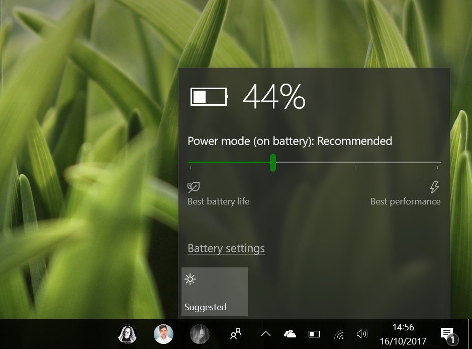
Other improvements include better performance, new video playback settings, and battery life enhancements. Devices with a battery can now click on the battery icon and find a new performance slider that favors battery life or PC performance. Sliding all the way to the left will favor battery, whereas sliding all the way to the right will favor performance at the expense of battery life.
A lot of built-in apps have been updated with the Fall Creators Update too. There's plenty of new Fluent Designs featured throughout all the apps, most notably Photos, the Microsoft Store, Calculator, and plenty more.
Windows 10 closing thoughts
The Fall Creators Update isn't what I would call a major update for most people; it's a minor one, with plenty of smaller improvements and tweaks that make for a well-rounded release. I will always recommend updating to the latest version of Windows 10 no matter what it includes, for security if anything else.
However, this update doesn't really include much in regards to "major" new features unless you're interested in Windows Mixed Reality, and that's a real shame. This is the nature of Windows as a Service, and it's something enthusiasts are going to have to get used to. For the most part, normal consumers actually prefer it when an update doesn't really add or change much, because people don't like change.
While not a major update, the Fall Creators Update brings some nice improvements to the table.
So yes, the Fall Creators Update is a good, albeit smaller update. That's fine for most, but for those who follow Microsoft and Windows closely, this update won't have the same level of significance as previous updates such as the Creators Update or Anniversary Update did.
Windows Mixed Reality is my favorite and most exciting part of the Fall Creators Update. I'd argue it's the biggest new part of Windows since Windows 10 began. Problem is, it's just getting started, and not many people know about it yet. So whether or not it'll be successful or used remains to be seen.
The Windows 10 Fall Creators Update is rolling out in waves starting today for free. If your Windows 10 device isn't seeing the update yet, don't worry. This can take several months to reach you, as Microsoft likes to make sure the update won't cause any issues for your device. If you don't have the update yet, there's likely good reason for it.
Pros:
- Nice tweaks to Start menu.
- My People has potential.
- Microsoft Edge is ready for prime-time.
- Mixed Reality!
- Ease of access improvements!
Cons:
- Still missing obvious options and functions.
- Inconsistent design language used throughout.
- Somewhat buggy at launch.
- Not as major as previous updates.
More Resources
- Windows 10 Support Forums at Windows Central
- Windows 10 Fall Creators Update News
- Windows 10 Tips, Tricks, and How-tos

