Xbox One dashboard UI evolution, from 2013 to today
The Xbox One has changed many, many times over the years, gradually improving over time. We thought we'd take a look back all the way to 2013 and see what got us here.
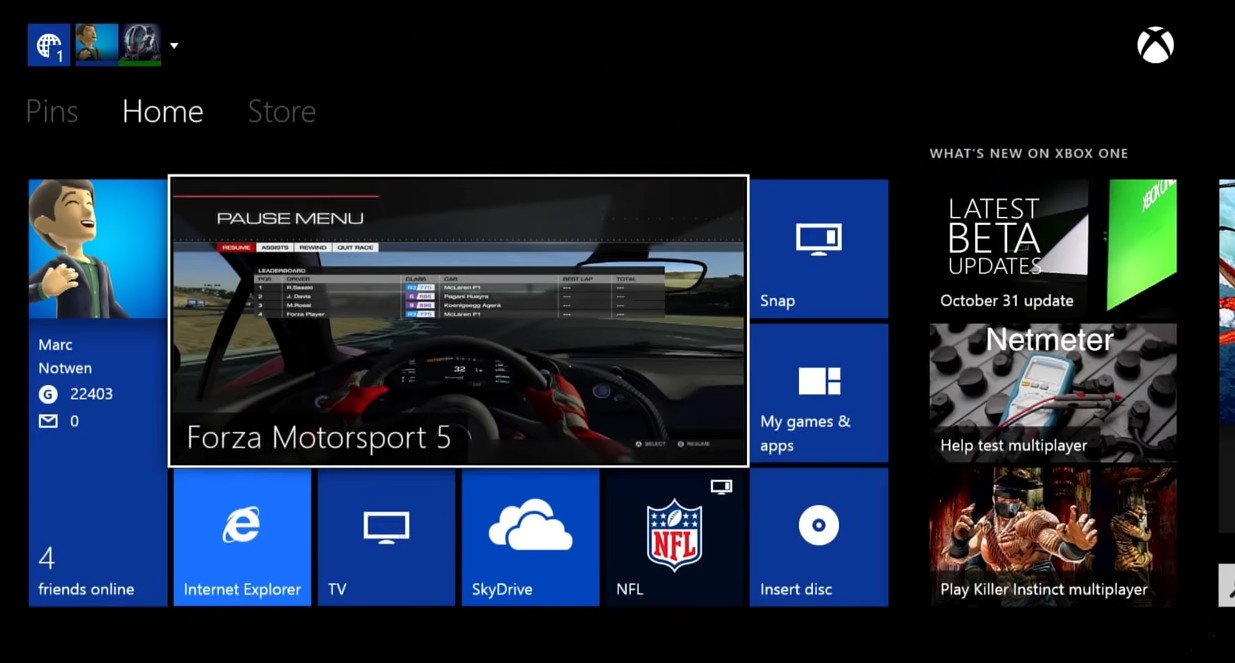
Microsoft demonstrates the original Xbox One dashboard.
The Xbox dashboard has evolved multiple times over the past years, since its launch in 2013. We've been given new features, had features taken away, and gradually seen speed creep up over time.
The latest February 2020 dashboard update brings another revamp to the system, further cleaning up the UI while improving speed. It feels a little more iterative than previous updates, meaning that Microsoft might finally be happy with the format they've landed on. They sure do love changing things, though, as our retrospective can attest.
Let's take a trip back in time and see how we got here.
2013: The OG dashboard
The original Xbox dashboard was shipped with the console back in 2013. It came complete with an array of unique features that, sadly, eventually got stripped out over time. Microsoft placed a big emphasis on entertainment features back then, with a game-app side-by-side feature called Snap mode, similar to what we had on Windows 8. Back then, it was possible to watch TV through the HDMI-in port on your Xbox One, while playing a game at the same time.
Over the next two years, the dashboard evolved a little more, gaining some additional requested features like wallpaper theming, transparent tiles, and so on. But it leaped ahead quite a bit in 2015 with the addition of Windows 10.
2015: New Xbox One Experience
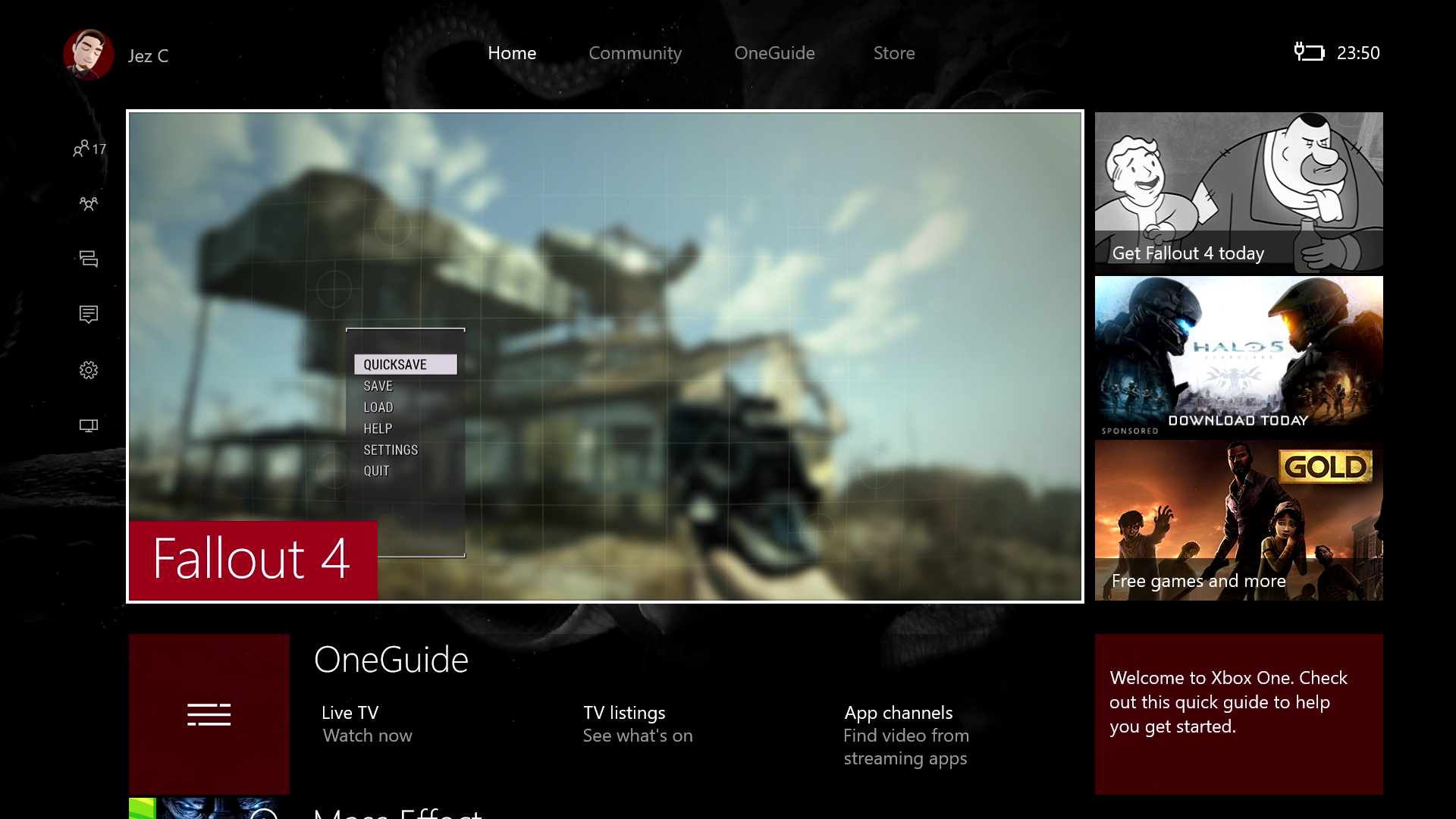
2015 saw the "New Xbox One Experience" update hit the console, which added elements of Windows 10 on top of the Windows 8-based OS, eventually leading to the inclusion of Cortana voice assistance and UWP-based apps.
Get the Windows Central Newsletter
All the latest news, reviews, and guides for Windows and Xbox diehards.
This update also added the new Guide menu, adding quick access to various features and settings without having to minimize your game. It made it easier to navigate the console's features without using Kinect voice commands, such as creating clips or screenshots. This new design, in general, was all about making it easier to use without Kinect navigation, essentially, since the peripheral had become unbundled.
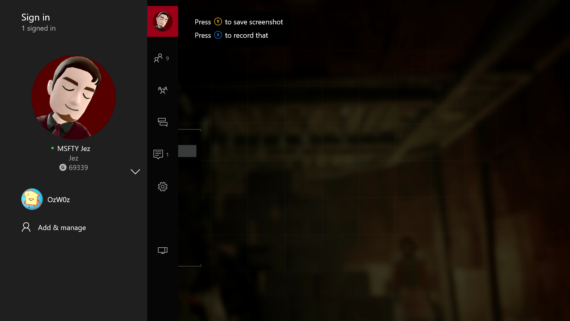
Microsoft shrank the Windows 8-style headers and put them further up. You could still navigate left and right to other sections of the dash at this point, but this marked the first significant shift away from the old "Metro"-style design language.
During the next two years, Microsoft refined and updated the "New Xbox One Experience" dashboard, adding various features such as the new Upload Studio for editing clips and videos, Xbox Clubs for creating social hubs, Xbox Arena, and Xbox Looking for Group.
Sadly, a lot of these promising features have been neglected to various degrees. Upload Studio hasn't received a meaningful update in literal years, and neither has Xbox Clubs. Xbox Arena, previously designed to be an easy-to-set-up tournament system for games, was really only pushed in Killer Instinct. Looking for Group lives on thankfully on console and on PC in the Xbox Game Bar.
2017: Creators Update
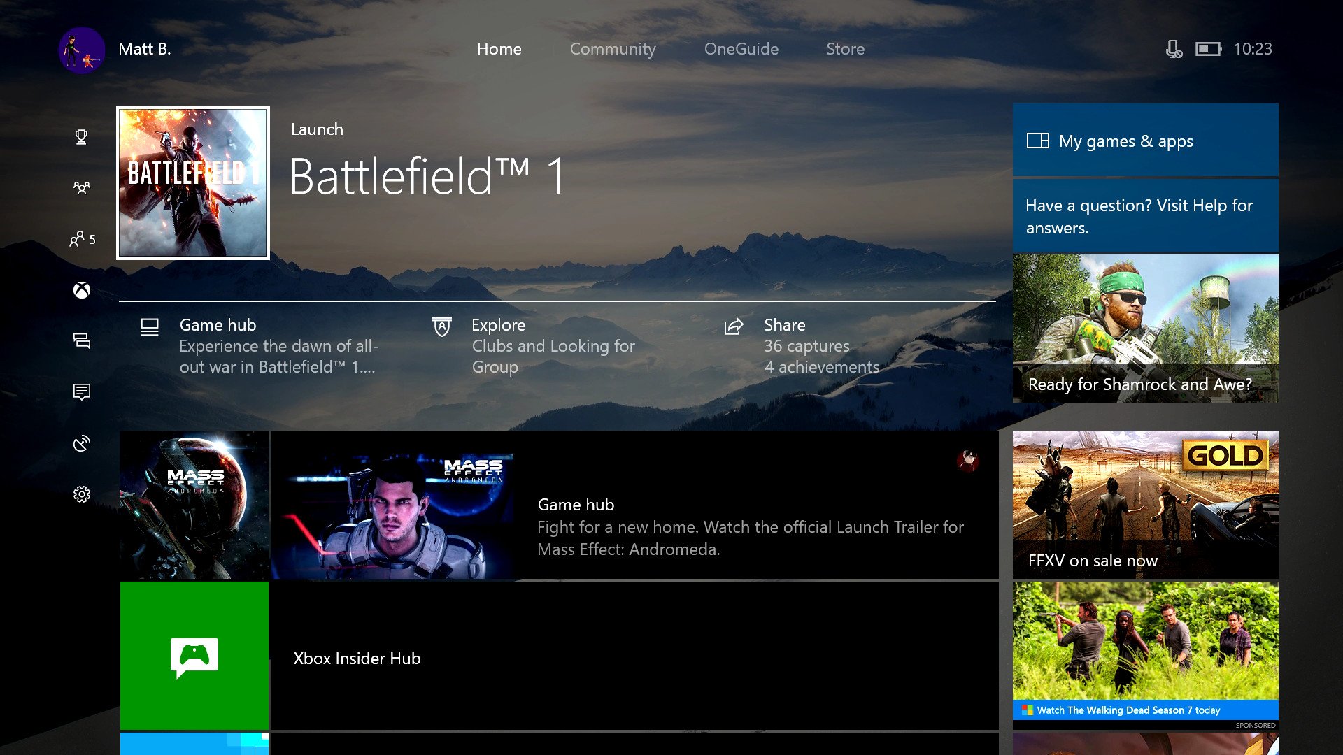
Microsoft revised and adapted this design throughout the next couple of years, adding early elements of Microsoft's Fluent Design System from Windows 10. This update also finally killed off Snap mode owing to low usage, freeing up more system resources for other things. Microsoft's platform lead of the day Mike Ybarra confirmed as much in this previous tweet.
We replaced Snap to improve multitasking, reduce memory use, improve overall speed, and free up resources going forward for bigger things.We replaced Snap to improve multitasking, reduce memory use, improve overall speed, and free up resources going forward for bigger things.— Mike Ybarra (@Qwik) January 24, 2017January 24, 2017
This update added Dolby Atmos and Windows Sonic support for more dynamic surround sound options and added a range of refinements to the Guide menu, which some had called confusing. This update also included Beam.pro, Microsoft's newly-acquired streaming service, now called Mixer. Microsoft also added a feature called co-pilot, allowing you to split controls of a single game across two controllers, which proved invaluable for accessibility.
2017: Another Creators Update
Source: Windows Central
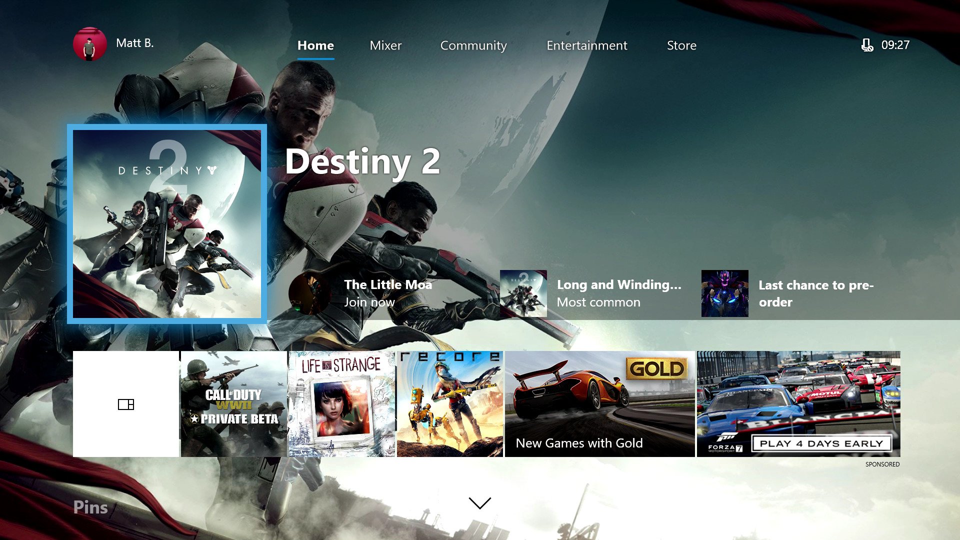
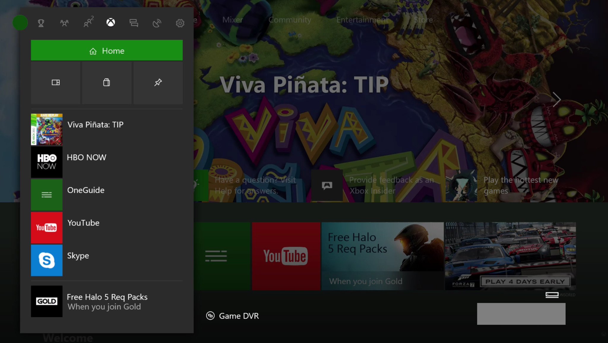
The first Creators Update design didn't stick around for very long. Microsoft revamped it again in the second half of 2017, incorporating even more Fluent Design System features, adding acrylic blurring effects to certain UI elements.
The "Fall Creators Update" also added some modularity to the home screen, which persists to this day. You can remove and customize the blocks that appear beneath the home screen, in addition to the main "twists" that you could navigate to the left and right. In this update, Microsoft also revamped the Guide to be on a horizontal axis, making it more reminiscent of the classic blades UI of yesteryear.
2018 to early 2020
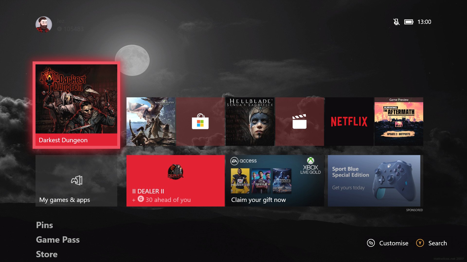
Here we have the 2020 February Update, which effectively pulls together and refines everything Microsoft improved over the past few years. Cortana was removed in 2019, again owing to low usage, while Amazon Alexa and Google Assistant support came in instead.
We got some nifty features like Discord integration for showing what games you're currently playing, and clip trimming straight in the Guide, as well as direct video sharing to social networks.
Microsoft removed the "twists," replacing them with an entirely vertical interface on the home dashboard, with fully customizable blocks. Microsoft also rearranged the Games & Apps section to promote speed, the lack of which has been a consistent source of criticism for the platform.
Late 2020: Fluent redesign
Microsoft has now totally revamped the Xbox dashboard style using rounded borders, new fonts, and other Fluent Design System elements to bring the operating system in-line with the new apps on PC. Additionally, Microsoft fully revamped the Xbox Store on a new codebase, making it all faster than ever.
What comes next?
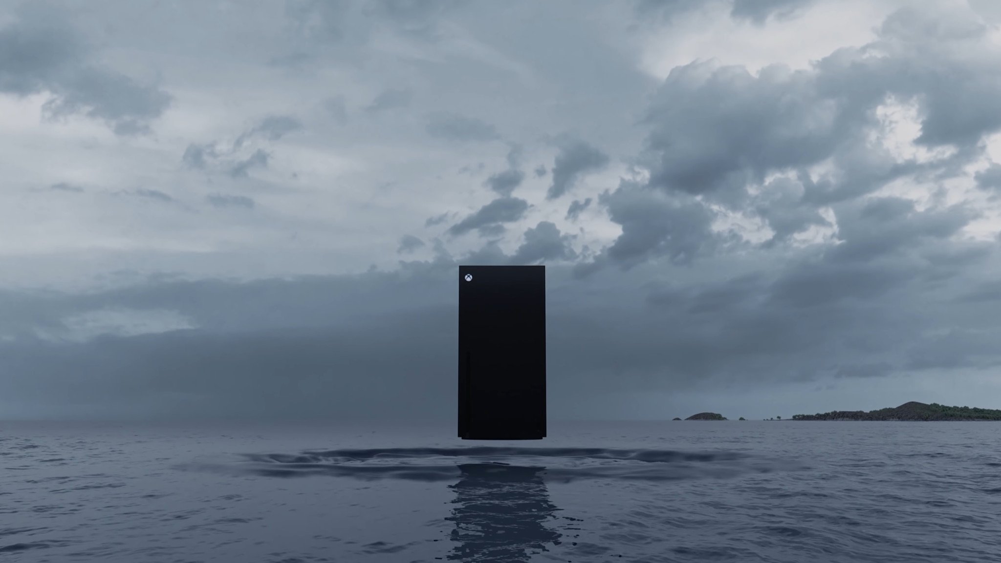
Typically people expect new consoles to have a refreshed dashboard experience, and that may well be the case for the Xbox Series X, which we've heard may contain updated visual flair over the Xbox One version of the Fluent redesign.
Microsoft may have maxed out what it can do with the base Xbox One consoles, but the beefier specs and the speedy SSD on the Xbox Series X could lead to dashboard innovations and features that simply aren't possible on the past-gen consoles. We'll have to wait and see.
Either way, the dashboard is arguably in the best state it has ever been right now, even if it took us quite a long time to get here.
What do you think about the Xbox dashboard? What would you change? What features do you miss? Let us know, down below.
Xbox
Main

Jez Corden is the Executive Editor at Windows Central, focusing primarily on all things Xbox and gaming. Jez is known for breaking exclusive news and analysis as relates to the Microsoft ecosystem while being powered by tea. Follow on Twitter (X) and Threads, and listen to his XB2 Podcast, all about, you guessed it, Xbox!
