Evernote revamps its Windows desktop app with improved UI, smarter search and more

All the latest news, reviews, and guides for Windows and Xbox diehards.
You are now subscribed
Your newsletter sign-up was successful
Join the club
Get full access to premium articles, exclusive features and a growing list of member rewards.
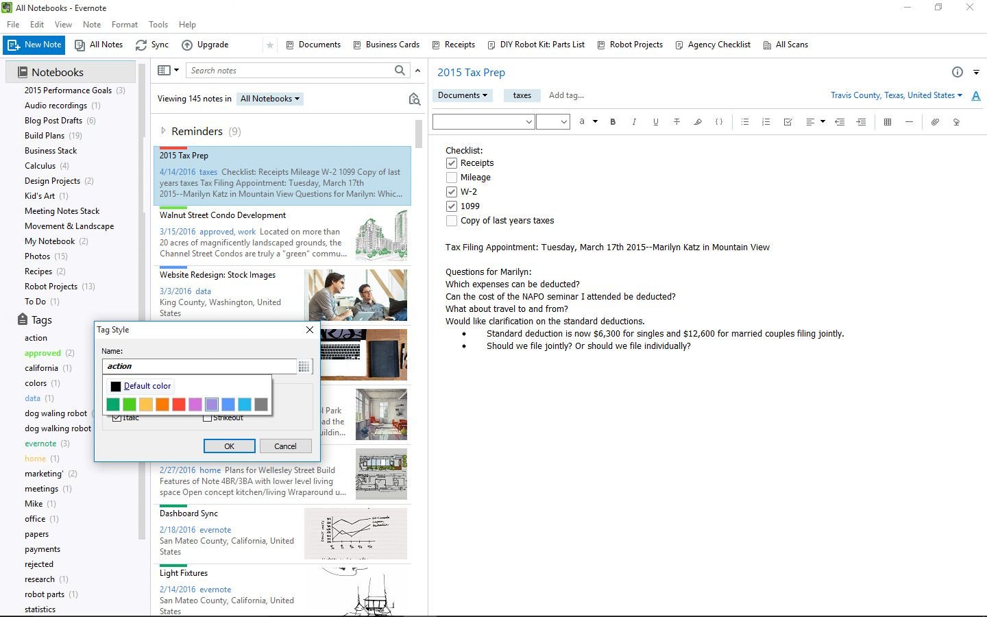
Note-taking app company Evernote is launching an all-new version of its Windows desktop app. The app, which is a major rival for Microsoft's OneNote, includes some new user interface improvements, better search features and more.
In a blog post, Evernote says the new Windows app includes a revamped left sidebar in the UI with some new features:
- Select 'Notebooks' to pull up all your notes in the Note List. Expand the 'Notebooks' section to reveal all the notebook stacks and notebooks not organized into a stack.
- Drag and drop a notebook into or out of a stack to move it to a different location.
- 'Trash' now sits permanently as its own section, permitting easier access to deleted notes.
The sidebar can also be reduced down to an even thinner navigation strip in the app. Also, Personal and Business Evernote accounts can be accessed on two tabs on top of the sidebar. The blog noted some of the improvements for searching in the app:
Article continues belowYou'll notice that the search bar sits at a new, more natural place on top of the Note List, closer to your results. Now when you perform a search, Evernote will suggest narrowing down to specific notebooks and introduce parameters to refine or broaden the breadth of your search. Evernote will also scavenge through 'Trash' for relevant notes that might have been accidentally deleted.
New color options are now available to label important notebooks and tags in the Evernote app.
Download Evernote for Windows desktop{.cta .large}
All the latest news, reviews, and guides for Windows and Xbox diehards.

John Callaham was a former contributor for Windows Central, covering Windows Phone, Surface, gaming, and more.
 Join The Club


