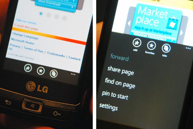
Even more subtle UI changes found in newer WP7 build

Looks like Microsoft is still tweaking their UI quite a bit with the latest changes continuing to be seen at TechEd 2010.
Now these aren't huge changes, but it does show Microsoft is paying attention to detail, which is something that will be important if the masses are to adopt this phone.
Long Zheng noticed how the old icons in the common application bar had no text to identify them, making it a bit harder for the user to adapt to them since they could be changed by developer willy-nilly. Now, however, when you expand the bar by swiping up, it reveals more details including the icon names.
Once again, nothing huge, just nice to know Microsoft is looking out for perfection this time around.
[via iStartedSomething]
Get the Windows Central Newsletter
All the latest news, reviews, and guides for Windows and Xbox diehards.

Daniel Rubino is the Editor-in-chief of Windows Central. He is also the head reviewer, podcast co-host, and analyst. He has been covering Microsoft since 2007 when this site was called WMExperts (and later Windows Phone Central). His interests include Windows, laptops, next-gen computing, and wearable tech. He has reviewed laptops for over 10 years and is particularly fond of 2-in-1 convertibles, Arm64 processors, new form factors, and thin-and-light PCs. Before all this tech stuff, he worked on a Ph.D. in linguistics, performed polysomnographs in NYC, and was a motion-picture operator for 17 years.
