Elements of Fluent Design make their way to the Xbox (beta) Windows 10 app
The Fluent Design System is Microsoft's new design language, and it's slowly permeating across all of the company's products.

All the latest news, reviews, and guides for Windows and Xbox diehards.
You are now subscribed
Your newsletter sign-up was successful
Join the club
Get full access to premium articles, exclusive features and a growing list of member rewards.
Fluent Design adds elements of translucency and cursor responsiveness to interactive features across all of Microsoft's apps and services. The most prolific examples of Fluent Design can be found on the Windows 10 Fast Ring for insiders, where more and more system apps and features are picking up design updates.
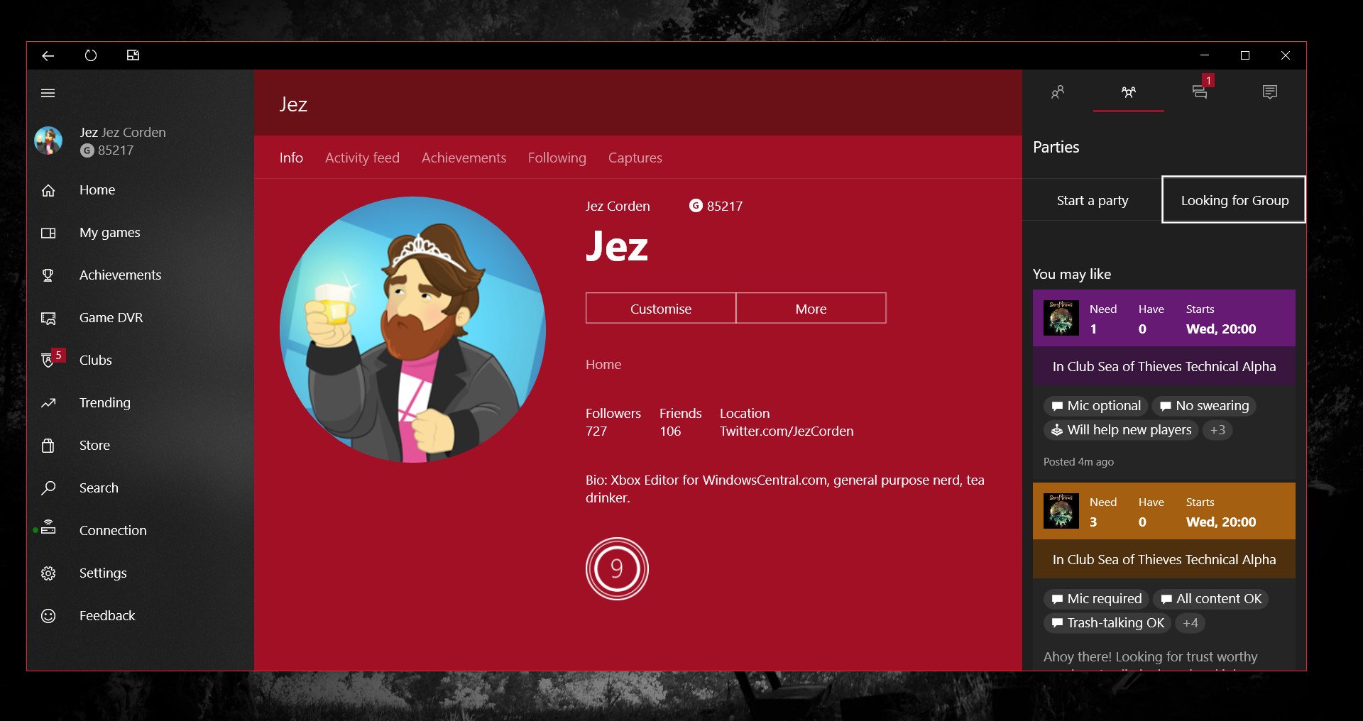
Microsoft previously showed some concepts of how the Xbox dashboard could look with Fluent Design. While we found out at E3 2017 that Microsoft isn't ready to talk about when (or if) the Xbox dashboard will pick up some Fluent visual tweaks, at least the Xbox (beta) app for Windows 10 is about to join the party.
The hamburger menu on the left side of the Xbox app now has a translucent effect, allowing you to see right through to whatever is behind the app. There's no mouse-over light feedback on the menu as seen in Microsoft Groove and certain other apps, but there's no reason to think it won't arrive in the future.
Article continues belowIt'll probably be months until all Microsoft apps are using the Fluent Design System fully, but at least for the time being, we'll have to put up with the random updates here and there. We'll keep you posted on other updates.
Download Xbox (Beta) from the Windows Store
All the latest news, reviews, and guides for Windows and Xbox diehards.

Jez Corden is the Executive Editor at Windows Central, focusing primarily on all things Xbox and gaming. Jez is known for breaking exclusive news and analysis as relates to the Microsoft ecosystem — while being powered by tea. Follow on X.com/JezCorden and tune in to the XB2 Podcast, all about, you guessed it, Xbox!
 Join The Club


