Does the Xbox Series X|S need a new dashboard OS?
A divisive discussion.

Recently, I noticed that every time an Xbox staff member tweets, regardless of the topic, a bunch of replies plead for Microsoft to provide a new dashboard, often without context. I was surprised in my Xbox surveys at the start of the year how many people were actually upset with the general dashboard design, with roughly a third of complaints revolving around specifics or general dissatisfaction. It should be noted that these surveys were in no way scientific, and also present a bias around Twitter itself, which tends to amplify certain topics and produce trends that may fly in contradiction to Microsoft's internal, more scientific polling.
Indeed, the Xbox Insider Program is designed for and around feedback on the dashboard. During the Xbox One generation, we saw the Xbox dashboard undergo several major revisions as it moved away from Kinect and Windows 8's "Metro" design language to something more closely resembling Windows 11's Fluent Design system. It's also somewhat notable that the Xbox Series X|S is the first "new generation" of Xbox console that didn't receive a unique design. It looks and functions identically to the Xbox One dashboard, save for dynamic themes and other under-the-hood features.
I once again turned to the community to ask what it was specifically that people dislike about the Xbox dashboard. For full transparency, I'm quite satisfied with it myself right now. I enjoy the consistency between my Windows 11 PC and Xbox console, and the new storefront on Xbox is excellent, being far faster and more usable than its predecessor. That said, there are some points raised on Twitter that I do agree with, and would hope that Microsoft addresses in some form.
Cleaner, with less "ads"

One of the main criticisms I see time and time again pertains to the perception of clutter and "ads" on the home screen right after you boot up your Xbox. I've put "ads" in quotations here because I suspect Microsoft views some of the content panels on the dashboard a little differently to average users.
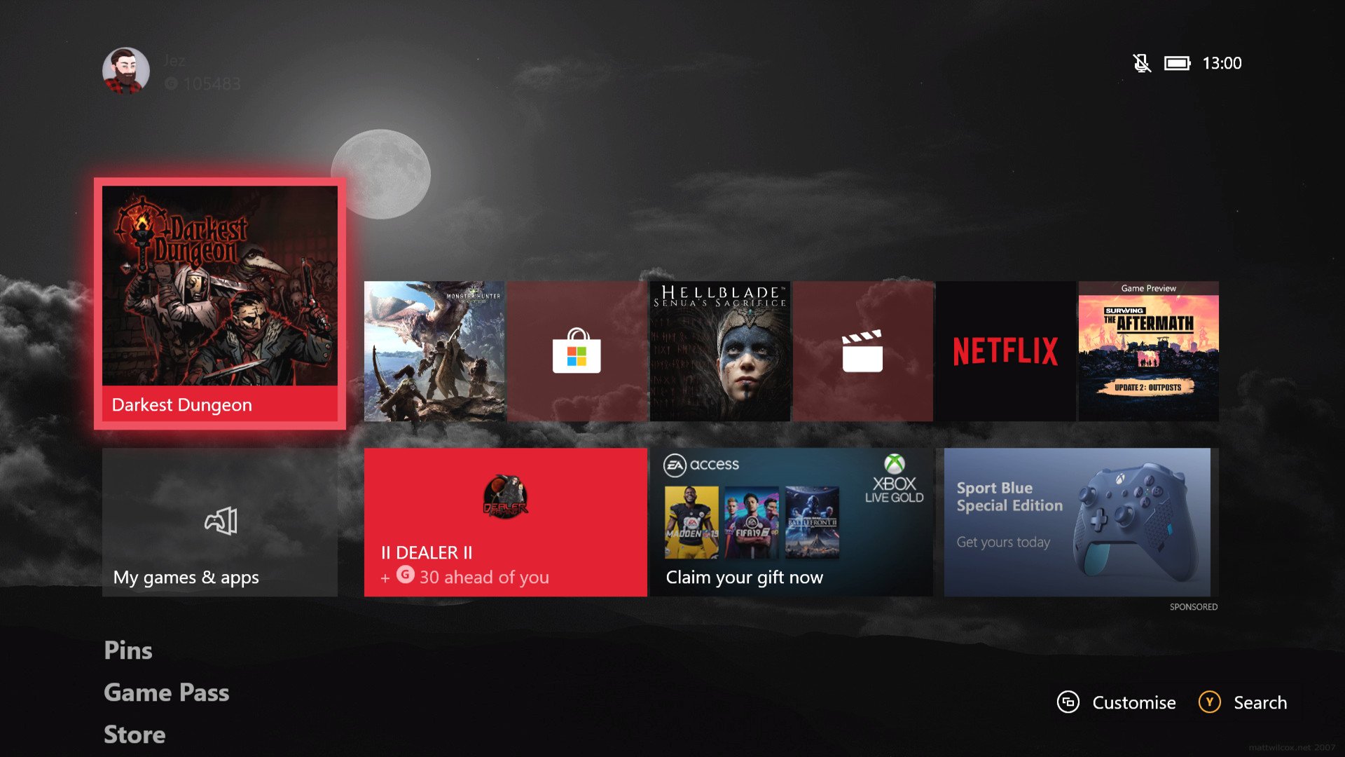
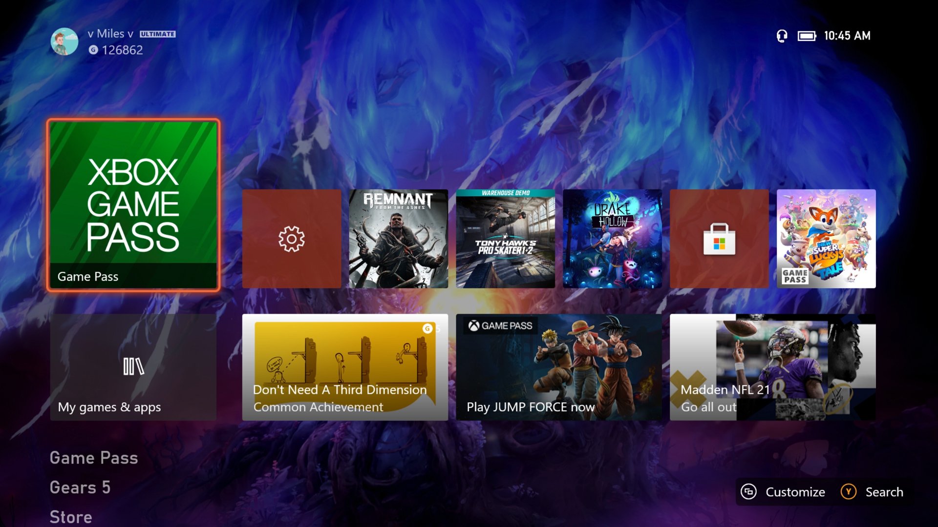
The dashboard is comprised of two rows of tiles. The top row is a list of most recently used apps and games, while the bottom row is comprised of a direct link to your Games and Apps folder, with three panels that contain "dynamic content." These content blocks are generated by AI and encourage you to engage with various Xbox features, whether it's store promotions, achievements, or friends that are logging in. The last panel on the bottom right is often reserved for actual ads, served by Bing.
I suspect complaints around this dashboard cluttering are amplified since Microsoft introduced dynamic themes to the Xbox Series X|S, which are gorgeously animated. Unfortunately, their impact is stunted because they're obscured behind the large unmovable tiles. Fan mock-ups envisage a more streamlined UI that gives more breathing space to the background while reducing the number of segments dedicated to "dynamic" content blocks.
Ads have long been a contentious topic on Xbox consoles, even in the Xbox 360 era. It's symptomatic partially of the business model that console gaming represents: You sell the hardware at cost and make money on the digital purchases. Ads on the dashboard present a relatively unintrusive method to generate additional revenue and subsidize the console itself. They're generally far less intrusive than on platforms like Instagram or Tiktok, which build up profiles on your habits and offer ads specifically tailored to encourage you to make a purchase. Xbox ads tend to be fixed with a very generalized target audience in mind.
Get the Windows Central Newsletter
All the latest news, reviews, and guides for Windows and Xbox diehards.
In the U.K., I often see ads for random campaigns being run by the government that don't even try to sell anything. Right now, I'm actually not seeing external ads at all in Germany, with the content blocks being focused on Xbox Game Pass benefits and a reminder that Tiny Tina's Wonderlands just launched. That said, they do take up an onerous portion of the dashboard, hiding away any dynamic themes or custom backgrounds you may have set.
Being realistic, I doubt Microsoft will eliminate ads on the dashboard entirely, given the extra revenue they generate. However, I suspect there must be some sort of compromise that reduces their command of the overall feel of the home screen. Many users requested more control over the home screen, with the ability to resize or move tiles, for example.
Performance and speed

Another topic that I saw frequently pertained to speed. Many users cited how slow the Xbox can be to pull down updates or navigate quickly between different sections of the dashboard.
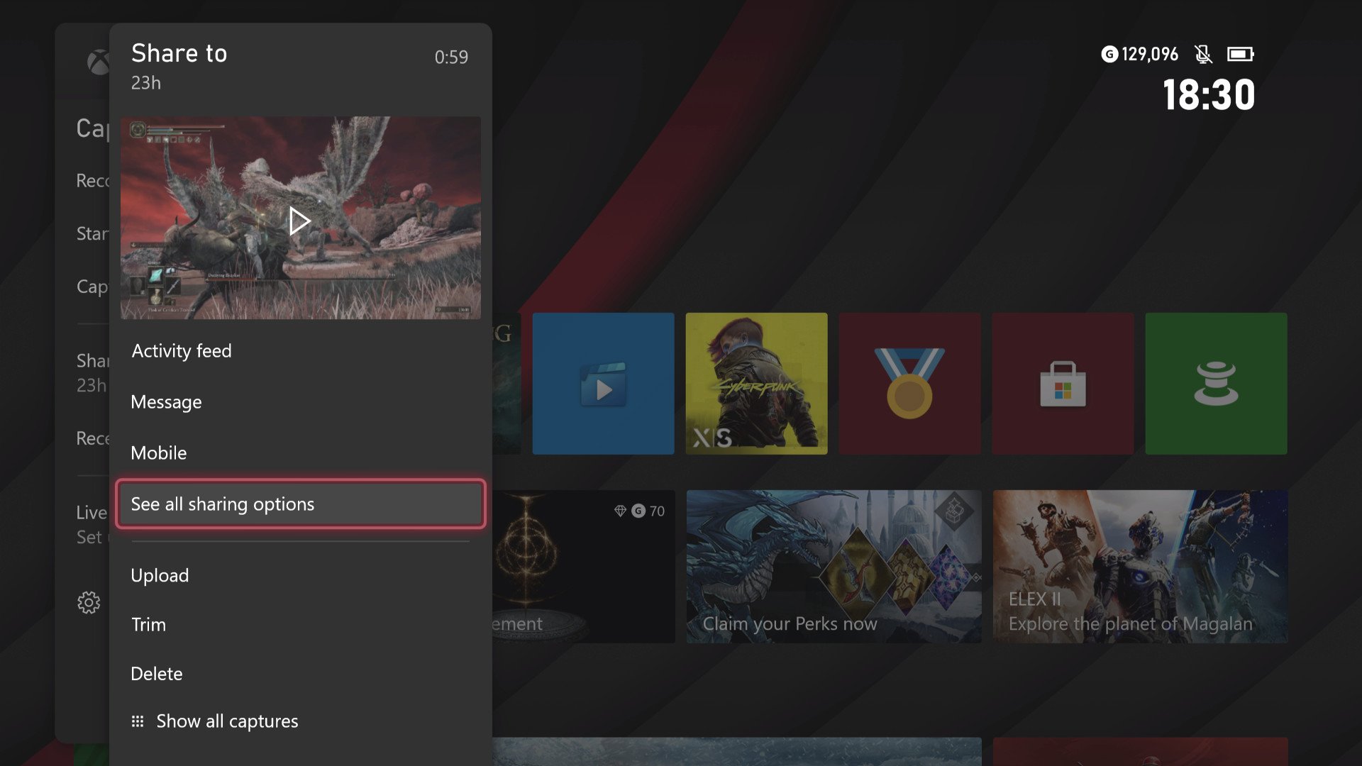
It seems true to some degree that the resource allocation for the OS holds it back. I recently tried to use Clipchamp on Microsoft Edge on the Xbox Series X, which is Microsoft's shiny new web-based video editing platform. Unfortunately, adding just a single short clip to the timeline caused the entire browser to crash since I maxed out its RAM availability. The Xbox Game DVR is another area of contention, given how painfully sluggish the Xbox is at handling the basics of clip editing and sharing. Microsoft removed the Upload Studio app entirely, removing deeper clip editing from the platform.
Hi Jez, i have no problems personally. But i have seen some concept designs that some people have made which caught my eye. Here's one. What do you think? pic.twitter.com/JWY0bsEDuuHi Jez, i have no problems personally. But i have seen some concept designs that some people have made which caught my eye. Here's one. What do you think? pic.twitter.com/JWY0bsEDuu— TheGentle0ne (@goatpodcast007) April 8, 2022April 8, 2022
Potentially, some OS performance constraints aren't things Microsoft can solve easily, given that the system resources are by and large reserved for games and gaming. A more pervasive revision of Xbox architecture may be needed in the future to improve some of these aspects of the console.
One thing users requested repeatedly on my Twitter thread was the option for an HDR-enabled dashboard. It's certainly irritating that whenever you switch from the dashboard to a game with HDR enabled, most TV sets flicker between HDR modes as a result of the Xbox dash missing out on the feature. If you're using a slower TV set, this mode switch can be pretty slow and annoying to deal with. Hopefully, this is at least one performance-related improvement Microsoft can implement a little more easily. In my experience talking to Xbox staff about these kinds of things, though, it sounds as if even things that seem relatively simple can in fact be quite complicated.
What is Microsoft working on right now?

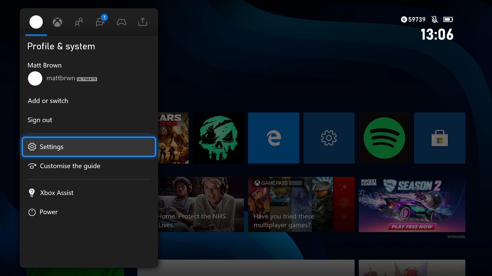
In previous interviews, Microsoft said that its priorities for 2022 included improving the Xbox Game DVR, while noting that it's heard calls to improve and overhaul the Xbox achievement system, which has fallen behind PlayStation in modernization. Microsoft has made a range of small improvements over the past few months, including customization for the share button, improvements to Quick Resume, 4K dashboard, and improvements to store localization and accessibility information.
For as many people that were calling for a full overhaul of the dashboard, just as many were calling for Microsoft to leave it as is. It was quite intense how many revisions the Xbox One generation dashboard went through during its tenure, and I would argue that what we have now is a lot more streamlined and focused, although it has come at the cost of losing TV features, snap mode, and other similar things.
That would be a great dashboard. Source:@klobrille pic.twitter.com/XmQbgZxsqWThat would be a great dashboard. Source:@klobrille pic.twitter.com/XmQbgZxsqW— x R I S C H I x (@XRischix) April 8, 2022April 8, 2022
I think that an entire dashboard revision isn't needed until the next generation at this point, but much like Windows 11 itself, it feels like this generation of Microsoft OS design is straying too far away from customization. People called on Microsoft to improve uniformity in Windows 11, and arguably it has achieved this. It has, however, come at the cost of customization in some ways. You can't move the Start Menu taskbar anymore, for example, and the new Start Menu has nowhere near as much customization as Windows 10 or Windows 8.1 did.
The same is true for the Xbox dashboard, but that has always been the case to some degree. I don't think it would hurt to give users a little more control over their experience, though. I opt in to the Android ecosystem for the control it affords me over the usability of my mobile devices. It would be nice to see a little of that design customization on Xbox (and Windows 11) as well.
What do you think? Hit the comments and let's talk.

Jez Corden is the Executive Editor at Windows Central, focusing primarily on all things Xbox and gaming. Jez is known for breaking exclusive news and analysis as relates to the Microsoft ecosystem while being powered by tea. Follow on Twitter (X) and Threads, and listen to his XB2 Podcast, all about, you guessed it, Xbox!
