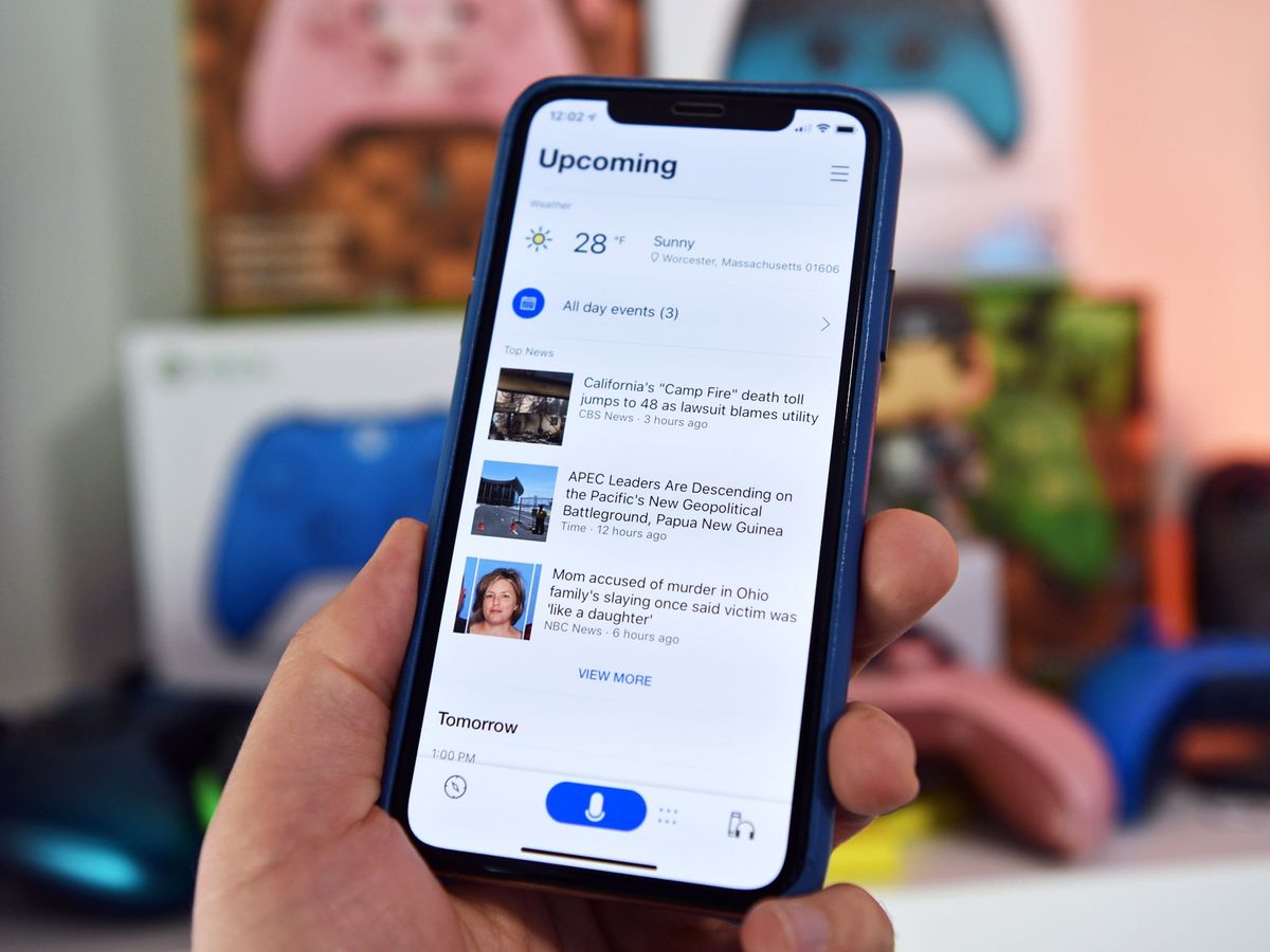
Cortana's big 3.0 update for iOS arrives with major UI overhaul
The new look focuses on creating a new "conversational experience" with Cortana.

Following around a month of beta testing, Cortana's big 3.0 update is now rolling out for iPhone. The update not only brings a new, refined look to the table but also adds a new place to manage Cortana devices and much more.
The biggest addition here is the overhauled UI, which Microsoft says has been created to focus on "conversational experiences" when interacting with Cortana. Gone is the bold-colored card-like interface seen in prior versions of Cortana. In its place is simplified look with quick access to news and weather, suggested tasks, and dedicated buttons for managing Cortana devices and interacting with the assistant.
Here's the full official look at what's new in Cortana 3.0 for iOS:
- A new conversational experience for answers
- A new place to manage and set up your Cortana devices
- Listen to music and podcasts on the go
- Stay on top of your tasks managing meetings, emails, reminders and To Do on the go
- Join your next Skype or Teams meeting by simply asking Cortana
If you're interested in checking out the revamped Cortana on iOS, the update to version 3.0 is available now at the App Store. Presumably, Android won't be far behind, as beta testing for version 3.0 kicked off at around the same time as it did for iOS last month.
Get the Windows Central Newsletter
All the latest news, reviews, and guides for Windows and Xbox diehards.
Dan Thorp-Lancaster is the former Editor-in-Chief of Windows Central. He began working with Windows Central, Android Central, and iMore as a news writer in 2014 and is obsessed with tech of all sorts. You can follow Dan on Twitter @DthorpL and Instagram @heyitsdtl.
