Concept artist reimagines Windows 10 Mobile with Fluent Design, breaks hearts
A talented graphic artist has created a beautiful concept reel showing off how Windows 10 Mobile might have looked with fluent design, and it's quite heart breaking.

All the latest news, reviews, and guides for Windows and Xbox diehards.
You are now subscribed
Your newsletter sign-up was successful
Join the club
Get full access to premium articles, exclusive features and a growing list of member rewards.
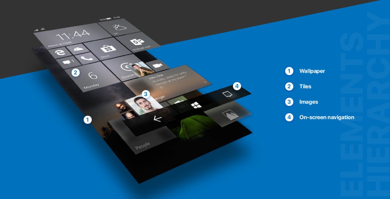
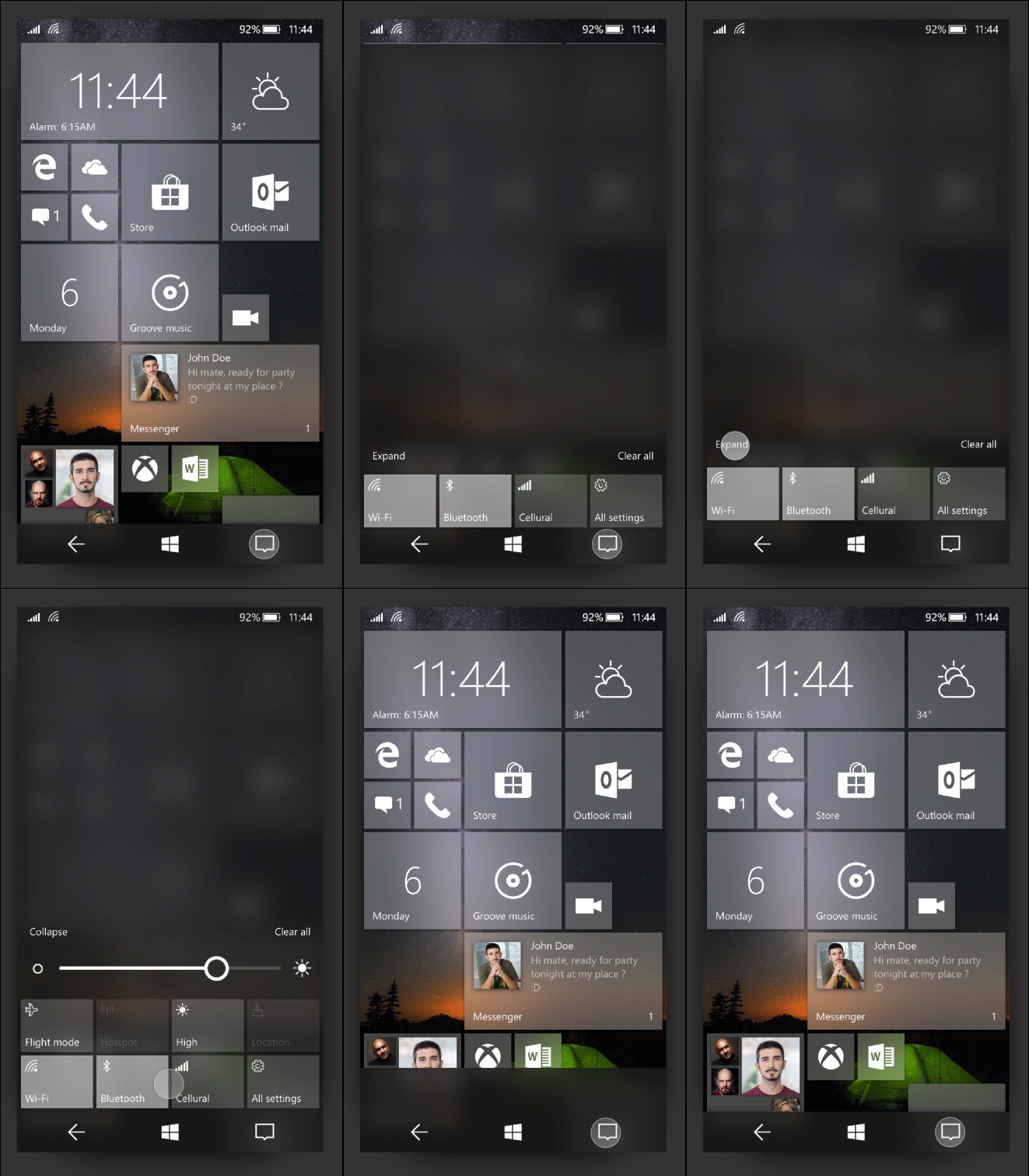
On Behance, designer Marko Malinović has created a stunning reimagining of Windows 10 Mobile (thanks Michael Gillett), showing how it might have looked with Microsoft's new translucency-heavy Fluent Design System. The results are quite gorgeous, and makes the heart yearn for what could have been.

Malinović's concept bleeds authenticity, incorporating the latest improvements seen in Windows 10 for PC, with some of his own ideas and planned mobile features, such as Force Touch, that never made it into production. Malinović has reimagined every aspect of the OS, from multi-tasking, to Cortana, while incorporating Android elements like rich notification widgets.
We'll never know what Windows 10 Mobile would have looked like if Microsoft had continued with it, but hopefully it would've looked something like this.
Article continues belowSenior editor Zac Bowden recently wrote a detailed piece explaining how Microsoft will leverage WinCore OS and CShell to produce a bespoke system for its widely rumored, not-yet-confirmed folding Surface mobile device. If you're listening Microsoft, maybe incorporate some of Malinović's ideas!
Be sure to view the full project on Behance below, you won't regret it (but your heart might).
Windows 10 Mobile Redesign by Marko Malinović
All the latest news, reviews, and guides for Windows and Xbox diehards.

Jez Corden is the Executive Editor at Windows Central, focusing primarily on all things Xbox and gaming. Jez is known for breaking exclusive news and analysis as relates to the Microsoft ecosystem — while being powered by tea. Follow on X.com/JezCorden and tune in to the XB2 Podcast, all about, you guessed it, Xbox!
 Join The Club


