Comparing Windows Mobile 6.5 and iPhone 3.0
We had a little fun with our friends at The iPhone Blog last week after the iPhone 3.0 software was announced. Certainly it's a red-letter day in TiPB nation.
But now that we've had our fun, let's a take a serious look at how the iPhone 3.0 software compares to Windows Mobile present — and future, in Windows Mobile 6.5. Join us as we break down Rene's excellent 3.0 walkthrough.
The home screen
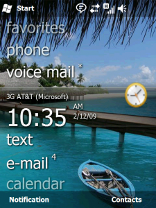
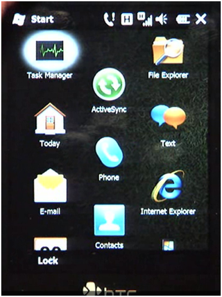
Windows Mobile 6.5: Us WinMo folks have a couple of new things to play with. Probably the most talked about has been the "honeycomb" start menu, which recently lost the hexagonal cells but will still keep the overall feel, and with larger icons.
There's also the new Today Screen, with more finger-friendly indicators with more information.
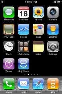
iPhone 3.0: If it ain't broke ... Apple's sticking with the tried and true grid launcher. One thing a number of people have been clamoring for is a way to better group the icons, and we can't blame them at all. Moving the icons around is still very simple. Touch and hold, then just slide it where you want it. That's something we're pretty worried about with the WinMo 6.5 hexa-start screen.
But the iPhone still doesn't have a proper place to see all of your information at once (without jailbreaking), like on the Windows Mobile Today Screen. Want to see your appointments for the day? Go to the calendar app. Miss a call, have a voicemail or e-mail? It'll let you know how many you have to check with a "badge" on top of the icon, but that's it. With WinMo a simple flick gives you a preview.
There is a new home screen to the left, which we'll touch on ... oh, now.
Get the Windows Central Newsletter
All the latest news, reviews, and guides for Windows and Xbox diehards.
Phone-wide search
WinMo 6.5: This is (sort of) something we've enjoyed for a long, long time. Need to look up a contact? Just start typing. From there you can choose to e-mail, text, call, look up address ... About the only thing missing is the ability to perform a Facebook poke directly from the contacts list.
You can search for files relatively easy, though you've got to find the "Find file" app first. Searching through e-mail is pretty painless and is a breeze if you're hooked into an Exchange server. But you have to be in Outlook first.
If all this were tied together and combined with basic Web search out of the box, it'd be as good as the iPhone and what's coming on the Palm Pre. Yeah, there are Today Screen plug-ins for Web search, but we'd like to see it all native and in one place.
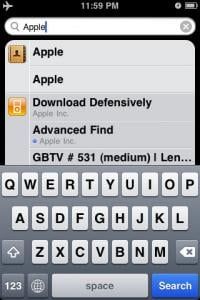
iPhone 3.0: Here's where that new home screen comes in. And like on the Mac desktop, it's called Spotlight. From the primary screen, you slide to the left, or click the Home Button. Start typing in the search bar, and you get Contact names, App names, iPod media file names, E-mail headers (from, to, and subject), and Calendar event names.
So, while the iPhone's a little late to this game, Spotlight's ability to drill through more than just contacts is a pretty big leg up.
Messages
Finally, FINALLY! The iPhone gets proper MMS, which we WinMo users have had for, well, ever. (OK, unless you're on Sprint.) We'll have to see how nicely it plays between carriers, but that's something the rest of us have to deal with, too.
Copy and paste
Don't need to beat this horse any longer. The iPhone's finally getting it. It will be interesting to see just how useable it is in real-world settings. From what we've seen so far, it's promising. Capacitive touch screens really help here. But, again, c&p is something we've had on WinMo for a long, long time.
Widgets

WinMo 6.5: We recently got confirmation that widgets will be on Windows Mobile 6.5. Dieter does a good job in the latest WMExperts Podcast of explaining just what they are, what they do, and how it's relatively easy for developers to code one up.
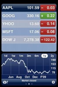
iPhone 3.0: The iPhone's had widgets from the start. An easy example: The stocks app. And that gets tweaked a little in 3.0 for landscape goodness, exact price, etc.
We must say, the iPhone stocks app definitely is a little more pleasing on the eye.
Landscape keyboard
Why it took Apple so long to implement this across the board? Who knows. We've had it on WinMo with sliders. (Yeah, that's not exactly an apples to apples comparison, but whatever.) The keyboardless HTC Touch HD had landscape keyboards from the start.
Safari vs. Internet Explorer
OK, it's really no contest here. Apple's set the bar for mobile browsing. IE6 appears to be an improvement over IE5, and we're already getting a taste of it on the Sprint Treo Pro. But IE6 supports Flash, and mobile Safari still doesn't. Personally, I'll give up flash for the smooth browsing on Safari any day of the week, but your needs may differ.
Turn-by-turn directions
We've still got 'em. The iPhone 3.0 software's gettting 'em.
Stereo Bluetooth
Another thing that's kept me coming back to Windows Mobile. I stream podcasts and phone calls wirelessly to a Motorola T505 speakerphone, and from there use the FM tuner to pipe it all into my car. And that's something that Windows Mobile has done pretty darn well (some phones have better Bluetooth stacks than others) for a while now. But now that the iPhone and iPod Touch 2G are getting A2DP support, it's going be a whole 'nother ball game for Apple — and for accessories.
Multitasking
Windows Mobile's still got it and can run apps in the background. iPhone still doesn't. 'Nuff said.
Notifications
The iPhone 3.0 software brings push notifications, but they're done either as "modal" boxes — which you have to acknowledge before doing anything else, or as badges on icons. Still not ideal, but it's a slight improvement. Audio alerts will be customizable for each application.
There still are several options in Windows Mobile 6.1 and 6.5, from the Today Screen to popups to audio and LED alerts. All of which beat modal alerts.
App store vs. Marketplace
Apple did it (mostly) right from the get-go. Easy to use, easy to buy. There's no two ways about it. We'll have to see what Microsoft and Marketplace have learned from a year of watching Apple.

Implementing a better way of sifting through apps to separate the wheat from the chaff would be a major plus for Microsoft. We'll also have to see how painless the transaction system is, though we're not anticipating a big headache there. Also still up in the air is how strong-armed Microsoft will be as a gatekeeper. Will it ban apps the same way as Apple? More transparency has been promised, however, and that could be the difference-maker.
Windows Mobile 6.5 vs. iPhone 3.0
So is there a clear victor here? Of course not. The platforms are vastly different. But while at first we bemoaned the fact that 6.5 is more of a re-skinning of Windows Mobile 6.0 than anything else, additions such as Widgets are making that a little easier to swallow. But, clearly, there's still much work to be done as we await Windows 7.
And, clearly, iPhone users have fewer and fewer major items left on their wish lists. Multitasking and background processes would be one on them. Better notifications are yet another.
But the iPhone definitely is the platform with the momentum right now. We'll see if Windows Mobile gains any later this year with the release of Windows Mobile 6.5 and as we get closer to Windows Mobile 7.
Phil is the father of two beautiful girls and is the Dad behind Modern Dad. Before that he spent seven years at the helm of Android Central. Before that he spent a decade in a newsroom of a two-time Pulitzer Prize-finalist newspaper. Before that — well, we don't talk much about those days. Subscribe to the Modern Dad newsletter!
