A closer look at the new light theme in coming to Windows 10
Are you a fan of light user interfaces? Microsoft is building a brand new one into Windows 10 and it looks good. Let's take a closer look.

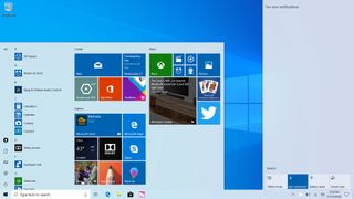
Last week, Microsoft started testing a brand new light theme with Insiders that's expected to ship in April 2019 with the 19H1 release. Although it's not finished, this early implementation of the light theme is a great start and an excellent addition for those who love options.
The new light theme in Windows 10 19H1 turns not only themes your apps, but the Windows Shell too. This includes the taskbar, Start Menu, Action Center, notifications, touch keyboard, and context menus (in some places) which gives the light theme a much more consistent feel.

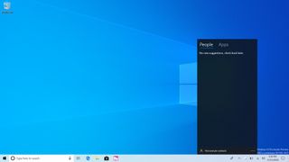
Like dark mode however, it isn't entirely consistent. There are still some areas of the OS that are themed dark, such as Cortana and My People. Since it's still early days however, we should expect to see Microsoft theme those areas as well to match the rest of the OS design when light mode is enabled.
Many icons on the taskbar will switch their icons from white to black if the developer has provided the assets for it, which makes your open apps easier to see on the lighter taskbar. If a developer hasn't provided the assets for light theme, Windows will automatically put those icons into a colored box to ensure you can see them.
Here's a cool detail. Windows will put the icons for Win32 programs from the Store in colored boxes when using light theme to ensure their icons are still easily visible (see Slack and Spotify) pic.twitter.com/mGQz26fz1JHere's a cool detail. Windows will put the icons for Win32 programs from the Store in colored boxes when using light theme to ensure their icons are still easily visible (see Slack and Spotify) pic.twitter.com/mGQz26fz1J— Zac Bowden (@zacbowden) November 15, 2018November 15, 2018
This only appears to happen with apps from the Microsoft Store, however, and now with Win32 programs downloaded from the web. This means that if you use an app with a white icon from the internet, you will have a hard time seeing that app open in the taskbar unless the developer provides a light theme version of their icon.
The other issue with the light theme right now is that Fluent Design reveal and translucency effects are a little harder to see within the Windows Shell right now. I assume this is just down to tweaking things a bit, but I'd love for the reveal effect to be darker when light theme is enabled so that you can see it like you can when dark mode is enabled.


Overall, this first version of light theme for Windows 10 is great. It's clean, fresh take on the Windows 10 UI that I'm sure many people are going to enjoy. There are a few teething issues right now, but nothing out of the ordinary for a pre-release feature that's still months away from being finalized. We can't wait to see how this improves.
Get the Windows Central Newsletter
All the latest news, reviews, and guides for Windows and Xbox diehards.
