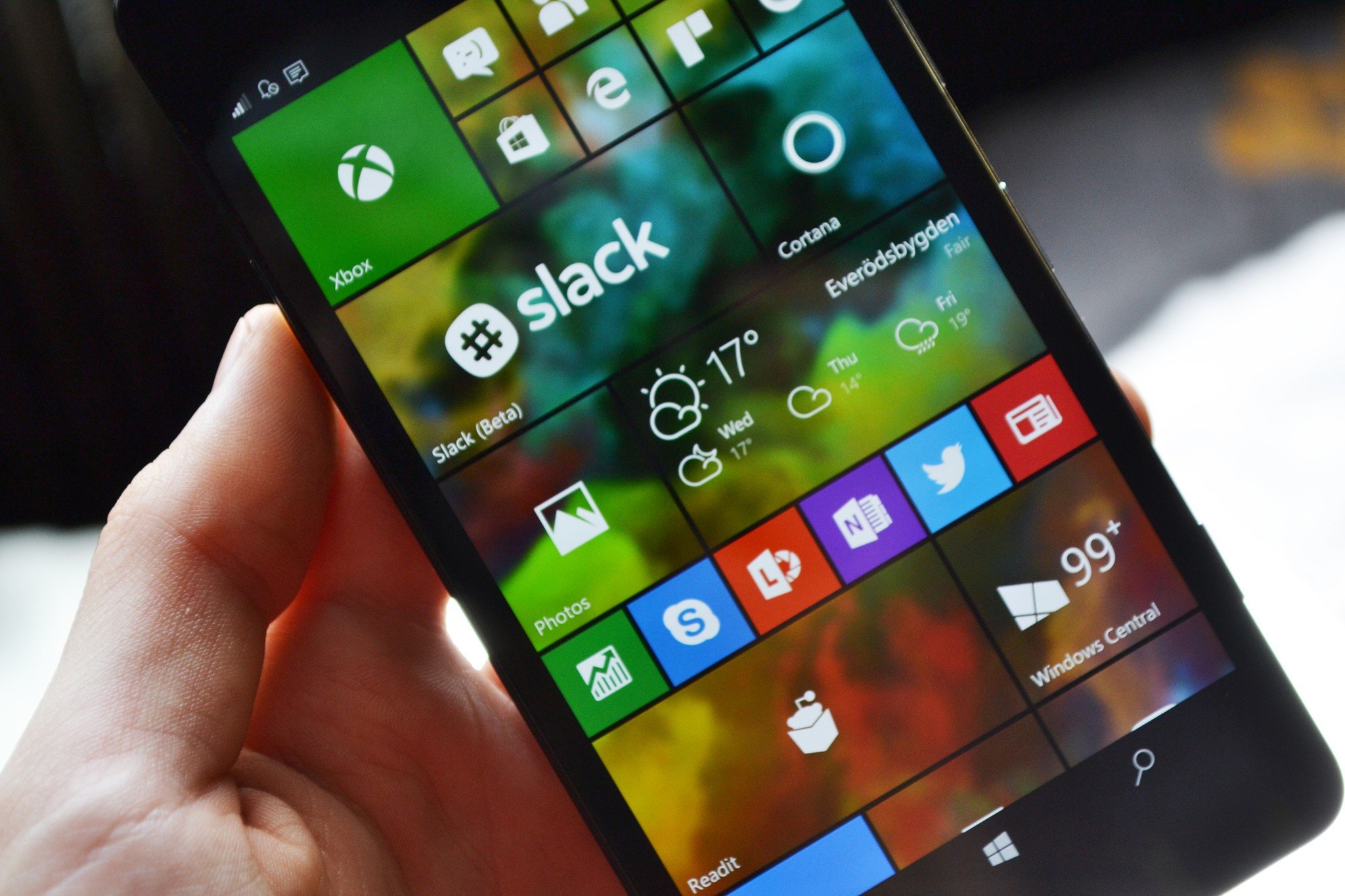
Chime in: Should the rumored Andromeda UI look like Windows 10 Mobile?
Our community is wondering whether or not Andromeda should use the Windows 10 Mobile UI?

All the latest news, reviews, and guides for Windows and Xbox diehards.
You are now subscribed
Your newsletter sign-up was successful
Microsoft's secret Andromeda project is something that everyone is thinking about, but what should the software look like? Since the device is rumoured to be a dual-screened handset, what kind of UI experience is best suited for that kind of setup?
Some people have suggested that Microsoft should just reuse the Windows 10 Mobile UI, kind of like in the video of CShell that we leaked back in 2017. As far as we know, however, that is not the case. Andromeda features a brand new UI that's build from the ground up for this form factor.
Is it likely that the update for Windows 10 to run concurrently with the release of Andromeda is to put the W10M user interface onto W10 as a new and improved Tablet mode?
BajanSaint69
So we know that it won't feature the Windows 10 Mobile UI, but should it? It will have live tiles, and a Start menu, but due to the form factor of the device, it isn't a direct port of the Windows 10 Mobile experience.
Article continues belowWe want to know your thoughts, so make sure you let us know in the comments!
All the latest news, reviews, and guides for Windows and Xbox diehards.

