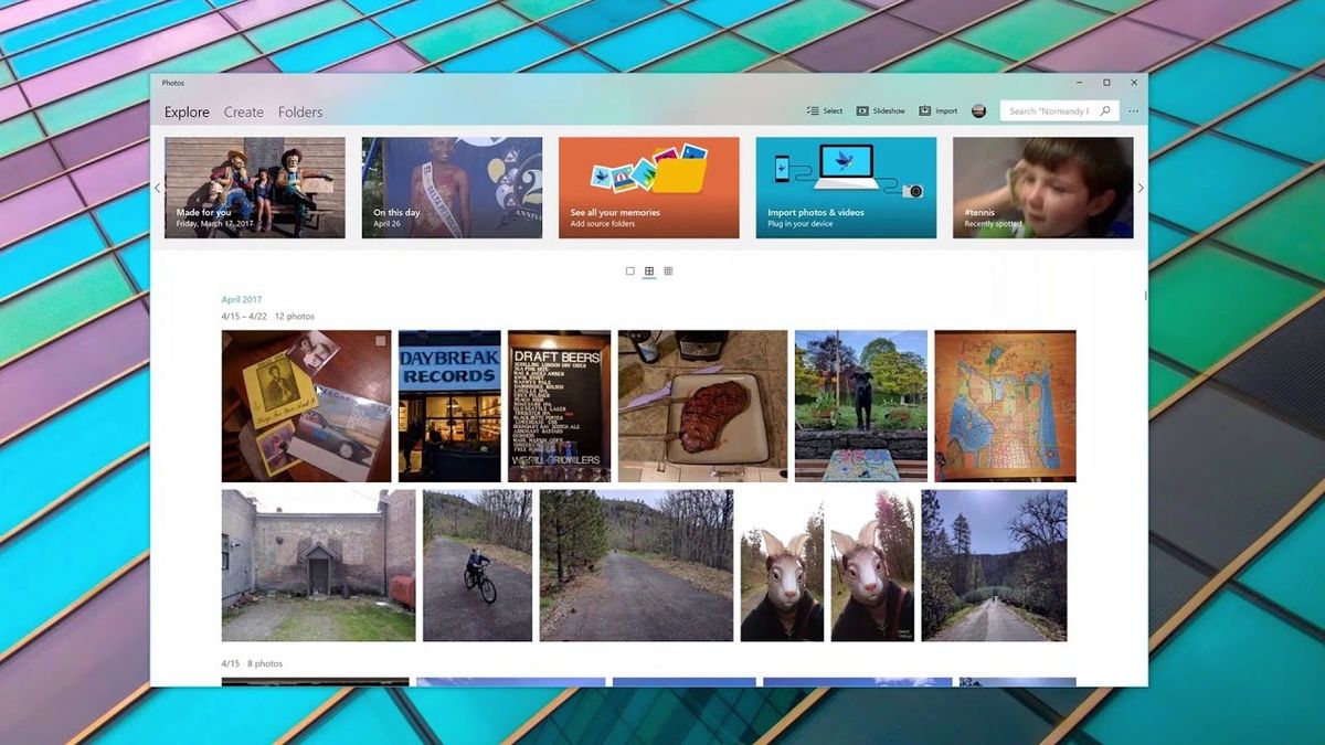
Chime in: How do you feel about Windows 10 Fluent Design so far?
What are your thoughts on the progress of Microsoft's Fluent Design System? Let us know in the forums.

Microsoft's new Fluent Design System has been around officially for a little over a year now. Unveiled at Build 2017, Microsoft and app developers have slowly been adding the new design language to their software, and with every new Windows 10 release, Fluent Design gets a little better.
We want to know your thoughts on the latest iteration of Fluent Design available in the Windows 10 April Update. Were you expecting more at this point? Less? Are there things you'd like to change? We want to know!
Honestly, who cares? There is no more originality in this world. Everything is a rehash of something - which is why execution is held to such a premium these days. Granted, Microsoft still has a lot to learn about execution and Fluent Design still has some ways to go in its implementation but it is a fresh and modern reinterpretation of Aero. It is also PRETTY. I like it. I'll take it....
Aldrich Uyliong
I am really happy with the level of Fluent Design we have in the current shipping version of Windows 10. Admittedly, there are still several design inconsistencies, especially with reveal effects at this time, but hopefully, those problems will be ironed out over the next couple of releases. And now it's coming to Office.
I also think Fluent Design looks much better than Microsoft's previous design languages, including Aero and Metro. Aero and Fluent Design are absolutely not the same, and you can tell just by looking at the style of blur used between the two. They're completely different, and the Fluent Design one is better.
Hit the forums and share your thoughts.
From the forums: Thoughts on Fluent Design?
Get the Windows Central Newsletter
All the latest news, reviews, and guides for Windows and Xbox diehards.
