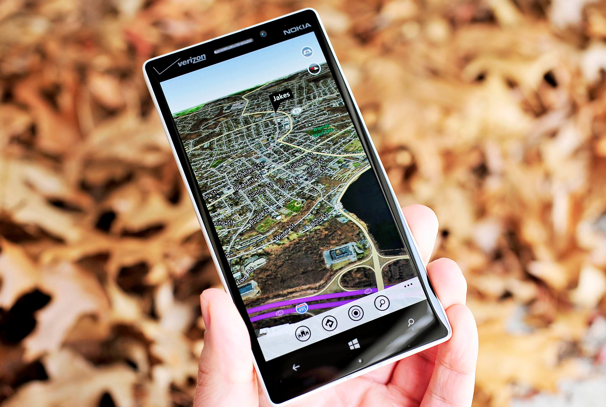
Bing Maps gets some style improvements, makes roads and landmarks stand out

The Bing team has unveiled some new styling and rendering enhancements that have been made to Bing Maps. These improvements include gradient land colors, localized landmark icons, and consolidated public transit icons.
The brightness of land colors will now adjust to your zoom level. Land will be a lighter color when zoomed out, and darker when you're zoomed in. The team says that this was done not only to improve the look of the maps, but also to increase contrast, making roads and other features are more visible. As part of making maps easier to understand, park trails and roads are now clearly differentiated from one another.
Alterations have been made to how icons are displayed. For instance, icons for landmarks like banks, drug stores, and more will be culturally accurate for their location, rather than using the same landmark for every location of the same type around the world. Additionally, public transit icons have been consolidated, removing any duplicate icons.
What do you think of the styling changes made to Bing Maps? Sound off below in the comments.
Source: Bing Maps Blog
Get the Windows Central Newsletter
All the latest news, reviews, and guides for Windows and Xbox diehards.

