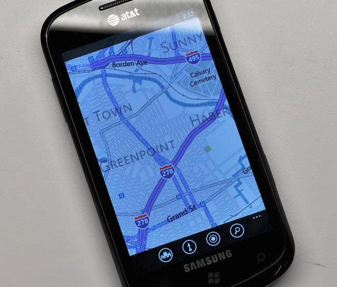
Bing Maps gets new color scheme and more legible features

It's always kind of cool when Microsoft updates that back-end of Bing Maps because you don't need to, you know, do anything. Sure, it's not better voice-navigation nor Ovi Maps, but the changes are not exactly subtle either. Instead, what we have in the mobile version of Bing Maps more closely matching the desktop version.
Most of the changes deal with the color scheme of roads, with purple denoting major highways, blue secondary roads and grey for back roads. Text looks a bit easier to read and perhaps its just us, but the app seems to handle downloading and caching maps a lot easier, resulting in faster scrolling. Other than that, we're not noticing too much else but we're betting this may be a regional thing too.
Shout out in comments if you noticing anything and we'll add it.
Source: MobileTechWorld; via Pocketnow
Get the Windows Central Newsletter
All the latest news, reviews, and guides for Windows and Xbox diehards.

Daniel Rubino is the Editor-in-chief of Windows Central. He is also the head reviewer, podcast co-host, and analyst. He has been covering Microsoft since 2007 when this site was called WMExperts (and later Windows Phone Central). His interests include Windows, laptops, next-gen computing, and wearable tech. He has reviewed laptops for over 10 years and is particularly fond of 2-in-1 convertibles, Arm64 processors, new form factors, and thin-and-light PCs. Before all this tech stuff, he worked on a Ph.D. in linguistics, performed polysomnographs in NYC, and was a motion-picture operator for 17 years.
