AT&T Tilt 2 Review - Four for Four
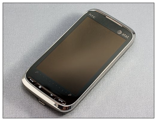
There is little doubt that the HTC Touch Pro 2 is a quality Windows phone. The AT&T version, the Tilt 2, is the final of the four major U.S. carriers to see release. Will the Tilt 2 be another outstanding Windows Phone? Can HTC hit four-for-four with the Touch Pro 2 models?
The Tilt 2 is in limited release through AT&T until October 18 and we've gotten our hands on one to review. This is the fourth Touch Pro 2 that I've reviewed, so let's cut to the chase. Follow the break to see if the Tilt 2 lives up to the standard the T-Mobile, Sprint, and Verizon versions have set.
First Impressions
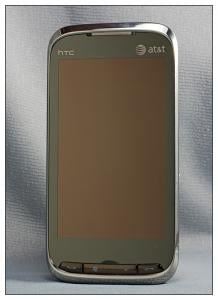
Like the other Touch Pro 2 models, the AT&T Tilt 2 has a solid feel to it. The phone comes in at 4.57 inches by 2.34 inches x 0.65 inches and weighs in at 6.3 ounces. While a little heftier than its little brother, the AT&T Pure (aka the Touch Diamond 2), the Tilt 2 feels good in the hand. AT&T is packaging the Tilt 2 with the USB cable, wall charger, spare stylus, head phone adapter, and the routine manuals and software CD.
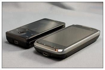
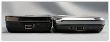
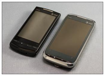
The Tilt 2 is noticeably larger than the AT&T Pure and the AT&T Fuze. But, surprisingly, the Tilt 2 is a smidgen thinner than the Fuze.
Design
The Tilt 2 has a black accented face with chrome trim. The back is a gun-metal gray, high-gloss finish with a center mesh screen for the speaker. The Tilt 2 does have a sharp, conservative look about it, but it is a fingerprint magnet. The gray battery cover helps minimize the impact, but you still have to frequently wipe it down.
I did find the chrome accents a little on the slick side, making it challenging to extend the keyboard with one hand. I think the Tilt 2 looks good but would have preferred a finish that had a little texture and grip to it.
Get the Windows Central Newsletter
All the latest news, reviews, and guides for Windows and Xbox diehards.
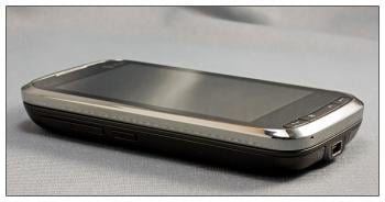
On the left side of the Tilt 2 you will find the volume buttons and the PTT button. I'm reluctant to call the PTT button a good thing because not everyone (anyone?) will use AT&T's push-to-talk service, but the button on the Tilt 2 has two things going for it. First, it's not as obnoxiously large as the PTT button on the Fuze and second, it's mapable.
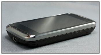
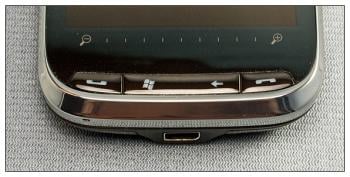
The right side of the Tilt 2 is bare and the power/sleep button rests to the top of the Windows phone. As with other Touch Pro 2 phones, a button panel rests at the bottom of the screen. Here is where you can find the answer, start, back and end buttons. Just above the buttons is the zoom bar.
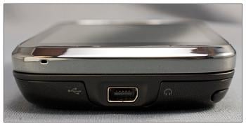
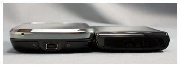
While many would prefer the 3.5mm jack, the Tilt 2 is fitted with the extUSB port only. As I've written in other reviews, the 3.5mm jack is more convenient than the extUSB port but isn't a deal-breaker, in my opinion. There are several options for wired headsets, and you've always got the adapter.
All the control buttons (volume, PTT, power, start, etc.) on the Tilt 2 were raised just enough to make them accessible and all were crisp and responsive.
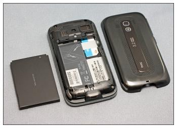
The Tilt 2 is fitted with a 1500mAh battery which, combined with the improve power management of Windows Mobile 6.5, lasts considerably longer. Where the Touch Pro's power source struggled at times to make it through a day, I had no difficulty making it through the day with the Tilt 2 under moderate to heavy use.
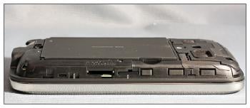
Under the battery cover you will also find the micro-SD expansion slot and reset button. AT&T threw in a little twist in positioning the reset button. It's under the battery cover but on the opposite side as the expansion slot. Sprint and Verizon placed their reset buttons adjacent to the expansion slot.
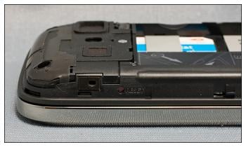
I would have preferred to have seen the reset button placed in the stylus port (like on the Pure) or on the bottom of the phone for convenience sakes. As with the lack of a 3.5mm jack, the location of the reset button is not a deal-breaker.
Screen
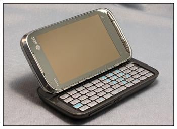
I've been using the AT&T Pure for a few weeks and before that, the AT&T Fuze. While the Pure's 3.2-inch screen is noticeably larger than the Fuze, the Tilt 2's 480x800, 3.6-inch screen dwarfs both of them. Simply put, it's a great screen both in responsiveness and image quality. I did notice that there was a slight blue cast on the screen but discount it because AT&T's themes incorporate so much blue.
The Tilt 2 has a proximity sensor. When you move the phone to your ear, the sensor turns off the screen. When you move the phone away, the screen turns back on. This is a wondrous invention that eliminates the need to hunt for the power/sleep button to turn on your screen when you're on a call.
I'm still on the fence with the tilting screen. I can live with or without it but will admit, it comes in handy when watching video. I'll maintain that it's better to have the tilt feature and not need it than need it and not have it.
One issue that was present with the AT&T Fuze was a slight delay with screen rotation. With the Tilt 2 there were no delays in screen rotation when extending the keyboard and about a half-second delay in rotating the screen.
Keyboard
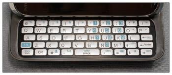
Okay, let's get to the point. AT&T dropped the ball by removing the numeric keys from the top row, right? I can see this as a valid point if you were coming from a Sprint or Verizon Touch Pro. However, if you're coming from the AT&T Fuze you're used to having to press the function key to type numbers. The Tilt 2's keyboard is consistent with the Fuze, making upgrade transition easier. The Tilt 2's keyboard may be different that other Touch Pro 2 models, but it's not something that you can't grow accustomed to.
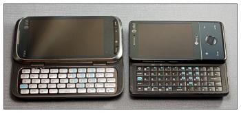
The silver keys did take a little getting used to, but they are nicely spaced and responsive to the touch. Typing was a breeze with no mushiness to the keys. There are just enough function keys (Web browser, e-mail, WiFi, etc.) to give the keyboard expanded functionality.
Software
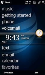


The Tilt 2 is the first of the Touch Pro 2 lineup to be introduced with Windows Mobile 6.5. We already taken a closer look at WM 6.5, and it compliments the Tilt 2 very nicely. Being an AT&T phone, it's also branded with its fair share of bloatware. You've got the customary AT&T App Center (media mall), Navigator, and AT&T WiFi. There's also the AT&T Online Locker and AT&T Music.
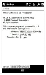
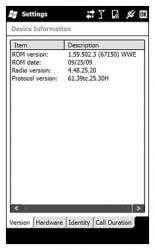
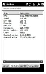
You do have the useful, pre-installed apps such as Microsoft Mobile Office, Opera Mobile browser (version 9.5), Adobe Reader LE, and Windows Marketplace.
As with the Pure, I'm finding several "hidden" applications on the Tilt 2. You've got a YouTube application and trial versions of Guitar Hero and Texas Hold'em Poker. The trick is finding the shortcut to the app and move it into your Windows>Start Menu>Programs folder.
Touchflo 3D
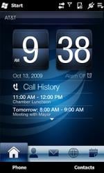
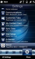
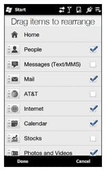
TouchFLO 3D 2 on the Tilt 2 is identical to the TF3D installed on the Pure. I'm still a little surprised that AT&T didn't opt for a more recent version of TouchFLO 3D.
The TouchFLO 3D on the Tilt 2 has the calendar and stock tabs along with the ability to hide unwanted or unused tabs (great for handling the AT&T tab). Navigating around TouchFLO 3D and other applications was effortless and I experienced very few mis-touches.
GPS
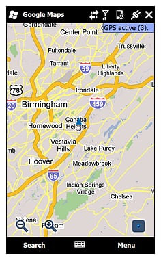
The GPS receiver on the Tilt 2 performed along the same lines as the other Touch Pro 2 versions. From a cold start, with QuickGPS updated it took just under 40 seconds to get a satellite fix through GoogleMaps. I experienced no lag time while moving and the positioning was accurate.
Camera
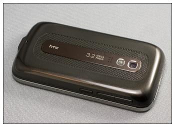
The camera on the Tilt 2 performed a little bit below par compared to the other Touch Pro 2 versions. The Tilt 2 seemed more "middle of the road" than anything with images a touch darker or muted than expected.


The Tilt 2 runs the standard HTC camera software and with the absence of a directional pad, you're left with using a shutter symbol to snap the picture. I was hoping you could map the PTT button to serve as the shutter button but then again, it might be a little awkward to manipulate.
You have eight capture modes including still photos, videos, video share, contact photos, panoramas, MMS videos, Theme photos (frame templates) and GPS photos (tags your pictures with GPS coordinates) to video.
The video quality of the Tilt 2's camera was also "middle of the road." Panning was smooth, focus acceptable, and the footage was a shade darker than other HTC cameras.
*Footnote: The weather in my neighborhood has been dreary lately with more rain than sunshine. When the weather clears, I'll re-test the camera and report back to you.
Performance
From power management to sound quality, the Tilt 2 performs just as nicely as any of the other Touch Pro 2's I've reviewed. I'm even seeing a strong wireless signal from the Tilt 2 compared to the AT&T Fuze.
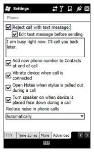
Call quality is really, really, really good. HTC has done an exceptional job with the dual microphones and noise-cancellation software. The Touch Pro 2 model's call quality is amongst the best I've experienced.
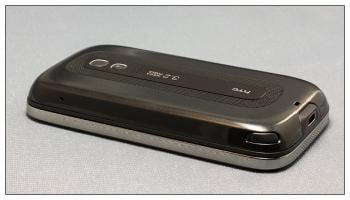
One of the key features of the Tilt 2 is the speakerphone. You have the ability to turn on the speaker either through the on-screen menu or simply lay it face down. A mute button is on the back for easy access when you're using the Tilt 2 more as a conference phone.
Speaker volumes were good and the dual microphones picked up your voice really good. You do have to speak up a little but shouting at the phone is not required.
One Oddity
The AT&T Tilt 2 is an impressive phone but during the review I ran across a strange anomaly. I noticed the screen would always be on when I pulled the Tilt 2 from the case and at first, I thought the case was pressing against the power button. Long story short, through trial and error, I discovered that if you place a magnet directly on a very specific and small area of the phone, it will turn on the screen.
The Tilt 2 has a feature that when you remove the stylus, it triggers a magnet that turns on the screen. Apparently, the magnets on the case were strong enough to trigger the Tilt 2's screen when passed by or pressed against the bottom of the phone.
In discussing this with HTC, the internal magnet in the Touch Pro 2/Tilt 2 can be activated by holding a strong enough magnet against the USB port. It's simply magnets being magnets. Granted some magnets are stronger than others so the results vary.
We were able to replicate the results with the Sprint and Verizon Touch Pro 2 models. We no longer had access to the T-Mobile Touch Pro 2 review unit so it was not tested. The Tilt 2 seems slightly more sensitive to the issue than the CDMA versions.
After much thought and discussion, we see this more as an oddity than a drawback with the Touch Pro 2 and Tilt 2 models. It's no different than the case pressing against the power button, just a little more mysterious.
Overall Impression
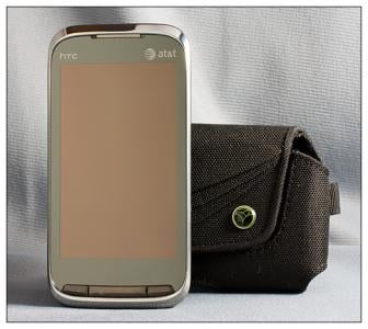
It may have taken AT&T a while to get the Tilt 2 on the shelves but the wait was definitely worth it. The Tilt 2 is currently available through AT&T's Premier/Business site and is expected to be available in retail stores and online October 18.
The Tilt 2 is solidly built with a sharp, conservative appearance. The chrome accents are slowly growing on me but I still wish there was a little texture and grip to the finish and less gloss. The Tilt 2 has a bit of heft to it compared to the AT&T Fuze but nothing to give it the feel of a brick.
The large 3.6-inch screen is a pleasant upgrade from the 2.4-inch screen of the Fuze. While the keyboard lacks the numeric row, it by no means diminishes the quality. Keys didn't feel soft or mushy and were spaced enough to make typing comfortable.
Call quality was outstanding and possibly the best on the market. The 528MHz processor zipped along nicely with no delays experienced with loading or transitioning software.
Understandably, many would have like to have seen a 3.5mm headphone jack on the Tilt 2. I can understand the disappointment but it's not a deal breaker.
Overall, I liked the Tilt 2 and it follows HTC's standard for quality really well. There's little doubt that HTC went four for four in producing another quality version of the Touch Pro 2.
If you're looking to move to AT&T (or already a customer) and looking for a quality Windows phone, the Tilt 2 will be hard to beat.
Phil is the father of two beautiful girls and is the Dad behind Modern Dad. Before that he spent seven years at the helm of Android Central. Before that he spent a decade in a newsroom of a two-time Pulitzer Prize-finalist newspaper. Before that — well, we don't talk much about those days. Subscribe to the Modern Dad newsletter!

