Android from a Windows Mobile perspective - Smartphone Round Robin

Of all the other smartphones and all the other operating systems we've looked at over the course of the third annual Smartphone Round Robin, none is as similar to Windows Mobile as Android. That's a little odd, as Windows Mobile at its core is rapidly aging, and Android is one of the newest players of the bunch. But it's true.
With Windows Mobile you get a high customizable operating system, with myriad options available to manufacturers, carriers, modders and end-users. We're constantly preaching the benefit of custom ROMs, chopped up from official releases and recompiled into smaller, faster packages. Android? Same thing. It's available on most major carriers, in several form factors (though front-facing QWERTY keyboards haven't really materialized), and with multiple versions of the operating system.
So is Android merely Windows Mobile's brother by another mother? Will its rapidly rising market share (and mind share) swallow up Windows Mobile and everyone else in its way? Let's talk about that a little after the break.
First things first: Let's revisit my sit-down with AndroidCentral's Casey Chan, where we take a look at the Sprint HTC Hero running Android 1.5, and the Motorola Droid, which at the time was running Android 2.0 but has since been updated to 2.0.1.
A new user interface paradigm (for us, anyway)
Probably the biggest difference between Windows Mobile and Android -- and the one that has taken me the longest to grow accustomed to -- is having widgets on the home screen. You previously saw widgets in this year's Round Robin on the Nokia phones Matt Miller introduced us to. The closest we've come to full widgets on either of our two Windows Mobile phones in this year's round robin -- the HD2 and Touch Pro 2 -- are in the tabs. The weather tab, Twitter tab (on Sense), the stocks tab. That sort of thing.
But those are all full-screen widgets. With Android's user interface, you get what I'll call micro widgets. Actually, they're widgets of any size. They're interactive. they can show information, like RSS feeds, clocks, weather, whatever. They can control applications in the background (like the Music tab in Sense and TouchFLO.) But they don't have to take up a whole screen to do it. They can live alongside icons, shortcuts, folders and the like.
Get the Windows Central Newsletter
All the latest news, reviews, and guides for Windows and Xbox diehards.
Think of it like this: Remember in old-school Windows Mobile when you'd hit the Windows button, and you'd get the folder/explorer metaphor. From there you'd dive deeper or choose and icon to launch a program. That's Android's home screen. Only there are multiple screens (the Droid has three; the new Nexus One has five), and icons stand beside widgets and shortcuts. My favorite: contact icons on the home screen, from which you can call, text, etc. Quick and easy.
The HTC Hero
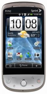
Any of you out there with an HTC Hero have Windows Mobile to thank for it. Go ahead. Find your nearest WinMo-toting friend and shake his or her hand. While it may be the HTC Hero that launched the future of HTC's custom interface -- the "Sense" UI -- we came to know and love it on Windows Mobile as TouchFLO. We're currently at TouchFLO 3D on the Touch Pro 2 and Touch Diamond 2 lines. But then came the Hero with Sense, and we all stood up and took notice.
And now the HTC HD2, the biggest, baddest Windows phone to ever walk the Earth, has its own version of Sense, which has, erm, since been ported over to just about every other Windows Mobile device out there, thanks to some enterprising fellers.
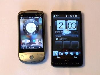
Sense may kind of look the same on Android and Windows Mobile, but they're two very different creatures. On Windows Mobile, Sense (and TouchFLO 3D) are what's known as a homescreen plug-in. You can turn it off and return to stock Windows Mobile (on WM6.5, you get what's called "Titanium, which looks a lot like the Zune HD's UI). As we learned in our interview with HTC's Eric Lin, Sense is baked into Android at a deeper level -- you can't just turn it off like a plug-in. The HTC Hero gets around that, however, though the use of "Scenes." Think of them as multiple (multiple) home screens. Don't like Sense? Change to a different scene and customize to your heart's content.
The Hero is no slouch of a phone. The particulars: Qualcomm MSM7600 proc at 528 MHz; 512MB ROM/288MB RAM; 3.2-inch HVGA (320x480) capacitive touchscreen; 5MP camera; 1500mAh battery. That said, it's already been eclipsed by the new Nexus One, in hardware (Snapdragon processor, 3.7-inch AMOLED screen) and software (Android 2.1).
Compared to the HTC HD2? No contest -- the WinMo behemoth wins hands-down. It's just too big and too powerful not to. And with it coming to T-Mobile and the possibility of it one day getting Windows Mobile 7, the HD2 should have some shelf life over the next year.
The Motorola Droid
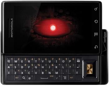
Remember when Motorola was the pride of the Windows Mobile Standard world? More than a few of us around here were big proponents of the front-facing QWERTY Motorola Q9 series (at least when the bugs were worked out) back in the day. Then Moto kind of fell off map. We got word that development was focusing on Android (and it looks like it's going to continue to do so for some time).
Verizon announced the Droid (or the DROID) on Oct. 28, 2009. It was available a week later. A television commercial blitzkrieg followed and still continues today. "Droid Does" became the official motto as it fired shots (accurately or not) at the iPhone. You might not be a smartphone nerd, but chances are you've heard of the Droid. (It's the phone I'm most often asked a bout by civilians.)
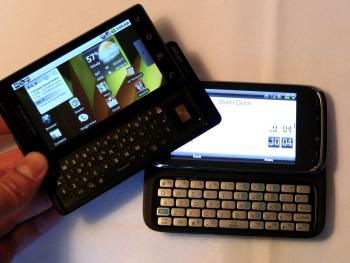
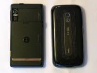
Whereas the iPhone is sleek and svelte, the Droid's design took a different route. It's cold. (Really. Feel it.) It's angular. It's heavy. And it works. So it's kind of an odd match-up, the Droid taking on the iPhone. For our purposes, however, the Droid's nearest competition is the HTC Touch Pro 2. Both have large, high-resolution screens (3.6-inch, 480x800 for the TP2; 3.7-inch, 480x854 for the Droid), though the Droid's is capacitive and is the winner there. Both have horizontal sliding keyboards. But while the Touch Pro 2's takes up the entire length of the phone and has five rows of large keys, the Droid's keyboard is four rows deep and is hampered by the directional pad that takes up about a half-inch of real estate.
The Droid's keyboard is usable, but just barely. And it suffers from the same odd mappings that afflict the AT&T Tilt 2. But compared to the Touch Pro 2 keyboard (even AT&T's version), well, it makes you want to cry. And you will cry trying to peck out e-mails on those cramped little letters. Otherwise, the Droid is an outstanding piece of hardware. It's the best Android phone (with a physical keyboard) available today. Coretex 8 processor (same as in the iPhone and the Palm Pre). The sliding mechanism feels like it will hold up long after you're dead and gone. The screen is beautiful. The battery life -- despite being just 1390 mAh -- seems nearly endless, and the phone charges quicker than almost any other I've seen. Oh, it has other shortcomings, too -- a sub-par camera, a flaky battery door and one of the craziest hard-reset key sequences you've seen (OK, we really shouldn't count that, but we're gonna).
And that's just the hardware end. Software-wise, the Droid was on the cutting edge (until the Nexus One came along). It's actually pretty frustrating. Because aside from the keyboard and camera, the Droid is a standout device, largely worthy of all the hype.
Why Android?
I've been using Android phones (the Droid and the Nexus One) pretty heavily over the past two months. Coming from Windows Mobile, there were things that have taken some getting used to: 1. Desktop widgets, which we talked about above. 2. App management. I keep wanting to quit an app when I'm done with it. Force of habit, I guess, and most reasonable people won't have three or four Twitter clients installed at the same time. (Didn't want them all using API counts.) There are third-party task managers available, but it was a little odd not having one available by default.
The Android Market is solid. With upward of 20,000 apps, there's plenty to explore. But it does suffer from some disorganization. Do I really need 30 on-screen keyboard skins?
The single-most reason I could switch to Android full-time? Google. Integration of Google's services -- gmail, Google Voice, Google Talk, Google Navigation and the like -- is near-flawless. It's the way it's meant to be. No third-party jankiness. No push e-mail alternative. To steal the line from Apple: It just works. I've asked before whether Google will properly implement gmail and its other services on other platforms. And the more I see Android grow, the more I worry that in spite of the platform's open nature Google may well keep its best products for itself, at least for a while. We'll just have to see.
And that brings us back to Windows Mobile. The launch of Windows Mobile 6.5 and the slew of hardware that came with it is nothing to scoff at. In the WinMo world, it's a pretty big deal. But aside from the sheer hardware power of the HTC HD2, it's still lagging behind. That likely will change by the time the next Round Robin rolls around. Question is, how much farther will Android have progressed by then?
Phil is the father of two beautiful girls and is the Dad behind Modern Dad. Before that he spent seven years at the helm of Android Central. Before that he spent a decade in a newsroom of a two-time Pulitzer Prize-finalist newspaper. Before that — well, we don't talk much about those days. Subscribe to the Modern Dad newsletter!
