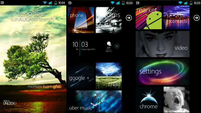
Android users mix in some Metro to beautify their UI

"Come to us my children!" - Steve Ballmer, I/O 2011. All jokes aside, it's become quite clear that a number of Android users actually want something more than a grid packed full of icons, widgets and whatnot. something cleaner, sleeker and more unique (as does Google). Windows Phone features Metro UI that ticks all the boxes mentioned above and has been somewhat ported to Android in many forms (including a media player, oh and Bing).
We've now learnt of a full-featured Android ROM that's been modified up by Lifehacker reader MortemTuam and sports a Windows Phone like home screen with a Metro UI influence. What differentiates this from previous Android attempts we've covered is that this actually looks pretty damn good. Here's how he put it all together (and what was used for you folk who have Android handsets):
- CyanogenMod 7
- The Widget Locker lock screen replacement with the CowonD3Lock theme
- The Clockr Evolution clock widget for the lock screen clock
- Launcher 7 for Windows Phone-style home screen tiles
- Font Changer, using the WP7 Segoe Light font
- SiMi Clock for the weather and clock home screen widget
- These gorgeous tile images for Launcher 7.
Seems like a lot of time and work, right? I'll always ask the question of "if you like it so much, why not experience the real thing?". Tinkering with the OS is fine but you'll never have the smoothness of WP7, something that goes hand-in-hand with the Metro UI. Sorry Android, you might be able to look like our OS, but you'll never behave like it.
Source: LifeHacker.au
Get the Windows Central Newsletter
All the latest news, reviews, and guides for Windows and Xbox diehards.

Rich Edmonds was formerly a Senior Editor of PC hardware at Windows Central, covering everything related to PC components and NAS. He's been involved in technology for more than a decade and knows a thing or two about the magic inside a PC chassis. You can follow him on Twitter at @RichEdmonds.