5 ways Microsoft could improve its Sets feature in Windows 10
Windows 10's Sets "apps into tabs" feature is in the works, but Microsoft doesn't know when it'll be ready. Here are 5 things it could do to improve the feature before release!
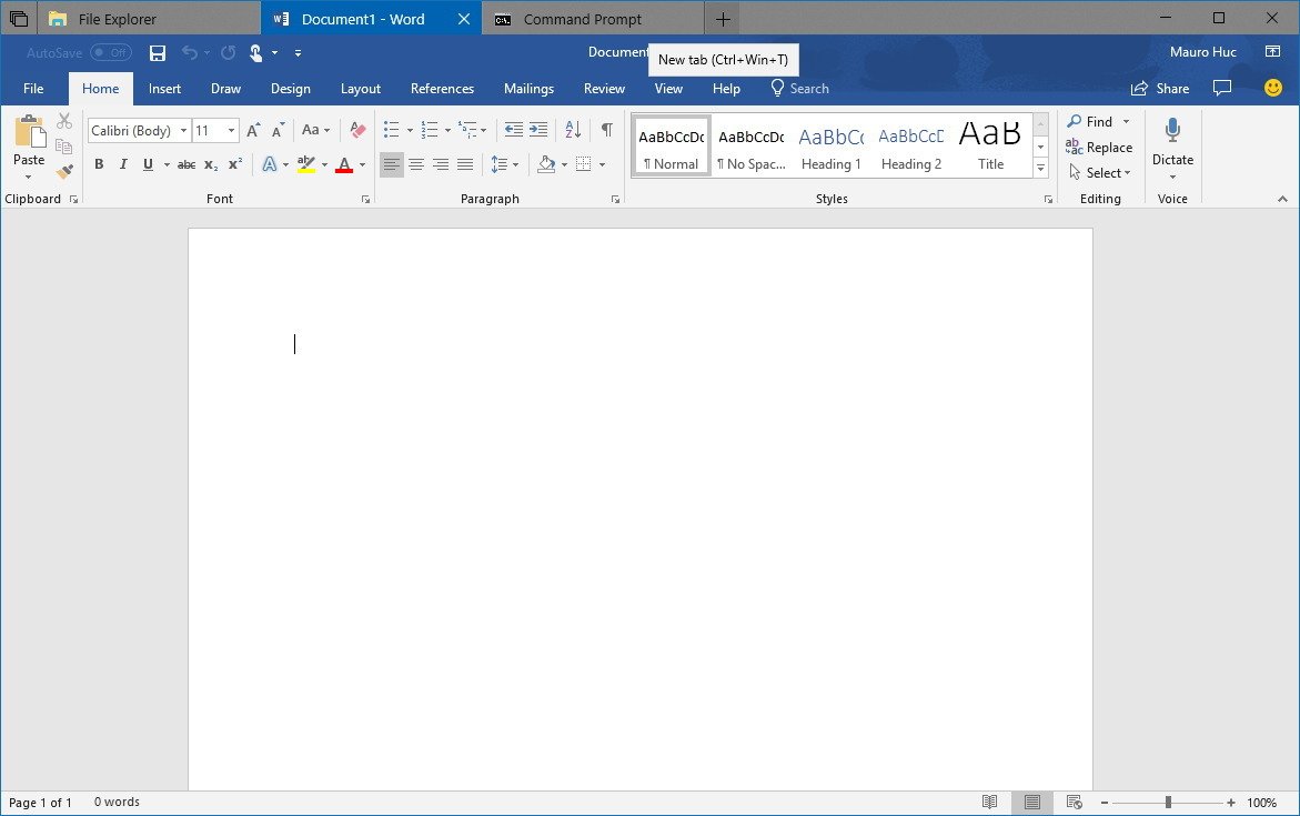
Microsoft's new Sets feature for Windows 10 was announced well over a year ago, yet we still don't know when exactly Microsoft is planning to ship it. Sets is a significant change in how the user interacts and manages windows on the desktop, so it's essential that Microsoft takes time to perfect the implementation of so that users aren't immediately turned off by the idea. As such, Microsoft hasn't committed to a release window for Sets, arguing that it's better if they ship it whenever they feel it's good and ready. And rightly so.
But, what exactly does Microsoft need to do to make sure Sets is as good as it can possibly be?
Unify Edge and Sets tabs
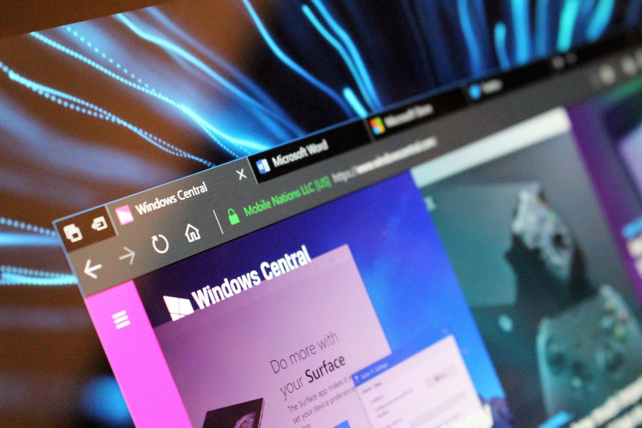
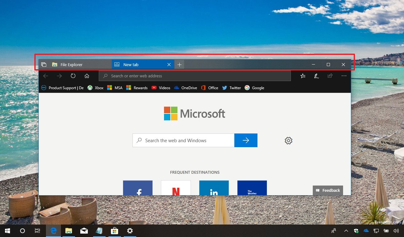
The first big issue with Sets that was apparent in the Insider Previews we've had so far is that Sets itself is separate from the tabs system available in Edge. While they look the same, they behave very differently. Now, this is likely because the Sets feature we've had a chance to play with was still pretty early in development, but I've asked a few people working on this feature what the plan is here, and no-one has been able to give me a confident answer.
Will Sets replace tabs in Edge? If not, there's an immediate disconnect in experience when launching a new tab from Edge and launching a new tab from Sets. This behavior needs to be the same everywhere. That also means Microsoft needs to figure out what it's going to do with "Set tabs aside" in Edge versus the "Tabs you've had opened" in Sets. They use the same icon, but functionally they're different. Microsoft needs to choose which system to go with.
A better new tab page
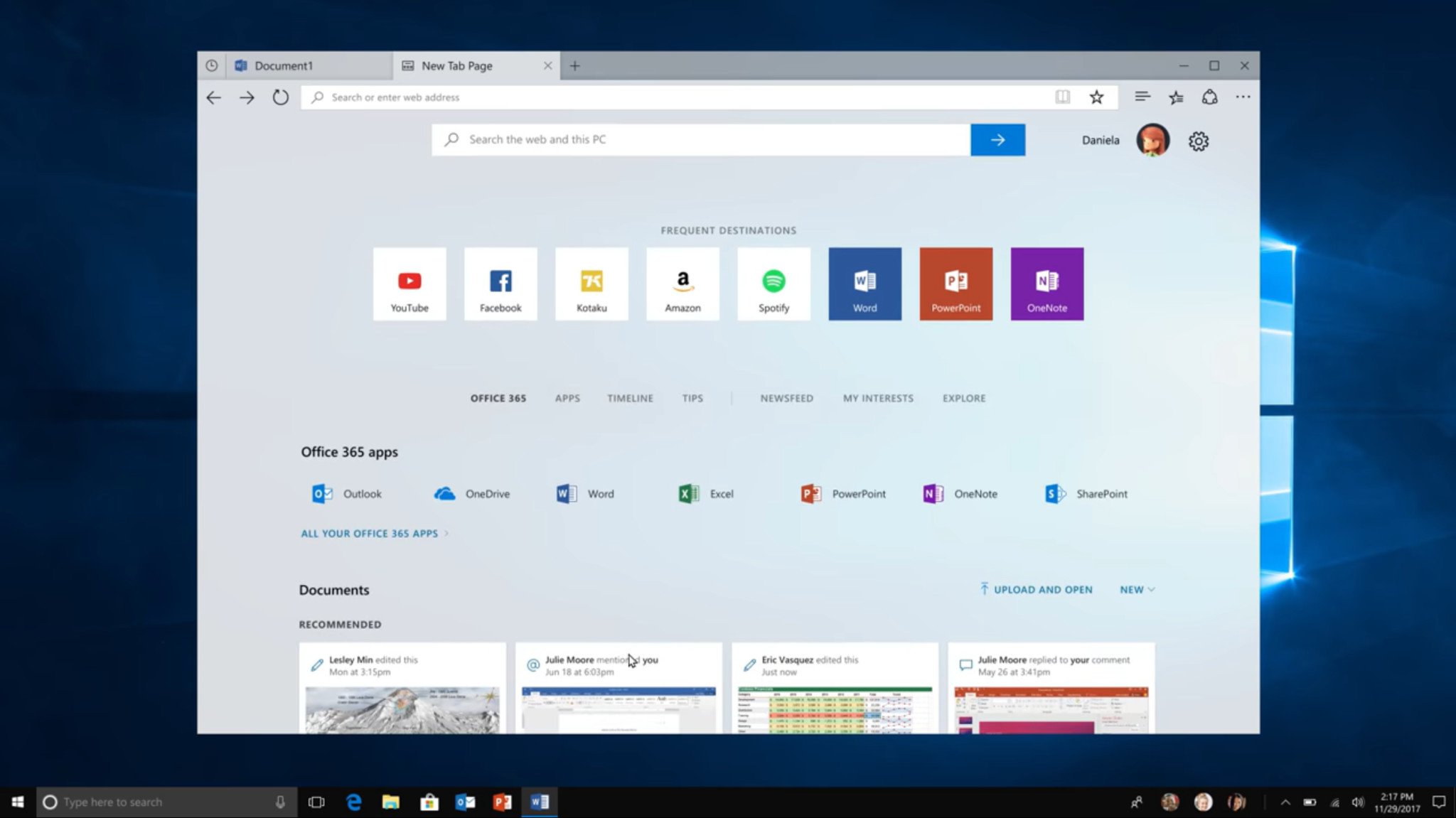
The new tab page for Sets was very rough in the preview builds released to Insiders. It was this weird combination of local apps and web pages. This experience needs to be better integrated with the system, highlighting not only apps and web pages but recent documents and photos too. It should act as a Start screen for the user rather than just a quick launcher to other apps on your system.
Perhaps integrating Timeline with the new tab page would help with this, as it would surface to the user different tasks that the user had been doing on their devices before. If you want to keep the user within Sets, and within Edge, then you don't want them hunting around the system for photos or documents that were open earlier.
Configurable new tab behavior
One thing I've seen testers ask about with Sets is the behavior of the new tab button itself. While many people are happy with it opening up into a new tab, some people would prefer the new tab button merely open a new instance of the same app they're running. Perhaps Microsoft should offer the option to the user to change how the behavior works to please both camps.
Get the Windows Central Newsletter
All the latest news, reviews, and guides for Windows and Xbox diehards.
This would arguably remove the whole point of Sets; allowing the user to group together different apps and web pages under one window to better organize projects and stuff, but if someone doesn't like that behavior, they'll simply turn Sets off. So, it's better to give the user the option.
Pinnable Sets
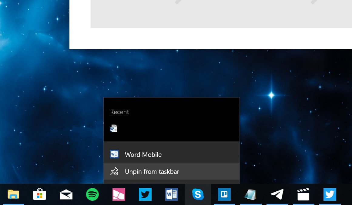
On the subject of grouped projects, it would be awesome if users could pin Sets as a clickable live tile or taskbar shortcut, just like launching any normal app, but with multiple web pages and programs within it. For example, you could have a window with web pages, Word, PowerPoint, and Spotify grouped with Sets, and you could pin that specific grouping to the taskbar or Start menu as a single icon.
From there, you can name it, and even choose an icon for it, and when clicked on would open a window with all those programs already grouped together. That would be pretty neat and would help out with the whole "productivity" aspect Microsoft is going for with Sets.
Stabilize the feature
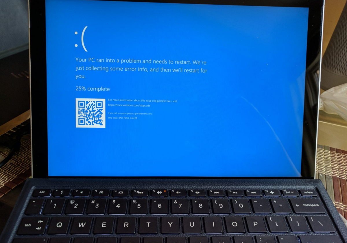
Finally, and this is the most important thing; Sets needs to be stable. It needs not to be buggy or laggy, and it needs to be a joy to use. If the user is getting frustrated with tabs not snapping correctly, or tabs being lost or moved around without their command, then that is a bad experience. In the preview builds, Sets had definitely improved in regards to stability, but there's also more room for improvement.
This is probably the biggest reason behind why Sets is not shipping yet: Microsoft wants to ensure the feature is stable enough for release. This is a good thing, even if it means we have to wait longer for it to show up.
Let's hear your thoughts!
What do you think Microsoft should do to improve Windows Sets? Let us know in the comments!

