4 things we really don't like about Windows 10 'Redstone 4'
Windows 10 'Redstone 4' is bringing some welcome new features and improvements, but not everything is roses...
Set to launch this spring, Windows 10 "Redstone" 4 is nearing completion and most of the major features for this release are already available for Insiders to test. That also means we've got a pretty good understanding of what we can expect to see in Redstone 4 when it does eventually rollout, so here's a list of things I am not a fan of in the Windows 10 Redstone 4 update.
Windows 10 'Redstone 4:' The 5 best new features and changes
Cumbersome Start customizations
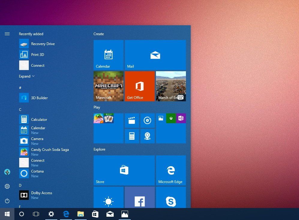
This is something I, and many Insiders, have been asking for since Windows 10 first made its debut in 2015. The Start menu is difficult to customize, and that's because Microsoft has overlooked some obvious features and behaviors of the Windows 8 Start Screen. Things like selecting multiple tiles at once to resize, move, or unpin, is a big one that's still omitted.
Because of that omission, most people just opt to leave their Start menu as-is. The only people who customize it are the obsessives (if you're reading this, you are one) with more experience and know-how than the average user. Everyone else, though, just doesn't care. Microsoft doesn't help by making the Start menu customization experience god-awful, and it's something that should be fixed by now.
Microsoft also makes it cumbersome to add new tiles to Start, depending on whether you have the Apps List hidden or not. If it is hidden, you have to enter the Apps List, scroll down to the app you want, right-click it, and then select "Pin to start." Microsoft should make this experience more intuitive, by possibly allowing users to pin apps to Start by just right-clicking or highlighting an empty-space in the menu and choosing from a list of frequently or suggested apps.
Can't unpin in Edge
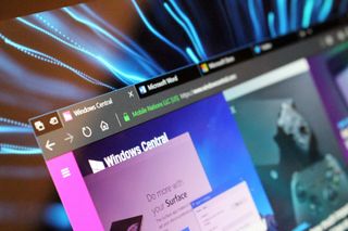
I like Microsoft Edge. I use it as my default browser on all my devices. But one lasting annoyance I have with Edge is that I cannot unpin any of the default buttons at the top of the window. You can't get rid of the Share icon or the Ink button, even if you know you're not going to be using any of those functions. It's weird, because this option was in testing in one of the old Insider builds, but was later removed and hasn't made a return since.
The other thing I wish you could hide in Edge is the "Set tabs aside" function. I've mentioned this before, but set tabs aside get in the way more than it is useful for me. I don't use the feature, at all, and I'll often accidentally hit it when switching back to the first tab in my window with my mouse. This closes all the tabs and saves them for later, requiring me to have to go into the tabs aside feature to restore the browsing sessions. It's incredibly frustrating.
Get the Windows Central Newsletter
All the latest news, reviews, and guides for Windows and Xbox diehards.
This issue could be easily solved if I could simply turn the feature off, or at least hide it from view. I wouldn't mind if the option moved it into the Edge Hub area, so I could go in there and manage my set aside tabs if I wanted. But I just think having it up right next to the other tabs is annoying, at least for me.
Bloatware galore
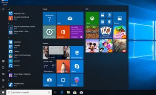
So, I recently did a fresh, clean install of the latest Windows 10 Insider build, which should be pretty representative of the final product at this point. The term "clean install" was a phrase that was put into use when a user would install Windows from scratch, removing all the bloatware and oddities that OEMs love bundling with their devices.
Now, fast forward to 2018, and "clean installing" Windows isn't as clean as it used to be. Windows 10, out of box, has pre-installed third-party mobile games and apps that automatically download from the Microsoft Store as soon as setup is complete. The Start menu is jam-packed with suggested apps that make it look noisy and gross, and the clean install experience is anything but because of it.
Yes, you can uninstall all the crap that gets automatically installed from the Store when you first setup your PC, but that's not the point. If you're clean installing Windows 10 Home or Windows 10 Pro, odds are an automatic installation of Candy Crush is not high on your wants list. This has been an issue with Windows 10 since 2015, and Microsoft hasn't rectified it.
Cortana is still limited outside the USA
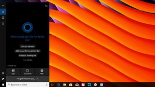
Cortana kind of sucks on Windows these days. It's still only available in a handful of markets, and even in those markets where it's available, its feature set is incredibly limited compared to what Cortana can do in the United States. In fact, Cortana is a pretty good virtual assistant in the United States, which is useless if you're someone who isn't in the United States.
I live in the UK, and Cortana can't do half the stuff Cortana US can do. Cortana UK can't even stream music from Spotify to an Invoke, or track packages. I imagine its feature set is even worse in non-English speaking countries. Microsoft has dropped the ball on Cortana — even the Cortana UI on Windows looks ugly compared to the Cortana experiences found elsewhere.
I hope, that Microsoft starts focusing on Cortana with Redstone 5. Introduce it to new markets, and bring existing, US-only features over to other markets. Microsoft's initial excuse for not rolling Cortana out to more markets was that the feature was early and still in testing, so they needed data from specific areas, but that was years ago. What's the hold up?
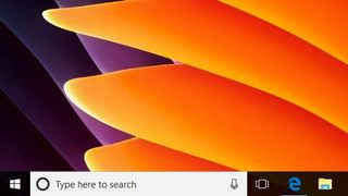
Also, and this is probably the biggest offender of them all, but what's up with this ugly white search bar on my nice dark taskbar? Please let it match the surroundings.
What do you dislike?
That's our list of things we dislike about Windows 10 with Redstone 4. Is there something you don't like about this new release? Make sure you let us know below! Also, make sure you check out our list of things we love about Windows 10 Redstone 4 too.
