Four reasons why the Surface Go's bezels are so thick
Dem bezels on Microsoft's latest Surface are driving some mad. Here are a few reasons why they're so thick.

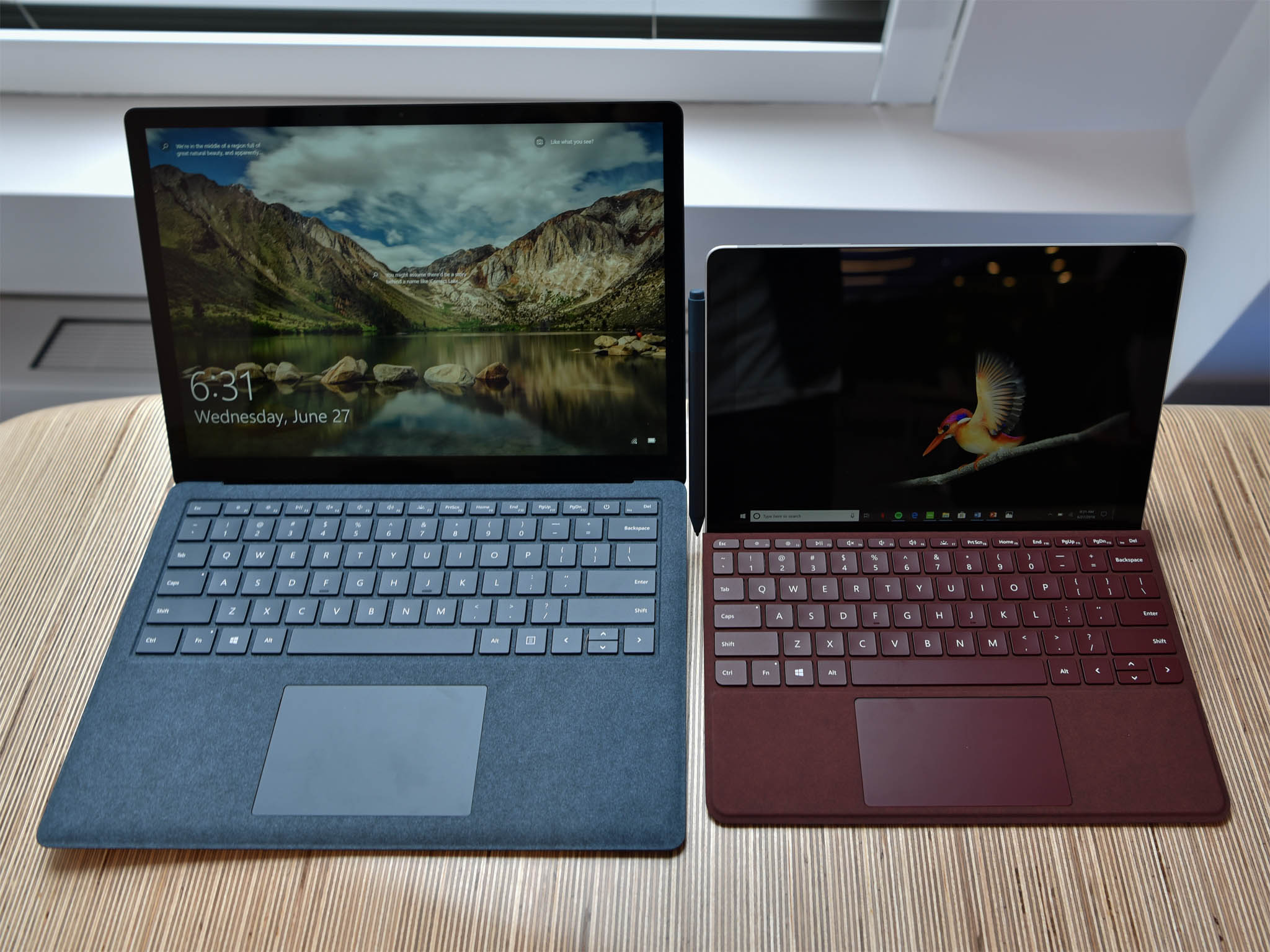
Reception so far of the new Microsoft Surface Go seems to be excellent with many people excited about a small, easily portable Surface PC running full Windows 10 – especially at that lower price point.
But if there is one complaint we're hearing a lot: 'dem bezels... why are they so thick?
Like a lot of things in life, there's no single answer, but rather a few reasons as to for the large black bars around the Surface Go's display. Here are a few we learned about when talking to some people at Microsoft regarding the Surface Go – and a few apparent explainers too.
1. Surface Go is for everyone (including kids)

Microsoft is positioning the Surface Go as an accessible Surface for all users, and that means those little tykes in elementary school. It's no secret that Microsoft is pushing hard on education lately and Surface Go is part of that strategy.
Gripping a 10-inch tablet with those teeny digits is a bit easier when you have a thicker bezel. Granted, a child in third grade could wield a more massive Surface Pro (1.7lbs, no keyboard) but the Surface Go's mere 1.15-pound heft lends itself better for kids K-12 in schools.
None of this is to say Surface Go is only for kids, but instead, for the first time, this is a Surface that has them in mind.
2. Windows Hello, cameras, antennas and being even-steven
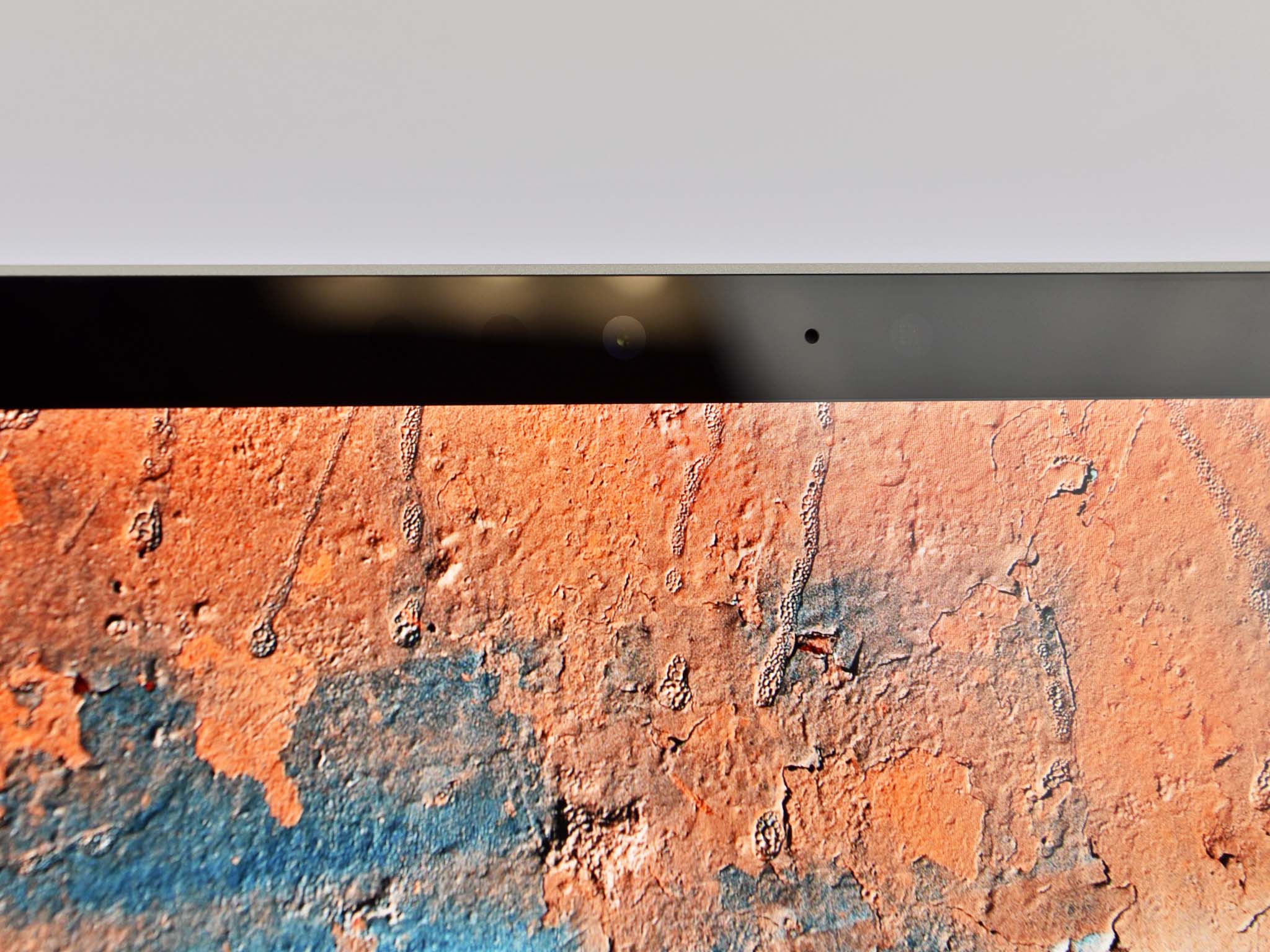
Microsoft could save some space by omitting the Windows Hello infrared (IR) camera and sensor, but they kept that premium feature for the budget-orientated Surface Go. It's a smart move.
Get the Windows Central Newsletter
All the latest news, reviews, and guides for Windows and Xbox diehards.
But between those sensors, the 5MP front-facing camera, and the precision antennas at the top of the device (including ones for the LTE edition), Microsoft needs a certain amount of border to accommodate it all. (There's also the dual speakers etched into the display and the space need for those).
That's fine as the other three borders (bottom, left, and right) could be substantially thinner – but then you lose symmetry. HP (in)famously does such a design on its popular Spectre 13t series of laptops, and not everyone agrees it's the best look primarily for a tablet, which frequently shifts orientation.
3. Bigger display, higher price or smaller display, larger keyboard
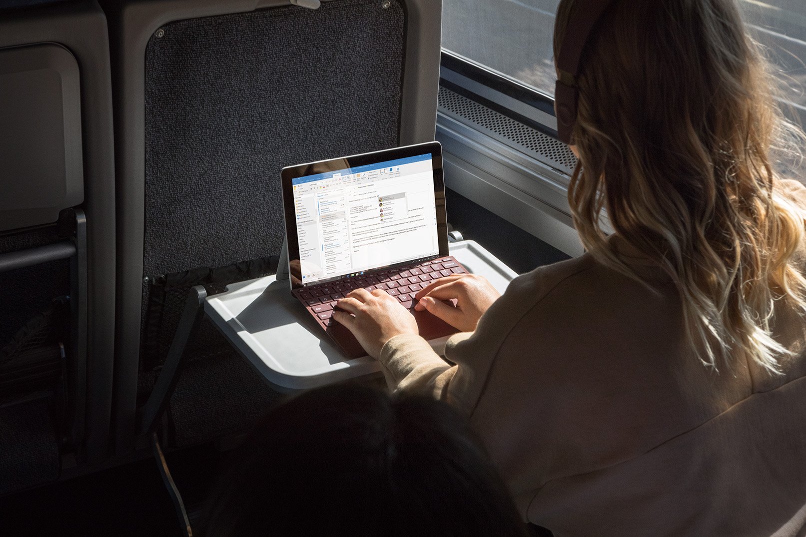
When engineering a laptop, the size of the display directly determines the dimensions of the lower half.
For laptops, the size of the bottom half governs battery size, thermal cooling, processor and GPU choice, and whether components are soldered or replaceable. Surface keeps all its guts in the top display half, but its size limits the dimensions of the keyboard.
The Surface Go already has a small, somewhat cramped keyboard since the display is 10-inches (plus extra for that bezel). Were Microsoft to reduce the bezel further the keyboard would have to match that reduction. That experience is a no-go for what is already a compromised typing experience (compared to a full laptop).
Sure, the Surface Go would look great, but at the cost of usability.
The other alternative is to keep the top half's dimensions the same, but jam in a larger display – so maybe 10.8-inch instead of 10. That solves the keyboard-size problem, but since nothing is free, you just drove up the cost of your "budget" PC and drove down battery life (which is already on the low side).
Compromises must be made, and the right balance of cost, features, and battery life needs to be found. You may think that tacking on an extra $50 for a larger display is no big deal, but when you're trying to get as low as possible for pricing, those margins matter to Microsoft and the buyer.
4. Magnets for Surface Pen and Type Cover
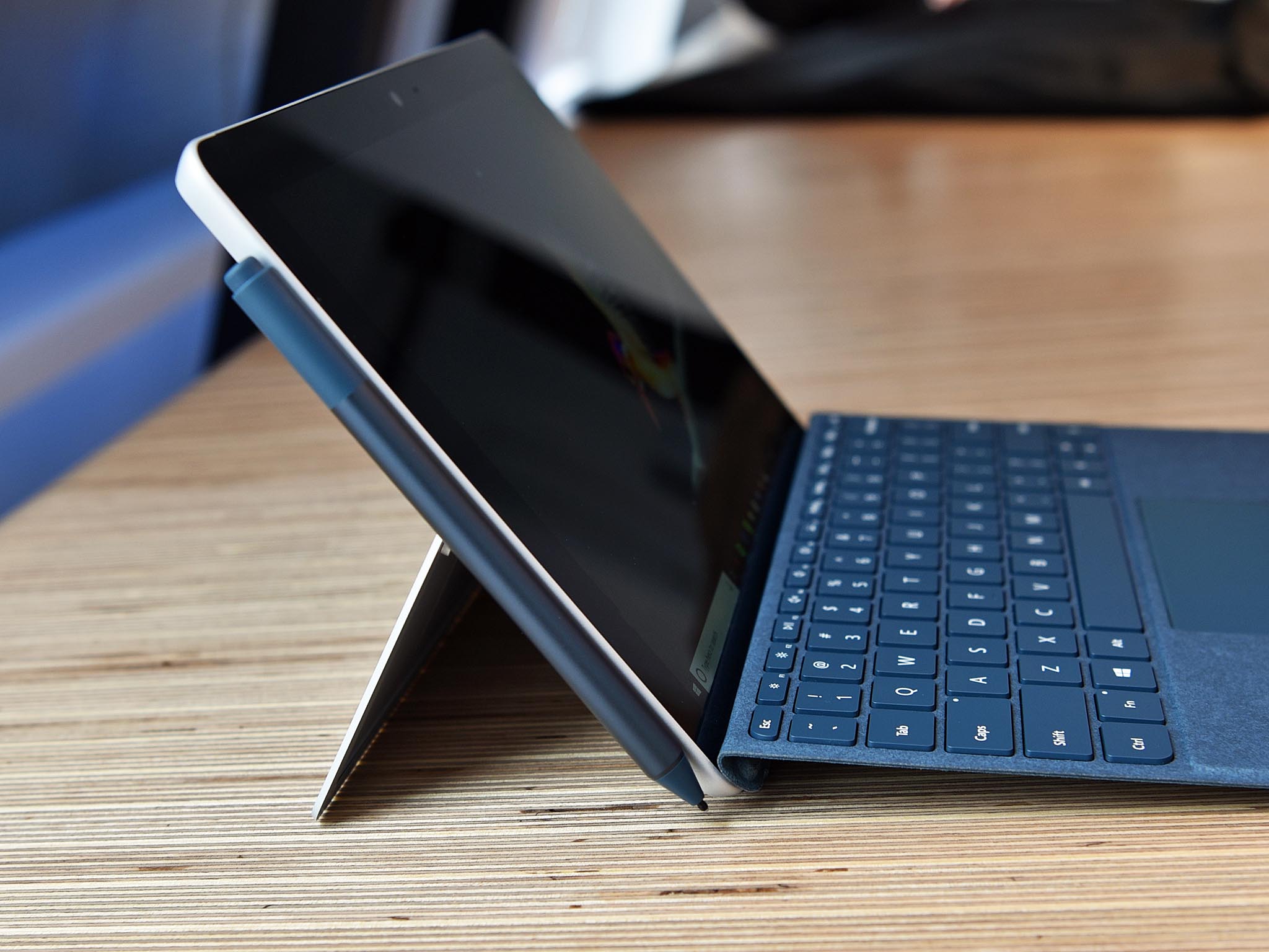
Just as Microsoft needed space for the Windows Hello camera and IR lights, the magnets needed to keep the (optional) Surface Pen stuck to the left side of the tablet also require space.
Keeping strong magnets near your motherboard and various electronic components can be risky if not properly shielded. Having some space between the magnets and those electronics certainly helps.
Microsoft could have omitted magnets for the Surface Pen altogether, but do we want to go back to the sticky pen loop on the keyboard solution from Surface 3 again? Probably not.
Also, as noted in comments Microsoft has more magnets on the bottom bezel. Those are need for the Type Cover, which not only sticks to the base, but sticks to the display bezel to create that nifty typing-angle. Without a thick bezel to match the keyboard either could not stick to the bezel, or it would be too close to the display. It's all about the angles!
No answer is satisfactory
If you saw the Surface Go and were repelled by 'dem bezels (which don't look as bad in person), then literally no explanation will make you feel better about the design. After all, beauty is in the eye of the beholder. For example, I find a '78 Chevrolet Corvette hideous looking, flat out revolting, but others disagree.
Nonetheless, when making something like Surface Go with a fixed retail cost of $399 and those size goals compromises must be made. We may not like all the design choices, but remember that they usually have a reason (or four) behind them, which helps explain it a bit.
- Surface Go: Everything you need to know
- Surface Go pre-orders and availability information
- Windows Central Podcast 97: Surface Go Go Go!

Daniel Rubino is the Editor-in-chief of Windows Central. He is also the head reviewer, podcast co-host, and analyst. He has been covering Microsoft since 2007 when this site was called WMExperts (and later Windows Phone Central). His interests include Windows, laptops, next-gen computing, and wearable tech. He has reviewed laptops for over 10 years and is particularly fond of 2-in-1 convertibles, Arm64 processors, new form factors, and thin-and-light PCs. Before all this tech stuff, he worked on a Ph.D. in linguistics, performed polysomnographs in NYC, and was a motion-picture operator for 17 years.
