Here are some of the problems, inconsistencies, and missing features in Windows 10

We're just days away from Microsoft pushing the button to release Windows 10 to the masses. On July 29, 2015, the software maker will begin to roll out its new operating system gradually to Windows Insiders, followed by those who reserved a free copy, and those customers who will be purchasing a new Windows PC.
Windows 10 is the next version of Microsoft's operating system that brings back some familiar features to help users get productive quickly. In this new version, the software maker is also updating many aspects of the user interface, introducing Cortana, adding a new Action Center, making Windows 10 adaptable to different screen sizes with Tablet mode. The company is also bringing universal Windows apps, Task View, and many other great features.
We have been spending a lot of time on the great things that are coming to Windows 10, but we haven't spent enough time on the features that are missing or need improvement.
It's worth pointing out that with Windows 10, Microsoft is also introducing a new way of servicing the operating system called "Windows as a Service". Instead of Microsoft releasing a new version every three years, the company will continue to release new updates and features as they become ready. Windows 10 will never be completed or finalized -- It's an ongoing project --. Therefore, even though many areas of the operating system might look odd or unfinished today, improvements will come in due time.
Having said that, today I want to point out some of the areas where users may find problems and inconsistencies, and we would like Microsoft to improve in Windows 10.
Settings
In Windows 10, Microsoft is introducing the Settings app, which is a new unified experience that allows users to change many aspects of the operating system. Also, like with universal Windows apps, users can use the same Settings experience across PC, tablet, and phone.
The Settings app is also what Microsoft is building to replace Control Panel, and when Windows 10 releases on July 29th, users will still find both experiences. The software maker has yet to migrate all of the Control Panel elements to the Settings app.
Get the Windows Central Newsletter
All the latest news, reviews, and guides for Windows and Xbox diehards.
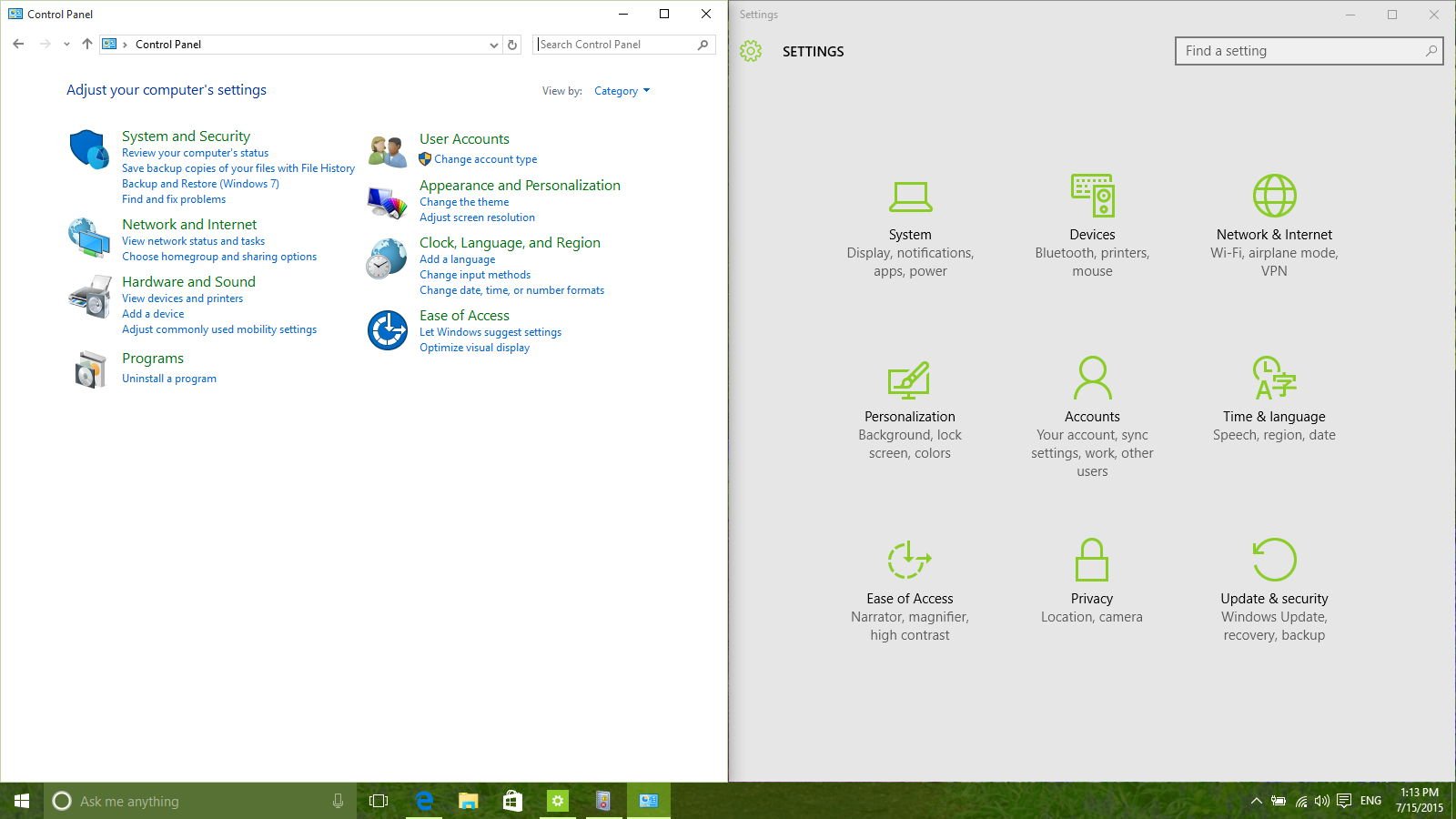
Many users may find it confusing to where they need to go to change configurations. I've been asked several times already if Microsoft will retire the Control Panel in Windows 10, and while we don't have a specific date, the company has said in the past that the Settings app will eventually replace the Control Panel.
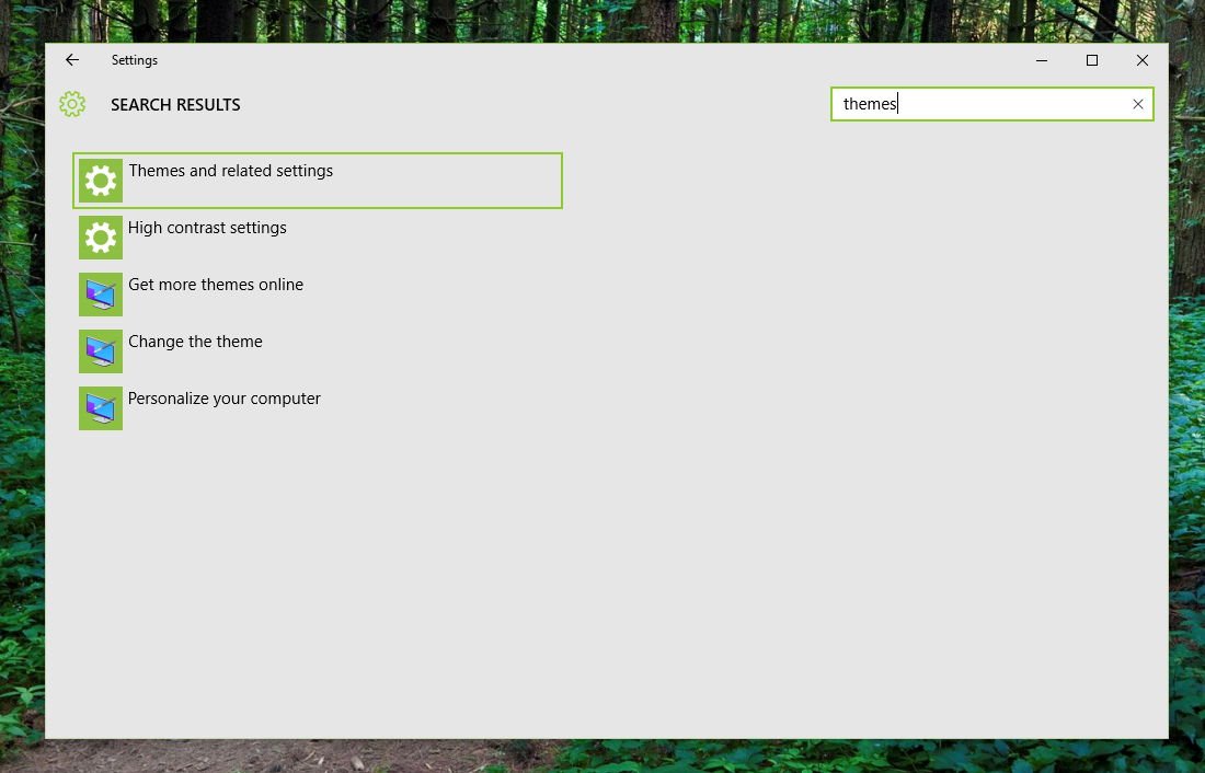
Here is a little tip, which may be obvious for a lot of users. If you need to change a setting, always go to the Settings app and use the search box in the top-right. Doing a search will list all the available options whether they are in the Settings app or Control Panel.
Pinning specific settings to Start is another feature hard to find. Previously, there was a pin icon next to the search box in Settings. Now, you have to right-click a setting in the left pane to see the "Pin to Start" option.
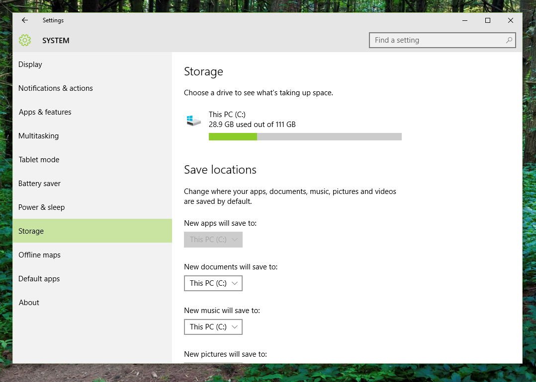
Users will also find that some features aren't yet available even though we're very close to the launch. These features include the ability to move apps to an SD card and configure an external storage to install new apps. Also, there are no options to adjust Themes through the new Settings app.
Context menus
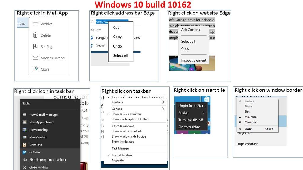
In my opinion, the context menus in Windows 10 can be considered one of the areas of Windows 10 with major inconsistencies. Today, if you right-click on the desktop, you get a standard context menu with a white background. However, if you open the context menu for a Live Tile, you get a different style. The same will happen when you use the context menu with Microsoft Edge, or when you access the menu in different parts of the operating system. Even the Mail app and Jump Lists have different menu styles.
Here is an image demonstrating exactly what I'm trying to say. Microsoft should decide and consolidate to one menu style that dynamically adapts to the theme and device.
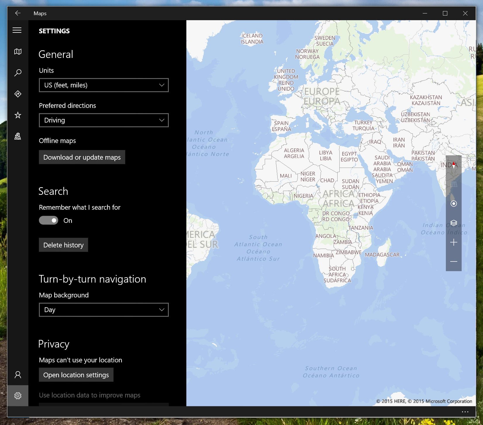
We have fragmentation on the settings menus. I can spot at least three layouts in which Microsoft is presenting app settings to users.
The Maps app offers settings with a flyout that appears on the left side of the screen.
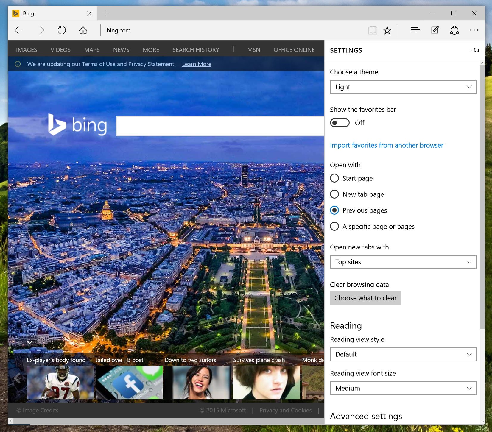
Microsoft Edge also provides a flyout, but it appears on the right side of the screen.
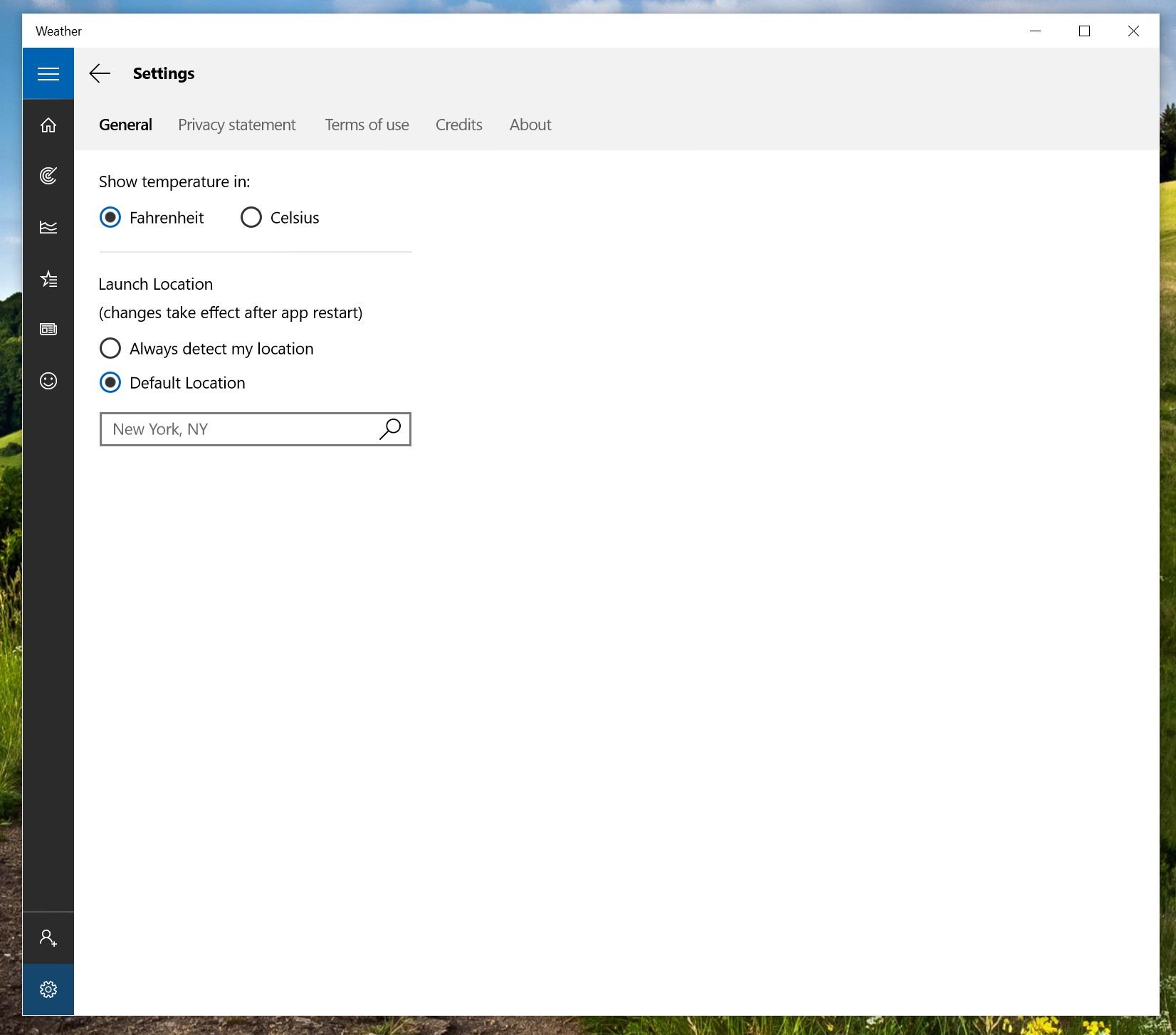
Other apps such as Weather and Groove (Xbox Music) have an entire page for settings. It looks similar to what we see when we access the Settings app, which I believe is the best option.
Also, we have the left rail styles on a per app basis. You'll notice that when clicking the hamburger button on apps to access different options in various apps. Sometimes, you see menus that overlap on top of the app UI and others simply force the UI to the right side of the screen. The back buttons also appear in different locations.
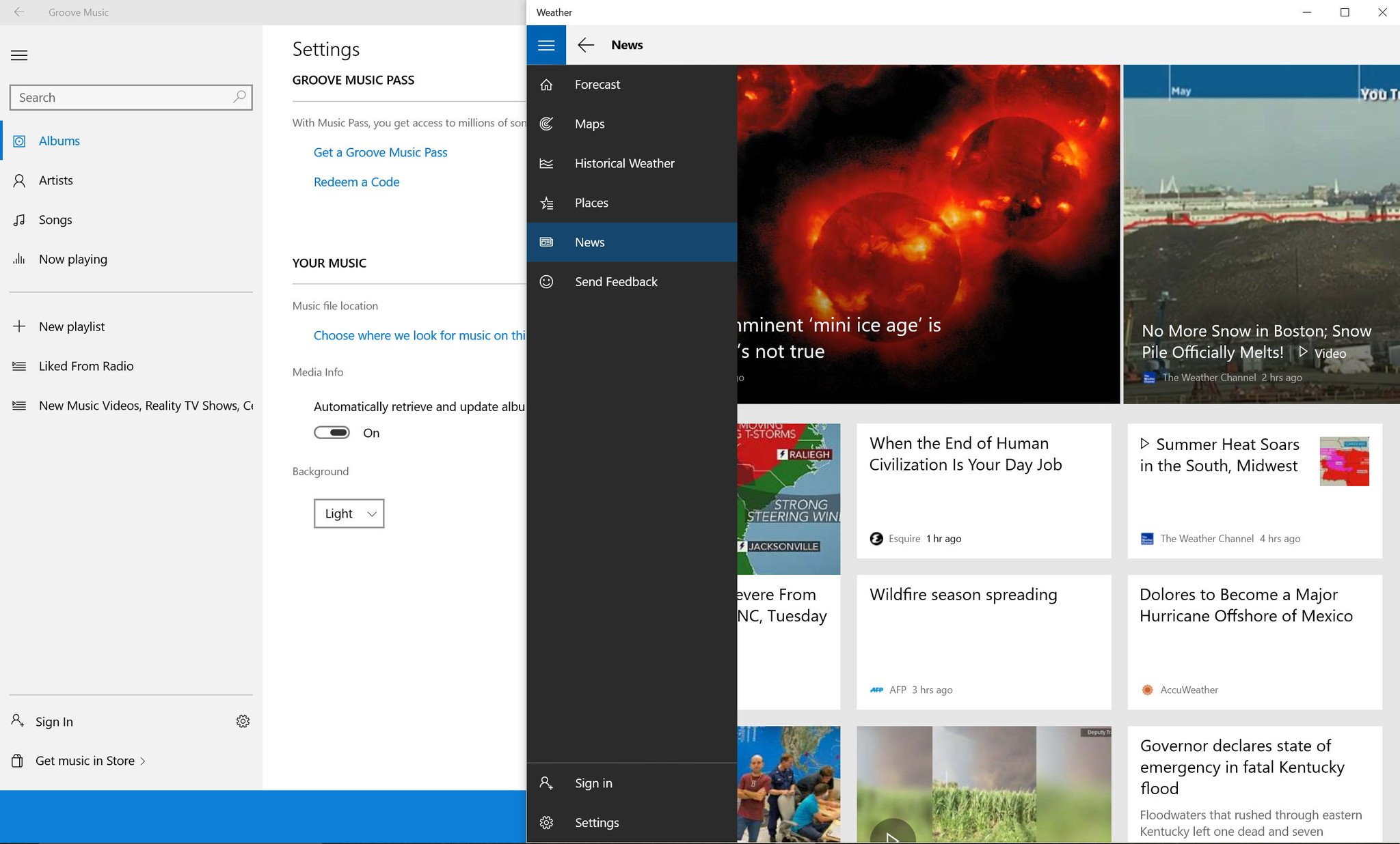
This could all be part of a Microsoft A/B test, but right now this fragmentation doesn't live up to a unified experience.
The title bar
If I have to point out one of the elements of Windows 10 that I hear many users complaining about, it is the title bar. In Windows 10, Microsoft seems to be trying to update the title bar to match the same element found on Windows apps, but up until today we haven't seen much improvement.
When you open File Explorer on the desktop environment, you'll notice a white title bar with the traditional minimize, maximize, and close buttons. They're slowly beginning to match the rest of the operating system's modern style, but there are still a lot of work left.
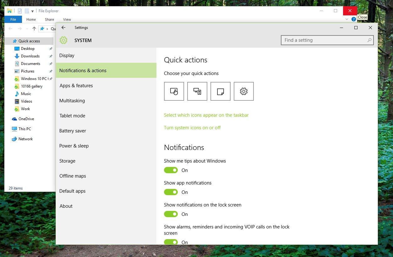
Below, you'll see a screenshot displaying how the buttons have different shapes (rectangle and not square) when the window is maximized.

We don't exactly know what the company is planning to do with the title bar. It's not crazy to expect that the software maker could make the title bar so that it takes the current accent color set in the personalization settings.
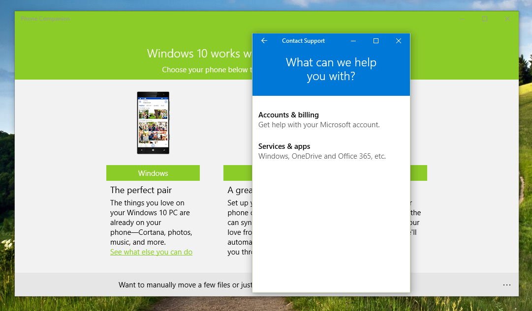
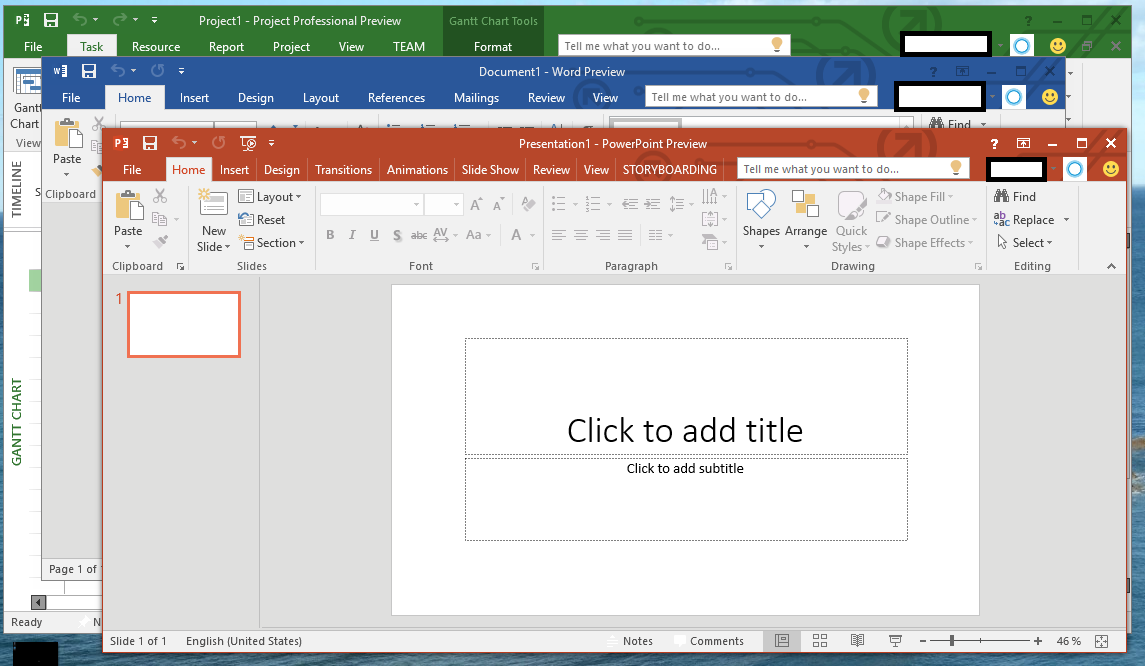
Personally, I would like Microsoft to use the Zune and Office user interfaces as a reference design to complete the title bar in Windows 10.
Tablet mode
Back in Windows 8, Microsoft has tried to make a touch-first operating system that also worked well with the keyboard and mouse, but this move backfired. Many users felt lost moving between the Metro and desktop environments.
In Windows 10, the company is trying to make an operating system that is optimized for the keyboard and mouse, but it's also a version of Windows that adapts to any screen size. As such, Windows 10 introduces a new feature called "Tablet mode," also known as Continuum. This feature allows users on 2-in-1 devices to move from a keyboard and mouse, to a touch experience.
Tablet mode in Windows 10 still needs work. For example, you can't access files, folders, and shortcuts on the desktop while in Tablet mode. You need to create a tile on the Start screen to access the Desktop through File Explorer.
Additionally, when using the desktop with Device Manager, File Explorer, etc., you will notice that the experience isn't smooth. I've even noticed that some elements won't open in full screen. For example, trying to open About Windows, you'll still get a windowed element inside of Tablet mode.
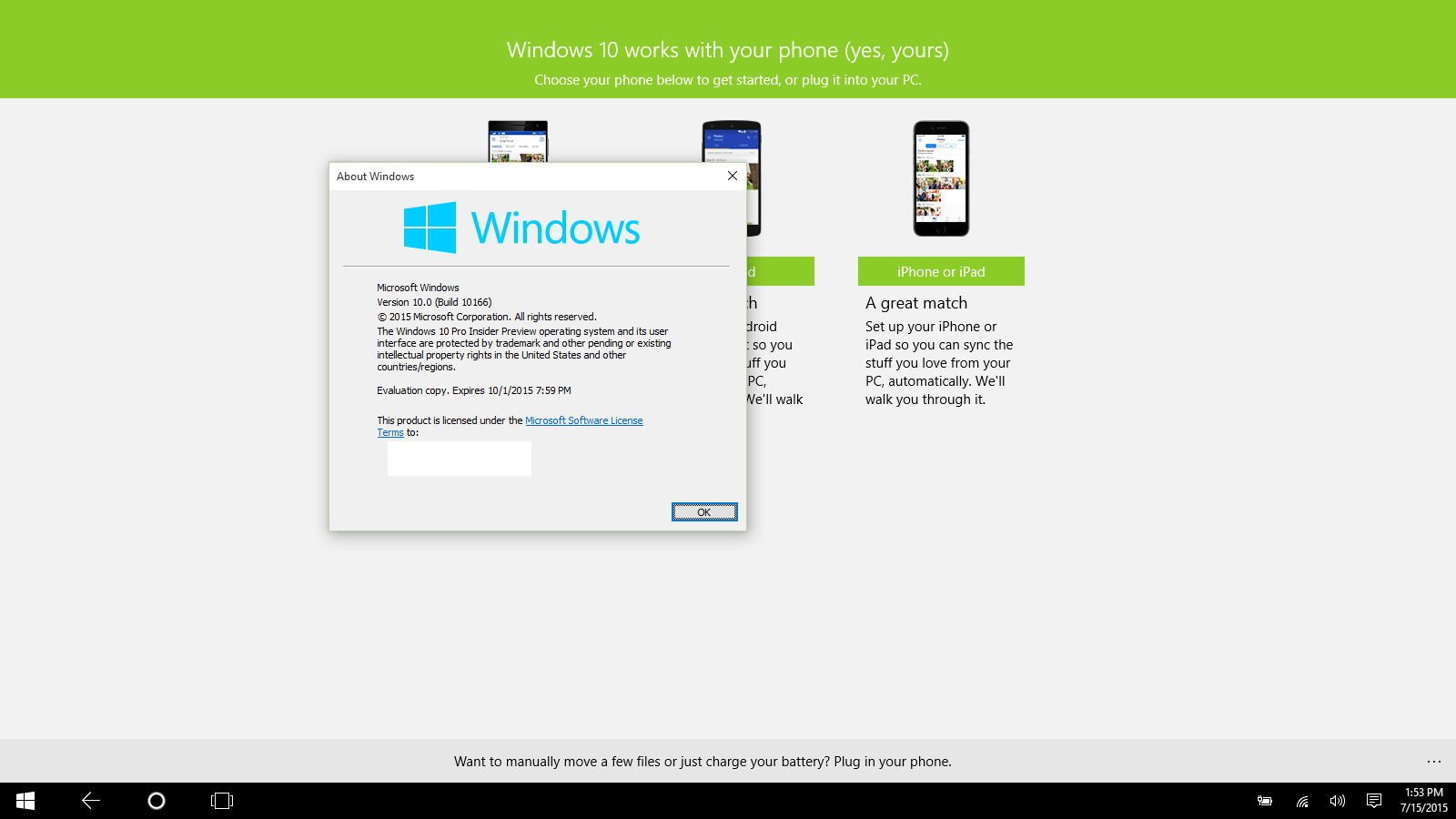
If you're a fan of the Start screen on Windows 8.1, but you also like the new Virtual Desktops feature, you'll see that that accessing Task View will only list all the running apps from all the desktops instead of having them grouped by individual desktops. Therefore, on Tablet mode, you can't create new Virtual Desktops.
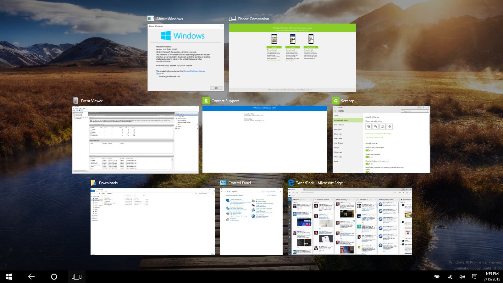
If you like to work with virtual desktops and you like the Start screen, you may want to stay away from Tablet mode and use the Start menu in full screen instead.
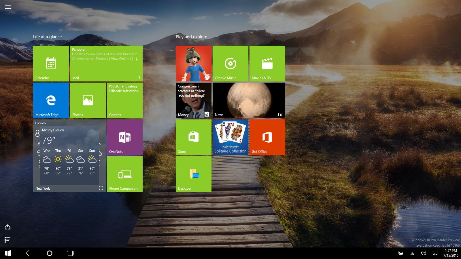
In the Start screen, we now also have three buttons that can be confusing to some users. Microsoft added a hamburger style menu button to access the left size of the Start menu features, such as "most used" apps, and buttons to different locations. At the bottom left corner, we have the new "Power" and "All apps" buttons. While they're a good addition in combination with the Start button, they also add extra elements that could confuse some users.
I don't think is a bad user experience, it's just that if things stay this way, it might take additional time for users to get used the new Windows 10 user interface.
Microsoft Edge
While Microsoft Edge is aiming to be a great web browser that will compete head-to-head with Chrome and Firefox, there are a few things to consider before making Edge your default web browser.
First, customization at this time is somewhat limited. Sometimes, it feels that performing tasks inside the browser is a slow experience. This doesn't mean that pages load slowly. Microsoft Edge renders web pages fairly quickly even more with the release of Windows 10 build 101240 where the company has improved performance and JavaScript rendering. Whatever else you do still feels a little slow.
You can now drag a tab out to create a new window, but trying to drag a tab back in will leave behind an empty tab, which is not the behavior we're expecting.
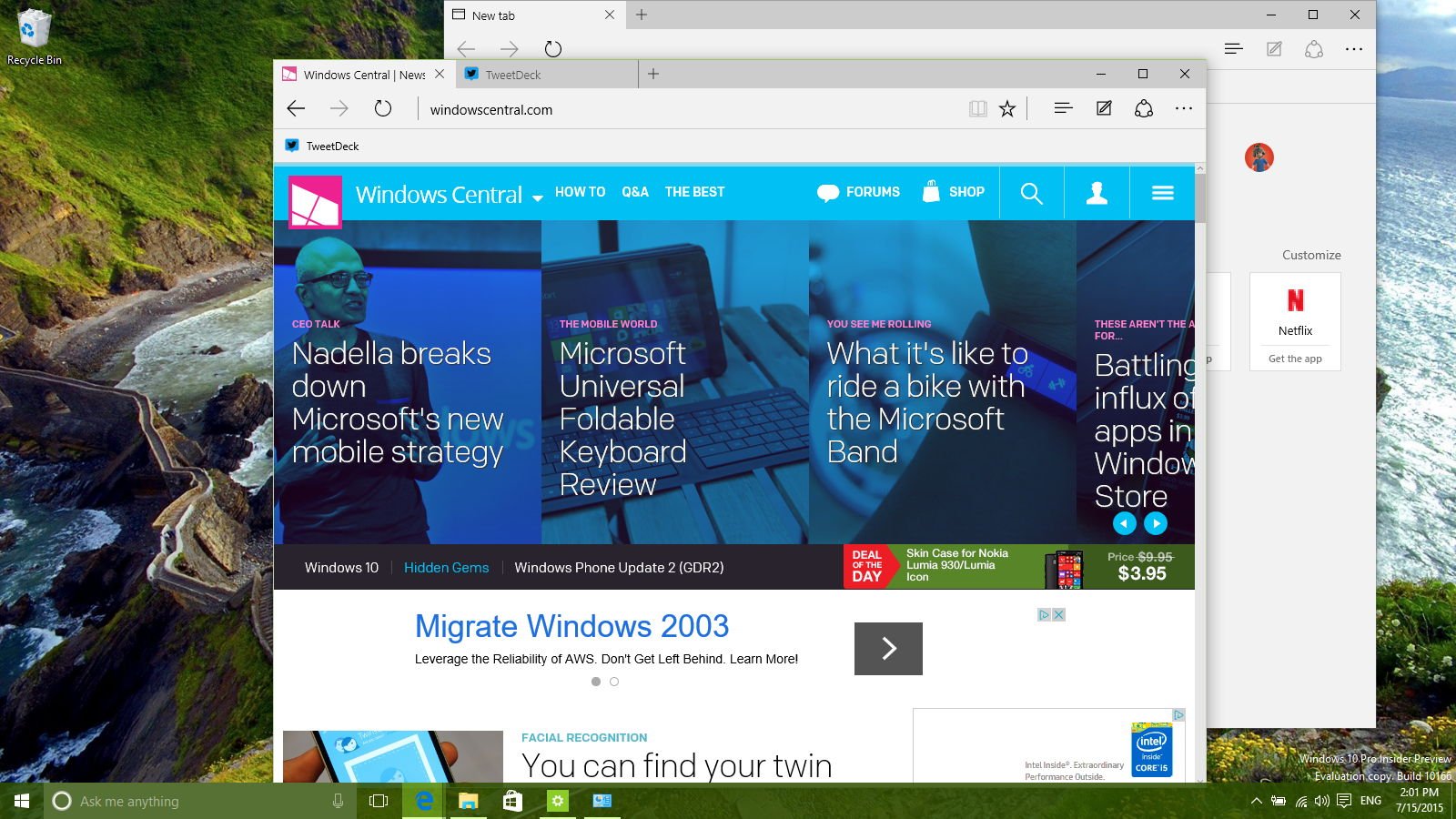
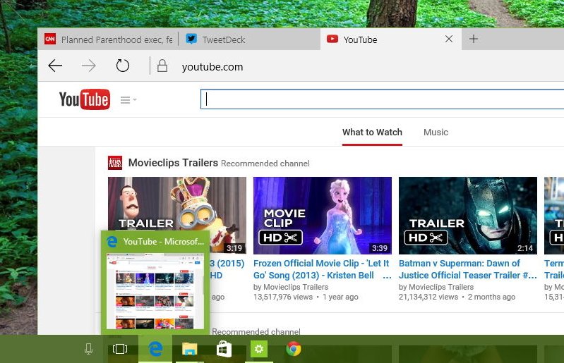
Sometimes, things just don't work as you would expect. For example, in my current installation, the taskbar preview only shows the preview for the website you're currently on. If you have more than one tab open, you won't see them, like when you have multiple tabs open with Internet Explorer. I also get some unexpected crashes, but not very often.
Cosmetically it also needs a few refinements. Right now it looks somewhat plain to me, but nothing that future updates may be able to fix.
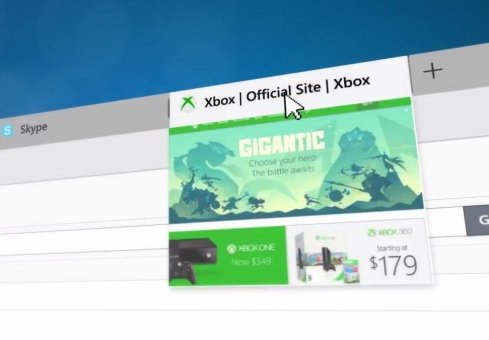
In addition, there are features that aren't yet implemented. This is the case of tab previews that we have seen on previous demos and videos. Just like in Chrome and Firefox, the company also promised extensions for Microsoft Edge, but we know that this functionality will not arrive until sometime after the launch of Windows 10.
What remains unchanged in Windows 10
There is no doubt that there are a lot of features and changes coming to Windows 10, but there are parts of the operating system that Microsoft isn't updating.
If you open the Event Viewer, Device Manager, and Disk Management, all these and other features on Windows that depend on the Microsoft Management Console, Computer Management, Services have not changed since Windows XP. Other tools such as Performance Monitor and Windows Firewall also remain the same since Windows Vista and Windows 7.
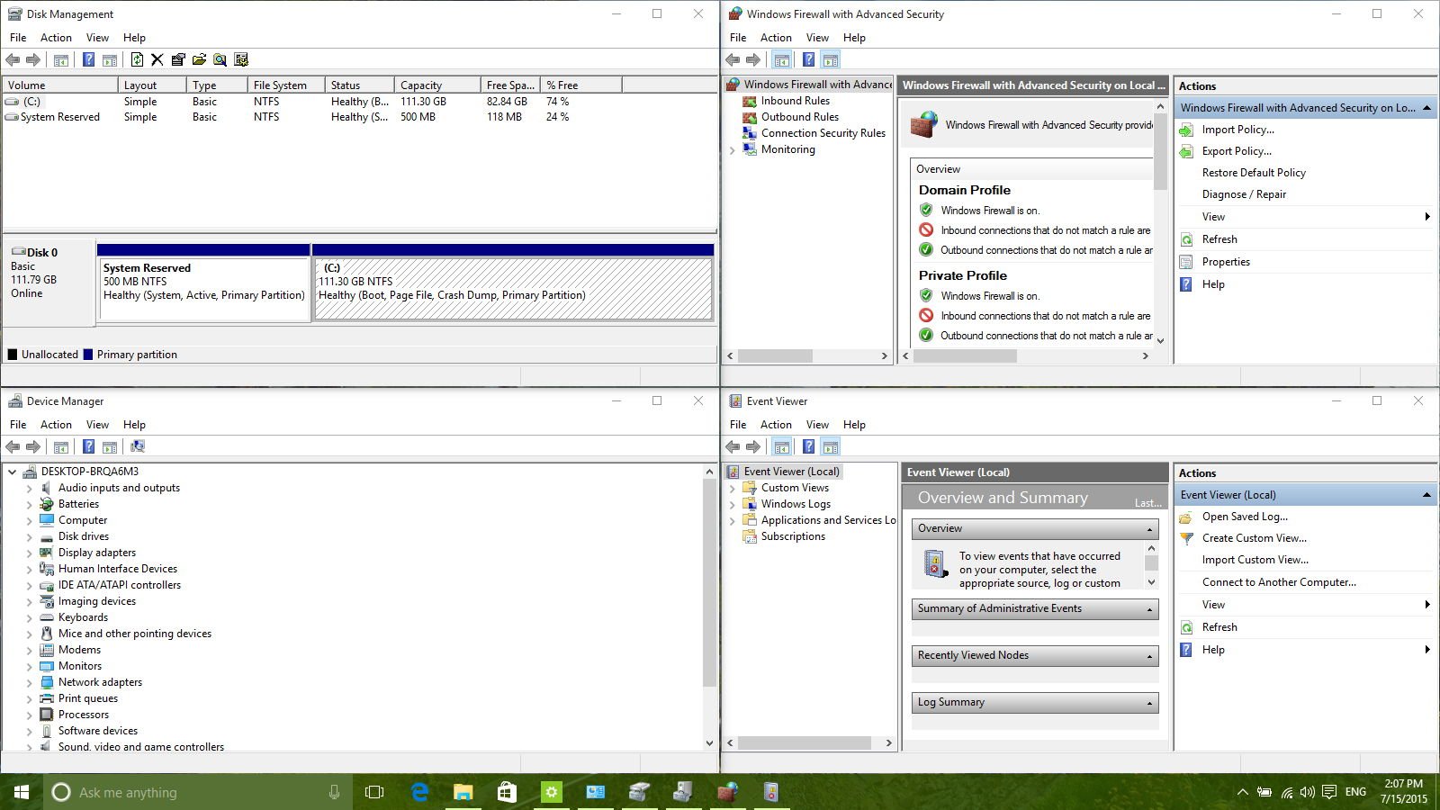
While these tools are designed for knowledgeable users, they still perform the work they are supposed to be doing. However, after seeing all the changes in Windows 10, it's time for Microsoft to revamp the tools and the user interface.
Wrapping thing up
Yes, there are few areas that need to be improved and some missing features, but overall Windows 10 is already looking great. Besides, as I mentioned before, Microsoft is now moving towards offering Windows as a Service. As such, Windows 10 will always be a work in progress, and new improvements and features will roll out regularly.
In the last few preview builds, such as build 10158 and 10166, it's noticeable how much polished, smoother, and quicker the operating system has become. Of course, there are still a few problems with installation and compatibility, but things like these are expected on pre-release versions. These bugs and inconveniences will eventually be worked out.
Windows 10, without a doubt, is aligning to be the next best release of Windows. Microsoft has put countless of hours of work and now we have a new operating system that brings tons of improvements and new technologies. A lot of things have changed under the hood. The operating system is now a single core that runs across PCs, tablets, phones, and even on Xbox. It's a big deal especially for developers as they can now build universal Windows apps and target them to millions of devices running Windows 10.
The security and data protection in Windows 10 are best we have seen in the operating system, and we're going to see even more improvements in the coming months. Microsoft is already getting ready for the next wave of updates, which we currently know as project "Redstone", and it's rumored to arrive sometime in 2016.
It's worth pointing out that Microsoft didn't do this alone. Over the lifetime of the Windows Insider Program, over 5 million testers have signed up to try the new operating system. This translates to hundreds of thousands of feedback that the company was able to gather to help shape Windows 10.
I'm personally a big fan of Windows 10, and I'm planning to upgrade all my devices to the final release on July 29th. Currently, I'm running the Windows 10 Insider Preview on my lab PC and virtual machines just to compare different builds when new features arrive.
Now, are you ready to upgrade? What areas of Windows 10 do you think need improvement? Let us know your opinion in the comments below and remember to keep using the feedback app and the official Microsoft forums to tell the company what you want to see improved in Windows 10.
Mauro Huculak has been a Windows How-To Expert contributor for WindowsCentral.com for nearly a decade and has over 15 years of experience writing comprehensive guides. He also has an IT background and has achieved different professional certifications from Microsoft, Cisco, VMware, and CompTIA. He has been recognized as a Microsoft MVP for many years.

