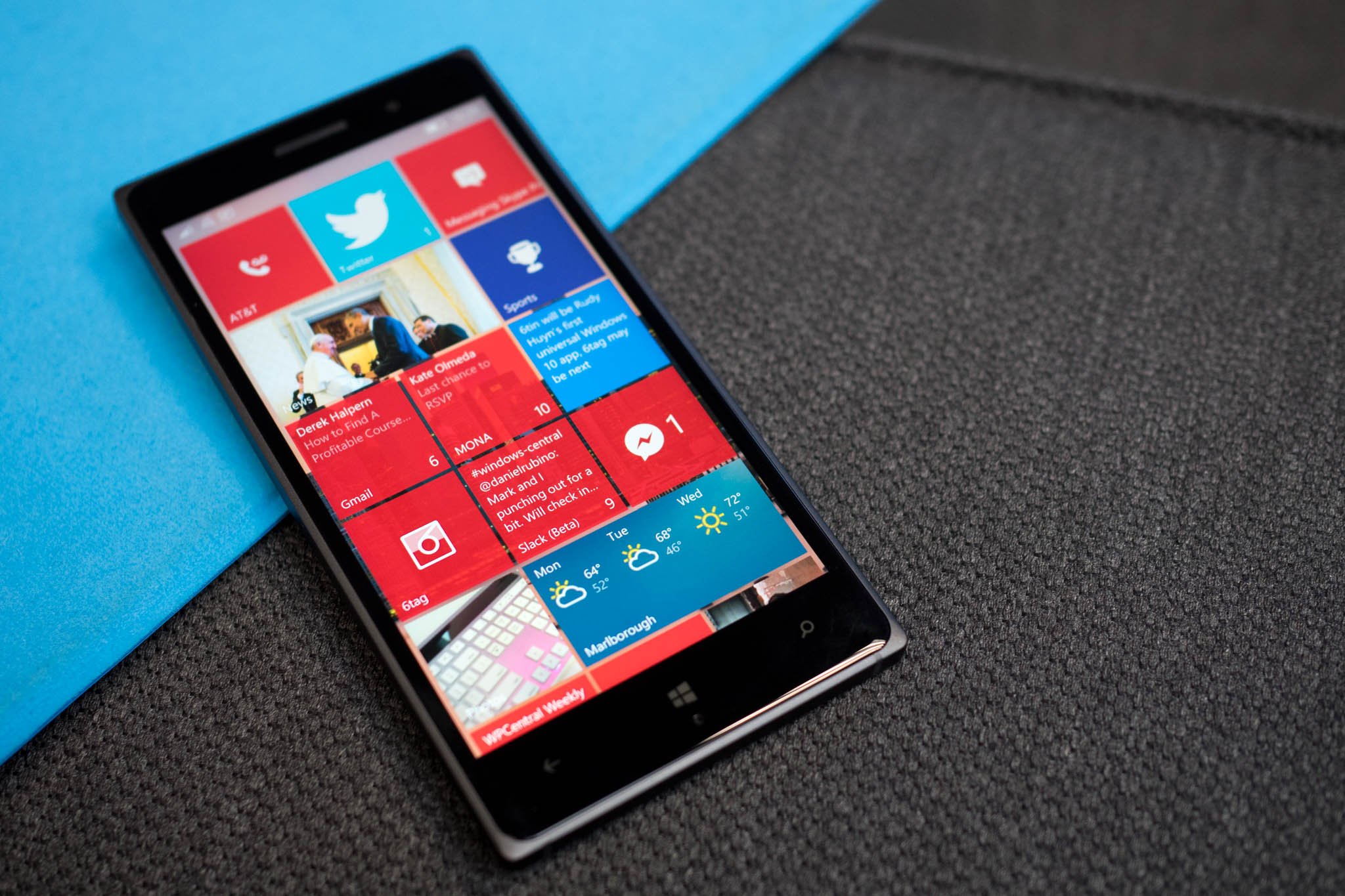
Windows 10 Mobile's Touch menu settings now have the new user interface

All the latest news, reviews, and guides for Windows and Xbox diehards.
You are now subscribed
Your newsletter sign-up was successful
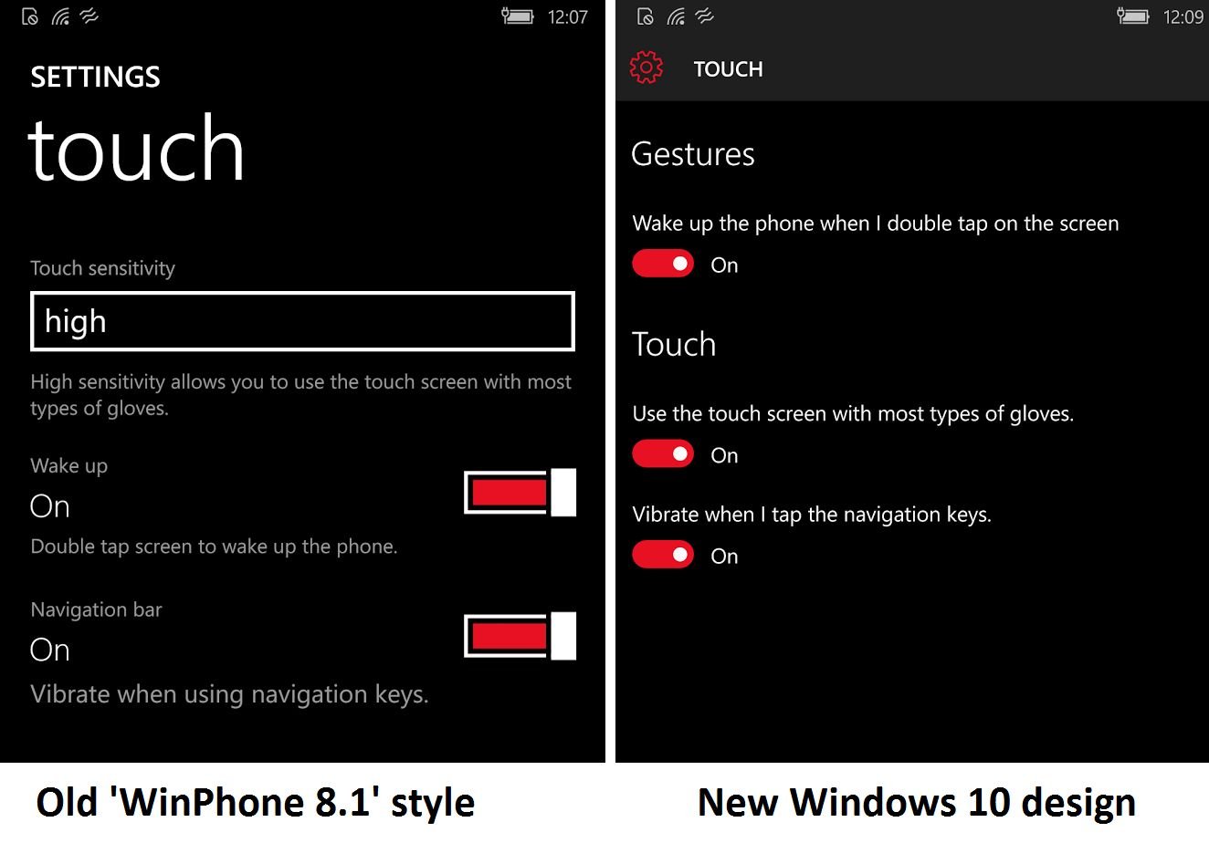
Windows 10 Mobile users will see a new update for the OS that has a small but interesting change. The Touch menu settings for the OS have now been revamped so that they look like the new user interface for the OS, rather than the old UI used in Windows Phone 8.1

You can see the changes in the screenshot above, which shows both the old and new looks. Oddly, this change seems to be just for Windows 10 Mobile, and not for Windows Phone 8.1. Again, this shows Microsoft is still changing things around in the OS before its official public over-the-air public launch, which is scheduled for December.
Article continues belowThanks to everyone who tipped us!

All the latest news, reviews, and guides for Windows and Xbox diehards.

John Callaham was a former contributor for Windows Central, covering Windows Phone, Surface, gaming, and more.
