The definitive Windows 10 Anniversary Update review
The Windows 10 Anniversary Update for PC goes a long way in realizing Microsoft's vision of personal computing, but there are still some gaps. Luckily, Redmond shows no signs of slowing down.
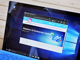
On July 29, 2015, Microsoft released what many have called the final version of Windows (see our review). Even though it goes by the name Windows 10 (implying an '11' someday) the budding OS kicked off a deeper philosophical change: Windows as a Service, or WaaS, if you're hip. Windows as a Service promises endless updates, infinite improvement, and a non-stop feedback loop with customers on what they like, want and dislike.
One year later on August 2, 2016, Windows as a Service is put into practice with the release of the free Anniversary Update (build 14393). What are the biggest changes and why should consumers bother? As it turns out, Microsoft has been using their crowdsourced Insider program to improve Windows 10 in addition to delivering new features. While the Windows 10 Anniversary Update is in many ways similar to the previous yearly upgrades, this one is the beginning of a new era.
Today, Zac Bowden and Daniel Rubino are reviewing the Windows 10 Anniversary Update.
- Insider Prologue
- Video Overview
- Start Menu
- Action Center
- Dark Mode
- Edge browser
- Windows Store
- Cortana
- Tablet Mode
- Microsoft Ink
- Conclusion
Prologue
How Insiders shaped Windows 10 is a big part of this story.
Reviewing an entire OS is never a trivial task. While there are the big banner changes that we focus on in this review, there are also the thousands of smaller bug fixes, battery optimizations, stability improvements, and general user experience changes that go undocumented. We will mention these where we can as they do affect your understanding of what Windows 10 Anniversary Update is and what you should expect when the update begins rolling out.
Many of the changes, or at least the direction in which the changes went, were a direct result of the millions of Windows Insiders. This free program means that customers can get early access to what eventually is the Anniversary Update. It also means that this OS was truly crowdsourced with 75 million pieces of feedback and 5,000+ enhancements to the OS attributable to volunteer Insiders (estimated to be slightly less than 10 million people).
Microsoft is releasing a mainstream operating system that was directly shaped by its most enthusiastic users.
To get to the "final" Windows 10 Anniversary Update for August 2 Microsoft released a staggering 25 builds for PC and 16 builds for Windows 10 Mobile over the last eight months. In the past, "beta testing" was often internal until just before release when it was opened up to the public. However, by this time the OS was already feature-locked meaning the feedback by the public was just last-minute bug fixing.
Get the Windows Central Newsletter
All the latest news, reviews, and guides for Windows and Xbox diehards.
The Windows 10 Anniversary Update differs from this dramatically as the OS you will get in August has been developed with millions of regular people already using it daily on laptops, tablets, phones, and desktop PCs. Microsoft is releasing a mainstream operating system that, for the first time, was directly shaped by its most enthusiastic users.
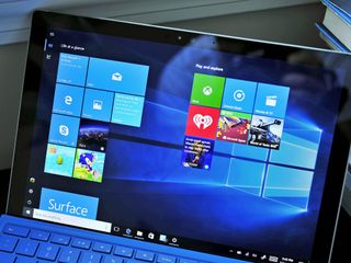
Will it be bug-free? Probably not, as no software, this complex can be. However, Windows 10 Anniversary Update promises to be one of the most stable, fluid, and trouble free experiences to date. After all, millions of people, including yours truly, have been using it for many months now.
Perhaps the most interesting aspect of the Insider program is that it will only improve. More users, more data points, better telemetry, detailed feedback, and mechanisms to improve the system. Yes, that means after this update the whole process begins again for the next update expected in Spring 2017 and the another in late 2017.
Windows as a Service is here and the Anniversary Update is just the beginning. Microsoft's Windows Insider program has turned from an experiment to a critical piece in making an OS that regular users want.
Just how successful were they with the Anniversary Update? That is our focus in this review. And for those asking about Windows 10 Mobile, stay tuned for that review a bit later.
Video Walkthrough
A picture says a thousand words, so this video must be like a million.
Don't want to read a few thousand words with exquisite detail? Check out Zac Bowden's 21-minute tour of the Windows 10 Anniversary Update to see what's new.
Start Screen
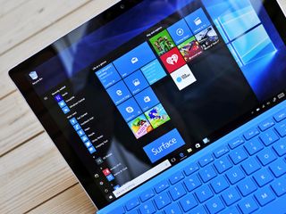
Why mess with a good thing? Microsoft keeps the Start menu simple while adding some refinement to the cornerstone of Windows.
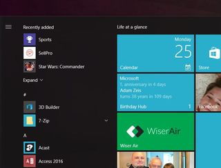
The Windows 10 Anniversary Update does not drastically alter the most recognizable aspect of the OS namely the Start menu. Instead, Microsoft opts for some smaller changes to the Start menu mostly based on user feedback.
The Start menu now features the Recently added at the top of the menu with Most Used below it. Even further down are all your apps in a single list. This layout differs from the original Windows 10 design where All Apps was nested in a submenu. Recently added is also expanded to show more freshly installed apps and games. Likewise, Settings, Folders, Power, and the User Profile Icon are all pushed to the left resulting in a three column layout instead of the previous two (System | New and All Apps | Start Menu).
The User Profile Icon is now shortened with a smaller version of the user profile image. No longer do you see the user name listed in the Start Menu unless you hover over it. This trend has been occurring for the last few versions of Windows, and it differs drastically from the me-centered approach from years ago.
The Start Screen aka "full-screen Start Menu" for use on Tablets ditches the single column for All Apps found in the previous version for a larger full-screen layout. This modification is needed since on touch devices you preferably want bigger targets to tap. With the Anniversary Update, you now see more of your apps as there are three columns instead of the previous single one. We'll return to Tablet Mode later on.
Finally, perhaps the biggest feature is not ready yet: Chase-able Live Tiles. Currently, Live Tiles display current information e.g. a news story. When a user clicks the Tile to read that particular story, instead of going straight to it the app just opens. The user now has to look for the headline. Starting with the Anniversary Update, this changes as a user can now go right to the specific content reflected on the Live Tile. However, Chase-able Live Tiles needs developers to enable it in their apps. It could be a few weeks before users see it in action, but it should be worth the wait.
Chase-able Live Tiles simply completes the metaphor
Overall, the small changes to Start Menu and Start Screen are smart for the Anniversary Update. The user experience is streamlined, there is less clicking, and users still have all the options they need to make the most frequently used part of the OS reflect their preferences.
Unlike the shift to Windows 10 itself, which is jarring for some, the Anniversary Update will not be a shock to current users. Chase-able Live Tiles simply completes the metaphor that many users likely assumed had already existed. In other words, it's about time.
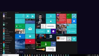
Nonetheless, the representation of Live Tiles and the Start screen is becoming a little too comfortable, in my opinion. While Microsoft has made smaller changes to the Windows 10 user experience and given developers improved tools for creating them, the basic concept has not evolved much in the last few years. Chase-able Live Tiles go a long way in making them intuitive to use, but Microsoft should think about the next stage for this paradigm.
Live Tiles are easily the most recognizable feature of Windows 10 and Windows 10 Mobile, so Microsoft does need to be careful, but at this point, the underlying concept could use a refresh. Something like so-called interactive Live Tiles present some interesting paths for Microsoft to pursue.
Action Center
Lights, Camera, Action Center. What's new and improved in the Anniversary Update? As it turns out, quite a lot and we like it.
The Action Center in Windows 10 has never really been that great. I've been using Windows 10 since it came out in July 2015, and I can confidently say that I rarely ever used the Action Center for anything other than clearing whatever notifications were in there. It simply sucked. That all changes with the Windows 10 Anniversary Update, however.
Microsoft has done lots to improve the overall Action Center experience, beginning with where the Action Center is actually located. In the past, the Action Center icon would always be buried alongside all your other taskbar notification icons in the system tray. With the Windows 10 Anniversary Update, however, Microsoft has given the Action Center button it's own bit of space at the far right of the taskbar, making it far easier to notice when a new notification comes in.
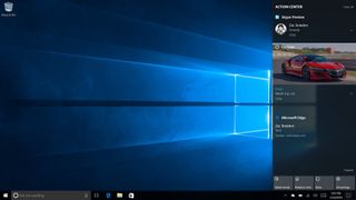
Not only that, but Microsoft has also made the Action Center button a little more interactive. When a new notification comes in, the Action Center icon will briefly change to the app icon that said notification originates from. Microsoft has also added a badge to the icon too, giving you a numbered overview of all your missed notifications.
Notifications
Notifications in the initial Windows 10 launch were pretty basic, but with the Anniversary Update Microsoft has made notifications far richer, interactive and just plain better to use. Apps can now incorporate things like images, profile icons, interactive options and more. Some notifications can adopt a "card-like" UI, being big and noticeable over all other notifications with buttons and other features that you can interact with without having to jump into the app.
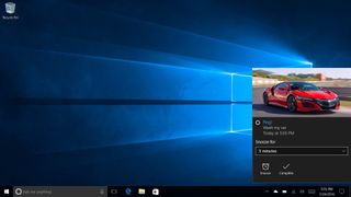
You can even change what apps take priority in the Action Center when a notification comes through. For example, I can make the Skype app a "Top Priority" app, meaning all notifications from that app will appear at the very top of the Action Center, regardless of what time they came in. Below "Top Priority", we have "High Priority" which places these notifications below Top Priority, but above normal notifications. So you've got a hierarchy of notification priorities that you can configure if you please.
This is super helpful for apps that you use that always get buried below other apps. You can set up whichever app you need always to show up at the top, so you never miss it.
Microsoft is also giving users the ability to configure how many notifications from a particular app appear in the Action Center, hiding the rest under a "see more" drop down to keep the Action Center clean and tidy. The default setting is 3, which I find is small. Users have the option of 1, 3, 5, 10 or 20.
I'd much prefer the default number be 5, which I manually configured via the Settings app.
Quick Actions
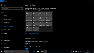
Quick Actions, which are located at the bottom of the Action Center, have also been improved with the Anniversary Update. You can now customize them to your liking by adding, removing and changing the position of all the actions to your liking. In the past, these Quick Actions were fixed, but now the user has maximum control over what shows up there.
Synced Notifications
In what I think is one of the best features arriving in the Windows 10 Anniversary Update, the Action Center will now sync across your PC and phone (Android and Windows Phone only). With the help of Cortana, she'll display your phone notifications directly in your PC Action Center, in some cases allowing you to reply to that notification directly from your PC. There's also support for Universal Dismiss, however, that feature only works if developers opt-in to it.
For those who don't know, Universal Dismiss allows users to dismiss a notification on one PC and have that notification dismiss everywhere else, too. For example, when using the Facebook Messenger app on your PC and your phone, you'll get notifications come in on both your devices. However, with Universal Dismiss, when dismissing a notification from one of your devices, that notification will dismiss everywhere else too. Great for those who have lots of devices running the same apps, hopefully, developers take advantages of this feature sooner rather than later.
I've noticed that Synced Notifications are, more often than not, really slow to show up everywhere. Sometimes they never show up. Perhaps it's a server side issue, or maybe this is just the nature of syncing notifications between devices. Nonetheless, this is an area that is likely to be improved upon in the coming weeks.
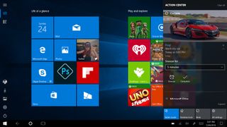
The Anniversary Update introduces many much-needed improvements to the Action Center, all of which I think make the Action Center usable now. Notifications look good, and I can configure the Action Center to my liking with ease.
Notifications are useful and rich with content, I find myself checking my notifications far more often
I was always in the camp of "We need a notification center" in Windows, but when it arrived on Windows 10, I rarely ever used it. Maybe I didn't need one after all, or maybe the Action Center that Microsoft originally designed just wasn't designed well enough. Luckily, in the Anniversary Update, this all changes. Now that Notifications are useful and rich with content, I find myself checking my notifications far more. Being able to customize my Quick Actions also help, as I can move my most used actions right to the very top row, making them super easy and quick to get at.
Admittedly, the Action Center can still use some work, especially with toast notifications working. I continue to struggle to get Cortana to send me notifications about reminders, and more often than not notifications from apps won't show up for a considerable amount of time. Syncing notifications between devices is also very slow, so much so it isn't worth it when I can just see my notifications come in on my phone, sitting on my desk.
Dark Mode
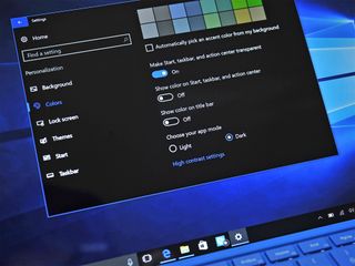
The only thing cooler than Windows 10 is making Windows 10 go dark.
Starting in spring 2016, AMOLED displays began to be available to consumers in laptops, Ultrabooks, and even tablets like Samsung's Galaxy Tab Pro S. AMOLED technology uses less power with black backgrounds, making an OS that utilizes the absence of color preferable.
Currently, many apps available on Windows 10 have an optional dark mode where the menus and app background are either all black or gray. The problem is that Windows 10 as an operating system lacked a comprehensive way to turn everything dark e.g. the system Settings area, which is a white-grey.
With the Windows 10 Anniversary Update users can now enable Dark mode under Settings > Personalization > Colors > Dark (or Light). The change even affects the Windows Store, which is where consumers will likely see the biggest benefit since that app is used so often.
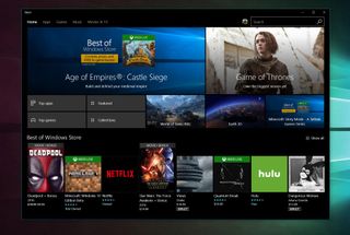
The feature does not, however, override user-installed apps, which often have their own settings (MSN News recently picked up the feature, but GroupMe has yet to).
Once you start using Dark Mode in certain environments like at night, you will not want to go back. But therein lies the rub: currently you need to change modes manually. What would make this feature ideal is the ability to auto-change light to dark based on local sunset/sunrise or a user-set particular time.
Dark mode remains, in my opinion, a feature about three-quarters complete
There are also exceptions likes File Explorer, which while getting more 'modern' is still very much in the legacy camp of pre-Windows 10. Do not expect a dark theme here, not yet.
For now, dark mode remains, in my opinion, a feature about three-quarters complete. While choice is appreciated it needs to be smart and so far, it is not.
Microsoft Edge
A lot of progress has been with the Microsoft Edge browser. Here is why we're excited.
You have to give Microsoft credit. Tearing down an aging (and mocked) Internet Explorer web browser and rebuilding a new one while competitors are miles ahead is brave.
How is Microsoft Edge with the Windows 10 Anniversary Update? There is no doubt that it is much better than it was a year ago. In fact, there are so many new features, fixes and improvements we have a huge article dedicated to everything that has changed:
What's new with Microsoft Edge for Windows 10 Anniversary Update
There are smaller new things like 'paste and go' that other browsers have had for years. There are features so advanced they are not even in use yet like biometrics with Windows Hello to log into websites.
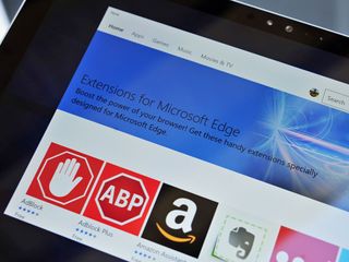
But perhaps the biggest banner feature to hit Edge is support for browser extensions.
But perhaps the biggest banner feature to hit Edge is support for browser extensions. Now, users can install AdBlock, uBlock, AdBlock Plus, Amazon Assistant, Pinterest, Reddit Enhancement Suite, LastPass, Enpass, and more. Browser extensions are already available in the Windows Store, and they even get updated automatically just like an app.
The design implementation of extensions is consistent throughout with similar menus and options for each one. It's well done. Companies can also evidently port their extensions from Chrome with only modest changes in the code. That means in the next few months we should see many extensions fill the Store giving users the choice they want.
Extensions work quite well, although on occasion they have disabled after an update from the Store or an OS upgrade. While it is trivial to re-enable them, it is something that users on Chrome or Firefox rarely experience. These are likely some early bugs that will be worked out over time.
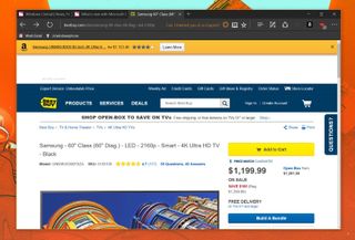
Another big improvement in Edge is in battery usage for laptop users. Microsoft knows that the future of personal computing is increasingly more mobile with laptops and two-in-ones taking the lead. Making sure that Edge behaves while using a limited power supply is important and despite Opera's protests Microsoft does have – forgive the pun – the edge in efficiency.
Nothing is free, however, and while Edge does tend to be better for the battery, it seems to love RAM more than other browsers. For example, with Gmail loaded to the same inbox Edge consumes nearly twice as much RAM as Opera (and Opera had, even more, extensions loaded). Granted, I cannot say this ever became a problem, but in a world where Chrome gets criticized for memory usage, Edge is the bigger offender.

So here is the deal with Microsoft Edge in the Anniversary Update. It is a much better experience than a year ago, so much so that you really should try using it for a few days as your only browser. My advice is to use it on a laptop or Surface first before going full-time on your desktop PC.
Oh, and let's not forget you can now swipe back and forward in Edge too for Tablet users!
Edge excels at page rendering, layout, and being a streamlined browser with no legacy nonsense on board. The UI design is also top notch being clean, minimal, and sharp looking especially with dark mode enabled.
Nonetheless, switching web browsers is hard. Everyone has a reason as to why they like their browser, and it can be over very trivial things. Overcoming that is akin to switching from Android to iOS or vice versa. You can do it, but it will take time to get used to it.
2016 may not be the year of Microsoft Edge, but you can feel that its day in the sun is fast approaching
Microsoft Edge has gone from an amusing sideshow to something compelling. However, Microsoft still has a long way to go. Opera, Chrome, and Firefox all have more features e.g. Opera's Turbo Mode (compressed data for faster browsing on slow connections) that leave Edge behind, but not for lack of trying.
2016 may not be the year of Microsoft Edge, but you can feel that its day in the sun is fast approaching, and I'm rooting for it. I like Microsoft Edge, and I want to love it, but it's still not quite there yet. For now, Edge is worth checking out, but you may not yet be convinced.
Regardless, the competition should start to worry about what comes next from Microsoft. They will catch up.
Windows Store

Did Microsoft add too much info to the Store? Maybe, but you can't really blame them, we think.
According to Microsoft the Windows Store is a destination you're supposed to be using all the time. After all, the Universal Windows Platform (UWP) lets developers release apps on PC, tablets, phones, HoloLens, Surface Hub, and very soon the Xbox One and One S. The Store is the heart and future of Windows 10. It is still not entirely clear just how many people use the Store and Windows Apps on desktop PCs, but that is not stopping Microsoft from improving the experience.
The Windows Store is your one-stop place for apps, games, music, and movies and TV. With the Anniversary Update, Microsoft is altering the layout of the Store and giving much more information to the consumer.
For instance, for each app, game or movie you can see things like:
- Available on: Xbox One, PC, Mobile, Holographic, and/or Hub
- System Requirements: Minimum vs. Recommended
- Improved user reviews
- Dark Theme
- Recent activity e.g. download history
- Movie and TV trailers
- Game clips
Whether you like the new design is a personal decision, but there is nothing inherently wrong with it save for the fact it is a bit busy.
There is a lot of information presented, which is a reflection of the universal nature of these apps and games. Some users have high-end PCs with GTX-1080 graphics cards, others are using a 5-year-old laptop with an outdated processor, and some are even on their phone. Being able to explain that to a consumer is challenging. You don't want them buying Gears of War: Ultimate Edition only to find out it does not run on their anemic Surface 3.
Ideally, the Store should match your system's specifications to an app or game preventing accidental purchases on non-compliant systems. In other words, if I go to the Store and try to buy/download Rise of the Tomb Raider on an 8-inch Intel Atom tablet, the Store should warn me the game will not play. That does not happen. Maybe that is asking for a bit much, but wanting a "smart" Store is something that could benefit Microsoft and consumers in the long run.
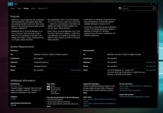
Other areas are, however, much improved. Reviews now can be broken down by platform e.g. PC or Mobile, and you can even sift through versions. That latter part is neat because sometimes an app gets poor reviews on release, but after a few updates, the reviews improve. A user can now see that and feel a little more confident with the decision to purchase.
For large games like the previously mentioned Gears of War, a user can now install it to a secondary drive. Previously, the Windows Store installed all apps and games to the primary disk, but with the Anniversary Update users are given a choice.
Under Movies you can now watch the film trailer and there is an amusing video clip that plays behind the main title. The new layout is more vertical than the previous one with less information positioned to the sides. In keeping up with the 'people are circles' design aesthetic of Windows 10 the 'Cast and Crew' are no longer square.
The Store in the Anniversary Update for PC is simply nicer to look at it.
Recent activity shows you what has updated on your system, which is perfect for those who leave on auto-updates. The Recent activity feature is visible under Downloads and updates and while it can take a few moments to populate, forthcoming updates improve its speed. Users can also have notifications for app updates observable in the Action Center. Under My library consumers can now hide apps that are no longer installed.
None of these are groundbreaking new features, but they do complete the experience. Once again, Microsoft is not drastically altering Windows 10, merely refining it based on user feedback and long-term design plans.
Overall, Microsoft has done well with the new Store. Some UI decisions like the wider download bars will cause some consternation amongst design aficionados, but regular people will probably be less judgmental. While the Store may suffer from information overload, it is better to have too much than too little when it comes to people's wallets. The Store in the Anniversary Update for PC is simply nicer to look at it.
Cortana
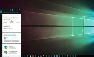
In the Anniversary Update, you can find Cortana doing more than ever, but it still may not be for everyone.
Microsoft's personal digital assistant Cortana gets some new features with the anniversary update. For example, users can now use Cortana above the lock screen. This feature lets you ask Cortana questions about the weather, trivia, request to play music or set reminders without having to unlock your PC or laptop. While an interesting concept it is not something I used on a regular basis so whether you find it useful will vary.
In fact, I find the whole lock screen something I see only momentarily as I log in. The only thing I notice are the pretty pictures found with Windows Spotlight.
A bit more exciting is the ability for Cortana to share notifications from your smartphone to your PC. By installing the Cortana app on Android, iOS or simply by using a Windows 10 Mobile phone users can have their phone notifications appear while working on their desktop or laptop.
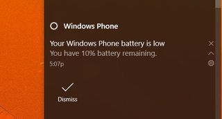
The idea here is simple: if you're busy working on the computer with your phone in your pocket, you can see that WhatsApp message and even respond to it without taking your phone out. Cortana can tell you even when your phone's battery is low. Of course, users can configure exactly what is shared with Cortana and can even turn off the feature entirely if it becomes a nuisance.
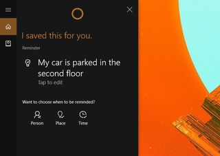
There is also the ability now for generic reminders i.e. just telling Cortana to store some detail without a set time, date, or place.
Just as useful is the capacity to share items in Windows 10 to Cortana to set as a reminder. For instance, while browsing the web in Edge, you could share a new story to Cortana who will then act on it as a reminder including saving the URL. Users can also attach photos to reminders in Cortana while using a Windows 10 Mobile device, which is useful for shopping or only to add flair to the note. Quite frankly, I find this feature a joy to use and is simply delightful.
Certainly, Cortana is getting "smarter" regarding general AI, but the feature is still dependent on how comfortable you are talking to your PC or laptop. The ability to integrate with your smartphone indeed extends its usefulness beyond just Windows 10 Mobile users and the abilities will only get better. Nonetheless, for some users, Cortana will remain a novelty, and Microsoft still needs to push the assistant to other countries and regions before everyone can benefit.
Tablet Mode
Has Microsoft finally righted its wrongs with Tablet Mode in Windows 10? Let's just say, yes, but there all is not perfect either.
With the original Windows 10 launch, Tablet Mode was a mix of good things and bad things. The good? All apps now operated like tablet apps, being accustomed to the same gestures and behaviors as actual tablet apps would, and the tablet experience would automatically take effect depending on whether you had a keyboard and mouse plugged in thanks to a feature called Continuum. The bad? It was a major step-back from the Windows 8.1 tablet mode experience, so much so many users opted not to upgrade to Windows 10.
Microsoft is aware of this and has been listening to customer feedback quite a bit surrounding tablets. With the Windows 10 Anniversary Update, Microsoft has improved the Tablet Mode experience to the point in which it's now bearable. Let's see what's new.
Start Screen
The Start Screen hasn't really changed much, still incorporating the same 3 or 4 column setup in a grid-style layout. What has changed is the hamburger menu found on the left-hand side, as it now includes some customizable shortcuts as well as quick access to your all apps list.
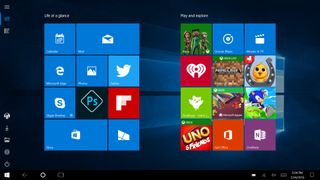
You can customize up to 10 shortcuts to appear directly on the Start Screen thanks to the hamburger menu. However, these shortcuts are limited to:
- File Explorer
- Settings
- Documents
- Downloads
- Music
- Pictures
- Videos
- HomeGroup
- Network
- Personal folder
So there's no real way of adding your own shortcuts, unfortunately. You can manually pin whatever you wish to the Start Screen, however.
Apps List
The biggest changes arrive with the Apps List, which in the original Windows 10 release was confined to the left of the screen in a long vertical menu. Now, the Apps List is much more like the Windows 8.1 apps list, spreading out across the center of the display and displaying much more content.
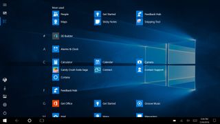
One of the advantages of this is the fact that you can now scroll the menu with any hand with ease. Before since the list was confined to the left, scrolling with your right hand was almost impossible without taking your right hand off the tablet first. With the Anniversary Update, that is no longer the case.
The only real difference between this Apps List and the one found in Windows 8.1 is that the Windows 10 Anniversary Update Apps List scrolls vertically, much like the Start Screen, instead of horizontally like on Windows 8.1.
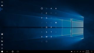
I much prefer the vertical scrolling on the Start Screen and Apps List personally. However, I'm aware that many prefer horizontal scrolling. Vertical scrolling is easier with your thumbs when holding the tablet with two hands, which is why I think Microsoft is sticking with the vertical method.
Taskbar
The Taskbar was a favorite topic up for debate when it came to Tablet Mode last year, as with the original Windows 10 launch the taskbar would always stay on screen. Many tablet users were not happy with this, asking Microsoft to allow users to remove the taskbar from the screen when in an app. Microsoft has listened and provided users with exactly that.
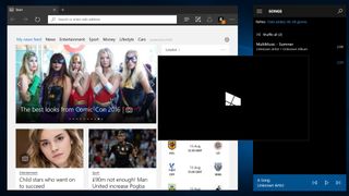
Now, once the user configures it, the taskbar will automatically hide when launching an app. It will remain present on the Start Screen, however, as getting access to Cortana as well as Task View and the system tray makes sense on the Start Screen. You can also swipe up from the bottom of the screen to gain access to the taskbar while in any app too, so if you do need it, you don't have to back out to the Start Screen first.
Lock Screen
Although these changes are also great on desktop, the Lock Screen is also vital for tablets too. So I'm going to detail some of the new Lock Screen changes here, as it makes sense.
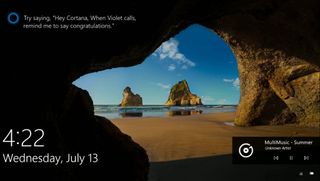
You can now easily play, pause and skip music directly from the Lock Screen instead of logging in first. In the past, users either had to log in, or tap the volume rocker to initiate the music controls which was incredibly annoying and unintuitive.
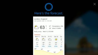
Not only that, but you can now access Cortana directly from the Lock Screen by saying "Hey Cortana" or tapping on the Cortana prompt that shows up around ¾ of the way up the display on the left. Cortana can do basic things such as tell you the weather, a joke, a few system commands and more directly from the lock screen, and will prompt you to login if needed for any additional tasks.
Up until now, the Windows 10 tablet experience was bad, real bad. It was a huge step back from Windows 8.1 concerning usability and experience, but with the Windows 10 Anniversary Update, Microsoft has started making strides in improving said experience for tablet users. I believe the Anniversary Update is a step in the right direction for tablets, making the experience far more satisfying and pleasing to use.
I believe the Anniversary Update is a step in the right direction for tablets
I love being able to use ALL my apps, whether they be tablet-specific of old fashioned desktop apps in full screen, now that I can remove the taskbar from my screen. The improved Apps List and Hamburger menu also make for a much better experience when in tablet mode. I wish Microsoft would begin focusing on the individual apps to improve their tablet experiences, however, as a lot of them are still designed for the desktop. For example, Microsoft Edge's UI is still desktop-focused rather than touch, meaning the address bar and tabs don't auto-hide like they used to with the tablet version of Internet Explorer.
The Anniversary Update is a step in the right direction for tablets, but there's still room for improvement regarding individual apps. If you're running Windows 10 on a tablet, I recommend you upgrade to the Anniversary Update when available, just for the improved tablet experience alone.
Windows Ink
Got a pen? Then you will want to jot down some notes about what is new with Windows Ink. Trust us, it's awesome.
As part of the improvements to Tablet Mode, Microsoft has also been working on improving the pen-input experience with tablets and 2-in-1's by introducing the new "Windows Ink Workspace". This new feature is home to everything pen-related, including an area to jot down notes, sketch out ideas, and even launch other pen-specific apps.
When using a tablet, the Ink Workspace shows up right next to the clock icon on the taskbar, and can be accessed from anywhere via that button. It can also be accessed from the lock screen by setting up a button on your pen as a shortcut to open the Ink Workspace, pretty convenient for when you want to jot down notes quickly without logging into your device.
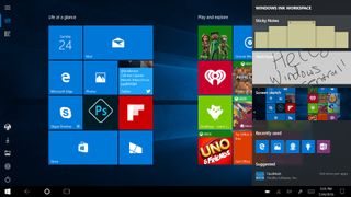
Upon opening up the Ink Workspace, you'll be greeted with three main options;
- Sticky Notes
- Sketchpad
- Screen sketch
These three options are the stars of the Ink Workspace, and allow pen-users to do some pretty nifty stuff. Let's start with Sticky Notes, which are updated and improved from previous versions of Windows.
Sticky Notes
Unlike in the past, these new sticky notes support pen-input, alongside typing normally. Not only that but these Sticky Notes are somewhat intelligent thanks to the Cortana integration. For example, in a sticky note I can write with my pen "Remember to hang out the washing", and low and behold, Cortana will highlight the thing she thinks I'll need to remember, and can add it to her notebook right from the Sticky Note itself.
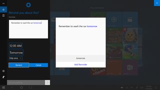
This feature works with both a pen and typing, so even as a desktop user, you can take advantage of this feature. I've been using the built-in Windows Sticky Notes offering for years, ever since it was introduced in Windows Vista back in 2007. It's been almost a decade, so it's good to see Microsoft updating them to keep with the times. Using Sticky Notes on Windows is now super easy and straightforward on a tablet (and even easier on the desktop now) thanks to the Ink Workspace.
Sketchpad
Up next is Sketchpad, probably one of the most convenient new additions to the Windows 10 Anniversary Update. If you've used Windows on a tablet before, you'll know that Microsoft used to use OneNote as your all-in-one note taking app, but with the Ink Workspace, Sketchpad takes over from OneNote by offering a far more straightforward and streamlined alternative. Sketchpad is basically OneNote without all the extra confusing features, a simple pad in which you can sketch images or take notes.
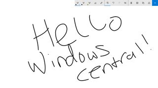
You've got the ability to change pen-type, with choosing's between a regular pen, pencil, and highlighter. You've also got capacity to modify the color of your ink, and even the size of your pen tip. You can save everything you do in Sketchpad quickly as a PNG image, or share it directly to OneDrive if you need to continue what you're doing in a more advanced pen environment.
The best feature about Sketchpad, however, is the built-in ruler, which is an absolute life saver
The best feature about Sketchpad, however, is the built-in ruler, which is an absolute life saver for taking notes. Gone are the days of drawing squiggly lines because trying to draw a straight line is just embarrassing, as the new ruler tool does exactly what you think it does; provide a virtual ruler on the screen that allows for easy straight lines.
I've had a blast using the ruler when taking notes, but I can image artists having a far more exciting time with it as drawing straight lines on a tablet can be difficult. Thankfully the ruler tool eliminates this problem entirely, and I am thankful Microsoft thought about adding it into the Ink Workspace. We also hear that more virtual stencils are headed to Windows Ink in the future, which is very exciting.
Additionally, for those of you who don't have a pen, you can use your finger in place of one in the Sketchpad, pretty neat. You can also use a mouse, although I'm not sure how productive that'd be.
Screen sketch
Last but not least, Microsoft has also built in a tool that allows you to draw basically on anything you want. It works by taking a screenshot of whatever's on your screen currently, and throwing you into the Sketchpad with the pen tools that allows you to draw and be creative/take notes.
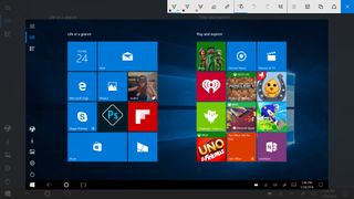
This ability is mostly useful when highlighting something in a program that doesn't natively support Inking, such as Google Chrome or a chat app. You can simply open up Screen Sketch, highlight/draw on whatever you want, and save that as an image or share directly via the Share charm to your favorite apps.
Since Screen sketch throws a screenshot into Sketchpad, you've still got access to all the tools Sketchpad does, including changing pen type, tip size, ruler access and more.
Additional Ink features
Below that, you'll see a few shortcuts to your most recently used pen-specific apps such as Microsoft Edge, OneNote and other 3rd party apps too. You can quickly jump to your recent apps from this panel, making productivity that much quicker.
Finally, you'll see Microsoft is also suggesting other pen-specific apps you might like to download and try out, all available via the Windows Store for convenience too.
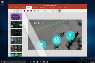
The Windows ink Workspace hooks up to a multitude of apps as well, such as the Maps, Microsoft Edge, OneNote, Office, and even 3rd party apps like Adobe Photoshop. An excellent example of this is with the Maps app, which with the Anniversary Update allows you to draw directly onto maps. You can draw routes, and the app will try and calculate the distance in which your route is, and how long it'll take you to walk/drive. It even compensates for things like mountains, adding extra time to your journey depending on whether the mountain has a significant climb to it.
Microsoft has also added a load of customization options for pen users, such as the ability to change button shortcuts, turn on or off the pen cursor, and a whole lot more. All of these options are now directly built into the Settings app, instead of being a separate app downloadable from the Windows Store, a great addition to an excellent pen experience.
The enhancements Microsoft has made to the pen experience in the Windows 10 Anniversary Update are tremendous, but for the improved pen experience to truly shine, developers are going to have to take advantage of the new Ink Workspace tools. Being able to use things like a ruler in certain apps is fantastic, and I can't wait to see developers begin picking up this new functionality.
Sketchpad is simply amazing at taking down simple notes or drawing basic diagrams.
As a tablet user myself, I didn't know I needed the Ink Workspace until I actually had it to use. I've always stuck to OneNote, but the Ink Workspace has allowed me to branch out and use my tablet in new and exciting ways. I've even found many new apps thanks to the suggestion area that show up at the bottom of the Ink Workspace. I'm often using my tablet to take notes with a Surface Pen, and Sketchpad is simply amazing at taking down simple notes or drawing basic diagrams.
Screen sketch is also pretty useful, especially for people like me who are often trying to help people out on Windows. I can quickly take a screen-grab, circle or highlight a part of the operating system and send it off as an image for them to view. Sticky Notes are just amazing, and I now use them more than I ever have in the past as they hook up to Cortana with ease. There are loads of new applications and experiences for tablet users to take advantage of with the Ink Workspace.
Final Thoughts
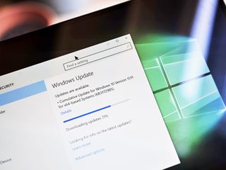
The Anniversary Update is the best Windows yet. Here are our final thoughts on why.
Nobody really understood what Microsoft meant when they announced Windows 10 would be updated like a service, but with the Windows 10 Anniversary Update, that vision is now clear. Microsoft wants to update Windows 10 at least once per year with significant new features, much like rival operating systems like MacOS, iOS or Android do, and keep users current with the latest version of Windows.
Microsoft has done a tremendous job at improving the Windows 10 experience with the Anniversary Update.
Microsoft has done a tremendous job at improving the Windows 10 experience with the Anniversary Update. With help from Windows Insiders and the public, Microsoft is slowly crafting and sculpting Windows 10 into the perfect operating system that was built around ideas and wants that the public ask for. The initial Windows 10 launch had its quirks, and it was evident that not everything was ready, but now, a year later, it's obvious that Microsoft's vision and strategy for Windows 10 is only getting stronger.
Improvements to the Start Menu, Action Center, Windows Ink and Tablet Mode, are huge factors in making Windows 10 the best version of Windows yet. Along with other changes such as the Universal Windows Store and Xbox integration, Microsoft is slowly positioning Windows 10 as a hub for all your devices, spanning from the desktop all the way down to Xbox and even phones. With things like synced notifications and Cortana being available everywhere, it's hard not to start buying into the Microsoft ecosystem.
If you're a Windows 10 user, we highly recommend you install the Windows 10 Anniversary Update.
And that's not a bad thing. Microsoft is building out its ecosystem much like Apple and Google have been for years. Now it's Microsoft's turn to take a stab at getting users in the world of Windows, and it is doing that by allowing customers to extend their Windows experience onto their own devices. Cortana is now available on Android and iOS, and with the Windows 10 Anniversary Update Cortana only gets stronger and can do more on these alternative platforms. The user is now always connected to their PC via the Microsoft cloud, and that's fantastic.
If you're a Windows 10 user, we highly recommend you install the Windows 10 Anniversary Update. It's a vast improvement over the Version 1511 and Version 1507 releases, and brings all your devices, whether they be desktops, tablets or phones, closer together. If you're still running Windows 7 or Windows 8, you need to upgrade to Windows 10 now to take advantage of the Anniversary Update, something we strongly recommend you do as you've only got a week left before the free upgrade offer expires. Finally, the Windows 10 Anniversary Update runs even better than the first version meaning once again there are no slowdowns due to older hardware.
The Windows 10 Anniversary Update will begin rolling out to Windows 10 users for free on August 2 as an update, for PC and tablets, and then phone and HoloLens soon after. For those tech-savvy enough, the build in question that will roll out on August 2nd is build 14393, and if you're an Insider Microsoft is now testing a number of patches via the fast ring for you to test that will roll out as one big day-one update on August 2nd. It's an exciting time to be a Windows user, and if Microsoft's current strategy is anything to go by, it's only going to get better.
Pros:
- Big improvements
- Microsoft is clearly listening to feedback
- Faster, more stable, and refined
- Dark mode!
- Inking!
- Action Center is much more useful
Cons:
- Microsoft Edge is still behind (but improving)
- Tablet mode could still be better
- Live Tiles could use some innovation
- Information density is a concern
More Resources
- Windows 10 Support Forums at Windows Central
- Windows 10 Anniversary Update News
- Windows 10 Tips, Tricks, and How-tos

Daniel Rubino is the Editor-in-chief of Windows Central. He is also the head reviewer, podcast co-host, and analyst. He has been covering Microsoft since 2007, when this site was called WMExperts (and later Windows Phone Central). His interests include Windows, laptops, next-gen computing, and watches. He has been reviewing laptops since 2015 and is particularly fond of 2-in-1 convertibles, ARM processors, new form factors, and thin-and-light PCs. Before all this tech stuff, he worked on a Ph.D. in linguistics, watched people sleep (for medical purposes!), and ran the projectors at movie theaters because it was fun.