Hands-on with Outlook Mail and Calendar's new dark theme for Windows 10
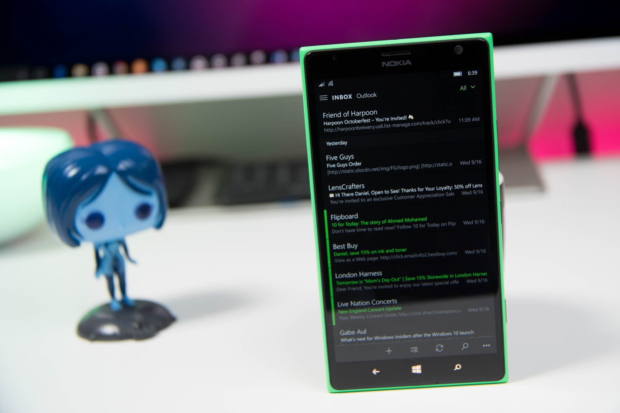
Microsoft has finally delivered a significant update to their fledgling Outlook Mail and Calendar apps for Windows 10 Mobile. The desktop version is also updated for Insiders and we have screenshots of that one too!
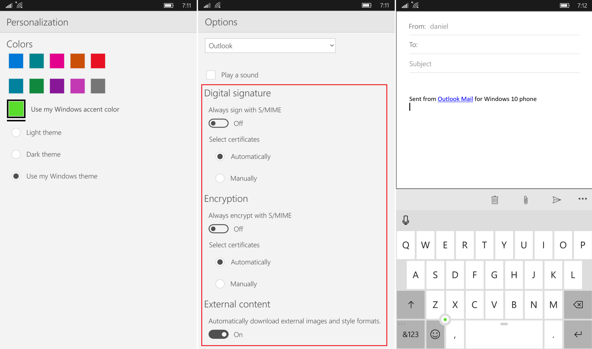
We have spent a few minutes with both apps, and you can check out the new dark theme and accent color options.
Additionally, besides the theming changes, Microsoft has also moved some things around in both apps. Here is what we have noticed:
- No longer linked – For some reason, the apps no longer link to each other. Whether this was because no one used it, or it is just temporarily gone, we're not sure. For now, you'll need to launch each app individually
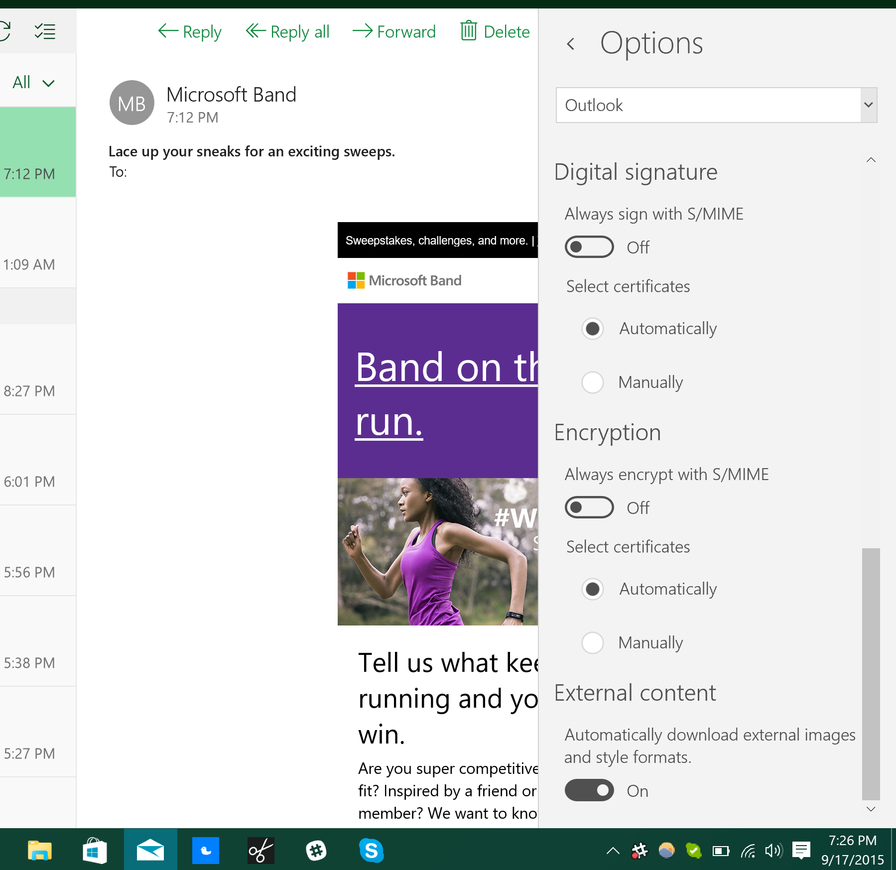
- New Options – Outlook Email now features Digital Signature, S/MIME Encryption, and the ability to automatically download external images and style formats
- Menu changes – Settings are now found in the ellipsis menu instead of being buried in the hamburger one, making it easier to find
- Animation – Now, opening a menu the bar slides out instead of pushing the whole thing
- Action Icons moved – In an opened email, the Forward & Back buttons are moved to the right, swapping places with delete Respond and Delete; Under the Compose new email, the delete icon is now to the left instead of being in the middle, swapping places with the Attachment icon; In the main menu Search and Select have changed places too
Outlook Mail for Desktop
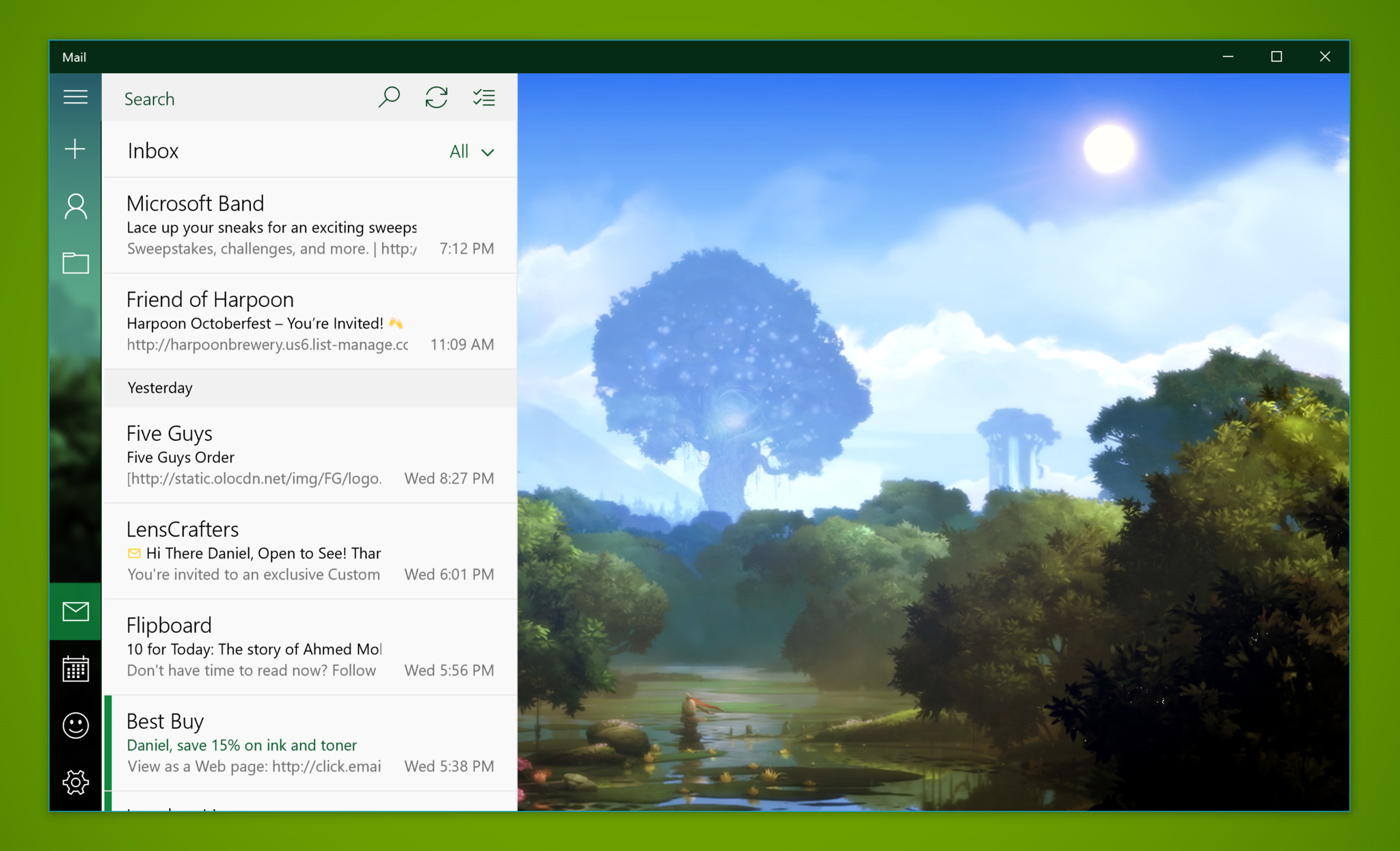
The Outlook Mail app for Windows 10 PC is also updated with some unique changes too. However this is only for those on the Insider program! Here is what we have noticed under the new Personalization menu:
- Background – You can now set it for the entire window instead of just the blank space; Ther are now images to choose from in addition to Browse
- Themes – There are the same light and dark themes along with accent colors to choose
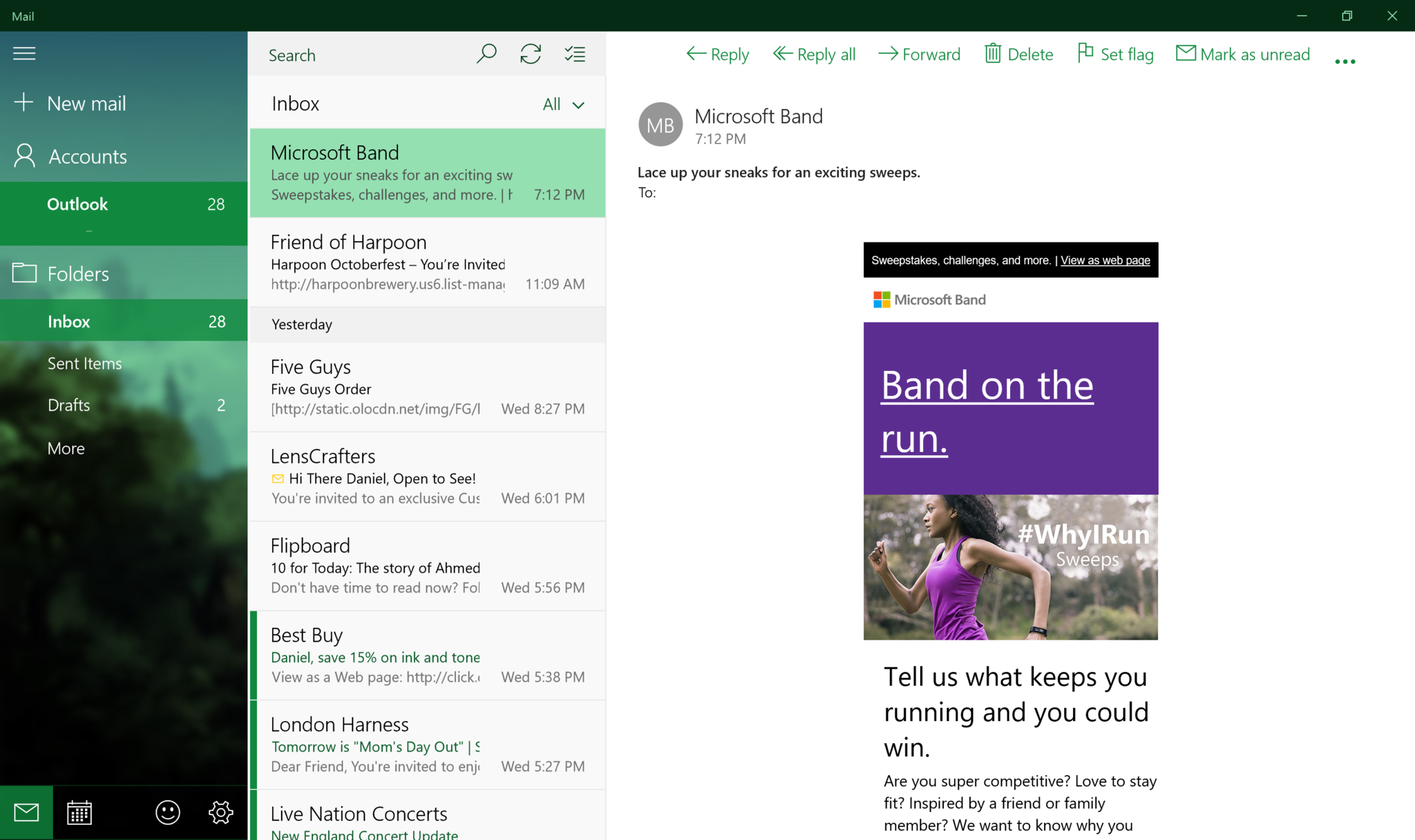
- Blue Menu – The menu area (extreme left) is now default blue instead of white
- Robust Menus – Your accounts are now listed under an Account heading
We are sure there are other changes to be found throughout the app, as this is a rather large change. If you see any other changes, let us know in comments!
Get the Windows Central Newsletter
All the latest news, reviews, and guides for Windows and Xbox diehards.

Daniel Rubino is the Editor-in-chief of Windows Central. He is also the head reviewer, podcast co-host, and analyst. He has been covering Microsoft since 2007 when this site was called WMExperts (and later Windows Phone Central). His interests include Windows, laptops, next-gen computing, and wearable tech. He has reviewed laptops for over 10 years and is particularly fond of 2-in-1 convertibles, Arm64 processors, new form factors, and thin-and-light PCs. Before all this tech stuff, he worked on a Ph.D. in linguistics, performed polysomnographs in NYC, and was a motion-picture operator for 17 years.
