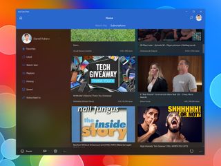
MyTube Beta updated with Project NEON blur, comment threads and more

The beta version of popular YouTube app myTube has been updated with a taste of Project NEON-like blur handful of new features to check out on Windows 10. Alongside the design shift, you can now also take advantage of comment threads, comment replies, and more.
As far as the new design is concerned, myTube Beta now sports a blurred transparency effect on the sidebar and behind the main video feed. This is similar to Microsoft's new Project NEON design language that is starting to make its way into Microsoft's own apps — including, most recently, Groove Music.
Here's a quick look at the release notes for the rest of this update:
- Added comment threads
- Added ability to reply to comments
- Implemented share target
- Added option to use official YouTube HTML5 player
- (PC) Added volume control
- (PC/Mobile) Added feedback hub option to account app bar
- (Xbox) Multi-process background audio disabled by default
For more on Microsoft's own plans for Project NEON, check out our overview of what's coming. Otherwise, MyTube Beta fans can check out all of what's new by grabbing version 2.9.91.0 from the Windows Store now.
Thanks, Chuck, for the tip!
Download MyTube Beta from the Windows Store
Get the Windows Central Newsletter
All the latest news, reviews, and guides for Windows and Xbox diehards.
Dan Thorp-Lancaster is the former Editor-in-Chief of Windows Central. He began working with Windows Central, Android Central, and iMore as a news writer in 2014 and is obsessed with tech of all sorts. You can follow Dan on Twitter @DthorpL and Instagram @heyitsdtl.
