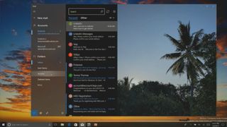
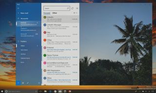
Here's a first look at Outlook Mail with Fluent Design coming in the Fall Creators Update
Upcoming improvements to Outlook Mail include some pretty cool Fluent Design elements, including acrylic, motion and light. Here's a first look.

Fluent Design is everywhere at Build this year. Being one of the biggest announcements for developers, it's the new design language that should soon be coming to all kinds of apps. Up until now, we had only seen Fluent Design in a few select apps that Microsoft had updated, but now at Build we've had a chance to see everything they've got planned.
We've already given you a first look at what Microsoft is planning to bring to Edge with Fluent Design, and now it's time to take a look at some of the other in-house apps being updated with Fluent with the Fall Creators Update (Redstone 3). Outlook Mail is another hugely popular Windows 10 app, and later this year it too will be joining Edge and other apps with a fresh paint of Fluent Design.
in a breakout session at Build, Microsoft showcased Outlook Mail's new Fluent Design, in apparently working code meaning Insiders might start seeing this rather soon. The updated Outlook Mail client includes Fluent Design features such as light, for hovering over sidebar menus and items, motion with smooth animation when opening and closing certain user-interface (UI) elements, and acrylic for blur in some areas.

Another design improvement being made is that the app now feels "borderless". Microsoft mentioned during a session that developers can make elements stretch the entire window, including up through the title bar creating a "borderless" experience. This looks super impressive, and makes the app feel a lot more streamlined and clean.
Although subtle changes in most cases, the Outlook Mail app with Fluent Design looks incredible. It's a far better improvement over what the current UI is, featuring a rather flat UI design which Microsoft tells us they're now moving away from after 10 years of forcing it into apps and onto developers.
Fluent Design is very much the "new" Metro, expecting it to show up literally everywhere throughout the system and in apps, and even throughout Microsoft services, through the Fall Creators Update and even in to releases throughout 2018 and 2019. Stay tuned to Windows Central for more on the new Fluent Design System.
Get the Windows Central Newsletter
All the latest news, reviews, and guides for Windows and Xbox diehards.
